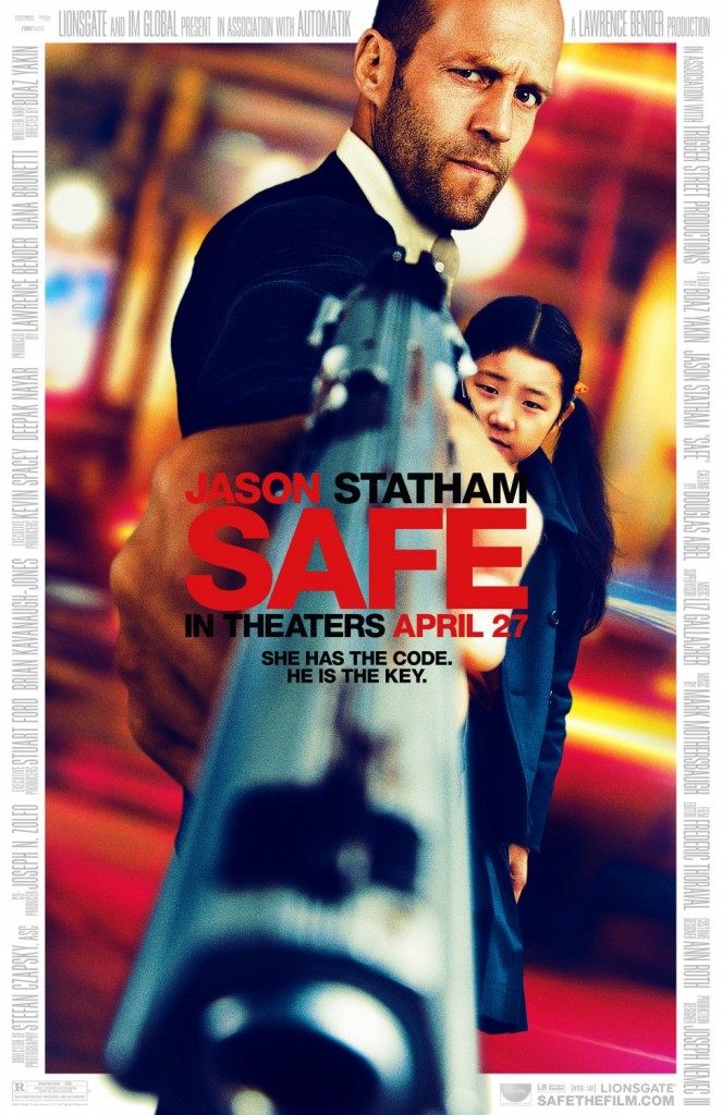
You know, I bet someone was really excited about this particular idea for a one-sheet composition, and had they taken the time to put everyone in a studio and lens this correctly, it could have been cool. As it is, the poster just demonstrates how few fucks are given about reasonable proportion and realism in marketing graphics these days. The result is this over-processed, dumb looking mess of photoshopped heads and disproportionate elements cookie-cut together…

Frankly, I’m not 100% comfortable with the juxtaposition of “little girl” and “giant bulbous Statham fist with absurdly large metal rod jutting from it.” Even Statham himself looks less intimidating than embarrassed that he’s waving his tumorrifically huge metal junk in my face why this young lady watches. And I’m left feeling less jazzed up about seeing an action movie and more worried that someone saw me looking at this shit.
It’s just becoming more clear to me how lazy the Hollywood PR machine is about these sub-standard composite jobs, and how we’re apparently accepting of them enough that the practice marches on. You’d think with the wide enthusiasm out there for custom-made movie posters with some art to them, that the studios would wise up and be more brave with their image choices.
And before I’ve wasted too many words on something ultimately very trivial, I’ll say this: They already have a decent, run-of-the-mill one-sheet for this film, and if I actually believe that the original image would exclusively be what’s actually printed to be put in theaters and given away at screenings, and that it would grace the cover of the DVD, then I couldn’t give Lionsgate too much shit for throwing the mess above together to circulate on the web. You can quite clearly see their logic for allocating a day’s worth of wages to a photoshop lackey to have a .jpeg that will spawn another thousand articles like this one raising awareness of the film. The thing is, I’ve seen even more egregiously bad looking work from bigger studios for larger films make it into lightboxes and onto home video shelves, so I have no doubt this will be a widely exploited image.
And regardless, this shit reflects on the movie no mater how quickly this plummets down the Facebook feeds and no matter how disposable a megabyte of pixels has become in this day and age (not to mention that this particular design looks increasingly fake the smaller it is, making it a dumb choice for web). This is a multi-million dollar endeavor from a giant studio that is flush enough to be absorbing other major studios… this shit should not be acceptable. You’re being outclassed by amateurs Hollywood, have some pride in your products and step up!
Twitter
Comment Below
Message Board
Source | IMPawards