Legion of Monsters #1 (of 4) (Marvel, $3.99)
by Graig Kent
There was a time when monsters were considered “scary”. Back in the ’30’s through ’50’s before we got all petrified about real world things like nuclear bombs, Russians and AIDS. Monsters these days more delight than terror-inducing… there’s something cathartic about watching a creature (or a man turned into a creature) satiate its primal id. Beyond that, there’s a point of view to creatures, from American Werewolf in London to Teen Wolf to Buffy The Vampire Slayer to True Blood to Being Human that is now taken into consideration. Monsters aren’t put here just to be killed by hunters, they’re there to challenge the status quo, to be understood.
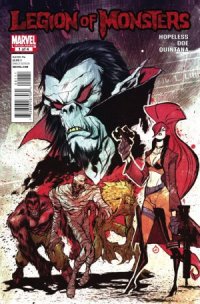
Elsa Bloodstone is a Monster Hunter, it’s what she does. But there’s a whole world she doesn’t know about, an underground city, deep deep underground, 400,000 monsters strong, living beneath New York City. Like any city, Monster Metropolis has homes for its residents, jobs, doctors, police, and a funky teleportation system… okay, maybe not like “any” city.
Elsa encounters Morbius “the Living Vampire”, head of the Monster Police, while chasing a creature through a portal from London. She’s promptly arrested, but Morbius enlists her help on a case. Turns out Monster Metropolis has been poisoned with dark magic, eating the minds of the monsters, turning them into murderous zombies. For Elsa, it’s either teaming up with the vampire now, or dealing with a few hundred thousand monsters spilling out of the sewers down the road.
Writer Dennis Hopeless provides a punchy, frequently funny script, and introduces both Elsa’s driven character and the Monster Metropolis in an effortless, yet knowing manner. Monster Metropolis, introduced in the Punisher last year, is perhaps not explored in too much detail, and although it’s analog police department is a recognizable cliche, it’s actually punctuated as such for lighter effect.
Juan Doe provides the illustrations in a style all his own. His characters are cartoonish but in a hard, angular way, straying far far away from the typically round manga influence that pervades the industry today. There’s a quasi-street art design aesthetic but adapted into a clear storytelling sensibility. He’s got a great sense of pacing, character design, and comedic timing, and with this one issue has become an instant favorite artist of mine.
Recommended.
Rating: 


Out of a Possible 5 Stars
 John Carter/ A Princess of Mars #1-2 (Marvel, $2.99)
By Adam Prosser
Let’s hear it for the public domain! It’s what lets certain characters haunt a multitude of media in a series of varied and often bizarre forms. Comics especially owe much to the public domain, having given birth to some of the most memorable incarnations of characters like King Arthur, Hercules and (especially) Dracula and Frankenstein. Now, with a John Carter of Mars movie due next year from Disney, comics are already rearing up with an array of comics starring JC-to-the-M, including, oddly enough, two different books published by Disney…or Marvel…or Marvel-Disney. The exact legalities of all this are all a little head-spinning (including the fact that “John Carter” is apparently trademarked but the basic property “A Princess of Mars” is public domain) but I’m not complaining; John Carter is the kind of character who’s always deserved the same kind of multiple treatments as Edgar Rice Burroughs’ more famous creation, Tarzan, so…better late than never!
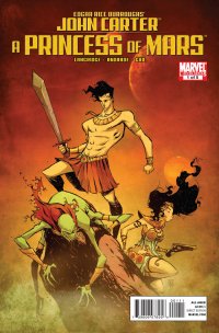
The story is practically an ur-text for pulp SF and fantasy: John Carter, Virginia gentleman and prospector, is transported to Mars via a mysterious cave and some kind of bizarre astral projection. In the original story he was a post-civil war cowboy; in this version he appears to have been transplanted to the modern day, but it’s not really clear, as the story picks up (smartly) in media res, with the captured Carter being interrogated by the gigantic green Martian “Tharks”. Fortunately, Mars’s lighter gravity and (apparently) atmosphere lends the Earthman extraordinary strength and the ability to leap huge distances in a single bound, and before long he’s earning the respect of the warlike Tharks through straightforward violence, has gained himself a chieftainhood and a potential ally in Tars Tarkas the Thark, as well as a gigantic Martian “dog” named Woola. Then the Tharks bring down an airship containing the red Martian princess and scantily-clad uber-babe Dejah Thoris, and sparks fly between the two sort-of-prisoners.
The modern incarnation of “retro pulp” traces its origins back to Raiders of the Lost Ark, and it’s usually rendered as a burnished, family-friendly excuse for geeky design and nostalgic adventure. This sort of belies the fact that, in its original incarnation from the late Victorian era (again, JC creator Edgar Rice Burroughs is to a great extent the godfather of SF adventure pulp) through to WWII and the early 50s, the adventure pulps were a great deal edgier, crammed with sex, violence, and moral lasciviousness, and aimed squarely at adult (if not necessarily grown-up) men. This has survived in our modern understanding of “noir” (Frank Miller’s Sin City is probably the comic most faithful to the spirit of the pulps) and, oddly enough, in most incarnations of Conan the Barbarian, but usually the modern take on pulp is surprisingly toothless. I bring this up because the upcoming John Carter movie, as technically proficient and strangely elegant as it looks, seems to go against the original spirit of the books—which were about naked people running around on Mars committing acts of wanton violence. They were a burst of raw energy, breaking free of Victorian prudishness and informing the pop culture of the 20th century; Dejah Thoris in particular has haunted the dreams of over a century’s worth of adolescent boys, thanks to artists like Frank Frazetta. As Graig commented in his review of the movie prequel comic (the other Marvel version of this book), Dejah seems to have had her sex appeal toned way down to make her palatable to Disney, which says something about where pop culture’s at these days, doesn’t it?
Fortunately, this particular take on JC is more in line with the classic pulps—it’s not as raw as a lot of the stuff that followed Carter into the 20s and 30s, but it maintains a certain level of energy, sexuality, brutality and unnervingness that I think are necessary for the character. Writer Roger Langridge is becoming a bit of a comics superstar of late, with his much-beloved, tragically short-lived run on Thor and his brilliant take on The Muppet Show, and here he takes the fairly straightforward material and delivers an effective and muscular script with unusually good dialogue (often the last priority in books like this, let’s face it). Speaking of muscular, artist Filipe Andrade delivers heavily stylized character art that somehow manages to be ugly and beautiful at the same time, adding a level of haunting surrealism that helps elevate this above the average swashbuckler, and colourist Sunny Cho evokes the primal colours and textures of Frazetta, which is always going to be the right choice on a book like this.
It must be admitted, John Carter’s adventures have been copied *so* often that even to a new reader it always risks seeming over-familiar. But this comic book team have managed to bring Burroughs’ work to life in a weird, idiosyncratic and powerful style that shows just how fresh even the oldest pulp adventures can feel. Like the dying world of Barsoom, as the Tharks call Mars, our tired, warmed-over pop culture of the early 21st century needs the vitality that John Carter brings, now more than ever.
Rating: 


Out of a Possible 5 Stars
Star Trek/Legion of Super-Heroes #1 (of 6) (IDW/DC Comics, $3.99)
by Graig Kent
Yes, you’ve read right. This is a real thing, there is actually a Star Trek/Legion of Super-Heroes team-up comic. The idea is, quite frankly, absurd, and yet delightful at the same time. These two properties really should not, in all good manner, co-exist in the same story environment, and yet here it is.
Is it a successful blending?
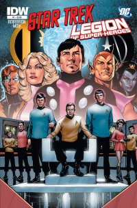
Well, quite frankly, the first issue doesn’t provide much other than a story foundation. The two teams haven’t met yet, and it’s not yet apparent how they will ultimately collide, though uniting against a common enemy is already part of the works. As introduced early this first issue, in an alternate timeline, the Federation has taken a turn towards the dark side, conquering and amalgamating new planets rather than peacefully reaching out and sharing ideas and culture. Through a malfunction with their time bubble, a sextet of Legionnaires wind up in this alternate 23rd century, while Kirk, Spock and company do the same via a transporter malfunction.
That’s really all there is so far, but can a dozen characters from two decidedly different backgrounds (and yet not all that dissimilar theologies) change the course of an entire universe? That obviously remains to be seen.
The story from Chris Roberson is workman like, simplistic, as to ease the concept upon its reader rather than try to force it upon them. It’s not much other than a hook yet, and perhaps not worth it for the four bucks it costs, except to the dedicated fan of both series. Jeffrey Moy, artist on the 90’s Legionnaires series for nearly 5 years, as well as a couple of Star Trek: Voyager mini-series tackles art, and his past familiarity (somewhat) with both worlds leads to an easy familiarity with the characters. Moy’s style is cartoonish, rounded, heavy lines and simplified designs, and their Trek characters particularly are nicely caricatured. However, I find the lack of detail in Moy’s backgrounds and technology to be too simplified and I’m left desiring more visual flair from the atmosphere, space ships, gadgetry etc.
It’s an innocuous start, and yet, I think it’s exactly what this series needs. There’s enough here in concept alone to keep even the mildly curious coming back for at least one more issue.
Rating: 


Out of a Possible 5 Stars
 Key of Z #1 of 4 (Boom! Studios/Evil Ink, $3.99)
By Jeb D.
I’ve always resisted the aural blandishments of Claudio Sanchez’ Coheed and Cambria; I’m almost completely unable to remember any of the issues of his Amory War comics I read; and if there’s anything I’m really done with, it’s zombies, making this comic a perfect storm of “meh” for me. So maybe I’m overcompensating for anticipated negativity, but I was pleasantly surprised at how much I enjoyed this first issue.
The story’s right out of “Walking Dead playbook 101”: our protagonist, Ewing, was living a nice, quiet life with his family until the plague of ghouls hit; now, he wanders the wasteland of post-apocalyptic New York, which is being carved up between fiefdoms, located in NYC landmarks like Madison Square Garden and Yankee Stadium, along class and ethnic lines.
Save the interesting facet of Ewing’s totem of power being a harmonica he received as a gift from his (presumably) late son, there’s not much new in the storyline, and lessons about human interdependence and tolerance are already weighing heavily. Though some of the internal monologue goes on a bit, Sanchez and co-writer Chondra Echert allow Ewing some perspective on the conditions under which humanity now exists that give the story more of a lived-in feel than is common in zombie comics. The pacing is a bit awkward: when, late in the issue, Ewing meets a young forager for a Hispanic warlord, we get several pages of infodump all at once that bog the story down, and might have been better developed more gradually.
What shines here is the art of Aaron Kuder. While the gore naturally abounds, there’s an added sense of rot and disquiet, even in the sequences that feature no shamblers at all: the look is rather like something out of R. Crumb, given a post-apocalyptic makeover. Charlie Kirchoff’s color palette has a garish brightness that adds a weird, almost “Simpsons” look, reinforcing Kuder’s depiction of an unusually disquieting zombified world.
Recommended for zombie fans looking for their next fix; probably not quite worth the four bucks for anyone else.
Rating: 


Out of a Possible 5 Stars
Deadpool MAX II #1 (Marvel, $3.99)
By Jeb D.
Art, at its best, is always about pushing envelopes and stretching boundaries, to one degree or another. The continued popularity of Deadpool has always been down to the character’s ability to play bull-in-the-china-shop with superhero comic conventions, and to re-examine-sometimes farcially, sometimes structurally-and extend the accepted conventions of superhero storytelling, providing the occasional naughty shock along the way. Remove the boundaries, though, and the antics become less interesting: when Deadpool isn’t even the most vulgar character in your comic book, something’s not working.
I was mildly interested in the first Deadpool MAX series, given the pedigree of the creative team, but apart from some of Baker’s art, it always left me with a bit of a shrug: not terrible, really, but what’s the point of being a bad-boy merc when there’s no upright-uptight heroes to compare yourself against? In a world where The Punisher falls on the well-balanced side of the mental spectrum, who needs Wade Wilson?
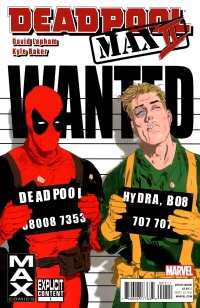
When you’re trying for comic insanity, it helps to keep the story structure relatively simple: Deadpool and his ex-Hydra handler/stooge, Bob, are chasing after a Dangerous Conspiracy when they find themselves blamed for the deadly aftermath of a terrorist attack, and will presumably spend the next few issues sorting that out. Or maybe not, I suppose: there was a time when things like continuity felt irrelevant in MAX comics, but as more and more of the 616 characters bleed over, it’s beginning to feel like there will soon be a third complete Marvel universe, just one where you can cuss and show tits.
At any rate, while David Lapham has always been a guy willing to stare, unblinking, into the abyss that can be human frailty, he’s at his best when he’s kept relatively grounded: something like Stray Bullets gets a lot of its punch from our recognition of shared humanity in its parade of lowlifes and losers. But Deadpool’s just a mouth: even in the relatively shallow world of superhero storytelling, his characterization rarely goes beyond him running his gums and behaving like an asshole… which, in the right context, can be entirely enjoyable. But that context has to have some limits, some structure for his rudeness to rub up against, and in the anything-goes, everyone’s-an-asshole environment that the MAX label allows Lapham to work in, nothing about ol’ Wade is particularly shocking, and you start to realize that the one-liners really aren’t all that funny. The principal supporting character in this issue is a preacher invested with every cliché of religious hypocrisy imaginable: not only is he tiresome as a character, but his stupid parrot feels like a tired attempt at wackiness.
As for Kyle Baker’s art… well, he’s still going strong. There’s no question that the roughness of the MAX approach gives him plenty of latitude, and there’s some good facial work here. The action sequences have a deliberate stiffness to them, as though he wants us to know that he’s in on the joke, in a sort of early-MAD style. But given how little meat there is on Lapham’s script, there’s not much payoff. And there some photo-ref sections that come so far out of left field as to be jarring.
Basically, if Lapham and Baker’s version of bad-boy whimsy caught your attention with the previous Deadpool MAX series, this one’s worth a look, though it’s not off to a particularly intriguing start. For anyone else, there’s better Deadpool, better Lapham, and better Baker, available elsewhere.
Rating: 


Out of a Possible 5 Stars