Think You Have What it Takes to Be a Warrior-Scribe?
 We’re looking for another reviewer. The details will be announced next week, both here and on the message boards. This is the final heads-up. As was the case during the last go-around (when we picked up Graig, Russell and Rob) you’ll be asked to review about four comics (at least two of which will be pre-selected by us ahead of time so as to create a level basis for comparison) under a strict time schedule. Just want you to be aware ahead of time of what it will basically entail.
Why so many alerts? Why not just announce it? Well, because when we did this the last time I actually received more after the fact emails by people saying they had no idea we were auditioning writers than actual submissions (and I thought that go-around was pretty heavily promoted).
We’re looking for someone talented, creative, dependable and proficient with either a battle-axe or a two-handed sword. Frost Giants need not apply.
Pit
By Graig
 If the appeal of zombies is be fading for some people, never fear, for there’s another retrofitted undead creature on the scene… two of them, in fact. Each goes by the name “Frankenstein”. Sound familiar?
But don’t let your preconceptions of boring Boris’ flailing, stiff limbs, grumblings about the badness of fire, and little girl drownings get in the way of your enjoying two uniquely similar (how’s that for oxymoronic?) recontextualizations of Mary Shelley’s public domain monster.
A few weeks ago, new issues of both Seven Soldiers: Frankenstein and Doc Frankenstein hit the stand on the same day, spaced nary two letters apart (depending on if your retailer indexes the Seven Soldiers titles under “S” or by their character title, or if they index by publisher, in which case let’s just forget how far away they were spaced. I was trying for some imagery here, but, just forget it….). If some n00b entered the store with a $5 bill how would they decide which title to pick up? Let’s run it down:
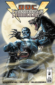
 Cover: Doc Frankenstein sports two different covers: full colour and the pencils-only version (which for some reason I prefer) of the same image that features our hero tussling with some werewolves. That’s cool, but negative point for multiple covers. Meanwhile, 7S: Frankenstein features a sneering head shot of ol’ stitched’n’ugly holding his steaming steampunk pistol, the suggestion that you just took a ball of lead in the chest that dropped you to the floor. As much as Doug Mahnke’s Frank, with his purple lips, freaks the crap outta me, dude, werewolves! Advantage: Doc Frank.
Price: Doc Frankenstein $3.50 ($4.75 CAN). 7S:Frankenstein $2.99 ($4.00 CAN). Factoring in the weak American dollar (which is running at a generous appx. $1.20 CAN for every $1 US), the cover for Doc Frank should only be $4.20 CAN while 7S:Frank should run $3.60. So either way our Canadian friends are getting screwed, but 7S:Frank has the advantage of being both cheaper and less screwing-of-Canadians.
Timeliness: Well, since March of 2005 we’ve been told that 7S: Frank would come out on January 4th. They were off by 1 day (since the holidays threw shipping off a day). Meanwhile, in the fine print of Doc Frank, it’s listed as bi-monthly… I picked up my last issue of Doc Frank on September 1st, and I was at least a few weeks late in the game. Last time I checked January didn’t come after October. Advantage 7S: Frank.
Writers: The Wachowski Siblings vs. Grant Morrison… hmm. I hated Matrix: Reloaded, but then I also didn’t care much for the Filth or Doom Patrol or Kid Eternity. So far, Doc Frank has been solid as grampa’s kidney stones, but then so has Morrison’s Frank, both on it’s own and as part of the larger Seven Soldiers enterprise. I call even Stevens.
Art: As solid as the writers have been, the art on both these books has kicked all sorts of ass even more. Mahnke’s Frank is a powerful, hulking beast of a patchwork man, heavily shadowed and scarred with an underbite that threatens to open and swallow your head. In the latest issue of 7S: Frankenstein, Mahnke’s drawing Frank on Mars (stopping some nasty cultists tied in with the rest of the Seven Soldiers gambit during a rescue mission). His martian environment is both inventive and sparse, while Frank’s adversaries are even creepier than he, rendered in a style that’s heavily Richard Corben-esque.
Meanwhile, over in Doc Frank, Steve Skroce packs in the detail in every damn panel. From the thousands of hairs on the dude squatting on the toilet’s legs to the army of cowboys that surround Frank in one skinny panel to the blisters that remain on his skin throughout. It’s madness… but when it looks this good, who wants sanity? Slight Advantage: Doc Frank.
Story: Issue four of Doc Frankenstein picks up from months ago, with Frank taken captive by the Vatican-esque fanatics, and being cleansed the old fashioned way (with fire. Yes, fire bad). Frank manages to escape but falls into the clutches of a family of werewolves who’ve had a grudge against him since his Old West (yes, we do get an Ol’ West Frank flashback). Very satisfying.
Issue two of Seven Soldiers: Frankenstein, as noted before, finds this Frank on Mars, where Frank roams the terrain on a giant bug in search of the settlers that have gone missing. He finds the settlers, now slaves of Mister Melmoth, the man giving the Sheeda queen a run for her title. Battle ensues in gruelling Frankenstein fashion, with no death ever resting heavily on his conscience. It not only stands alone well, but it also ties in with the over-arching series nicely, although the sudden jump from a high school gymnasium last issue to Mars was a little disorienting (but, really, damn cool as well, no?). There’s not much depth to Frank’s character, but what there is, I certainly like. This time, even Stephens.
So, lad with $5 to spend, you have a choice between a Wachowski Frankenstein or a Morrison Frankenstein, and by my tally, you can go with either and not be disappointed. Whatchewgonnado? I say go to your wife and/or mommy and get yourself another fivespot, because you’re going to want them both.
FOUR AND A HALF OUT OF FIVE VIKINGS
Artist Peter Snejbjerg’s Danish work comes to America for the first time
By Graig Kent
 In doing reviews for this column, I challenge myself to find new comics I wouldn’t generally pick up, and force myself to read things I’d normally leave for my when-I-get-to-it/under-the-bed tote box. I have a wide range of interests and tastes, but certain things will catch my fancy while other things just put me off. I mean I could just as easily pick up something by Chris Ware, but I’d prefer something by Kyle Baker. I could pick up a Drawn and Quarterly book, but Oni has things more my speed. I try not to get too trapped in labels or names, and I try not to be superficial about these things, but sometimes a name will put me off a book (and not just Liefeld), just as a quick flip through the pages can be the deciding factor of whether it makes my stack for the week or not.
Danish artist Peter Snejbjerg (spellcheck just loves that name) is a familiar name to me, and though I’ve enjoyed his work on Starman and the Dreaming, amongst other titles around DC and Vertigo, it was the recent reading of The Light Brigade that made me a fan. So I was excited to see his name above the title Marlene on the stands, and to see on the back cover that it’s a Slave Labor book. Slave Labor has produced some of my favorite comics over the years (although, they also produce a tremendous amount of stuff I care very little about), so the two names were enough to sell me on the book without even flipping through the pages or reading the back cover blurb to find out what the story was about.
Getting my stash home and doing as I do, I flipped through my books before deciding on the order in which I’d read them. As I thumbed through Marlene I was a little stunned as there was a lot of nakedness flailing about its pages, and at least one explicit sex scene which I did a double take on to make sure I wasn’t imagining it. Just what kind of Europorn had I naively purchased? (Now I’m no prude, but comic book porn just seems silly when there’s real porn out there, you know?) It went to the bottom of the pile. And rapidly ploughing through that pile, Marlene quickly reared its head again. It was time to face it and see exactly what I got myself into.
Originally published in Denmark in ’98, this is Snejbjerg’s first translated work published in North America. It’s the story of an aging police detective trying to figure out why the people obsessed with an artist’s model keep dying. It delves heavily into the psychology of obsession taking a turn towards things supernatural in a natural way. It’s a murder mystery and a horror-suspense that actually reminded me heavily of Dario Argento’s stories (which, for this Agento fan, is a big compliment). The nudity is in fitting with the story as is the sex (although perhaps a bit more… visual… than what American audiences are used to) and is all actually handled quite tastefully and in a realist, non-gratuitous manner.
Snejbjerg’s art in Marlene is all him, inks and digital grey shading included, and it’s a great looking book. It’s almost unfortunate for me to say that this near-8 year old work is actually some of his best. I would love to see Snejbjerg in black and white more often, because he certainly handles contrasting dark and light space masterfully.
It’s a subtle book, not something most would rush to pick up on the stands and not something that’s going to completely astound you, but it’s a solid read, enjoyable and quite recommended if you’re looking for an one-off of something different..
THREE AND A HALF OUT OF FIVE VIKINGS
Legendary “Sgt. Rock” Artist Joe Kubert Returns With “The Prophecy”
By Sean Fahey
 Aside from the actual merits of the book, there are a lot of reasons why I appreciate the new Sgt. Rock mini-series The Prophecy. The first is that it marks the long awaited return of Joe Kubert (whose name is synonymous with the character) to a Sgt. Rock comic book as both artist and writer. The second is that the book is another positive sign (Jonah Hex and Warlord being two others) that DC may in fact be committed to diversifying the types of genres explored in its DCU (its most mainstream) line of books. And finally, and more personally, Sgt. Rock was the first comic book I read as kid, way before Wolverine and the X-Men put me on the superhero train, and the Sarge has always been one of my favorite characters.
Interesting points, but what about the book itself? Well, suffice it to say that The Prophecy # 1 is classic Sgt. Rock and classic Kubert. The man simply hasn’t missed a beat.
It’s the height of World War II and Easy Company once again finds themselves between a rock and a hard place, dropped smack dab in the middle of the Eastern Front to retrieve an article critical to the war effort before the Nazis can…or the Russians for that matter. Outnumbered and surrounded, Easy must put their trust in a ruthless band of partisans to have any hope of making it out alive. But in the wasteland of the Eastern Front, that just might not be enough. ‘Nuff said.
I was incredibly impressed with the economy of language here. The dialogue is direct and to the point (with the Sarge stoically barking orders), and what exposition there is creates atmosphere rather than dumps information on the reader. Kurbet makes every work count, and as a result is able to build in a great deal of characterization between action sequences and setting up the plot. Easy Company and its squad dynamics are well established by the end of this issue – you know who these people are. And even if they aren’t the most original characters in the world, they’re more than just faceless grunts, and that makes the action have more meaning.
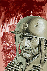
Visually, Kubert is on top of his game here. The man just has a real knack for capturing the tired, restless look of battle-hardened soldiers, and the book’s primary action-sequence is well-paced and exciting. The colors are drab and muted, capturing the lifelessness of the Eastern Front. And Kubert skillfully takes good advantage of visual motifs (in this case a starving puppy) to capture the tragic peripheral consequences of war. But that’s just business usual.
Those unfamiliar with the character shouldn’t be looking for Band of Brothers. Sgt. Rock has never been about pleasing historians or “realistic” battle sequences. It can be a bit hyper-realistic at times, and also a bit clichéd. But it’s always about heroism – the courage of ordinary men – and The Prophecy is true to form.
FOUR AND A HALF OUT OF FIVE VIKINGS
Hey there Iron Man fan, are you ready to have your guts kicked in?
By Graig Kent
 I wanted to be mad at The Invincible Iron Man, I so desperately wanted to got to the stands and say “screw you issue 5, where were you in September, huh? Or October, November or December for that matter?” I wanted to be the bitter housewife, angry at her hubby for coming home way too late reeking of cigarettes, perfume and beer. But if I were that housewife, then Issue 5 would be the slickest mofo since Lloyd Dobler, able to smooth over the situation with surprise gifts, fancy talk and some hyper-sexy action. You can bet Issue 5 would be getting some that night.
I can’t even friggin’ remember what happened in “Extremis” parts 1 through 4. There’s a vague recollection that tugs at my brain stem, a little inkling notion of what may have come before, but sodding hell if I can fully recall it. But it doesn’t matter. I mean, in a sense of understanding the larger story it does matter, but for the purpose of just this issue alone, it doesn’t matter. And why is that? Because this issue is a spike through the head that doesn’t kill you but instead makes you a drooling invalid. Yes, I’m metaphor top-heavy this review, but you don’t understand how utterly amazing this issue is.
You want to know how good it is? It’s so good that I’m going to tell you everything that happens in it and you’re still going to want to pick it up and experience it for yourself. It’s that good.
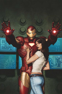
Somewhere along the line Tony Stark got beat up real good-like and now he’s injured with a piece of shrapnel burrowing a path deeper into his chest, threatening to puncture his heart any second now. Oh, and he’s been kidnapped by some insurgents or terrorists or something, and they want him to build them a weapon to use against America. Tony agrees to build a weapon, but also something that will keep the shrapnel from getting any closer to his heart. With the aid of another kidnapped scientist he develops a magnetic chestplate, and then a full-on iron outfit that he uses to tear those terrorists a new one. Yes, this is all in flashback. Meanwhile there’s this cocoon being watched over in some high tech lab by some lady who seems to be lamenting Tony, when suddenly it cracks open and a vital, energetic (and naked, ladies) Tony emerges. Though he seems as in the buff as when he was born he carries crucial elements of his armor with him, and how the emperor dons his new robes is one of the coolest things ever.
Oh, Iron Man purists may scoff at Warren Ellis’ updates to the legend, but for me, a guy who didn’t ever give a crap, this whole issue made me an Iron Man fan, baby. As cool as the crimson and gold armor is, seeing that old grey warhorse in action made my bladder release, and then the new IM tech excited those bowel wide open. Okay, metaphors officially getting gross now.
Yes, it is many (goddamn) months late, with Adi Granov’s artwork being the key hold up, but hot damn, it actually was worth it.
FIVE OUT OF FIVE VIKINGS

Malinky Robot Isn’t in Need of Repair
By Graig Kent
 If there’s a major fault with Malinky Robot issue 02: Bicycle, it is that it’s labelled “issue 02”. Comic readers and collectors are a fickle bunch, and the likelihood of someone picking up the second issue of a series if they’ve not already picked up the first is a lot less than if it were a first issue. But seeing as there already was a first issue, what was creator Sonny Liew to do?
Simple, forget the numbering, and just call it “Malinky Robot: Bicycle”. Afterall, the second issue carries no allegiances to the first: it’s a different size, a different format, and pretty different in structure. Sure the characters of Oliver and Atari were previously seen, but the second issue establishes them once again, the fact that they’ve appeared before is inconsequential. Plus, it’s not like Malinky Robot is carrying on any sort of tangible story arc. That’s not really the crux of what it’s about. Then again, I’m not really sure what it is actually about.
It’s pan-Asian anime mixed with French and other European Metal Hurlant neo-futurism dabbling in quiet American indie-comic sensibilities. Oliver is drawn as a Babar-esque baby elephant in hipster’s clothing, while Atari is a spunky orphan that would be Annie by way of Akira. Liew uses these two characters as a tracking point while exploring his industrial/suburban/shanty town of San’Ya, as well as diverting into comic strip parody and pop-culture geek-outs. “Bicycle” is like a guided anthology of humour, satire, and serene moments, and Liew has a completely distinctive style that’s capable of bending it under his own whims.
Though the stories are uniquely charming, it is absolutely Liew’s artwork that is the draw to Malinky Robot. Liew brazenly publishes his pencil-only artwork (with nary a hint of eraser markings), and then segues into heavily inked black and white, and then into traditional full color for some newspaper comic strip mimicry, only to impress even more with a combo of uninked pencils and a color palette akin to that of Triplettes of Belleville. His artwork in every form is absolutely gorgeous, awe-inspiring. Comparing him to other artists is difficult. Assumed inspirations could be plenty, but he’s forged his own aesthetic that, especially in his pencil-only work, leaves you too stunned to even think of anything else but what you’re looking at.
If I can recall, the first issue of Malinky Robot was done in this pencil-only style (I can’t seem to find my copy kicking around anywhere), and although I don’t really remember what happened in that first issue, the style and design of Liew’s ingenuity stuck with me, and months later the announcement of second issue had me very excited, and I’m glad to say it exceeded expectations. Plus, at 48 pages for $2.95 it’s an absolute steal.
FOUR AND A HALF OUT OF FIVE VIKINGS
Not quite dead yet: X-Statix Presents:Dead Girl #1
By Graig Kent
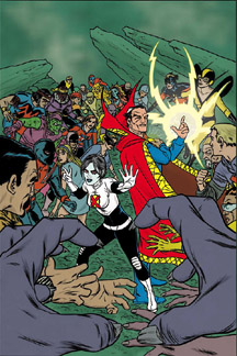 People die: that’s life. People die and come back to life: that’s comics (or, if you will, soap operas, but we do comic reviews here so we’ll just stick with them for now). Even before Superman did it, it was de rigueur in the medium… if you were a superhero and you died, it wasn’t the end. The reports of your demise were indeed exaggerated.
Likewise, you can’t keep a good comic down… well you can, but these days once the trades hit the shelf and they have some breathing room and time to circulate, a revival is sure to be at hand.
Tying those vaguely threaded paragraphs together is the new Marvel Knights mini-series X-Statix Presents: Dead Girl, which reunites Pete Milligan and Mike Allred with their media-critical and meta-analytical creations. Well, you’d think so, at least. In fact, the first issue of this new mini is more like X-Statix Presents: Dr. Strange, because he’s really the focus of this first chapter, although by the final page it’s rather obvious how one of the more forgettable characters from the X-Statix crew (that’d be the one with her name in the title, fyi) is going to play into this.
If you’ve never read X-Statix, would you pick up this mini-series? Probably not, but, first of all, you could do much worse than picking up the X-Force/X-Statix trades, and secondly, your familiarity with the characters isn’t all that necessary. In fact, if the only Marvel character you really know is Dr. Strange, well, then you’ll do just fine. Unless you’re one of them purists who likes their Strange serious, at which point you might not do so fine. Picking up the good Dr. where Giffen and DeMattis left him off in their recent Defenders mini-series, our man Strange is acting a little funny, making with the jokes, being all light hearted and generally way out of character. His houseboy/manservant/life companion Wong takes him to a psychiatrist, but Dr. Strange just excises a demon from the therapist and goes about his merry way, sensing trouble in the underworld. Meanwhile, in the underworld, five dead Marvel “superstars” – Kraven, Mysterio, ex-X-Statix Tycho Alicar, some mummy dude and a chick with a very American shield on her sweater (I did my research here) – have found a pile of green stuff (Doop?) which, when using the correct symbolism, allows them to traverse back in man’s world for 24 hours. Things don’t go very smoothly for either the Dr. or this group of the undead. Strange is going to need some help, and thus the book’s titular hero (who can travel between the living and the dead, btw) puts in an appearance on the final page.
What we have here is what I like to call a superhero-action-metaphysical-comedy. Rolls off the tongue, don’t it? It’s actually laugh-out-loud funny at points, and amongst other things, very clever. Not that the concept of resurrecting dead superheroes hasn’t happened before, but Milligan plays a fresh angle, and the continuation of an increasingly out-of-step Dr. Strange from Defenders is a nice touch. The artwork features pencils by Nick Dragotta, which, if you’re an X-Statix fan might be a bit disappointing considering how usually Mike Allred’s name’s forever fixed to the series. But, never fret, for Dragotta’s pencils bear witness to those Toth-ian influences, while Allred rocks the inks, managing to bring it even closer to what we’d expect an X-Statix book to look like. Not to forget Laura Allreds colors… it’s always a good thing when she’s involved. This book looks sharp, reads even sharper, and it’s open enough for new readers and old fans alike. Solid.
FOUR AND A HALF OUT OF FIVE VIKINGS
![]()

Penny Arcade Vol. 1: Attack of the Bacon Robots
Dark Horse Comics
By Graig Kent
 Recently, CHUD’s own Dave Davis wrote a review of the on-line comic the Hitpack (right HERE) that was as much a meditation on the state of comics and their on-line counterparts. Rereading what he wrote, I can’t help but see his point if only just a little in reading over the first volume collecting the on-line comic strip, Penny Arcade.
“Collections and tech, those are the two directions I see comics going”, Dave said, and this release serves as validation of that opinion. I mean, here’s a strip that has run exclusively on-line for going on 8 years, creators Jerry Holkins and Mike Krahulik gaining and maintaining their audience there, but also growing their own internet empire with gaming community commentary and criticism, merchandise and even a Penny Arcade expo. There’s your tech, and now here’s your collection.
I think it’s fairly safe to say Penny Arcade is one of the biggest success stories in on-line publishing, becoming, as the back cover states, “the most popular Webcomic of all time”. Holkins and Krahulik found an audience for their themed humour in the only place where logically you would find it, the only place where millions of likeminded people can gather without having to have a religious leader of some sort present (I speak of the internet. Amen). Those likeminded people are the gaming community of which I am very peripherally a part. I have one game installed on my computer (“City of Heroes”, surprise, surprise) and I havn’t owned a gaming system since Sega Genesis. I like playing games but I get tired of them quickly. So safe to say I’m barely their target audience, so my reviewing of this is obviously not going to jive with the legion of fans already out there. Chances are if you’re Penny Arcade’s target market, you’ve already heard of them. So then what’s the point of commenting?
Well, what I found interesting in reading through this collection was really not the comics themselves, which were intermittently funny, but rather the commentary for each and every strip by Krahulik. It’s like watching the gestation of a flower from the seed into full bloom (only replace “flower” with “comic strip”), and it’s really quite fascinating. I found the commentary to be much more amusing than the strips, but the strips themselves, once they hit their stride (and it’s amazing how quickly they did) became enjoyable themselves. Gabe and Tycho – the cartoon manifestations of Krahulik and Holkins – came into their own as characters, and the rhythm of the humour rarely broke, and when it did, it was usually for a funnier gag. Penny Arcade is a universe in its own right, and I can certainly see how it became so popular, and I can appreciate the majority of it even from the outside.
This “offline archive” and its inevitable popularity may be the first step in proving our man Dave’s point, or it may wind up being the only highly successful web-to-page transition for some time. Time will tell. In any case, the compilation with running commentary is certainly the best way to package a comic strip collection (especially one filled with somewhat time-sensitive/contextual material), web or no.
FOUR OUT OF FIVE VIKINGS

The Light Brigade tpb
(DC Comics)
by Graig Kent
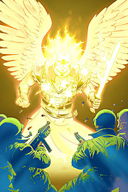 I remember reading the solicitation for this prestige format mini-series back in 2004 and being intrigued: in short, the war in heaven spills out onto the World War II battlefield. It’s simplistic in idea, with the potential for an extremely complex and involving execution. And as much as I love stories that use religion as a pretence for action, speculative fiction, or horror, for some reason I passed.
Well, for many reasons I passed. The first was the price: prestige format mini-series’ aren’t cheap, for one. The second being that I knew of writer Peter Tomasi merely as an editor at DC, and for some reason I’ve always had difficulty accepting editors as writers. It’s a little prejudice I’ve had for some time, and despite the fact that favorite writers of mine (like Christopher Priest or Mark Waid) broke in through editorships first, I always hesitate, thinking that it’s connections and not quality that get them their first step into the publishing world.
Well, if anything, Light Brigade has taught me a heady lesson, because it’s easily one of the best stories I read last year (released late December, it knocked some heavy competition out of the top five spot in my best-of 2005 list). The premise is exactly as is stated above, the war in heaven has spilled to the Earth, specifically the battlefield of World War II. The conflict between God’s angels and the opposing fallen angels and half-breeds (angle/human or demon/human children or descendants) is coming to a head as an ex-Angel comes to possess the Sword of God, which could spell the destruction of both Heaven and Earth. In God’s wisdom, he’s left it up to a troop of humans and one known as “the Centurion” to defend his kingdom from seemingly insurmountable odds, battling opponents who can survive bullets and knives and most other mundane forms of attack.
Imagine the plot of the Christopher Walken classic The Prophecy merged with the battlefield grue of A Very Long Engagement, and the divine charge of Monty Python and the Holy Grail and you get a sense of the full bodied-ness of this book. Action, spirituality, gore, humour, it covers all grounds, and cross-breeds genres like war, action, zombie horror and religious in one extremely tight package. Though I have no indication of what the man has planned, I could picture this story being Tarantino’s Inglorious Bastards. Yes, it’s that good.
What I still don’t understand is why this isn’t filed under the Vertigo banner. Regardless, it’s virtually perfect. Tomasi’s characters are each distinct, while still retaining a collective grunt mentality, and Peter Snejbjerg’s artwork handles the entire thing sublimely, from fiery angels to exploding heads to exploding tanks and barren battlefields, in every instance the scene is set and the characters distinct. The only problem with this book is that I didn’t read it sooner.
FIVE OUT OF FIVE VIKINGS
![]()
 Fantastic Four/Iron Man: Big In Japan #3 (Marvel) – Zeb Wells takes this giant monster invasion story on a crazy Morrison-esque turn in this third issue, which may be one of the craziest meta-books I’ve ever read. I can’t give Zeb Wells all the credit, though, because it’s Seth Fisher’s insane artwork that brings it together. Picture H.R.Giger’s Alien hive interiors, where the design is bio-organic, much like the aliens themselves. Now imagine if those hive walls were made up of cartoon teeth, eyeballs and fingers, all drawn in a vibrant, psychedelic-pop style somewhere in-between the dementia of Robert Crumb and the retro of Mike Allred. Add to the mix the creation of a race of two-dimensional characters who live within the confines of the very same comic pages you hold in your hands (with Iron Man and the FF not cognizant of living there themselves), and you have one excessively trippy comic book. The series up to this point was neat, but mostly carried along by Fisher’s illustrations (and much credit to Vic Caramagna’s letters, he managed to create a new two-dimensional language by skewing his text blocks