Fear Itself Prologue: Book of Skull ($3.99, Marvel Comics)
By Devon Sanders
Germany, 1942, the tide is yet to turn for either side and The Red Skull is determined to change that. Blood spills upon unholy ground in the hope of conjuring something. Something ancient. All that stands between total Nazi supremacy and potential Ally victory are three men: Captain America, Bucky, Namor, The Sub-Mariner, The Invaders. Lightning strikes, bullets fly and The Invaders barely, just barely win the day. Seventy years later, this evil will be revisited and reclaimed by the daughter of the Red Skull, Sin and much like before, the heroes of the Marvel Universe will have to give their all to fight back this all-encompassing evil. Fear Itself Prologue: Book Of Skull is pretty unnecessary in the sense that while you’re reading it, you know the multiple Fear Itself series will go over this event numerous times in order to sell you on how epic it all is. It’s really not. It feels repetitive and it hasn’t even happened yet. Writer Ed Brubaker hits the marks that need to be hit in order to turn over the Fear Itself storytelling engine but that’s about it. It’s all set-up but quite frankly, in something like this, that’s all it really needs to be. Scot Eaton’s art serves the story well. Eaton allows for each main character to have a unique body language and nobility that shows he knows these characters and even more importantly, what the script needs. Fear Itself Prologue: Book Of Skull most likely won’t change anyone’s thinking either way on the validity of the massive superhero crossover but what it will do is simply entertain. And if that’s all you want, this book will do that.
Rating: 

![]()
![]()
Out of a Possible 5 Stars
 Suicide Squad Vol.1: Trial By Fire (DC Comics, $19.99)
by Graig Kent
There are a few landmarks of the 1980’s that have sustained through to today as classics of the medium. These include real game changers of the genre like The Dark Knight Returns, Watchmen, Claremont/Byrne’s Uncanny X-Men, Wolfman/Perez’s The New Teen Titans, Crisis on Infinite Earths, Giffen/DeMatteis’ Justice League, Sandman, Morrison’s Animal Man… all books which laid the groundwork (for better or worse) for the more mature landscape (both in sophistication of storytelling and tone of story) of the medium we have today. They all received their dues at the time, and continue to be prominent in the legend of the industry. If there’s one mainstream book from that time which hasn’t truly gotten its due, it’s John Ostrander’s revamp of the Suicide Squad. Though widely beloved by readers of the era, its absence from the reprint market has meant most comic enthusiasts who have come since have either little exposure to or little awareness of the series. Last month, for the first time ever, the 80’s Suicide Squad was reprinted in collected form, with this first volume presenting the series prologue (from the Secret Origins series) and the first 8 issues of the ongoing.
Like many from my generation, I can get overwhelmed by nostalgia for my 1980’s childhood but I don’t view the Suicide Squad with the same rose-coloured glasses I have for the likes of He-Man, because the truth is, when the series was in its heyday, I totally slept on it. The book, with its roster of (mostly) costumeless characters, its densely constructed espionage missions, and its exploration of the gray areas of humanity held no interest to me back then. On top of that, its art was dark and blocky, with densely paneled pages, surrounded by a lot of dialogue, and it just seemed too different from the dozens of brighter, flashier superhero books I was reading. Also, naive child that I was, I didn’t understand it. I had random issues from crossovers as my sole exposure, which, revisiting over the years as my perceptions changed (and brains swelled), those issues revealed the depths that I couldn’t see before.
In the roughly 25 years that have passed, I’ve since collected a near-complete run of the book, but enjoying each issue as I found it, rather than reading it in chronological/publishing order. I’ve recently sat down with the issues that comprise this first collected volume, and was immediately surprised by how intelligent it is, how advanced it seems for its time, and how different a book it is not only of its era but even compared to most books today. It’s a high-concept riff on the Dirty Dozen, with government agent Amanda Waller recruiting a team of super-villains out of a high-security prison for highly dangerous, highly sensitive black ops missions which require full deniability/disassociation from the U.S. government. Dangling a pardon of their sentence before them, the series offers both a stable cast of supervillains as well as rotating roles, plus a mammoth cast of supporting personnel the likes rarely seen in superhero books. The missions are varied, as are the teams’ success rates, with death looming over almost every page. It’s dark in tone and especially in character, but it’s not necessarily bleak. Ostrander makes a point of adding comic relief, mostly in the guise of Captain Boomerang, but also in the severely dysfunctional relationship of the team. The Suicide Squad, as a group, shouldn’t work, and for the most part it doesn’t, but for her purposes, Amanda Waller deems them essential.
If the Suicide Squad has any legacy which fans would know today, it is Amanda Waller. In my eyes, Waller is hands down the greatest supporting character in comics history. Miles above a Lois Lane or J. Jonah Jameson, looking back one sees she came out of the gate a richly constructed figure who over the years has grown even more mythic and exciting with every use, in comics and out. And even though the Squad wasn’t the first title to prominently feature supervillains as leads, it was the first to take them seriously enough as characters, and show both how nasty and noble they could be. The Squad is the obvious precursor to Marvel’s Thunderbolts and equally paved the way for Secret Six and the recent Checkmate series. As for the art, I’ve come around on Luke McDonnell’s work, which is much better suited to the plainclothes than the spandex tights. He loads the pages with naturalistic atmosphere and detail, his figures, while often rigid, do feel at home in the slightly noir, ink-heavy tinge his work brings. But most accomplished of all is McDonnell’s storytelling, which sees him negotiating Ostrander’s compressed stories with equally densely structured pages.
It’s not all gold, as there’s some melodrama that’s frankly out of place, and handled about as deftly as most melodrama was handled in the 1980’s, but it’s such a minor facet of the overall series that it’s easily overlooked. This is about as good as comics get in any era, and for comic enthusiasts who have yet to experience it, you’re in for a treat… so treat yourself.
Rating:
Out of a Possible 5 Stars
Your Highness: Knight and Dazed One-Shot (Dark Horse, $7.99)

by Graig Kent
Knight and Dazed continues the trend of releasing a tie-in comic to a film that has yet to prove itself, with Your Highness joining the ranks of films like Predators, Machete, and Tron:Legacy in doing so. The difference here is that some of the creative force behind the film is involved in producing this prequel/prologue. Danny McBride is joined by (his Foot-Fist Way co-creator) Jeff Fradley to pen two stories that show what his character, Thadeous, and James Franco’s character Fabious were up to leading into the film.
“Knight,” crisply illustrated by Gabriel Guzman and Jordi Tarragona, follows Fabious and his men as they set out to slay the beastly cyclops which has been terrorizing his father’s kingdom. It’s an awkward, unusual and gruesome battle with the creature, with moments that are likely intended as humorous but without the context of the characters and the performances behind them it’s hard to say. It’s not outright funny in any respect, but I believe the aim was to show Fabious’ valor, charm, and integrity, so as to juxtapose against the next story.
“Dazed”, finds Fabious’ shiftless brother, Thadeous, charged with attending a celebration in the dwarf kingdom, with the ultimate goal of getting a treaty signed by the dwarf king. Thadeous speaks with a more colloquial and guttur tongue, which I presume is supposed to be humorous placing modern phraseology amidst the more Olde English speak of everyone else, but it’s rather obvious and seemigly designed for cheap laughs. Thadeous is obsessed with weed and sex, and naturally bungles even the simplest of tasks. Sean Philips illustrates the tale with a much lighter touch than you would see in his work on Criminal and I’m still deciding whether he’s pulled off working on bawdy stoner comedy just as well as he does noir. His style may not be innately suited for it, but he does show he’s capable of versatility.
Knight and Dazed raises suspicions that Your Highness, as a fantasy comedy is going to be more Jabberwocky “funny” rather than Monty Python and The Holy Grail funny, and itself fails to inspire much enthusiasm for the forthcoming movie. I’m not sure if this is intended as promotional material for the film, or if it’s to help generate enthusiasm for the project, or if it’s really something “for the fans”, but if it’s the latter it’s definitely premature (can one intone that by releasing it before the movie, Dark Horse doesn’t have much confidence in selling the book after the film’s release?), and if it’s either of the former, at almost the cost of a movie ticket and a print run of I’m sure no more than twenty thousand copies it’s not exactly penetrating a broad market, so I’m not really sure the point. I guess the success of the movie, both financially and with audience appeal, will retroactively measure of this book’s success.
Rating: ![]()
![]()
Out of a Possible 5 Stars
 Xombi #1 (DC Comics, $2.99)
by Graig Kent
The last issue of Milestone Comics Xombi appeared in comic shops in December of 2005. Fifteen years ago if you don’t feel like doing the math. It was a challenging series from a relatively new superhero universe that itself sought to challenge people, but Xombi was even out of step with other groundbreaking series like Blood Syndicate and Static. If we were to typify the Milestone line, with Icon being Superman, Hardware being Iron Man, then Xombi was the John Constantine. Xombi was the weirdness magnet, and because of it, it remains the series that stood out for me the most, amidst a line of comics I remember quite fondly.
I probably last read the 22 issues of the original Xombi series at the turn of the millenium, so it’s nowhere near fresh in my brain, and yet, seeing David Kim, Nun of the Above, Catholic Girl, and Julian Parker’s moustache again brought a huge smile to my face, even if most of the details about them are pretty much gone.
An accident some time ago “infected” David Kim with nanomachines which repair and maintain David’s body at an alarming rate, and in alarming ways. Ultimately it means that David cannot be killed, and is thus a Xombi, the walking undying (as opposed to the walking dead). It’s evident some time has passed since the end of the original series and the start of this (though in story-time, it’s much less than 15 years). David has learned a few tricks to control the nanomachines in his body, and is, as expected, just as involved in the weird stuff as he ever was, this issue kicking of a new weird mystery and partnering David up with some old acquaintances.
Original series writer John Rozum is back at the helm and injects his return story with just as much awesomely weird stuff as I fondly remember it having back in the day. Talking dead presidents on the heads of coins, a nun who can shrink (“Nun the Less” of course), and, well, the Snow Angels which just have to be seen. Rozum’s story isn’t supremely tight, primarly because of the necessity of reintroducing the characters to the reader, and it’s occasionally a little difficult to follow (information overload perhaps), but otherwise it’s almost exactly as delightfully bizarre as I’d hoped it would be. Though now in the DC Universe proper, Xombi would be just as at home within Vertigo terrain.
If the original series had a failing it would have been J.J. Birch’s (ahem) wooden art. The figures were stiff, ugly, and the overall look was generally unappealing. All the ugliness and roughly hewn illustrations lent it a certain charm, but I always felt the series would have done better with a cleaner artist on board. This new series gets that artist in Fraser Irving. Irving is a personal favourite of mine, since his teaming with Grant Morrison on the Seven Soldiers: Klarion series. I was agog to find out that Xombi was returning with Irving handling the visuals and he doesn’t let me down. Irving’s digitally produced art is always effective at establishing mood and atmosphere, which this book needs in spades, Irving handling all the weird stuff with confidence and ease. His distilled colour palette with digital “washes” give the book a suitably curious texture and the final three pages are just a wonderful showcase of his style.
It’s a pleasant and welcome surprise that Xombi is the first Milestone character to return to regular series status. He may not be even remotely as popular as Static, if there ever was a time where a character and series like Xombi should thrive, it would be now.
Rating: ![]()
Out of a Possible 5 Stars
Casanova: Gula #1-3, Icon, $3.99
by Adam Prosser
One of the reasons I’ve never been a huge fan of “decompression” in comics is that I believe it’s a medium uniquely suited to…well, compression. Whereas film and TV force you to receive information at a certain rate, comics allow you to create your own pace. You can spend minutes looking at a particularly detailed panel, if you wish—and, indeed, detail is one of the methods comic artists use to try to control the pacing of a story, exactly because they can’t control the reader’s eyeballs. Because of this, comics can cram more into less space. Which is generally a good idea anyway, given the infamously high price ratio offered by comics as a form of entertainment.
Casanova is probably one of the more spectacular examples of how effective hyper-compression can be. Originally offered as part of Image’s experiment in a 16-page, $1.99 monochrome format (along with Fell), the first two story arcs are being reprinted in full colour by Marvel’s Icon imprint, in 40-page issues that combine two of the original issues with some original backmatter in the form of interviews with other comics artists. Long story short: this is a lot of comics for your dollar. The sheer density here could be a little bewildering for people who have been trained to read comics as “movies that don’t move”—there’s more going on in a single issue of Casanova than there is in an entire 6-issue arc of most Brian Michael Bendis comics—but personally, I love this kind of thing.
Casanova Quinn is an amoral, would-be-rockstar super-spy, son of the hardassed Cornelius Quinn, director of the E.M.P.I.R.E. counterespionage unit, with whom he frequently clashes. Shortly after the death of his much more well-behaved sister Zephyr, Casanova finds himself kidnapped to a parallel dimension by the supervillain Newman Xeno. Here, it’s Casanova’s alternate-world equivalent who was the “good son”, and he’s now dead; Xeno’s brought in “our” more morally-flexible Casanova to replace him and infiltrate E.M.P.I.R.E. But Casanova doesn’t care to be anyone’s patsy, and by the end of the first storyline, Luxuria, he was openly flaunting both sides. This second storyline, Gula, rather daringly by leaping forward several months and involves the various supporting characters hunting for the missing Casanova, assisted by Casanova’s blue-skinned, multi-armed girlfriend from the future (who he hasn’t technically met yet). And that, believe it or not, is a bare-bones summary.
As you might have been able to detect, the basic premise is a mash-up of Jack Kirby and Jim Steranko’s Nick Fury with Michael Moorcock’s Jerry Cornelius, with the weirdness amped up several levels. It takes 60s “spy-fi” as a baseline (not just in terms of premise but in imagery and attitude as well) but then spins off in all kinds of loopy directions. The artwork for the first series was handled by Gabriel Ba (The Umbrella Academy), with his brother Fabio Moon (Daytripper, Sugarshock) taking over for Gula. Moon’s style is looser and curvier than his brother’s, but both share an interest in sleek, stripped-down, highly abstract design and cartoony, sinewy figures. Neither Fraction, Moon or Ba are interested in conventional realism—the book is pure fantasy in every sense, a dispatch from a world even further out than most comics, where everyone’s a rockstar and pursuing a hedonistic lifestyle of pure fun is just as noble, if not more so, than putting an end to a supervillainy and terrorism. Parallel realities, indeed.
In that sense, the book’s aesthetic echoes its form. Casanova’s life is a non-stop party; his comic is one with no time for anything but the good bits.
Rating:
Out of a Possible 5 Stars
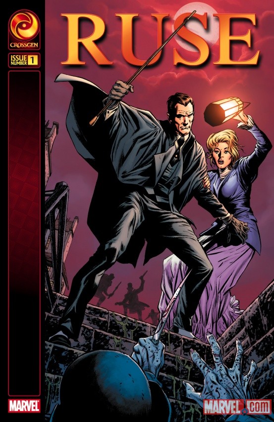
 Ruse #1 of 4 (Marvel Crossgen, $2.99)
By Jeb D.
Of all the original Crossgen properties, Ruse stood out as being something hard to pin down. Ostensibly, it’s a Sherlock Holmes-style mystery series, but there was much more to it than that: the setting was a world based on Victorian England, but with the addition of magical elements (including gargoyle-like dragons flying about), and the characterizations owed as much to TV’s The Avengers as to Conan Doyle: Simon Archard is a brilliant, cold, and arrogant detective, but a clotheshorse with John Steed’s impeccable sartorial style, and with matinee-idol good looks. His “assistant/partner” (depending on whose view is being invoked), Emma Bishop, is imbued with the elegance and wit of her namesake Mrs. Peel, but she is hiding from Archard the fact that she was one of the “Sigil-verse”‘s wielders of mystic powers (the “ruse” that gave the series its title); his evident inability to recognize this was metaphorical reinforcement of his condescension to Emma’s status as mere “assistant,” due to the presumed limitations of her gender. Add to this the inevitable sexual undercurrent of a young and attractive couple embroiled in situations of danger and peril, and you had a series that operated very effectively, both on the level of clever mystery plotting, and the sense that there was always a larger story unfolding under the surface.
Unfortunately, after the first year, writer Mark Waid parted ways with Crossgen, and the series never again balanced the two elements as effectively: standalone issues felt slight, the ongoing story seemed to be spinning its wheels, occasionally pulling “reveals” that appeared to contradict Waid’s original intentions, with no purpose but to grab an audience for the next issue. With Marvel’s revival, Waid is back to put things to right… more or less.
Though it’s not explicitly stated in the text, Waid’s interviews on the revived title have suggested that much of the mega-story undercurrent is being stripped out (which only makes sense, given that most of the other Crossgen titles still linger in IP limbo), leaving the new Ruse to stand or fall on the basis of Waid’s ability to tell a mystery story intriguing enough to keep readers coming back. And this first issue suggests that he’s off to a good start.
We open with Archard getting to the bottom of a rather grisly crime, sneering his contempt for the perpetrator’s idea that he might be fooled by misdirection or red herrings. From there, the duo take on the mystery of an epidemic of “gambling fever,” which has just the right Doyle-like combination of the mundane and the bizarre, and the banter and period atmosphere are entirely satisfying. The four-issue miniseries format feels right for this sort of Ruse-lite approach, though I have to admit that I miss the deep undercurrents of the previous series, where each new villain or mystery seemed to peel back another layer of intrigue regarding the characters’ histories. I’d love to give this new series an unqualified recommendation, particularly since Waid has done such a fine job of getting back into this particular saddle. And given that I haven’t mentioned the art yet, you can probably guess what the fly in this particular ointment is.
As clever as the storytelling was in the original Ruse series, what set it apart was the stunning artwork from penciller Butch Guice and colorist Laura Martin. While Guice did a perfectly fine job with the paneling and layouts, and gave Emma, in particular, a wonderful range of facial expressions, it was clear that he and Martin were principally focused on the getting the period look and feel of the book just right: Ruse had the sumptuousness of a Masterpiece Theater presentation, or a Merchant-Ivory film. They paid particular attention to texture: you could practically reach out and touch every deep fold in Simon’s cloak, every silky strand of Emma’s blond hair. While I generally am more impressed with an artist’s ability to move a story along than to create “pretty pictures,” Guice and Martin used the sheer beauty of their technique to envelop the reader in their world to an amazing extent: Guice, in particular, doesn’t appear to have tried anything similar since.
And while artist Mirco Pierfederici gives it his best shot, he doesn’t quite recapture the magic. Actually, I wish he hadn’t tried: instead of bringing something of his own to the series, his attempt to recreate the look of the original feels flat, and some of the facial work is seriously off. In addition, something about the presentation seems to create an unusually large gulf between the foreground characters and the backgrounds, giving the effect of two-dimensional cutouts moving against a painted backdrop. It’s not terrible work, by any means, but its attempt to reproduce the specific look if its predecessor has an “uncanny valley” effect: it’s close enough to the original as to make its shortcomings especially obvious.
Still and all, a warm “welcome back” to one of my favorite comic series of the past decade or so, and here’s hoping it does well enough to allow Waid to creat an ongoing adventure, and to develop a few more levels of intrigue as he goes along.
Rating: ![]()
Out of a Possible 5 Stars