 BUY IT AT AMAZON: CLICK HERE!
STUDIO: Walt Disney Home Entertainment
MSRP: $29.99
RATED: PG
RUNNING TIME: 104 Minutes
SPECIAL FEATURES:
• "Behind the Microphone" featurette
• Japanese theatrical trailer
• Original storyboards
Isao
Takahata’s films tend to contain studies in contrasts. On the surface, they’re
unabashedly cute and sentimental, but beneath that is a current of maturity not
often found in children’s movies. It’s arguable whether My Neighbors The Yamadas
is meant to be a children’s movie, and maybe unnecessary to consider, but I’m
going to consider it alongside Takahata’s other recently-released film from
Studio Ghibli, Pom Poko, which is definitely skewed toward youth.
With My
Neighbors The Yamadas, Takahata has created the most internally
contrasting film of his career. It’s accessible to youth while being potent for
adults, and contains, in any given frame, artwork that is at once infantile and
refined.

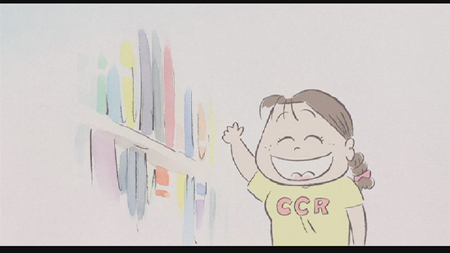
One C short of a union.
The Flick
Based on
a comic strip of the same name by Hisaichi Ishii, the story My
Neighbors The Yamadas is told through disconnected vignettes, each with
a chapter name and title card. The vignettes don’t take place in the same time
frame, or with overlapping events; each is self-contained. They gain meaning
from the way in which they are ordered, though, deriving context by placement.
The
titular family is composed of a father, Takashi, a mother, Matsuko, a brother,
Noboru, a sister, Nonoko, and a grandmother, Shige. They are a typical suburban
family; Takashi works all day every day and complains about it to anyone who
will listen. Matsuko tries hard to be a good housewife but doesn’t quite have
the hang of being the woman everyone else depends on. Noboru hates studying and
sucks at flirting with cute girls in school. Nonoko is innocent and sweet and
gullible. Shige is wise, has an acid tongue, and disapproves of the direction
the world is headed.
There’s
not much more to each character. They are hastily drawn (speaking of the
narrative, for now) and it is left to the audience to approach to the middle
distance and impose their own assumptions on the Yamada family. The characters
don’t grow, as such, through the progression of vignettes, but they do get the
chance to explore the shading suggested by their initial outlines, though never
stepping out of those boundaries.
In fact,
the Yamadas are caricatures. There’s very little to distinguish them from any
other suburban family in a random sampling, except that they are the ones who
occupy the narrative eye. This gives them the sort of everyman feeling, the
proxy self, which is always hit-or-miss in film because it gambles on the
audience having the personal experience to invest in these characters.

Who’s better than we are? We are!
As I see
it, two things that could obstruct the audience from that participation: the art
style, and the running time combined with the lack of a coherent narrative. At
over 100 minutes, the film seems to drag right around the three-quarters mark.
With nothing driving the narrative forward, the isolated sequences begin to
feel repetitive, and could easily put off a viewer who wasn’t already involved
in the voyeurism. The third-to-last sequence is a nice redemption from the
trend, though, featuring a slight shift in art, am action-packed fantasy
sequence for Takashi, and the associated pathos of finding the fantasy unmet.
The art
is the other potential block in the way of a viewer’s engagement with the film.
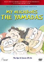
You can get a pretty good idea of what it’s like by looking at the screenshots
in this review or at the cover of the box. Supporting the Yamadas’ nature as
caricatures, the art has a sidewalk sketch quality to it, quick lines, simple
shapes, broad emotions. At first, the art seems either lazy or a simple
cribbing from the strip the film was based on, but I encourage anyone
discomfited by it to stick with it for just a bit longer than they’d like.
By
employing this overtly minimal style of artwork, Takahata accomplishes three
things. First, he supports the unobtrusive nature of the story. These are not
characters that scream for your attention, and neither do their physical
representations. Second, there tends to be a lot more an artist can get away
with in terms of drawing the fantastic when the audience’s disbelief is already
suspended to the point of accepting practical stick figures as fully rounded
characters. Third, it serves to create a continuum for emphasis, as the artists
increase or decrease the realism in the animation to bring out key passages. At
the dramatic center of the film is a sequence in which Takashi confronts a
suburban biker gang. The artwork here takes a turn for the realistic, stripping
away the fancy and replacing it with deep shadows and ragged lines.

That is the confident glower of a man with a magical scrotum.
There are
individual sections, like the above, that can be pulled out of their context
and held up as being worthwhile or not, but it’s hard to do the same with the
film as a whole. Some sequences carry a definite moral, but the greater portion
just spark onto the screen and then fade out without a clear resolution. This
is one of the strengths of the film, as it never seems to be resorting to a
reductive, American Beauty style parable; it also makes it a bit hard to quantify
the film’s value.
Maybe the
best clue as to the goal of the film comes in the form of occasional poems
presented at the ends of the vignettes. Many are by Japanese poet Basho, and,
while not haiku strictly, have the same minimalist beauty that we Westerners associate
with that poetic form. I’m not going to make a direct comparison between My
Neighbors The Yamadas and timeless poetry, but, like many of the quick
details in the film, the poetry does inform both the tone and the flow of the
narrative, as well as contributing this vital piece of inspiration: the little
things are important.
A whole
raft of little things make up My Neighbors The Yamadas. Any one of
them might be removed, and I bet the construct would keep on sailing. (At around
the 90 minute mark I was considering removing a few of the little things with
my handy skip button.) The point is that the director thinks these particular
little things are important, and this reviewer was convinced by way Takahata’s conflicted
conviction and deliberate, unorthodox choices.
7.5 out of 10

"Gonna show sis this thing in my hand, thing in my hand."
The Look
Widescreen
1.85:1. The color palette is very shallow, so there’s not much to judge in the
way of the transfer. The world is mostly white, with a few pastel shades here
and there. My wife walked into the room as I was watching the movie and, not
having her contacts in, wondered why I was watching a blank, white screen.
The lines
are all crisp; there was no artifacting that I saw, which I’m thankful for.
With so few lines on the screen at any one time, a flaw in any of them would be
like a broken limb.
Another facet
of the animation which I feel I ought to mention is that there is very little,
if any, tweening, which is the process of interpolating frames between the
hand-drawn cels. As a result, the animation seems jerky, but that you can’t
blame on the disc.
8 out of 10
The Noise
Dolby 5.1
Surround. There’s not much to either complain about or laud, here. The use of
music is — surprise! — minimal. What few pieces are chosen fit very well,
from the occasional J-pop song, to the Mahler symphony, to the original score by
Akiko Yano featuring child-like soloist.
The mix
is just right, again unobtrusive.
7 out of 10

In 1948, Japan’s cabbage crops were seized by the dreaded Kosume disease,
the symptoms of which included these oddly-shaped polyps.
The Goodies
There’s a
brief documentary featuring the recording of the English language track,
featuring Jim Belushi as Takashi, Molly Shannon as Matsuko, Daryl Sabara as
Noboru, and Liliana Mumy as Nonoko. It doesn’t feature any new information; by
now, just about everyone on Earth knows how the redubbing process works, don’t
they?
We also
get a few of the film’s original Japanese trailers and selected Japanese
storyboards, as with other Ghibli releases by Disney.
6 out of 10

At last, Moon Knight is given a vehicle worthy of his great prowess.
The Artwork
The image
chosen for the cover is further evidence of the thought put into the film. It’s
not apparently an image to end all images — it displays the basic art style
and shows a bit of irony when contrasted with the image chosen for the back
cover art. But there’s another layer beneath that. The image they chose for the
cover, when viewed in context in the movie, is the most bittersweet image in
the whole movie.
I hate
the stupid little bar along the bottom with the tagline. "The Ups &
Downs Of Life." That’s never attracted anyone to a movie, has it? Why not
just write, "Extraordinarily Boring. Insomnia Cure." I hope nobody
out there is too easily influenced by marketing.