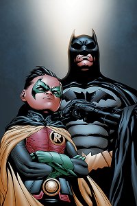
 BATMAN AND ROBIN #20 (DC Comics, $2.99)
By Devon Sanders
The new writer/artist team of Peter Tomasi and Patrick Gleason have finally come to the pages of Batman and Robin, following a hellaciously good run by space alien/comics writer Grant Morrison. Can they match the mad genius of Morrison? Was that an angel going “SPLAT” against the Gotham pavement at a Wayne Foundation charity event? Well, if that doesn’t say “hope,” I don’t know what does.
Dick Grayson and Damian Wayne are tuxedo-ed up and ready for a night of back-slaps and handshakes, when out of nowhere, a mystery, literally, falls at their feet. Costumes on, and The Dynamic Duo hit the town again, encountering a sometimes foe/sometimes ally, literally bursting with a story to tell.
Writer Peter Tomasi, no stranger to Dick Grayson as the former writer of Nightwing, weaves a story full of the things I love about Batman. There are moments of complete surprise and intense mood that launch you completely into the story. Tomasi’s greatest strength is finding out exactly who a character is and he does exactly that in an opening scene sure to touch the heart of a true Batman fan. This is simply good Batman comics.
Joining him is former Green Lantern Corps and Brightest Day collaborator Patrick Gleason. With Batman and Robin #20, Gleason shows he’s ready to be mentioned as one of comics’ better artists. Gleason has an eye for detail like few others, showcased in his use of shadow, down to the brilliant reflection he places within an ice cream scoop (Bonus points if you can find it,) of all things, he let’s you know he’s not here to play around.
Batman and Robin #20 isn’t Grant Morrison’s Batman and Robin. It starts out with a bit of weirdness, true. What it is a well done comic that certainly draws inspiration from what came before. This book is in very good hands.
Rating: 


Out of a Possible 5 Stars
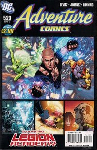 Adventure Comics #523 (DC Comics, $2.99), Legion of Super-Heroes Annual #1 (DC Comics, $4.99)
by Graig Kent
Unless you were there, it’s perhaps difficult to believe, but the Legion of Super-Heroes under the guiding hand of Paul Levitz used to be one of the the most popular comic books on the continent during the early 1980’s, following close behind the Uncanny X-Men and The New Teen Titans in terms of excitement and enthusiasm. Then, in the mid-80’s… Crisis. Watchmen. Dark Knight Returns. The landscape of comics changed practically overnight. The Legion was reborn, and a few years later it would be reborn again, and a few years later again, and then again and again, until a few years ago when the Legion was reborn into the Legion where it first left off, if that makes any sense at all.
Once again under the guiding hand of Paul Levitz, the Legion is back, filling two titles monthly and reading like one of the last vestigial tendrils connected to the glory days of superhero comics. This is a good thing, sort of. On the one hand, comics have changed and continue to adapt to the depreciating market that continues to support it. Generally this requires comic series’ to have concentrated story arcs that are fit for trade paperbacks, rather than acting as true ongoing series with character arcs and storylines that grow organically and unplanned around that which is planned. This leads to a more cinematic-like quality to comics, which means they’re generally more exciting, fat-free and easier to digest, especially for casual or new readers.
But the idea of endlessly serialized or even episodic storytelling has gone almost extinct in comic books, fanboy attrition being what it is these days, and yet as a fanboy it’s still rather exciting to read a comic that has a memory and isn’t rushing to hit character or plot milestones while racing towards a predefined conclusion. The Legion of Super-Heroes, with its cast of dozens, its universe-wide setting, and its freedom from nearly all continuity but its own is easily the best suited for this kind of storytelling. In the best sense it’s a superhero soap opera, with no single character essential to the team or series, with fresh faces expected at any turn (though old faces are always welcome back), and with, yes, plenty of in-team bickering and romantic entanglements alongside the requisite superhero punch-em-ups.
The latest issue of Adventure Comics brings notable artist Phil Jimenez into the Legion fold for perhaps the first time, sharing story duties with Levitz as well as penciling the book with his usual detail-heavy panache. Well, that latter part is a bit of a fib, Jimenez actually skimps a bit on the detail focusing more on character work in his densely paneled pages instead of background architecture and setting. Glancing through it’s fairly obvious and off-putting but less important upon actually reading the story. As for the story, it’s a Frat Comedy, Legion style, only minus most of the comedy. But that’s the general idea. A new recruit to the Legion academy narrates their overawed perceptions of Earth of the 31st Century, as well as her diverse roster of class mates. Stealing focus is Chemical Kid, arrogant, defiant and spoiled, he’s the rabblerouser of the group, and he’s about to, no doubt, get a lesson in humility as this storyline proceeds. It’s a frivolous read, but fun in its own take on a well worn cliche.
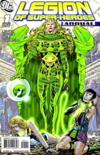 The first Legion of Super-Heroes Annual since Levitz’s return feels alternately like the best and worst first issue for any new Legion reader. Even as an experienced Legion reader, I felt lost, and yet, I also felt reading this exactly as I did reading my very first Legion issue: entertained by what I understood and kind of curious about what I didn’t. The characters here aren’t really introduced in any fashion, rather they appear on the page, and the reader either will know them already or find out about them (at least a little, anyway). Here, a new Emerald Empress emerges from the dirt of a familiar Legion planet. Filled with new power and rage, she’s left unchecked to run ramshod and takes over its civilization with ease. But two vacationing Legionnaires, Lightning Lass and Shrinking Violet, are thrust into the mix, and so it begins. The book is self contained in that old fashioned way Annuals which is to say it focuses on a specific minor character, revealing some some juicy background details, but in the end having very little impact on the series at large. Annuals used to be great big asides to the main series. This is wildly uneven in its storytelling, yet it’s still nearly perfect in capturing a style that has seemingly past. Topping it off, it reunites Levitz with Keith Giffen, who served as artist on the Legion with him for memorable chunks of his initial run. Though focusing more on writing in recent years, Giffen’s unique style remains, and here he channels Jack Kirby unapologetically on practically every pannel in some form or another. It may be set in the future, but it’s so retro.
It’s a mighty challenge to even expect to catch up on the Legion before jumping in, believe me. I tried this Herculean effort 3 years ago, reading a couple hundred Legion comics over the span of a few months and still only scratched the surface of what was available from their storied past. My advise, if you’re curious about the Legion, just jump in, and don’t worry about looking back until you’re comfortable.
Both: Rating: 


Out of a Possible 5 Stars
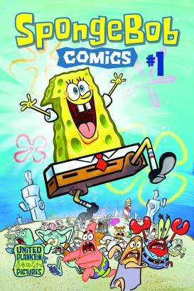 SpongeBob Comics #1 (United Plankton Pictures/Bongo Comics, $2.99)
by Graig Kent
The most remarkable thing about the new SpongeBob SquarePants comic is that there’s never been a SpongeBob SquarePants comics before. Ever. Appearing first in 1999, SpongeBob has gone from curious children’s commodity to college/stoner fixation to multimedia sensation and now an affirmed pop culture icon. The cartoon has changed the landscape of not just cartoons, but comedy, introducing absurdist comedy on a sanity-shattering scale, tearing young minds apart and reconstructing them like a Picasso.
SpongeBob has worked his squishy magic on multiple generations at once, a rare feat shared only with the likes of Pixar and the Simpsons, pummelling the globe with cartoons, dvds, a feature movie, toys, candies, macaroni and cheese, blankets, shoes, t-shirt and pretty much any consumer good you can imprint an image upon (which, let’s be honest, is pretty much all of them). And yet, never before, a comic.
For the longevity that SpongeBob has experienced, credit the source, a half hour tv program broken into two 15-minute stories that have a primary focus of telling a ridiculous and entertaining story. Character development is inessential and continuity is completely ignored, leaving basically a shell structure to build any kind of story or situation around. The 15-minute format allows for time to build a quick story and balloon the comedy, but it doesn’t allow much time for pausing or reflection. It’s quick dose of comedy, almost like sketch comedy, with its rapid-fire humour, quotability and occasional insanity makes the show by and large endlessly watchable.
If SpongeBob Comics #1 has a perceived fault it’s that it doesn’t use the format its working in to build like the cartoon does. But then again, if you wanted the cartoon, then watch the cartoon. The comic does look at SpongeBob at a different angle, in some respects, presenting the character almost Mad Magazine anthology style, with three mini-stories, three one-page comics, two pages of SpongeBob strips, a Pin-up poster, and a “Behind the Seas” page giving some background on SpongeBob’s creation.
Some of the condensed mini-stories and comic strips feel like fragments of a typical SpongeBob episode, which doesn’t mean they’re bad, but they just feel incomplete. Most notable and exciting of these is the beautifully illustrated “Mermaid Man and Barnacle Boy vs. The Octopus King” written by James Kolchaka, illustrated by Hilary Barta, with gorgeous colours from Rick Neilsen.
The inside front cover features a hilarious sepia-toned “Pirate Service Announcement” about “The Pirates’ Code o’ Comics Collectin'” by R. Sikoryak and is perhaps what this book should feature more of, SpongeBob-related comics but not necessarily SpongeBob-included comics.
The book and its format are obviously still young, and it needs to find its footing, experimenting with different lengths of story, styles of comic strips, and generally establish a mission for what its trying to accomplish that both differentiates it from the TV show but also compliments and reflects it. There’s a lot to like here, maybe not love, but most definitely like.
Rating: 


Out of a Possible 5 Stars
 Zita the Spacegirl OGN (First Second, $10.99)
by Adam Prosser
You can’t always recognize a significant trend when it’s just starting to have an influence; it’s often only years later that you can pinpoint the beginnings of a consistant aesthetic. That’s sometimes because it takes a while to be sure that a style is going to last, but it can also be because the more revolutionary and distinctive styles rarely appear in the places where the mainstream audience’s attention is focused.
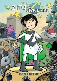
It might be a little early to call this yet, but I think that one such style has emerged out of the popular Flight anthologies from Image. These books showcase spectacular artwork, influenced by animation and manga, along with simple, deliberately paced, uncluttered stories, usually with a fantasy element and an overall dreamlike tone. I’m not sure precisely who buys them, but they seem to have a following, since they’ve continued to come out like clockwork over the years. I can’t help but think that these have done a pretty good job of reaching younger readers (especially since they seem to pop up on bookstore shelves in a format that would be more enticing to them than floppies), and as a result, we seem to be seeing more and more comics that owe them a stylistic debt—or that are directly spun off from them, like Ben Hatke’s Zita the Spacegirl.
The story wastes no time getting started: two little kids of indeterminate age, Zita and Joseph, stumble across a meteor containing a mysterious red button. Zita, the more daring of the two, presses the button, only to see Joseph snatched away by the Cthulhian tentacles of an alien that snakes from a newly-opened portal. Chasing after her friend and his abductor, Zita finds herself on a distant planet doomed to be destroyed a few days hence. Despite the SF setting, the story plays out from there more like a children’s fantasy novel, with Zita accruing weird companions, dealing with weird creatures that help or hinder her, and undertaking a quest to rescue her friend and return home.
Like most of the Flight alums, Hatke’s style is most easily described as “sweet,” with deceptively simple, sketchy linework and lavish colours. Also like other Flight contributors, including editor Kazu Kabiuchi, Hatke’s clearly more interested in composition, pacing, and atmosphere than complex plots or snappy dialogue; there’s a sparseness to the storytelling that keeps things from getting too cutesy. It also helps that Hatke is genuinely hilarious at times, particularly in rendering the facial expressions and bombastic pronouncements of the battle robot One, or the nervous non sequiturs of Randy the Robot, Zita’s two major companions. There’s also a very funny bit with two pipe-dwelling creatures who try to cheer Zita up and fail miserably. The whole thing is very reminiscent of Jim Henson’s work, particularly Labyrinth and Fraggle Rock (the latter actually gets an explicit shout-out), with a heavy dose of Calvin and Hobbes in the artwork. And of course, there’s that familiar Flight feeling to everything. It’s a welcome break from the standard tone of modern superhero comics, and it’s one I suspect we’ll be seeing more and more over the next few years. These are the comics that today’s kids will be looking back on nostalgically in the decades to come. The future is now, people!
Rating: 


Out of a Possible 5 Stars
 Ultimate Avengers vs New Ultimates #1 (Marvel, #3.99)
By Jeb D.
Mark Millar’s fans, and his detractors, are rarely in agreement about much, but on one subject they’re united: Jeph Loeb’s version of The Ultimates was utter pants. And while Millar’s never going to slag off one of his industry buds, his comments about being delighted to finally have the whole range of Ultimates/Avengers characters to play with again suggest that, even if he doesn’t completely share that sentiment, he’s at least determined to right the ship, even if fanboys were the only ones that saw it foundering.
(Personally, I always figured that Ultimates 3 was given to Loeb just so that someone with nothing better to do with his time could have the fun of waiting for Joe Madureira to churn out pages).
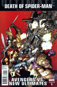
Though he’s picking up the threads from the recent Ultimate Avengers run, UA vs NA (fuck if I’m typing that out more than once), in a way, is Millar kicking the story back to a near-reboot: this feels like exactly the story that he and Hitch might have used to follow on the end of Ultimates 2, continuing to explore the ramifications of the super-soldier program; in particular, the notion of whether superhumans should be treated as weapons of mass destruction by a world increasingly endangered by their presence.
The story proper begins with the rescue of Iron Man by Cap and Thor, but with a twist: the injury that Tony seemed to have suffered at the end of Ultimate Avengers 3 was, in fact, the flaring up of the brain tumor that he’s kept hidden from all but his fellow Ultimates. This would seem to make it all the more important that the team add some new blood, in the form of recent promotees Black Widow and current Giant-Man Scott Lang… except that Scott’s stuck in the Iranian desert, and new Black Widow Monica Chang has family to worry about, including her infant son whose paternity is sufficiently mysterious as to virtually guarantee it will be a major plot point. Such homey concerns don’t keep Millar and artist Lenil Francis Yu from digging right into the super-powered espionage/action storyline, as Thor and Cap ambush a military train in several pages of gleeful mayhem, and begin to unravel the plot that involves the sale of super-soldiers to what Cap would doubtless refer to as “unfriendly powers,” the appalling consequences for at least one of its participants, and the betrayal that lies at the heart of it (though the big reveal at the end isn’t exactly a huge surprise, given that there’s few characters in the Ultimate U better positioned to play the role). Yu does a pretty good Hitch here, with sweeping aerial shots of SHIELD ordnance, and his slightly rougher texture downplays some of the facial photo-modeling that can sometimes be distracting in Hitch’s work. The look of the book is also nicely consistent, given that he’s working with three different inkers (Gerry Alanguilan, Jason Paz and Jeff Huet) and two colorists (Sunny Gho with Jim Charalampidis). And for what it’s worth, this is (so far) one of the least cutesy self-aware scripts Millar has done yet, and his decision to return Thor to his non-Stan-Lee speaking style might be as welcome as his decision to omit the Lindsay Lohan references.
All in all, a satisfying return to form for anyone who enjoyed the first two Ultimates series, and it’s toned down just enough that it might be worth a try even for those who didn’t care for its predecessors. If you liked Loeb’s Ultimates, though, I have no idea what you’d make of this (actually, if you liked Loeb’s Ultimates, I have no idea what you make of comics in the first place).
Rating: 


Out of a Possible 5 Stars