Miniature Jesus #1 ($3.99, Image)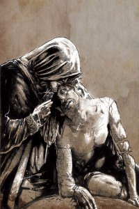
by D.S. Randlett (@dsrandlett)
Sometimes, a book just gives you too little.
I have heard of Ted McKeever before, but have never sought out his work. To be sure, this is a beautiful, if grimy, book to look at. One can spot the influence of Richard Corben, and not a little bit of Sam Keith. He works in black and white here, and lays the black on thick. As a mood piece, it’s staggering. The entire book has a dirty, syrupy feel, like a suspended drop of pitch just waiting to drop. McKeever works in a series of unsettling close ups, and to a one you’ll probably feel like each character is insane. Or are they? Judging from a glance at McKeever’s bibliography he’s no stranger to bringing in metaphysical elements.
The book opens with a recovering alcoholic in a motel room talking to an Egyptian god in the form of a dead cat. Once he leaves the room, he encounters other demons as he… walks around? Here, McKeever is barely concerned with plot, and more with conveying the feeling of a post-DT daze where you’re not entirely sure who you’re going to be from now on. This issue functions less as a story and more as a tone poem. Which would be fine if not for the final few pages where a plot starts to emerge. The connection of the developments at the end to the rest of the book is extremely unclear, which I am sure will be remedied in future issues of this series. But for now, it feels like an instance of the book falling into a trap in had hitherto avoided: weird for weird’s sake.
Definitely wait for the trade on this one, or at least bank issues until the five issue series is complete. As it stands, what we have in this first issue of Miniature Jesus is the work of an obvious talent, but an incomplete statement.
Rating: 
![]()
![]()
Out of a Possible 5 Stars
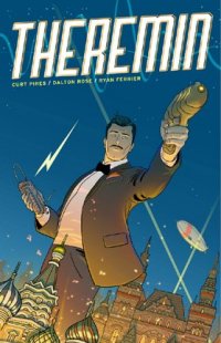 Theremin #1 (Monkeybrain, $0.99)
by Graig Kent
Theremin‘s set-up has a certain sense of familiarity, a real-world science figure cast as a Bond-ian super-spy set in an anachronistic past, with a science-fiction tinged reality of weirdo gadgets and mysterious other-dimensions and time travel. It’s heavily reminiscent of Jonathan Hickman’s Manhattan Projects and Grant Morrison’s The Invisibles which I could easily peg as influential, beyond even that the writer calls those series out in the comic’s backmatter (a recent Oni Press series, The Secret Hstory Of D.B. Cooper is the most direct comparison, story-wise, but it’s a less prominent comic thus less likely an influence). As Audre Lorde opined “There are no new ideas, there are only new ways of making them felt.” Yes, I just pulled out that hoary old chestnut, but it’s definitely a relevant statement here. Theremin’s launching point is not primarily formed of new ideas, but it definitely feels like an interesting take on an old one.
The backmatter of the book is 8 solid pages, wherein writer Curt Pires discusses his discovery of comics as a child, his influences in the intervening years and current entertainment preferences. He also talks about the creative process, providing samples of the script, as well as noting bits about artist Dalton Rose’s approach to illustration. But the centerpiece of this smorgasbord is the gestation of the series as an essay written for an ambiant/experimental music magazine, which Pires reprints here. It’s a brief synopsis of the life and hard times of Leon Theremin, Russian inventor of the uncommon instrument named after him. It’s a short but fascinating piece that greatly accentuates the story that comprises the 14 story pages of the book. One comes to understand how Pires made the leap from maligned scientist/political prisoner/failed pioneer to super-spy/Lenin-assassin/dimension-hopping time-traveler.
Even if you don’t fully understand that leap, Pires presents and interesting story, starting with a forward moment in time, then jumping into backstory, showing two sides to Leon Theremin. Starting with his quite adept future-self, Leon is unflinching and unphased by the tasks before him and the creatures that chase after him. His jumps into an alternate reality, his rehashing of moments in time seem to have little resonance with him. Whereas his earlier self has an anxiousness about him as well as a desire for recognition from his superiors of his intellect and ability.
Dalton Rose handles all of the visual chores save for the lettering. His figure work is somewhere between Tintin‘s Herge and Paul Grist, purposeful, restrained lines create a clean, simple presence on the page. It’s in the coloring process, in which Rose illustrates background details without solid black lines but with colors instead, that the book truly explodes. I presume it’s an all digital process for Rose, but the coloring emulates watercolors and gives it a dept and a hazy ages-past feel that establishes the mood and tone of the story as much as, if not moreso than the narrative or action.
Theremin comes from Monkeybrain Comics, a digital only publisher that’s taken the unique stance of offering up every issue of their titles for only 99 cents. The books seem to hover around the 12-15 page point, which is more than worth the money compared to other digital and physical offerings.
Rating: 
![]()
Out of a Possible 5 Stars
Danger Girl: Trinity #1 of 4 (IDW, $3.99)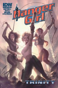
By Jeb D.
I continue to be impressed, and somewhat baffled, by the durability of the Danger Girl franchise: irregular doses of recycled pulp adventures, cornball dialogue, and fan service that rarely equals (much less exceeds) what the Big 2 offer each month, would seem to have pretty ephemeral appeal, at best. But Abbey, Sydney and Sonya soldier on, evidently riding as comfortably on shifting market forces as they do planes, boats, motorcycles, and the like.
Trinity, as the name might imply, brings us three separate (but doubtless to-be-joined) adventures of the three Danger Girl operatives, penned by DG co-creator Andy Hartnell, but with a different artist tackling each section, with rather varied results.
The first section basically lifts the shipboard pre-credits sequence from Indiana Jones and the Last Crusade, as Abbey is cornered with a precious artifact onboard a tossing pirate ship on a raging sea (there’s even a monkey with an eyepatch, in a nod to Raiders of the Lost Ark’s cute Nazi simian). Artist John Royle hews more closely to J. Scott Campbell’s original style than his successors, which has its obvious advantages, but the heavy crosshatching suggests nostalgia not for old-fashioned serial adventure, but for the Liefeld/Lee Roaring 90’s. There’s also not much variation in Abbey’s facial expressions, and Royle’s less cinematic in his layouts than Campbell, so while he gets the point across, there’s not a lot of development (plenty of water, though).
Sydney’s segment is interesting for being one of the few examples of a straightforward approach to sexual relations in the series: nothing explicit, but the scene opens on a quiet post-coital moment… which is naturally shattered by gunfire, at which point artist Harvey Tolibao plays with some interesting paneling effects, my enthusiasm for which is somewhat dampened by the drabness and inconsistency in his facial and anatomical work (if any series really needs to define itself with aesthetically pleasing art, it’s Danger Girl).
Finally, Sonya is embroiled in a perilous jungle adventure, and artist Stephen Molnar probably brings the ideal homage to the original DG concept with cleaner, more consistent linework than Tolibao, but more effective, and interesting storytelling, than Royle brought to his segment. It helps that Hartnell does a better job of giving Molnar something to work with, as there’s more development than in Abbey’s segment, and allows him to end on a more classic cliffhanger than Sydney’s.
On balance, Danger Girl continues to leverage its position as one of the few female-centric adventure comics in the shops these days, but its assumption that its female readership is satisfied with warmed-over action movie clichés, or that its male readership will keep coming back as long as there are enough of those “headlights” and butt shots, is going right past tiresome to mildly offensive.
Rating: ![]()
![]()
![]()
Out of a Possible 5 Stars
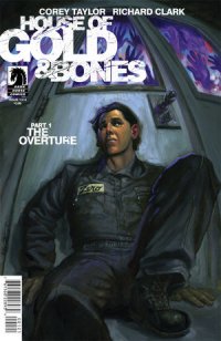 House of Gold & Bones #1 of 4 (Dark Horse, $3.99)
By Jeb D.
It’s not unusual for a comic writer to share with readers the music they were listening to as they worked (Kieron Gillen comes to mind), or to suggest music to listen to as one reads (the film of Watchmen foundered seriously on taking some of Alan Moore’s suggestions literally), but Slipknot/Stone Sour singer Corey Taylor’s new comic is closer , to something like the Amory Wars series that draws its storylines from the albums by Coheed and Cambria. House of Gold & Bones is tied in with the new Stone Sour album of the same name, and the promotional material suggests that following along between both comic and album is more or less the optimal way to enjoy the story. This can be a sticking point for anyone not looking to invest $15-20 to get the full benefit of a 22-page comic. Particularly one as crude as this.
And that’s not a description I use lightly, but it’s pretty much inevitable here. Taylor tries to draw us into a mystery: a man we know as The Human has lost his memory, and in a bleak, empty landscape, he encounters his sinister doppelganger, who doles out hints and insinuations, but little enlightenment. I won’t pretend that I’d expect Taylor to approach Agatha Christie levels in the mystery plotting department, but even a tyro at this ought to understand that all good mysteries are, basically, locked-room mysteries: a satisfying conclusion depends on establishing parameters for the reader that are then subverted in ways that looked improbable at the beginning, but inevitable by the end. At this point, though, there really aren’t any parameters: we have no frame of reference, and we know so little that it would be virtually impossible for any future development to surprise us. Call it a slow burn if you like, but that’s not the ideal way to begin a four-issue miniseries.
It’s possible, of course, that listening to the album would fill some of this in, but not only do I have no plans to do so (Slipknot never did much for me either), if there’s that much information in the songs, then the comic itself becomes redundant, particularly because the art by Richard Clark and inker Dan Jackson is even more crude than the script: flat, amateurish, inconsistent, and muddy. Some of this may be the script’s fault, but Clark takes no opportunity to do anything imaginative with the otherworldly landscape that The Human is stumbling through: it’s just flat horizons with bland sky behind it. Crude art can certainly be effective, but geniuses like Fletcher Hanks come along pretty infrequently, and what Clark and Jackson offer here is well this side of that sort of genius.
I do give this comic good marks for the backmatter: an amusing two-page excerpt of Taylor’s upcoming book A Funny Thing Happened on the Way to Heaven (Or, How I Made Peace with the Paranormal and Stigmatized Zealots and Cynics), which displays a crisp wit that suggests that the problem with this comic isn’t so much that Taylor isn’t a good writer, as that he’s simply chosen to work in a form, and genre, for which he has no particular affinity.
Rating: ![]()
![]()
![]()
![]()
Out of a Possible 5 Stars