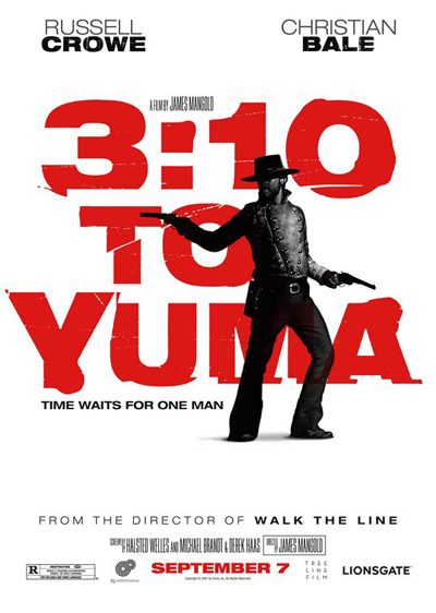
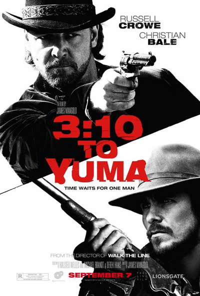
UPDATED! Scroll down below the first poster for the new goods.
Alright, this is a lot better. After the filigree and font-heavy design of the first one-sheet, I’m psyched for the old-school simplicity of this new design. It’s stark and simple, like some of the ’60s and ’70s western posters I used to have on the walls. (Damn you, small house! Thank you, storage space!)
My only complaint is that Crowe (at least I think that’s Crowe — actually, reader Jeffrey checked the trailer and suggests that it’s Ben Foster) looks more like the Robert Zemeckis performance capture version of himself than the image of a real gunslinger. My point being not so much that it didn’t look like Crowe and more that he doesn’t look…human.
But I’ll take it…anyone for Yuma Poster 3.0 now?

