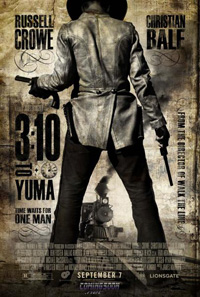
It’s been said that James Mangold’s 3:10 To Yuma remake is as much of a straight-up, no frills, no bullshit action western as we’re going to see any time soon. And I’m perfectly OK with that. So why is the poster so packed with frills and bullshit? Did an ancient letterpress see The Mangler on Showtime and decide to enact the film on a piece of paper? Did some Chris Ware apprentice have his ugly way with this thing?
Jeff Wells posted the image at Hollywood Elsewhere (where I first saw it, though it’s a ComingSoon exclusive) and commented that it looked like an ad for a Bob Fosse western. My first thought was Baz Luhrman, but that just shows the generation gap I’m very happy to have between me and Wells*; otherwise we’re basically saying the same thing.
And yes, I fully understand the look they’re going for with this design; I just don’t think it works. The image of a gunslinger about to get locomotive head is alright as a starting point, though.
Click to hit ComingSoon for the full size spectacle.
*Though I’d take Fosse over Luhrman in a fight, or a dance-off.