Constantine #1 (DC, $2.99)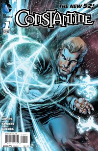
By Adam Prosser
Part of the reason I’m so fed up with the New 52 as an initiative is that one of its objectives is to basically rewrite DC’s own history—to seemingly get rid of all that goofy kid’s stuff and ridiculousness and wipe the slate clean for a blander, “edgier” and supposedly more realistic universe that will appeal more to…well, I’m not sure who it’s supposed to appeal to, really. As I’ve said before, DC seems to be going for the same fanbase that was reading comics in the early 90s, even though that particular demographic a) barely exists anymore and b) was more interested in Marvel (and eventually, Image) than it ever was in DC. It doesn’t matter how much armour you slap on Superman, the core of the character is never going to appeal to hardcore Wolverine fans.
But, OK, I grant you: some of DC’s smaller-scale characters do have a level of hipness to them that the big guns of the Justice League don’t. Like, for instance, John Constantine, who was at the vanguard of the wave of edgier, mostly mystical third-tier characters that sprouted up at DC in the 80s and eventually spun off to Vertigo. Well, now history has come full circle and Constantine is back inhabiting the DCU proper. Arriving fast on the heels of his long-running Vertigo book’s cancellation, this issue basically picks up without missing a beat.
This really is a classic Constantine tale, to the point where it almost seems pointless to summarize the plot. John has a friend who has weird powers and needs help. John uses him to find a magic relic while evading a malign power, in this case the nasty magic cult called the Cold Flame. John ends up getting his friend killed while he faces down a nasty, who threatens to make his life miserable. Rinse, repeat.
I don’t mean to sound too down on this issue, which is elegantly written by Jeff Lemire. Lemire seems to be the new go-to guy at DC, especially for the aforementioned Vertigo refugees, and he shows a confident grasp of the character—I might quibble with John’s apartment being stocked with dusty magical paraphernalia, which is exactly the kind of clichéd stuff he’s traditionally avoided, but otherwise he’s basically got it. (Words can’t express how happy I am that Lemire doesn’t overdo the British speech patterns, the way a lot of North American writers do when they tackle the character.)
I have a slightly bigger problem with Lemire’s introduction of the Cold Flame leadership, which apparently includes Zatara, Sargon, Tannarak (no idea who that is) and, most bafflingly of all, Constantine’s old Trenchcoat Brigade pal, Mr. E. At least three of these were all originally heroic characters—though I grant Mr. E seemed to be occupying a somewhat grey area—and transforming them into baddies (and douchey Criss Angel-esque character designs, to boot) just speaks to the once thrilling, now tiresome desire in comics to subvert its past for the sake of hipness. (I’m dreading, in particular, the revelation of what’s up with Zatara, who’s still mentioned to be dead; it sounds like Zatanna’s going to have an and-then-I-had-to-kill-my-father narrative retconned into her backstory. Ugh.)
There is, I suppose, a certain symmetry here; after all, Alan Moore got this ball rolling in the pages of Swamp Thing, which introduced Constantine in the first place, and in the classic Crisis on Infinite Earths tie-in, Moore killed off Zatara and Sargon in the first place, as well as introducing a new flood of darkness and moral ambiguity to the DCU. But what people miss is that Moore wasn’t just doing this to be XXXTREME, the way so many of the people following in his footsteps have been. There were sound narrative reasons for everything he did, and even in killing characters off he was attempting to open new story pathways for these characters. Story-wise, Zatara was killed because he wasn’t the most interesting character, and in dying he suddenly took the more interesting Zatanna in a new direction. But he was still able to retain his heroism, his dignity, in death. Retconning him into a baddie smacks of defilement in the name of desperation. DC editorial no longer seems capable of letting its characters go forward in interesting ways, so instead their pasts are being constantly rewritten.
By the end of the 80s, Vertigo was founded to let characters like Constantine run free in their own little pocket universe so the rest of DC could maintain its wildly different, mostly heroic and upbeat, tone. While I sometimes feel a little ambiguous about this—I think smart writers could have juggled the two satisfactorily and made DC an even more interesting world of stories—from this remove I can’t help but applaud the desire to keep DC quarantined against the creeping darkness that so many goonish minds want to make the baseline for superhero comics. On the first page of this issue, Constantine (summarizing magic) thinks, “We trick the universe into handing us effects without the cause…we twist time and space, warp minds, create life, for people like me.” That’s true on a metanarrative level, too. Constantine’s returned to the DCU, with some grousing that his adventures are going to be bowdlerized, but to me the concern runs the other way—the DC universe has changed to fit him, and that’s made it a bleaker, darker, less hopeful place.
Constantine will be fine. As always, it’s everyone in his vicinity who has to watch out.
Rating: 
![]()
![]()
Out of a Possible 5 Stars
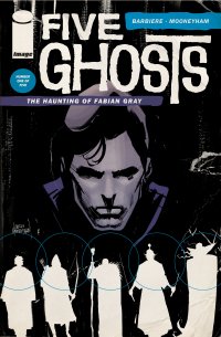 Five Ghosts: The Haunting of Fabian Gray (Image, $3.50)
by Graig Kent
2012 was a banner year for Image, and 2013 hasn’t slowed them down one bit. Diggle and Jock’s reunion on Snapshot, Joe Casey’s Sex, and Jonathan Hickman’s East of West waiting in the wings just a few notable projects coming from big creators.
But if you’re not a biggish creator, Kickstarter is fast becoming the place to get a project noticed. If your project is having difficulty attracting the attention of publishers, pitching it to the public is now another increasingly viable option, and if public will respond, it looks like so too will the publishers. Taking a peek at Frank J. Barbiere’s pitch on Kickstarter, the original intent was to self-publish the full series. That it’s now in Image’s stable is no surprise, I imagine Image is now keeping their eyes glued to Kickstarter both to see what’s complimentary to their output (interesting concepts, distinctive artwork) as well as what’s gaining traction with fans.
While I missed out on the Five Ghosts Kickstarter (and the self-published first issue), I was immediately intrigued and attracted to Image’s ads for the series. It’s a strong pulp concept: a 1930’s treasure hunter has been possessed by five literary ghosts, the Wizard (Merlin), the Archer (Robin Hood), the Detective (Sherlock Holmes), the Samurai (Musashi) and the Vampire (Dracula), whose powers and abilities he can summon as needed. In reading the story, it’s not just straight adventure heroics, but rather the tale of a tortured hero with literary undertones (ala Kill Shakespeare, Fables or League of Extraordinary Gentlemen). The possession,it turns out, isn’t just a fun, handy superpower, instead it is taking an increasing toll on him. As well, if his adventuring has a purpose, it’s to find a means of awakening his comatose sister. Meanwhile, the rather nefarious Iago, in the command of spirits of his own, seeks to steal whatever power it is Gray has obtained.
Gray is possessed by archetypes and he’s also quite the archetype himself, a more stone-faced take on Indiana Jones, a smooth lover and cold-blooded fighter. There’s not much in the character we haven’t seen countless times before, so the story so far leans heavily on its conceit, which is admittedly very cool. As well, Gray’s story begins in media res so there’s a lot of backstory to cover which could flesh him out more as the series progresses. But if that doesn’t get you right out, the art will.
It should surprise no one to learn Chris Mooneyham was a product of the Kubert School of Art. His work bears signature Kubert-isms, particularly in the line weight, crosshatching and and shading (as well as his signature on the cover, a total homage to Joe). But it’s not all Kubert in there, there’s stylistic parity with Gene Colan’s Tomb of Dracula and the art of newspaper serials like Modesty Blaise or James Bond by the likes of Jim Holdaway and John McLusky. The coloring by Mooneyham (with assists from S.M. Vidaurri) is an appropriately muted and exceptionally executed palette, each scene taking a dominant color, but one gets the feeling Mooneyham’s prepared the art as much for black and white publication as color. Take note, he’s going to be a major talent in the industry in short order.
I’ve said it elsewhere, but graphic design goes a long way to making an impression and standing out from other books on the stand. Few titles from the big two employ much in the way of graphic design beyond a logo or occasional playful cover, but the contributions of Dylan Todd cannot be undervalued. The covers, outside and in, as well as the (eventual) letters pages, and I would assume the attention-grabbing advertisements, all contribute to establishing what this book is trying to be. It’s a successful take on retro 1930’s high-adventure in a 1970’s horror comic-style. Please, sir, can I have some more?
Rating: ![]()
Out of a Possible 5 Stars
Action Comics #18 ($4.99, DC)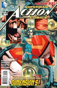
by D.S. Randlett (@dsrandlett)
When the New 52 started, and I was thinking about picking up comics again, the prospect of a Grant Morrison and Rags Morales run on Action Comics was very exciting for me. And really, that first issue is still a pure joy, an issue that, in retrospect, turns the New 52 project on its head. There, Morrison and Morales fulfill the dictates of the reboot along with the mandate for “more of an edge,” but within a few pages that is all but gone as the young Kal El goes from grim avenger of wrongs to smiling social activist. Shortly thereafter, it was pretty obvious that Morrison wasn’t too interested in rehashing Superman’s early days. To be fair, his scripts were never really phoned in, but the story of how Superman got his new suit is a fairly standard affair that at the very least has a strong understanding of Superman’s character and some fun beats. It wasn’t until the rather amazing ninth issue that we began to see what Morrison was really up to.
The core of Morrison’s Action Comics run has been an analysis of the idea of Superman, and that analysis seems to orbit around three key themes: Conflicting ideas of masculinity, Superman’s relationship to DC Comics (the corporate entity, not the fictional universe), and the relationship between Superman and his audience. The first two are bound up in the series’ villain: the fifth dimensional being Vyndktvx, who seems to represent both the corporate alpha male and an overbearing, multi-tiered editorial board. Vyndktvx’s motivation isn’t so much the defeat of Superman, but the changing of him. To that end, he’s recruited Superdoom, a twisted Superman from a parallel Earth who seems to be composed of the ideas that nearly ruined the character in the nineties. Superdoom sports Doomsday’s bony growths, a version of the Kingdom Come sigil, and a set of tights that seem to resemble the “Lightning” costume and the costume from the Batman Beyond version of the character. In this final issue of Morrison’s run, the readership seems to be split between Vyndktvx and the people watching this final battle. In effect, here we see a climactic battle between what the superhero market wants Superman to be, and what we need him to be. The villains here are essentially the New 52 made flesh, and they are defeated by the primal artistic core of Superman.
And really, this all makes for a very rich and stimulating essay. This issue is deliberately psychedelic, featuring Kurt Swan’s Lion Superman and that ant-Superman from the Silver Age in a context that turns out to be richly symbolic. Hell, even Superbaby makes an appearance in a panel that evokes the child Herakles strangling snakes in his crib. This all makes for some rich reading and an exciting essay, but is it a good story? Well, sometimes. The fact is that this issue, and the majority of this run, work almost purely in the realm of ideas. This is thrilling in its own way, but in the way that a particularly good academic paper is. Rarely does this issue, and this entire run, really access the dramatic and emotional pathways that have made Superman endure for so long. It’s odd that this run has been at its most successful in that regard through its use of Krypto, who by now is probably the most revitalized aspect of Superman lore. The final page of Morrison’s story is incredibly sweet, and artist Rags Morales makes the image of a dusted up Superman and his dog one of the all time great Superman images, but the context doesn’t really match it. Still, it’s fitting that this story end on a note of tenderness and affection.
Much has been made of the shuffling artistic crew on this title, but after the first half of this run I think that the entire crew found a sort of groove. Different artists handle different aspects of the story. Rags Morales usually comes in when its time for Superman to do something overtly physical, while Brad Walker usually steps in to handle the story’s trippier aspects. While Morales and Walker have very different styles, I’ve never found the transitions between the two especially jarring. Both artists acquit themselves ably here, with Walker being the more consistent and Morales having greater highs and lows. Some of Morales’ work feels a bit rushed here (although never egregiously so), but when he devotes himself to an image (like the final page), you can really tell.
The final issue of Morrison’s Action Comics is much like the rest of his run: stimulating and provoking, but with only the briefest flashes of that little bit of something that’s made his past work with the character so special and memorable.
Rating: 
![]()
Out of a Possible 5 Stars
 Captain Marvel #11 (Marvel, $3.99)
By Jeb D.
Not sure if I’ve ever started a review by commenting on a letters page (and if I ever did, it was probably an old issue of Powers), but for those who have been concerned about the supposedly impending cancellation of this series, we are assured by editor Sana Amanat that such is not the case; and while we don’t trust everything we read, if the book were for the imminent chop, you’d imagine that they wouldn’t comment on the topic at all. Assuming that to be the case, it’s certainly encouraging, because there was reason to be concerned: of the recent surge in fun, imaginative Marvel comics that exist apart from the core Avengers/X-Men mainstream (Hawkeye, Young Avengers, Journey Into Mystery, and FF among them), Captain Marvel has deliberately set itself apart in ways that probably made it tough for many long-time fans to get past: this is a comic that’s no longer trying to sell itself as a pinup book.
It’s certainly easy to overreact to the idea of female comic characters rendered as impossibly shaped supermodels: after all, soap operas (arguably the closest cultural relatives to the corporate superhero comic) succeed by playing out their melodramatic plotlines with impossibly pretty protagonists (male and female, though I won’t pretend that there’s a simple equivalency there): it’s not impossible to balance strong storytelling with sex appeal. But it would be hard to find a more cynically obvious attempt at fan service than Marvel’s decision to launch the previous Ms. Marvel series with a batch of blatant cheesecake covers from Frank Cho: no matter how hard writer Brian Reed might have worked to try to define Carol Danvers’ place in the Marvel U, the marketing of the book undercut him (and with all respect to Cho, the guy is capable of sequential work that’s as vigorous as it is pretty, but his cover work tends to the blandly posed).
Fast-forward to the new Carol Danvers series: she’s now Captain, not Ms, Marvel, and she’s being well-written by a woman, Kelly Sue DeConnick, whose idea of feminism is simply placing female characters in charge of their own stories (and with a costume that no longer suggests an interstellar hooker). But for all the strong storytelling that DeConnick is bringing to the character, the series is once more being undermined by the marketing department, with an utter disconnect between the artistic style of the covers, and that of the book’s interior.
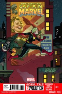
And take a look at that Joe Quinones cover represented here: it’s joyously of a piece with the delightfully old-school tone that Ed McGuiness’ covers set with the first few issues. And given that DeConnick’s storylines have tied Danvers’ background into the aerial exploits of female WWII pilots, as well as the women of the “Mercury 13” astronaut program of the 60’s, an art style that deliberately echoed those eras would have been appropriate. But whether the decision was editorial, or with DeConnick’s input, the interior artwork on the series seemed to have come out gunshy regarding any possibility of cheesecake: rather than colorful, high-flying exhilaration, original artist Dexter Soy went for a thick line and anatomical exaggeration, with a muddy color palette. The palette has remained, under Emma Rios and now current artist Filipe Andrade, who is working in an even more angular style, all frenetic movement, with sharp contrast between the clarity of facial closeup and vagueness of distant shots, but again seeming to deliberately back away from “glamourzing” his heroine. The marketing folks have tinkered with the presentation a bit, including a pair of typically lush Terry and Rachel Dodson covers on issues 6 and 7, but for better or worse, the interiors have remained idiosyncratically dark and impressionistic. It’s not necessarily a bad choice, but those darn McGuiness covers did suggest what might have been an interesting alternative approach.
It’s also true that, while DeConnick’s not particularly “writing for the trade,” this hasn’t been a one-story-per-issue book like Hawkeye, that you can just randomly hand to a new reader; the storylines have a lived-in depth, that draws the reader over the course of a few issues. That may be why we’re starting to get slightly tighter plotting, like the 2-issue Captain Marvel pairup of Danvers with Monica Rambeaux, and the current issue, in which Carol decides to challenge the mysterious brain ailment, which threatens to kill her if she uses her power of flight, by taking to the air with the aid of guest star Dakota North and her…um… Marvel-cycle? Apart from the medical gobbledygook, the script (by DeConnick and Christopher Sebela) is simple and direct, as Carol has to adapt to crime-fighting and aerial adventuring by more “conventional” means. Andrade’s work feels a bit looser and more comfortable this issue, using Carol’s flowing blond mane to punctuate her fluid movement across rooftops, and into the sky on her new toy.
Captain Marvel isn’t the kind of storytelling departure that we’re getting from, say, Hawkeye, or FF: it’s a good, well-characterized superhero adventure comic, with a female protagonist, that needs to make no allowances for gender. But it’s decidedly NOT a book to judge by its cover.
Rating: ![]()
Out of a Possible 5 Stars