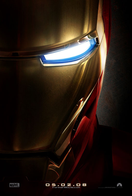
The new Iron Man teaser poster just looks like a Transformers 2 poster. It’s like someone at Paramount is just recycling ideas – did the design guy really want to get home early and beat all the traffic on the highway?
I would like to donate a concept to Paramount, for free: A black poster. How much more black could it be? None more black. In this black poster are burning energy blue eyes, just like the ones on this teaser poster. Below them, where Iron Man’s chest plate would be, the same color burning energy blue disc. And below that, and on either side, two more smaller burning blue energy discs, where Iron Man’s palms would be. At the bottom: Iron Man. May 2008.
Now this isn’t genius, but it’s certainly more arresting than this poster. I’m looking forward to this movie, and I love the footage I’ve seen, and I love the star and the director and everything else, but I cannot get behind this poster.