Flex Mentallo: Man of Muscle Mystery — The Deluxe Edition (Vertigo, $22.99)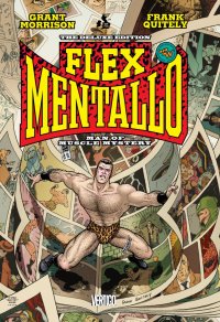
by Graig Kent
The release of an average Grant Morrison book is generally something to be excited by, but the release of a Grant Morrison book that’s been held back from the masses for nigh on 15 years, well, that’s an event. Though printed as a four issue mini-series in 1996, Flex Mentallo: Man of Muscle Mystery was never collected, despite overwhelming fan interest, especially as the Cult of Grant has ballooned over the years. The primary reason for this was the lawsuit filed against DC comics by Charles Atlas, Ltd. over copyright infringement. Although the case was summarily dismissed, a reprinting of the mini-series may have opened them up to further suits. And yet, in 2006, the original appearances of Flex in the pages of Morrison’s Doom Patrol were reprinted so obviously the publisher wasn’t that intimidated by more litigation. If I could hazard a guess or two, I would say DC was stoking the fire, building up the legend, heightening the anticipation, and, just perhaps, holding off in order to do it right.
I don’t think Flex would be considered a minor Morrison work even if it had been readily available all these years, but with all the hub bub and hoopla behind it lo these 15 years or so, it’s certainly takes on a brighter glow, as if Flex’s “Hero Halo” shimmers above it. Part of that may be the beautiful re-coloring from Peter Doherty and the glossy paperstock, but the larger part of it just may be the power of discovering (or rediscovering) one of Morrison’s classic meta-texts, and his first collaboration with Frank Quitely.
The synergy between Morrison and Quitely is evident from the first two pages, each 9-panel grids, beginning with a suspicious trenchcoated character lobbing a cartoon bomb which gives birth to the cosmos, which is revealed to be an inkstamp of that very same trenchcoated character upon the surface of an egg which is then fried up like “your brain on drugs”. Nearly everything in these two pages has some relation to the story at large: the trenchcoated character, the bomb, the explosion of light, the cosmos/microcosmos, the “brain on drugs” reference… it’s both the set-up for and revelation of what’s to come.
What comes is a Morrison specialty: using the medium of comics to tell a story that’s only relevant to the medium of comics and can really only be told in the medium of comics.
For all the years of waiting, and all the anticipation of a collected edition of Flex Mentallo, to be honest, I had no idea what to expect. Though I’ve read Morrison’s Doom Patrol run in trade, I can honestly say Flex,as a character, didn’t stick out all that much other than another of many pop-culture satires that I’ve read in comics over the years. Even here, Flex is less a well-rounded character and more a vessel in service of Morrison’s twisting, non-linear, time-and-dimension hopping story.
Flex Mentallo: Man of Muscle Mystery finds Morrison exploring the trajectory of comics (the medium as a whole, but with a focus on superheroes) from the golden age through to where it was at the time of its publication, deeply set in “grim and gritty”. He does so through Flex’s investigation into the suspected reappearance of his old ally, The Fact, while a strung out rock star calls a distress line after overdosing on painkillers, LSD, and booze to talk comics before he dies, and a police detective searches for his own understanding of reality. These threads are at once disparate and intricately interwoven, coming to a head in a manner that’s convoluted, but logical, challenging and purposeful.
But relating this story, even as a narrow distillation, is doing the book a disservice, as well as incorrectly insinuates that I fully understood the events that transpired within after only one meager reading. Sure, I get the gist, but I won’t appreciate the nuance and craft until I’ve had another couple of passes.
The easiest craft and nuance to appreciate is Quitely’s art which has innumerable demands placed upon it, and he triumphs at every turn. His ability to eject himself from his own style and into simpler and nostalgic forms when necessary seems surprisingly effortless, and there’s boundless creativity in his panels, both layout and content, having done some fascinating things with motion within panels to wondrous effect. Attention to detail is obviously mandatory, and he’s careful to unclutter where focus needs to be called upon a specific element of the panel, but otherwise busies up his pages with details worthy of investigating. For a four-issue series, it’s a dense read, but reading time is definitely prolonged delving into Quitely’s painstakingly detailed work.
The collection is beautiful, from the handsome dustcover to the vibrant and striking interior design. The additional materials, including a four-page essay on “A Brief History of a Legend in Briefs” and 14 pages of Quitely’s sketchbook and uncolored pages are added bonuses to an already richly rewarding book. It may not be everyone’s cup of tea, but for those that like to be challenged, lovers of of spectacular art, and explorations of the medium in story form, this is essential.
Rating: 


Out of a Possible 5 Stars
 Danger Club #1 ($2.99, Image)
By D.S. Randlett
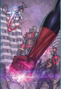
If Teen Titans is a comic book about kid superheroes running away from the adults who should be their mentors, Danger Club is about kid superheroes hanging on to their visions of absentee adults. Danger Club takes place in a superhero universe that’s mostly analogous to certain versions of the DCU. Three months ago, all of the adult superheroes on the planet went into outer space to take on an unknown threat. They left the sidekicks behind. The first issue of this new series begins in a derelict city (we don’t know if the whole world is like this or not) full of kid superheroes. A Lord of the Flies-style cult has arisen around Apollo, basically Superboy, who is raising an army of superkids of the powered variety. The kids with gimmicks like trick guns or magic wands seem to have flocked around Kid Vigilante, the Robin analog.
This book sure isn’t fucking around. This issue is basically a superpowered Battle Royale, with teen superheroes battling for supremacy in a ruined city. Reading this issue put me in the mind of something like The Warriors, where brutal rivalry, competition, and survival were entirely the points of the story. It’s a dirty, raw, and ultraviolent book, much like something Mark Millar would write.
And that’s sort of the problem. Millar’s most extreme work can be shocking, funny, and at times even fist-pumpingly awesome, but it’s always derivative to a fault. It’s like a magic show where you can appreciate the audacity of the spectacle, but you can still see every single wire. Danger Club shares this problem. While I was interested in the world and the base idea, I couldn’t help but spot the influences. It’s not that having influences is bad. All creative people have them, after all. But writer Landry Q. Walker just doesn’t manage to pull those influences together into something that feels like it has its own personality.
Danger Club definitely has a style, though. The art by Eric Jones just flows, and he really breathes life into all of the fights that this slender first issue is packed with. While I don’t really know anything about these characters beyond the basic premise, this book is at least a pure ride. The colors by Michael Drake also pop. It’s a great looking book, all around.
As violent as it is, it doesn’t quite feel as mean as something like some of Millar’s work. There’s still a friendliness here, but little story. As a first issue, this seems to be an aggressive setting of tone and premise. If future installments can flesh out the characters and story more, and push beyond the influences, this might turn out to be a series to keep an eye on. But on its own merits, I have to recommend this first issue with some degree of reservation. It looks damn good, but feels lacking as a chunk of story, like the climax to a run that doesn’t exist.
Rating: 


Out of a Possible 5 Stars
Supreme #63 (Image, $2.99)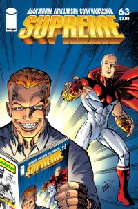
By Adam Prosser
How’s this for a strange-but-true fact for you: Rob Liefield is now one of the more influential comics creators of the past couple of decades.
Despite his, let’s face it, minimal talent and imagination, he was poised effectively at a crucial moment in comics history, becoming part of the team that split off from Marvel to form Image Comics. Regardless of the quality of their output, the fact that the Image crew were able to solidify the idea of creator-owned comics at a wildly successful company resulted in a much-needed sea change in the independent comics industry…one which, ironically enough, was then retarded by the boom-and-bust of the 90s, which was largely Image’s fault as well. But anyway! As uninspiring as Liefeld and company’s comics may have been, they were able to attract top-flight talent like Alan Moore to the table simply by virtue of their corporate policies. Moore had famously fled the superhero genre several years earlier due to what he saw as exploitative policies—I know it’s hard to remember all this, since it doesn’t come up much nowadays—but he’d never had a problem with the content, just the people who owned that content. A company like Image, which made no claim on a creator’s work and indeed didn’t seem to have much in the way of editorial oversight at all, was an ideal place for Moore to return to superheroes.
And Moore did in fact have something he wanted to say. After all, he’s the guy who’s regularly credited, or blamed, with the “grimmification” of superheroes in the wake of Watchmen and some of his other deconstructionist superhero epics. What too many lesser writers had taken away from Watchmen was that dark, brutally subversive stories were what superhero fans craved, and this had reached its pinnacle in Image’s output. Among them was a character Liefeld had conceived of as a “mean Superman”, initially introduced simply as a foil for Youngblood. But since any new character at Image was a virtual licence to print money, The Ivory Icon soon landed his own book, one that offered a Superman-style character doused in the cutting edge, grim ‘n’ gritty brand of nihilism that had become Image’s stock in trade. While the comic sold, it would be hard to argue that anyone had any particular attachment to it, which is presumably why Moore was allowed to revamp the character to his heart’s content.
Ever the iconoclast, Moore did the exact opposite of what everyone else was doing. His original, classic efforts in the realm of superhero comics had been aimed at adding sophistication and darkness—a genuinely “adult” sensibility—to superheroes, and that had initially carried with it a slightly snide attitude towards the juvenile and ridiculous nature of Golden and Silver Age stories. But Moore had never intended to destroy the genre, and indeed, he was somewhat horrified by the shape superhero stories had taken in the years since Watchmen. As cheesy and frequently stupid as classic comics can be, there was real wonder and imagination lurking in their pages as well, something that Moore felt had been lost in the rush to “realism” and darkness. If Moore was partly to blame for the current state of superheroes, maybe he could undo some of the damage.
Comics events like Crisis on Infinite Earths had stripped away a lot of the bizarre arcanum surrounding Superman, but now, working with a character who was a blatant ripoff of Superman to begin with, Moore went the exact opposite direction, turning an edgy, violent character into a paragon of old-fashioned heroism and giving him a rich, imaginative world to play in. Moore’s reverse engineering went so far as to give Supreme a backstory spanning the previous century that deliberately echoed Superman’s own, and which brought in his own versions of Lois Lane, Jimmy Olsen, Lex Luthor, Kryptonite, the Justice League, and so on and so on. These retro interludes were beautifully handled by Rick Veitch, but it wasn’t simply a wallow in nostalgia; despite a light, somewhat campy tone, Moore was trying to find ways to make these ideas work in the present without sacrificing their imaginative potential. The result made it clear that DC really shot themselves in the foot by not keeping Moore happy, as the next two year’s worth of stories on the title read like one of the best Superman runs ever, setting the stage for stuff like All-Star Superman and the general embrace of the medium’s history that swept through the comics industry for the next decade or so.
Ironically, the series was ended prematurely by the boom-and-bust that Image itself helped to promulgate, and the two planned final issues of the second year’s arc were never published. Moore had, however, written at least one of the two scripts, which now finally sees the light of day with this issue.
Supreme had always been interested in metacommentary, beginning with the first issue, where the title character wound up in a pocket dimension called The Supremacy while his reality was being “revised”, just like a comic book with a new writer on board. In this dimension were hundreds of alternate versions of himself, obviously meant as stand-ins for all the Superman pastiches comics have foisted on us over the years, but Supreme was unusual in that he had become aware of this place before he was revised. Later, Supreme came back to visit and even took along his comics-writer girlfriend, Diana Dane; likewise, his archnemesis Darius Dax found himself banished to his own negative version of the Supremacy, Daxia, surrounded by his own alternate-reality doppelgangers. Having escaped Daxia, Dax has now gotten wind of the Supremacy in a comic book Diana wrote—featuring another Superman stand-in, Omniman, whose adventures are now mirroring those of Supreme (and provide a nice tie-in to Moore’s original first issue). Yes, this comic is like an endless hall of meta-mirrors. Which is probably less of a problem than what Dax plans to unleash on the Supremacy…
I really can’t express what a delight it is to be able to read this comic. While Moore’s run didn’t end on a cliffhanger per se, it felt sadly unresolved, and the world he’d created was so much fun that even with a neat resolution I would have been begging for more. (In a sense, Moore agreed, since many of his ideas here carried over into his run on Tom Strong and the ABC line.) In some ways, it’s really just a brief ramp up to the big finale, which means that we only get a brief visit with Supreme, Diana, Dax, and Supreme’s sister Suprema, but it’s like spending time with old friends. And Moore still manages to work in some neat concepts, like the angel who believes the world of the story is fictional (and, well, she’s not wrong!) and Dax seducing an alternate version of Diana in Daxia.
Here, Moore’s final script provides a nice segue into Erik Larsen’s tenure on the book (Larsen provides the art for this issue with Cory Hamscher), and unlike the previous issue, this IS a cliffhanger. This means that what would have been Moore’s final issue will instead be written at least partially by Larsen, and I’m not 100% sure how I feel about that. But then, it’s pretty churlish to complain when a long lost chapter to a beloved series has just landed at my feet. That’s still one more issue than I had any right to expect.
Rating: 


Out of a Possible 5 Stars
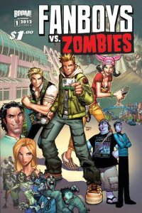 Fanboys vs. Zombies (Boom! Studios, $1.00)
By Bart Bishop
San Diego Comic con is my Mecca. I’ve wanted to go there for years, but until recently haven’t had the finances to plan a trip. Unfortunately, now that I’m in a place where it could be conceivable, the next two years of my life have been mapped out: I’m moving next summer, starting a PhD program, and getting married in the fall of 2013. Still, one can dream. As a result, when I heard about Fanboys vs. Zombies I was flooded with curiosity and trepidation. On the one hand, it’s set at Comic-Con, a rare setting for a piece of popular media (and timely, considering Morgan Spurlock’s documentary Comic-Con Episode Four: A Fan’s Hope will be released this Friday). On the other hand it’s yet another zombie-centric tale, a genre that has been on life support since its surge in popularity more than a decade ago.
What is the appeal of zombies? That is, more specifically the Romero zombie that started in 1968’s Night of the Living Dead. It’s obvious, and has been discussed to death: they’re us. More important, the real villains in a zombie story are the humans. The zombies are only a catalyst, a force of nature that could be anything from a hurricane to an alien invasion. The point is to put the humans into a conflict and heighten the stress, and see how they tear each other apart. Only so much can be done with the premise, so the key is to mix it up with different kinds of characters and different settings. Dawn of the Dead quantified the ultimate criticism of consumerism back in 1978, but something like Fanboys vs. Zombies has an opportunity to add new layers to the metaphor.
Fanboys vs. Zombies follows a formerly tight group of friends, calling themselves the Wrecking Crew, who have gone their separate ways. They agreed years ago that, no matter what, they would always meet at Comic-Con, on the same spot, every year. That pact, unfortunately for lead character Rob, has been broken. Rob is your typical failure-to-launch in these kinds of stories (shades of Shaun of the Dead), who stills works in a video store and lives with his mom. Burger, his pleasantly plump best friend, is some sort of unspecified industry type. Kyle works for Comic-Con as…some sort of organizer. Jenna and J-Mac aren’t dating. Kyle and Rob used to be close, but had a falling out over Jenna. Amanda is Kyle’s sister, and (maybe) an Asian stereotype. Amidst all the chaos, there’s a zombie outbreak and the former friends are forced to work together to survive!
It’s not as cliché as it sounds. Well, maybe it is, but in fact it’s kind of charming. I’m not familiar with writer Sam Humphries (he’s worked on, amongst other things, Ultimate Comics Ultimates (ugh, it’s hard to even type that)), but if he has anything it’s comic timing. This is a very funny book, and not because of the references. That was a bit irksome to me, especially the cutesy Internet speak and the fact that almost every line of dialogue had allusions to a geek property. Everything from Battlestar Galactica to Watchmen gets tossed out here, but what am I to expect? “Fanboy” is in the title, after all. The upside is that the story stands on its own, not relying on homage and in-jokes to tell a story. It’s clear, even to an outsider, what the significance of this event is and why hundreds of thousands of people flock to it, and a zombie threat speaks for itself.
The characters are painted broadly enough to be understandable and sympathetic, and what’s really important (for a first issue) is they have motivation. The dynamics of the relationships with the six main characters, both past and present, are clearly laid out and promise sitcom-esque hijinks. My only problem, however, is the presentation is a bit off. There may be a bit of self-loathing inherent in this argument, but this rowdy group of (ex) friends all come across as a bit too cool. From what I can construe they’re in their mid-twenties and are all well adjusted emotionally, and (except for maybe Burger) are attractive. It’s not that a geek can’t be attractive, but it reeks of wish-fulfillment (especially with the two female leads). If Rob is a good looking, articulate guy, why hasn’t he succeeded in life? He’s no Dante or Randall.
This brings me to the women. It’s a lot to hope for that a comic book, especially a comic book like this that is aimed at a young male demographic, would present women in a well-rounded fashion. In truth, the two female leads are quite the opposite: negative, lowest common denominator and positive female role model. Let’s start with Amanda, Kyle’s sister and fanboy wetdream. She has pink hair, is incredibly shapely, dresses like an Anime character, and speaks in broken English. I honestly couldn’t tell from the art, but her round face and sharp eyes imply that she’s Asian. Kyle has vague Asian features, but also looks like (with that haircut) he’s dressed up like Spock. So Amanda is a trash talking sex kitten, while Jenna is a confident, straight-forward, independent, entirely relatable woman. I’d wager Humphries created these two characters anticipating objections, having them balance each other.
I wish the same could be said of the art. The designs of the characters were done by Humberto Ramos, who is best known for his work on Spider-Man this last decade, and it shows. The characters are incredibly long and boxy, but also very contemporary. With the guys this means baggy jackets with pins and cargo pants, but with the women it means cutoff jean shirts and bare mid-drifts. I will give interior artist Jerry Gaylord credit, he doesn’t succumb to the “male gaze” that often, only portraying a character in a sexualized pose with Jenna’s first appearance, and in that instance she’s posing in a mock photo so it actually works as a bit of subtle subversion. Gaylord’s style is very Manga influenced, but it’s fun and energetic and always unique. From panel to panel he uses simple signifiers, from palm trees to escalators to Ninja Turtle plush dolls, to convey scene and scale. His facial expressions, as well, are varied from J-Mac’s goofy grin to Kyle’s intense glare.
Not the most original, but a lot of fun. There’s very little dwelling on the origin of the zombie threat, and I kind of love that the Wrecking Crew react to the zombies without ever questioning their existence. They’re geeks; they’ve been anticipating this their entire lives.
Rating: 


Out of a Possible 5 Stars
Daredevil 10.1 (Marvel, $2.99)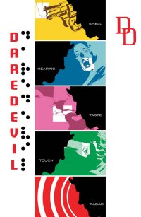
By Jeb D.
I haven’t really been paying a lot of attention to Marvel’s “Point One” titles, but since the release of this one coincides with Daredevil being nominated for an Eisner Award as the year’s best comic series, I figured it was as good a time as any to see what’s up.
Conceptually, Point One seems to me to be stuck in a familiar mindset: that the large audience for superhero films can be mined as a vast untapped source for potential new comics readers if you can give them a clean start or comfortable entry point. Mind you, there is virtually no evidence that this kind of thing succeeds on any measurable basis (and things aren’t any better at DC: what was that figure–that a whopping two percent of the buyers of the New 52 #1’s were not regular comics readers already?), but the efforts continue.
Even if we were to grant the possibility that this kind of marketing can make some inroads, somewhere, if done correctly, this seems an odd place to be trying it. Daredevil has recently been cleaned up, restarted, and refurbished to a point just short of outright reboot already; a quick glance at the numbering confirms that it’s been less than a year since Mark Waid took over the book, and his first six-issue arc has already been released in hardcover. For the past decade or so, Daredevil has been an urban playground for writers like Brian Bendis and Ed Brubaker, who brought their background in crime writing to push ol’ Hornhead into a bleak noir environment, which in the end was never going to be sustainable (noir stories are not typically characterized by long-term survival), followed by the confusing renumbering/renaming with the Shadowland/Black Panther crossover. Waid was an ideal choice to try to balance the scales, keeping the street-toughness that Bendis and Brubaker emphasized (along with some of the dangling plotlines and story threads), while restoring the rough and tumble roof-swinging fun at the heart of the character’s original appeal.
And there’s no question he’s managed that, while also juggling Matt’s legal skills, social conscience, and horndog tendencies. He’s also had great fun playing with the absurdly vast array of “secret” criminal organizations in the Marvel Universe, not quite putting his tongue all the way into his cheek, as Matt forces several of them into a standoff that leaves an uneasy status quo, and one with plenty of story possibilities going forward. Waid has also thought a good deal about the implications and possibilities in Matt’s powers, and those of his foes; he continues to ring new changes on these decades-old tropes, which is welcome. The result is unquestionably a good comic book series. Personally, though, I think there’s a fair amount of stuff going on at Marvel these days that’s a bit more interesting (including Fantastic Four, Journey Into Mystery, and Ultimate Spider-Man or WTF it’s actually called), and the Eisner nomination for Daredevil strikes me as more a “See? Superheroes can be intelligent and still be fun!” statement than anything else (or possibly a simple “Fuck you, Bendis!“), but whatever–I’m not big on awards for the arts anyway (I figure once you start trying to decide something is empirically “the best,” you’ve moved on from art to science).
Now as to the particular issue in question–well, as I say, it’s been less than a year since Waid’s first issue provided an ideal jumping-on point for new/lapsed readers; it’s also worth noting that the current Daredevil series already has what might be the most succinctly comprehensive intro page of any comic being published today: it’s practically a one-page “Point One” all by itself. The actual story in this issue has a bifurcated quality to it: we open with Matt visiting a client in prison, and Waid once more plays with the question of Matt’s ability to deny his identity as Daredevil (his “outing” having now become a hazy part of several news cycles ago, while some of his more extreme behavior gets chalked up to demonic intervention), introduces yet another challenge uniquely suited to bedevil Daredevil’s senses, and makes good use of Matt as both legal eagle and badass. But given that Daredevil is about to springboard off his recent faceoff with the Black Spectre into a new crossover with Spidey and The Punisher, Waid is required to squeeze some rather talky exposition into the last part of the book, so that the self-contained “introductory” story is deprived a few pages of breathing space it could really use.
I was interested to note that the Eisner nomination cited Waid’s co-creator on the book as artist Marcos Martin, even though he’s only done three of the first ten (well, ten-point-one, I guess) issues (along with the recurring introductory page). It’s nice that his brilliance is noted: he has a great feel for those wildly imaginative aspects of the early Marvel U that were defined less by Jack Kirby than by Steve Ditko, George Tuska, or Don Heck. Waid’s more or less regular partners, Paolo and Joe Rivera, are certainly no slouches, though, and their work on the snowbound issue #7 is among my favorite superhero art of recent years. Which is why my biggest beef with this issue is the art of Kori Pham. He seems to be trying to fit his blocky modern style into a 60s era “Make Mine Marvel” bag that feels like an awkward mix; the stodgy paneling and less than inspired color is certainly not the way to meet the issue’s goal of enticing new readers. Not helping the comparison is the fact that Martin’s cover for this issue is among his best.
Waid collectors and DD completists will want this, and anyone else picking it up will get at least a feel for why Daredevil is garnering so much praise these days, based on Waid’s tidy, imaginative scripting. But, honestly, both newbies and regulars can skip this one and not miss anything crucial.
Rating: 


Out of a Possible 5 Stars