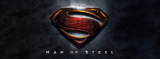
Warner Bros. has officially unveiled the new logo for Zack Snyder’s Superman re-reboot attempt The Man of Steel. Here it be (clicking the image will take you to the film’s official Facebook page):
Looks a tad more alien than what we’re used to, but the iconography is there. Correct me if I’m wrong, but I believe that Donner’s ’78 film was the first to interpret the symbol as not an “S” but rather a family crest for the House of El on Krypton (from which Supes was born out of). The origin of the symbol in comics has changed quite a bit, but Mark Waid’s 2004 series Superman: Birthright depicted the “S” as the Kryptonian symbol of hope.
A lot of work to justify a fucking “S”. But if I were a betting man I’d bet on the symbol’s origins representing the House of El.
Source: Warner Bros.
