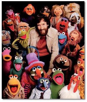
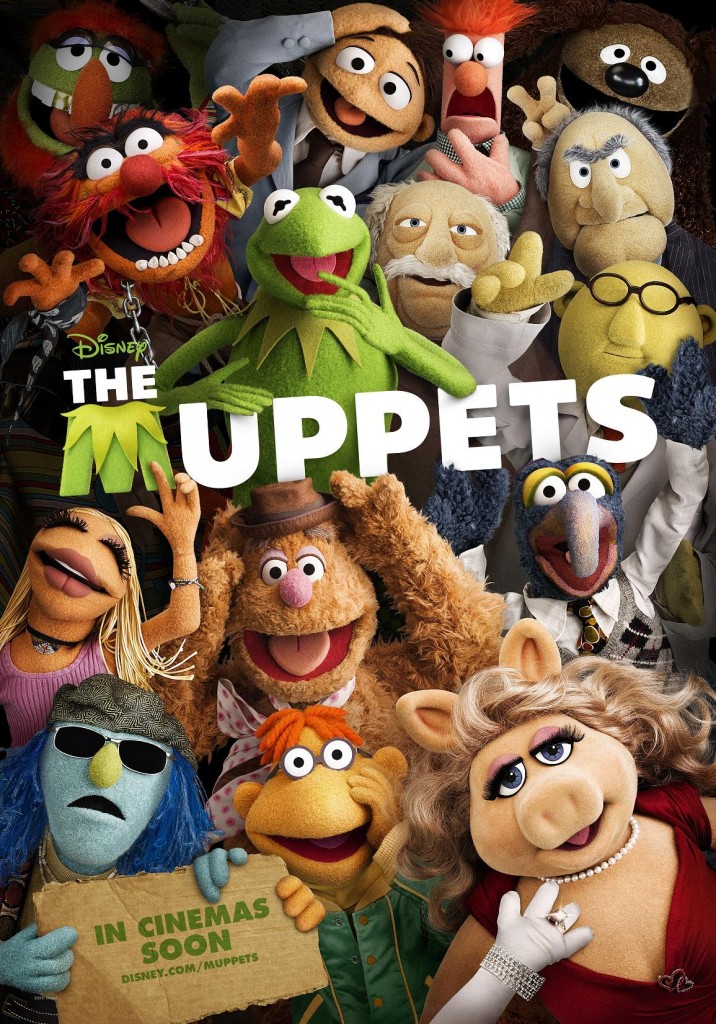
The first Muppets poster was a touch disconcerting, simply because one often forgets these are theoretically autonomously mobile beings. Without hand up ass though… they look a little odd. For the latest international design though, they’ve gone back to the tried-and-true Muppet collage…
It’s perfect, because these felt character are what you’re ultimately selling here. This kind of photo was a favorite of Henson’s, and he had many portraits with his characters taken in this style over the years.


So good on them for dropping the whole vaguely creepy runway trotting, as well keeping stupid humans out of it.
As an anecdotal rider to this poster piece, I thought I’d mention a cute moment I witnessed over the weekend. As I sat on ass playing with my phone in a theater lobby waiting for my Winnie The Pooh screening to start, I witnessed a family walk by a row of half a dozen upcoming kid’s movies. A little girl that couldn’t have been more than 4 or 5 lagged behind and stopped to look at the posters.

She put her hand on her hips and seemed to carefully observe each poster, until she came to the one on the far right, which caused her to jump up, exclaiming, “Mommy, look!” while running to point. I’m happy to say she chose the right poster to get excited about (obviously Brave wouldn’t have been bad either).
(via JoBlo)
Tweet, comment, or hit the forums!
