Dark, Disturbing “War-Fix” One of ‘06’s Best
By Mark Wheaton
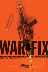 “March 2003 – the Iraqis were firing scuds at our base camp almost every night. You’d hear the sirens. You’d see the streak of light. You’d cower in your bunker, waiting and wondering…is this the end? You’re scared. You’re lonely and mad. But there’s more. You’re curious. You wonder…what’s it like to die? And can it really be any worse than this? Then you survive. You feel more alive than ever. And you think you’ve learned something. But in the back of your mind, you know you’re missing out. War’s about a lot of things, David, but mostly it’s about dying. Short of dying, you’ve never really known it. All you can do is watch.”
Joining Ted Rall’s “To Afghanistan and Back” and Joe Sacco’s “The Fixer”/“Safe Area: Gorazde,” writer David Axe and artist Steven Olexa launch “War-Fix” into the pantheon of great first-person conflict reporting in comics with a hauntingly disturbing look at one reporter’s descent into Iraq and the reasons why he felt he must go.
With Sacco’s first-person writing, the author often portrays himself in self-deprecating ways, making himself almost R. Crumb-ishly cartoony to show that there is still life and humor to be found even when surrounded by misery (nowhere more prevalent than in his troubling “Palestine”). David Axe goes in the opposite direction, portraying himself as a war junkie who doesn’t know he is one until he gets to combat and meets a Scottish reporter who, by all rights, should be long dead (“Twenty wars in 20 years? I’d say you’re a war addict,” an Army shrink tells the Scotsman). When Axe tries to get his editor interested in the story of his condition, it’s quickly rejected. They want objective war coverage, not personal pieces. So, we’re given “War-Fix.”
Several things make “War-Fix” stand out. First off, there’s something so compelling about participatory journalism when it comes to war coverage. When then-just-promoted ABC News anchor Bob Woodruff was gravely injured in
On top of that, the unflinching art – not overly dramatic, but often torturous – comes from actual photographs taken by Axe and sent home to Olexa, who worked on this project as Axe was in
“War-Fix” is a brilliant, challenging text and once again shows the level of artistry that can be found in comic books these days. While certain documentaries (“Gunner Palace,” for instance) have tackled the war in ways the television news can’t or won’t, the combination of the art and the writing of “War-Fix” shines a thoughtful and emotional light on the current conflict (and other) like few are able to do.
[As a side note, if this book appeals to you, this reviewer would highly recommend the book “The Bang-Bang Club: Snapshots of a Hidden War” by Greg Marinovich and Joao Silva concerning the ANC vs. Inkatha violence that followed the fall of apartheid in South Africa]
RATING: 
Strong Premise and Sense of Intrigue Color Mini-Series “Talent”
By Sean Fahey
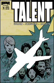 Boom! Studios latest mini-series Talent is promoted as being in the spirit of ABC’s “Lost,” but I’m not exactly sure why. About all the two have in common (at least at this point) is a plane crash and a sense of intrigue. The similarities stop there, as Talent focuses on the sole survivor of the crash – Nicholas Dane – who finds that he has inexplicably absorbed, and can now mimic, the various skills and attributes of all the other passengers. Toss in a secret society that is trying to rub Dane out and you’ve got one of hell of a premise – a premise, though, that doesn’t sound anything like “Lost.” Then again, I’m not in marketing, and I guess you need to hook people in. Still, I think this premise is strong enough without any hooks.
Thematically, Talent seems to have more in common with “Memento” than it does “Lost” in that it raises some interesting questions about identity – what makes us who we are. Not only has Dane absorbed the abilities of the numerous passengers, who range from housewives to a professional boxer, but he has also absorbed their memories and (to a degree) their emotional baggage. One of the better scenes in Talent # 1 is when Dane feels compelled to call the husband of one of the deceased passengers and (as a kind of spiritual proxy for the deceased passenger) apologize for walking out on him prior to the fateful flight. It’s interesting because by the end of this first issue, we know close to nothing about Nicholas Dane. Does he even have his own identity anymore, or is he now just a vessel – an amalgamation of dozens and dozens of other people and other peoples’ memories?
Writers Christopher Golden and Tom Sniegoski manage to really draw the reader in. Aside from establishing an interesting high concept, the writers also convey a constant sense of tension and intrigue throughout the story, as Dane is pursued by a mysterious secret society of which at least one of the dead passengers may have been a member of. The makings of a good thriller are certainly there, and I’m hooked, baby!
In addition to some strong writing, Talent # 1 is also one of the sharper looking books that Boom! Studios has published. Paul Azaceta’s crisp and angular visual aesthetic is very similar to that of J.P. Leon (The Wintermen) and Tommy Lee Edwards (The Question), but Azaceta also manages to add his own signature touch. More importantly, Azaceta is a skilled visual storyteller – very apt at moving the plot forward and conveying emotion.
All things considered, Talent # 1 is a solid book.
RATING: 
Worth the trip into the rabbit hole: Wonderland #1
By Graig
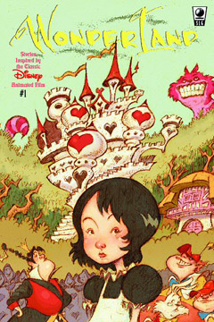 Say what you will about the corporate machine that is Disney, you still have to admit that when they do good, they do real good. This publishing deal with Slave Labor, for instance, falls into the “real good” category. Even if the other books that Slave Labor has put together from Disney properties like
In the interests of full disclosure, I have to admit that I havn’t watched the Alice cartoon since childhood, but at the same time, the bulk of the story, if not the finer details, still remain in my head, and I can clearly picture scenes like I watched them yesterday. I have read Alice’s Adventures In Wonderland and Through The Looking Glass, quite recently in fact, but again, the fine points are lost in my cognitive ether. That said, although this first issue of Wonderland may present a new extension to the mythos, it certainly fits in quite nicely.
Picking up almost immediately after the little blonde haired girl’s departure, the
Wonderland introduces a new character into the fold, Mary Ann, who is the Rabbit’s housekeeper (a little research finds that the oft-confused Rabbit would frequently call
Writer Tommy Kovac professes to be somewhat of an
While the story of Wonderland may integrate nicely with the Disney canon, it’s Sonny Liew’s visuals that help define and distinguish Slave Labor’s expansion. Liew takes some inspiration from the cartoon, and stays true to character and scene design, but the most impressive thing about this book is in his interpretation and flourishes. Liew completely bypasses the inking stage of traditional comic books, and jumps straight from pencils to colors, giving the book its own exciting texture. The colors are muted compared to traditional cel animation, but overall the effect is unique and stunning. A must read for comics and cartoon fans, young and old alike.
RATING: 
Corben’s back with mo’ Poe in Haunt of Horror #1
By Jeb D.
 By an odd coincidence, this is the second comic I’ve reviewed recently based on works of Edgar Allen Poe. The first, Dawn Brown’s Ravenous, was an attempt to build a modern serial-killer tale around the plots and themes of several of Poe’s works. Haunt of Horror takes a different approach, with writer/artist Rich Corben and longtime collaborator/cowriter Rich Margopoulous offering three separate adaptations of Poe’s poems. It’s a less original approach than Ravenous, but I think it plays better to the creators’ strengths.
This 3-issue miniseries (prestige stock, no ads) is something of a sequel to Corben and Margopoulous’ previous collection from the 80’s, featuring Poe tales like “Fall of the House of Usher.” Turning poems, rather than short stories, into comics is tricky: literalizing what’s meant to be evocative can leave the reader with a neither-fish-nor-fowl experience. Knowing those limitations, Corben tends to place the poetry at the service of the creep-out, and generally makes it work.
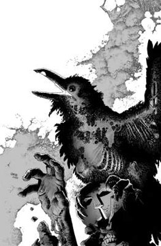
The first story, “The Raven” is an odd retelling of the famous poem, in the kind of vernacular language that is often used to make works like Shakespeare or the Bible easier for modern readers to understand. It’s sinister enough, and would be more effective for the reader who doesn’t miss the gorgeously doomed poetry of the original. Corben gives the nameless narrator a visual journey from curiosity to fear to the ultimate in hopelessness, a journey that’s faithful to Poe’s intent, if not his specifics.
“The Sleeper” takes a slightly different approach, with the actual poem presented as narrative panels for Corben’s nightmarish vision of ghouls and ghosts. As is the case throughout the book, Corben literalizes where Poe intimates. This approach could very easily lead to a cheesy “by-the-numbers” predictability, and in lesser artistic hands than Corben’s, it might well have done so. It’s bracing to see his work in black and white, too, something he’s done surprisingly rarely. Even when he goes for the gross-out, he never loses the overall feeling of dread.
The book wraps with “The Conqueror Worm,” where Corben and Rick (“American Splendor”) Dahl riff on the poem with a hoary post-apocalyptic story that’s effective for all of its predictability. It’s reminiscent of the AIP films of the 60’s, where Vincent Price and his cronies would borrow little more than a title from Poe as they constructed their own gruesome entertainments.
Visually, it almost goes without saying that there’s nothing else quite like this book out there today. Corben’s at the top of his game, and no one uses a deeper, more menacing black, or finds more ways to shade levels of gray. The role of writer isn’t where Corben’s strengths lie, and there’s a “lowest common denominator” feel to some of this stuff. But artistically, this is one of the greats of the medium let loose to try and scare the bejeezus out of us, and more often that not, he does just that.
Like Brown’s Ravenous, Marvel has here included the original Poe texts. What they haven’t included is any explanation of why they decided to try something so unorthodox for them in the first place (if this came out through Vertigo you wouldn’t think twice), particularly considering that the MAX imprint barely exists anymore. If they’re willing to go the distance with something so unusual, that’s great, but their recent track record with out-of-the-mainstream material hasn’t exactly been stellar. Since Amazon’s already listing the hardcover of this title, I guess we can at least expect all three issues to come out. These days, that’s not something to take for granted.
RATING: 
Blood ‘n’ Guts ‘n’ Then Some in Moon Knight #2
By Jeb D.
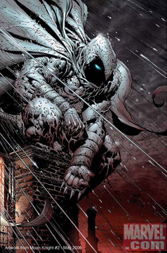 I’ve never been a big fan of David Finch’s art, or the "90’s Image" school that he seems to fit into: it feels too big and busy to me, full of pointless crosshatching, bland scowling faces, and grossly exaggerated musculature. I don’t begrudge him his success—there’s clearly plenty of people who disagree with me—but his work on established characters like the Avengers or X-Men has left me pretty cold.
Surprisingly, though, the relaunched Moon Knight is almost perfectly suited to Finch’s style. One of the challenges to the character has always been that there is no practical reason for a "dark avenger of the night" to run around dressed in white, and while writer Charlie Huston has given an “explanation” (religious duty), Finch’s Moon Knight is so preposterously larger than life that you barely notice color of the costume. He actually makes white seem nearly as dark as black, and Moon Knight seems less a big guy in a suit than some freak force of nature.
Moon Knight #2 includes what is probably the most vicious fight scene I’ve seen outside a Garth Ennis comic in quite some time. It doesn’t feature the sweeping gestures and roundhouse punches that one associates with an artist like Finch– instead, it’s a close-in, down and dirty affair, all grit and sweat and blood– lots and lots of blood, as Moon Knight remembers his last great showdown with his enemy Bushman. The book is marked “Parental Advisory”, but it frankly looks like something that should come out through Marvel’s MAX line.
As with issue #1, the big action set piece is followed with more of Huston bringing us up to speed on just how Moon Knight came to his present miserable situation. Huston’s got a humanity that’s unusual in a writer of such brutal fiction (in his first two novels, his tough-guy protagonist remains devoted to his parents), and he’s working that here, too. Readers don’t need to know anything about Moon Knight’s convoluted history to appreciate the sight of a hero come to what seems a last desperate pass, and readers who do know the character will be intrigued to see the old plotlines coming together as the issue draws to a close with a visit from an “old friend.”
Tough-guy superheroics have been almost their own subgenre since Dark Knight Returns, and too often that approach feels poorly grafted onto characters that ought to know better (ironically, the current All Star Batman series is a perfect example). Moon Knight is a case where nothing about the approach feels forced, and where each bloody punch is earned.
RATING: 
![]()

The Acme Novelty Library # 16
By
 While many comic books and strips among the cognoscenti are spoken about and thought of as Art (capital "A"), virtually none have reached that status among critics of the studio arts, or as called by some, the fine arts. Krazy Kat comes to mind as a comic strip that has made the transition, but even though artists like Roy Lichtenstein have enlarged panels into aesthetic exercises accepted into galleries and museums, until recently no comic book could be included. Chris Ware, the creator of the Acme Comic Library series has managed to transcend the label of "comic book artist". Any of his books should convince the harshest critic of this, but proof positive is his invitation to be part of the last Whitney Biennial, a most impressive achievement.
This latest addition is a hardbound volume concerned entirely with one of his more depressed and depressing characters Rusty Brown. As these books have progressed we have followed the growth of Rusty from a lonely child to a lonely adult, and the peripheral details of those persons he comes into contact with. Here in the main panels we see the child Rusty suffering through an average day of agony in school, the same school his father suffers in equally, if differently, as a teacher. Simultaneously, across the bottom of each page, reflecting old comic strips, runs a related but separate story that eventually intersects the main story, in a complex weaving and dancing of tales and time lines.
The last eight pages and endpaper are panel stories unique to Chris Ware. A layered and subtle combination of images and panel upon panel constructions that allow a story to be told but only if the reader applies himself to a translation and interpretation. These are works of genius. The design of all the books in this series are handsome, clever, and have the depth that great art has. These are clearly the work of a mature artist, a great writer, a true credit to the art form.
If there is a flaw it is the pessimistic viewpoint of life that permeates Rusty’s life. If it reflects Mr. Ware’s true outlook, it can only be hoped that this outlet renews his ability to continue so that we may all be graced with work of this quality far into the future. A one page autobiographical aside after the main story gives us hope that this is so.
RATING: 
50 Reasons To Stop Sketching At Conventions
(One Horse Leadworks)
By Graig
 If you’ve been regularly reading mainstream comics for the past 10 years or so, you’ve no doubt come across Stuart Immonen’s work at one time or another, chances are you quite liked his work, if you’re not already a fan. He’s worked on everything from X-Men to Superman, Fantastic Four to Legion of Superheroes. Oh and a little thing with Warren Ellis called Nextwave.
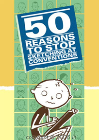
On the side, Immonen publishes a series of webcomics (www.immonen.ca) from which spawned this humour collection. The title of the book is self-explanatory, I suppose, but essentially the compilation is 50 one-page strips (plus an 7-page introduction) that offer a behind-the-table look at convention life. Immonen details his experiences with con-goers but is careful to note in his introduction that these 50 bad experiences are the exceptions to norm. At the same time, each one is punctuated humorously enough to wonder why he wouldn’t stop doing it all together. Although he does attempt it, Immonen can’t go far enough to be a curmudgeon, but instead appears as a sincere and kind man who gets pulled to the end of his tether on occasion.
Immonen’s self-portrait cartooning is stripped down and highly simplified, like Charles Schulz meets James Kolchaka, although not quite as practiced, still retaining a lot of rough edges. But for a change, the art here isn’t the point, but rather the artist is. It’s a cute, funny, and quick read, but a nice how-not-to-act primer for fanboys and fangirls heading out to a con.
RATING: 
The Abandoned
(TokyoPop)
By Sean Fahey
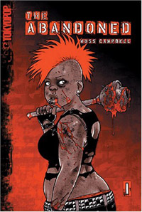 There’s a ton of zombie fiction out there these days. Like some kind of bizarre virus, the zombie fiction “craze” just continues to spread across bookshelves causing mass hysteria among publisher after publisher until…Anyways, there’s a lot of it. So, anything new that comes along in this genre has to work hard to distinguish itself from the wealth of material that’s already available (and just keeps coming). One tried and true way to do this is to use the “zombie concept” as a vehicle from something else, whether that’s a different kind of story or some form of social commentary. TokyoPop’s The Abandoned is certainly in that vein, but unfortunately it fails to fully capitalize on its initial premise and themes.
Similar in some respects to the cult classic movie “Bubba Ho-Tep,” The Abandoned touches on the way modern society generally just shelves away and forgets its senior citizens when they become too much of a “hassle” to deal with. The story follows Rylie, a punk-rock girl that splits her time between working at the horror-themed ice cream parlor (“I, Scream”) and volunteering at the local retirement home. In these early chapters, writer / artist Ross Campbell does a good job of establishing the tone and themes of the story. No one really cares about these old people. They smell, drool, and shift around mindlessly. They are forgotten, unloved and – as the title suggests – abandoned. It’s an important message, and one that needs to be talked about more as the Baby Boomers get older. But when the apocalyptic event that turns old people into zombies hits (about a third of the way through), The Abandoned shifts almost completely to a very familiar zombie siege story (ala “Night of the Living Dead”) as Rylie and her companions spend the bulk of the story holed up in an old house. Save for an occasion crack about how disgusting “they” look and sound, the message and generational themes that were established early on are…well, they’re abandoned. (That’s right, I went there.)
To be fair,
Interestingly enough though, if you’re looking for some relentless comic book gore,
RATING: 
The Celebrated Cases of Dick Tracy 1931 – 1951
(Chelsea House)
By
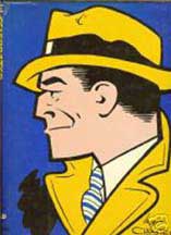 Deep in the American psyche there are qualities, desires, ambitions, and ethos that have been latched onto by creators and carefully crafted into characters so resonate that the public in general have accepted them as icons. Chester Gould did this with Dick Tracy in 1931. Still an active comic strip over seventy years later, this is the personification of the relentless champion of justice. Faced with the most hideous lineup of villains ever created, continually standing between the innocent and the guilty, he faces horrible death with each criminal.
It is difficult to imagine that Batman was not created with Dick Tracy in mind; dark, without mercy, hard men with hard attitudes. One difference is that the evildoers that run afoul of
This is the best one volume collection anyone has put together so far.
RATING: 
The Fate Of The Artist
(firstsecond books)
by Graig
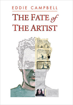 Though I’ve found it difficult to let go of my childhood fascination with spandex tights and superpowers, I’ve long since grown extremely fond of the comics medium and its capabilities for storytelling. While I still do my weekly Wednesday jaunt to the local dealer for bright four-color action, I also make great pains to find books that are unique or at least different from the standard mainstream. I wish I could say it’s easy to do, but it’s often a crapshoot, since what looks interesting can turn out to be boring, pretentious or too abstract. At the same time, some books can look mundane or unskilled, and turn out to be some of the most entertaining, thought provoking or challenging literature you’ll read.
With The Fate of the Artist, one of the first releases from new publisher firstsecond books, Eddie Campbell has delivered an intriguingly original visual work, but also provides a multi-layered narrative that can be interpreted, analysed and enjoyed in so many different ways.
In one aspect Fate is another self-exploratory effort like