Every news site loves to cover cool movie-related infographics, and we all love seeing them. I’ve run some columns on them before, and even showcased a particularly interesting approach that let you see an entire film in one image. Well all of that has now been put to shame by one guy, Frederic Brodbeck, who has created a system and series of processes that break down a film and generate truly awesome informational graphics.
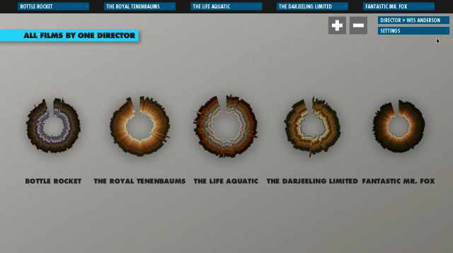
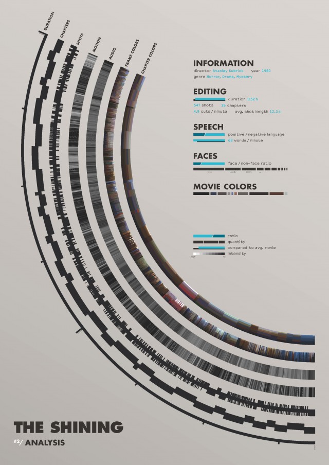
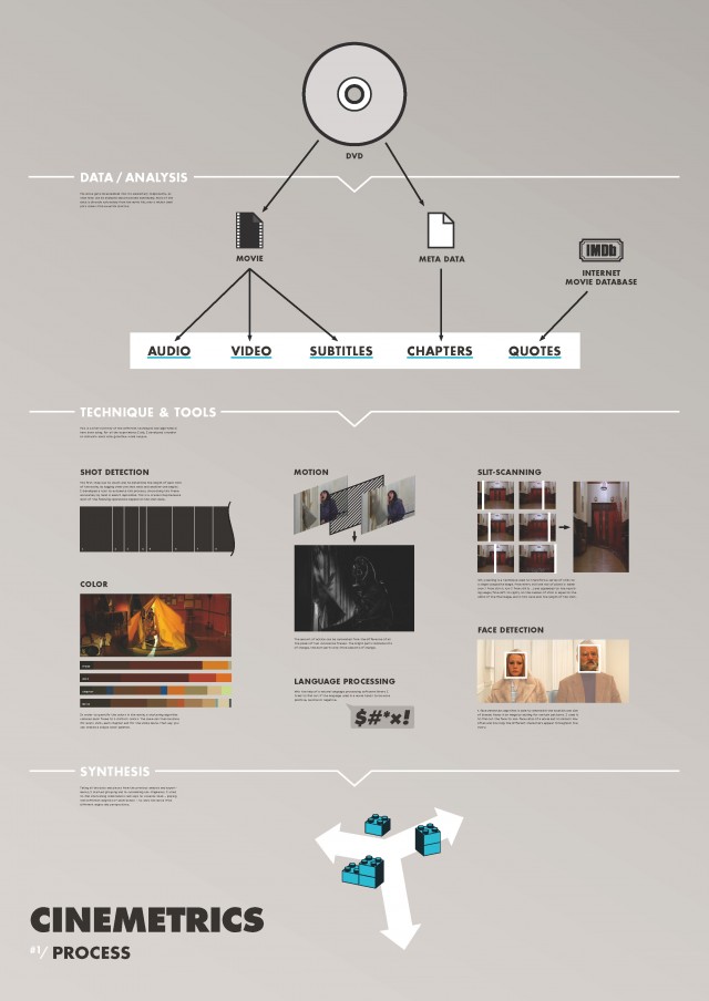
Called Cinemetrics, it essentially breaks down films into 10-shot chunks, analyzing the pieces for motion, color, and more while simultaneously cross-referencing them with quote collections, chapter, and sub-title date. The result is a series of infographics, including an interactive motion “fingerprint” of the film that gives you insight into the dynamics of the film’s color palette and visual motion. Take a look at the demo video…
Unfortunately this is not a system that allows you to just pick a movie and have it quickly spat out, even though all of the code Brodbeck generated is public. As it is, right now there seems to simply be the explanation website, and a few really cool examples shown in the video. I’m hoping for a more accessible and easily used interface some day, hopefully soon. This guy’s application of stunning design sensibilities to the world of film is quite amazing.


Have a look at the site and let me know what you think. What movies would you like to see processed in this manner? twitter, boards, comments are all good…
(via NoFilmSchool)