 BUY IT AT AMAZON: CLICK HERE!
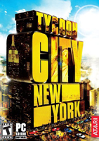
PLATFORM: PC
ESRB RATING: T
DEVELOPER: Red Dream
PUBLISHER: Atari
Walk into
any department store’s electronics section and you can see for yourself that
tycoon games are a dime a dozen, or would be if publishers would charge
anything less than thirty bucks for their stuff. What, if anything, sets Tycoon
City – New York apart from the glut? For one thing, it’s published by
Atari, who also brought gamers the venerable Rollercoaster Tycoon series.
For another, it’s set in a real-ish location and tries to capture the flavor of
York City
ship in a bottle, in that it doesn’t really
mirror the Big Apple unless you squint, but it does come with a depth of
gameplay — and consequent frustration — that trumps most of its spiritual
siblings.
The Pitch
You play
as a business tycoon in a blank slate of
as your influence grows. In your pursuit of McDuck-volumes of cash, you manage
apartment buildings, create restaurants, parks, and services, and do a little
site beautification — y’know, just to stretch your boundaries.
As your
empire expands, you are free to shape the economy of the city as you see fit.
But your success as a businessman, in true Marxist fashion, rests on the
proletariat. You have to listen to what the little people want, or you’ll find
yourself with a dozen high-class cinemas, playing to empty seats, or Internet
cafes where your elderly tenants would prefer a shuffleboard court.

The Play
The game
begins with an optional tutorial, which is nice in that it is given by a lively
and fully animated character, rather than a disembodied voice. This character
runs you through the basics of moving your view around the city, and your first
couple of build options. Then he basically says, "That’s the introduction.
Have fun figuring out the rest on your own!"
Fuck, you
might say, as I did, as you’re then thrown headfirst into a city full of
virtual people that are as demanding as they are sleep-deprived. This opening
tutorial is pretty much worthless. The remainder of the game has tool-tips and
hint boxes that can be toggled on in the options menu, but you still have the
impression that you’ve gone right into the post-doctoral course without the
prerequisites.
The
number of options you’re confronted with initially is daunting. There are a
wide number of context-sensitive buildings, upgrades, menus, reports, and
records reached by various ways through Byzantine menus. The game window
quickly fills up with slide-down boxes and tiny buttons featuring icons that
make very little sense without a key. The layout of the menus becomes
intuitive, after a bit of training your intuition, but the window becomes
cramped too easily and loses the concrete grounding that might be necessary for
some players to remain involved in the play.
You can
play the game either in a sandbox mode, where anything goes and you just try to
maintain a positive cash balance while fighting off rival tycoons, or in a
goal-based mode. In the latter, you progress through the boroughs by
accomplishing what the game terms "opportunities" and "prize
opportunities." These are similar in design to the desires/needs of The
Sims in that they grant the player tangible bonuses (money, or item
rewards) when they are achieved, in addition to propelling the scenarios forward.
You receive reports of opportunities from the man-or-woman-on-the-street, and
get a handy checklist of things to achieve before the opportunity can be
considered complete.
There’s a
slight balancing problem in the execution of these opportunities. If you
concentrate on moving the game forward — which is the only way it has any
momentum — then you often have to focus on opportunities. These opportunities
have many different qualifications for completion, and so you end up spending a
lot of time on them. While you do so, you necessarily neglect the evolution of
your other business ventures. I ended up screwing myself more than once in
trying to manage my time. Vice-versa applies. It’s good to have a carrot on a
stick to keep the player interested, but it’s better to keep the carrot at
least visible despite the presence of
other attractions.

Time
management becomes a serious issue when there are so many individual,
disconnected opportunities vying for your attention. Making it even more
difficult is the developer’s decision to disallow gameplay while paused. It’s a
grand tradition of these type of games to allow inspection of the playing field
while the world’s on hold, but Tycoon City locks you down onto your
current view. You can view status menus of whatever building you have selected,
but you can’t browse around to other places and focus your chi appropriately.
Forcing you to make your choices while time presses forward is a challenge that
could easily be a positive or a negative for a player, but I won’t hesitate to
say that it takes some of the strategy out of the game. In fact, Tycoon
City – New York is the twitchiest game of its type I’ve ever played.
Adding to
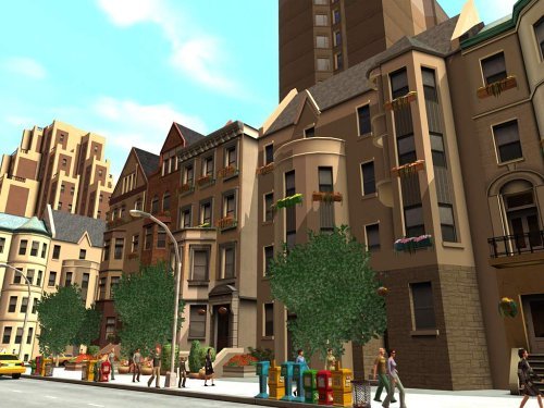
the confusion/frustration side of things is the art design. It’s
more character than the cookie-cutter architecture featured here. Not only does
it make the world seem dull and a bit lifeless, but it also makes navigating a
chore, since it’s hard to tell which apartment complex was the one with the
cranky elderly man who needed coffee, and which was the art-school hangout that
wanted a paint supply store nearby.
I also
encountered a minor but annoying glitch in which I would select a building, and
see the stats for that building, but the world view would be taken to a
completely different block. This made it difficult to add upgrades to my
building of choice without zooming out the view, painstakingly finding the
right place, and manually moving the view in again. This happened more
frequently than could reasonably be ignored.

The Replay
So,
there’s lots of detail in the micromanagement, edging on too much. It’s the
sort of thing you’d expect would work well with replayability. Sadly, the tasks
are so repetitive, with so little variation, that after only fifteen minutes of
concentrated play you start getting the sensation that you’re replaying. The
opportunities and prize opportunities don’t offer any new surprises once you’re
a couple hours in, and so the motivation to continue dwindles, except for that
faint glimmer of a challenge in surviving in the big city against your
competitors.
Playing
to a successful completion of the challenge mode, conquering all the
opportunities the city has to offer, will take somewhere around a dozen hours
if played to win. After that, you have the sandbox mode, which lacks any of the
momentum of the challenge mode, but does dump as many items, buildings, and details on you as you can handle.
The Presentation
The music
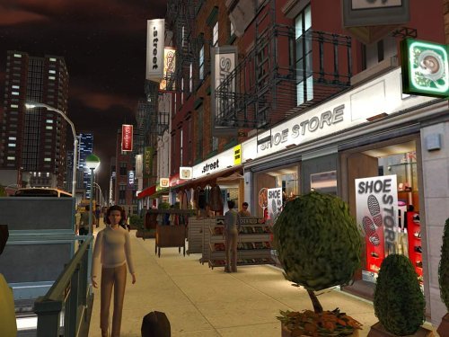
and sound design are excellent, creating a sensation of city life that the
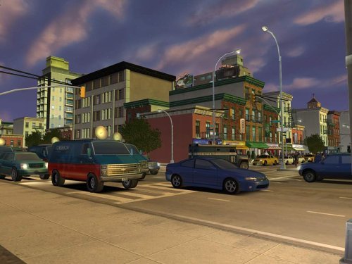
graphics fail to live up to. Even on the highest graphical settings, the draw
distance isn’t impressive, and whatever borough you’re working in looks isolated
from the rest of the world, a little island in a void. The detail work on the buildings is much more impressive, though stylized and far too clean. Where’s the grit? Nowhere, my friend. Grit don’t make money.
There
were a lot of voices recorded for the vox
populi, and, while each and every character is a hard-set cliché, it’s a
nice bonus to have and, again, contributes to the setting of the game
immeasurably.
The Verdict
Tycoon City – New
York isn’t as
friendly to new players as the Rollercoaster games, nor as easy to
manage as Microsoft’s Zoo Tycoon series. What it offers,
instead, is a wealth of detail, a micro-manager’s daydream. As a result, the
gameplay is deep, but unfortunately repetitive. It’s no Sim City 2000; it’s much more Donald Trump’s Day Planner.