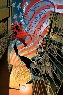
 Batman, Inc. #4 (DC, $2.99)
By Adam Prosser
One of the reasons I think superheroes have lasted for as long as they have is that they can mean so many different things to so many different people. They’re an incredibly flexible storytelling device, and comic writers are always finding new ways to exploit them as a metaphor for some aspect of modern life.
One of the more resonant ideas in comics right now is the idea of a superhero as a corporate mascot or a brand extension. Grant Morrison didn’t invent this idea—not even the idea of making this explicit within the comics themselves—but in linking it to Batman, he’s found perhaps the most successful realization of the concept. Batman, after all, has always been a natural fit with the idea of corporate superheroics—aside from the obvious fact that he’s already the head of a multinational corporation, there’s the fact that Batman’s been “building the brand” by spinning off sidekicks for years now, as this current issue of Batman, Inc. makes clear.
The issue features what was apparently supposed to be a crossover with the much-delayed, much-anticipated “Batwoman” comic by J. H. Williams. Her presence on the cover confused more than a few people, though, since, when last we left Batman, he was caught in a deathtrap in Argentina with El Gaucho, and it was hard to see how the two plot strands were going to mesh within 20 pages. As it turns out, Batwoman doesn’t actually meet Batman in this issue, and yet the two parallel storylines are connected thematically by the appearance of Kathy Kane, the original, Silver Age, and now dead Batwoman. The modern, Kate Kane Batwoman has a seeming encounter with her (and a flashback to her original adventures creates a third narrative strand for this issue), and there’s a revelation about El Gaucho’s relationship to her that puts him at odds with Batman. In the past, I’ve found Grant Morrison to be occasionally guilty of over-compressing storylines to the point of murkiness—it’s probably his biggest failing as a writer—but here, he juggles the three storylines masterfully, keeping everything clear and distinct even while cutting back and forth, and having Batwoman impact the resolution of last issue’s cliffhanger logically.
As for Chris Burnham’s art, I predict it may be controversial, but I personally loved it. Burnham’s another of these sketchy, expressive, indie-style artists like Frank Quitely, Rafael Grampa or Shaky Kane (the flashbacks in this book, which of course evoke classic Silver Age art but add a modern flavour, remind me a lot of Kane’s recent Bulletproof Coffin series) who always feel like they’re putting quotation marks around the superheroes they draw. There’s something kind of skeezy and dark about his artwork, no matter how trippy and psychedelic the subject matter, which works perfectly for a Batman book, at least as far as I’m concerned.
I think the highest praise I can give this issue is that Batwoman’s appearance here doesn’t feel at all shoehorned-in. It’s possible that she’s in here simply to keep fan anticipation alive for the upcoming series—but that’s a noble goal, as far as I’m concerned, and whatever the motives, it fits the story. After all, in a book about how Batman is franchising himself, what’s more logical than jumping back to the original “Bat-groupie”?
Rating: 


Out of a Possible 5 Stars
Neonomicon #1-4 (Avatar, $3.99)![]()
By Adam Prosser
Any writer worth his or her salt is going to use their fiction to work out personal issues. Some would argue that that’s all writing is, translating your feelings and experiences into a slightly altered form and putting it out there as a fictional story—whether it’s a slightly tweaked autobiography or a purely fantastic tale, a story isn’t worth much if it doesn’t have some of its author in it.
Given how Alan Moore’s been feeling about his work in the comics industry lately, and along with the fact that it’s a Lovecraftian tale, you can probably guess how dark and bleak his latest, Neonomicon, ends up being. Except…does it, really? In a perverse way, I thought I detected a note of hope in there, if not for the characters than for their author.
Neonomicon is a de facto sequel to a short story Alan Moore wrote a while back, The Courtyard, which was then turned into a comic by Avatar. Lovecraft has clearly been a fascination of Moore’s for his entire career, and these two comics seem to be the culmination of that, exploring the Cthulhu mythos in Moore’s typical meta style. The story concerns a troubled FBI agent, Merill Brears, who’s drawn into the investigation around a series of killings that involve Aldo Sax, the now insane and institutionalized protagonist of The Courtyard. Her investigations lead to her discovery that Lovecraft’s mythos is real, and then subject her to some utterly horrific experiences—Moore is here plunging into darkness in a way he hasn’t since From Hell, and it seems to be a metaphor for the stuff he’s gone through in the last decade or so.
What’s surprising here is the way the protagonist ends up not as a broken shell of a human being—there’s even a very twisted form of empowerment going on—and indeed, for a story that went such unpleasant places at the midpoint, the ending is strangely detached and philosophical. While the typical note of cosmic horror is being struck, it’s somehow unconvincing; I couldn’t avoid the feeling that Moore is embracing a newfound sense of freedom. Even when a character discusses the forthcoming end of the world, the exact phrase used is “it’s the end, and the beginning”. The world that’s really ending here seems to be the world of corporate comics and movies that’s bedevilled Moore for so long—it’s a one-man apocalypse, with Moore taking the side of the Great Old Ones. So it’s no surprise that as a horror story, this ends up feeling more than a little conflicted.
Rating: 


Out of a Possible 5 Stars
Captain America #615.1 (Marvel Comics $2.99)
Captain America: Man Out Of Time #5 (of 5)($3.99)
Captain America and Batroc The Leaper #1 ($3.99)
by Graig Kent
 With the new major motion picture coming out in a few short months, Marvel is cranking out what must be a record number of titles featuring Captain America leading into it, however I should point out that perhaps the most iconic of Marvel’s stable of heroes still only holds a single ongoing title to his name, 600+ issues strong.
This week, five books held the name “Captain America” in their title, two of which were reprints (one of the first issue of the Captain America ongoing comic, the other a $1 edition of the first issue of the “Captain America: Reborn” mini-series), another the latest in a series of one-shots, plus the final issue of a tremendous mini-series, and a “point one” edition of the ongoing.
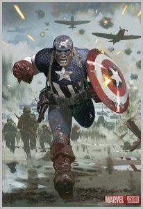
The Marvel “point one” books are intended to be a great jumping on point for new readers, and I’m not sure if Captain America #615.1 truly represents that, especially given where the last issue of the series left off. A new reader, unfamiliar with the death of Steve Rogers, his replacement by Bucky Barnes, and the subsequent resurrection of Steve Rogers might not get the full mileage out of this issue as perhaps the “point one” conceit would intone. This specific issue having a knowledge of recent events within the series might not be necessary, but stepping into the next issue may prove tremendously confusing unless more stepping stones are laid.
Outside of that quibble, however, it’s a solid one-off issue for the series. Steve Rogers: Agent of SHIELD learns of a new super-soldier staking claim to the mantle of Captain America in the wake of Bucky Barnes’ trial. But Steve isn’t just about to let anyone wear the uniform and he puts a tail on the new Cap, just in time to see him get kidnapped by agents of A.I.M. and improvise a rescue mission.
Series writer Ed Brubaker, now in his sixth year of his renaissance run on Cap, provides a lightweight, but character-focussed stand-alone issue that serves to tease Steve Rogers’ return to the red, white and blue. Artist Mitch Breitweiser has worked on Steve Rogers over two recent mini-series (“Patriot” and “The Chosen”) and he seems incredibly at ease with the character. His ink lines have gotten looser with his characters, bearing more than a passing resemblance to Sean Philips, but his architecture and backgrounds are stunningly rendered, as is his panel composition. The angles he’s presents, the sheer dynamics, recall Steranko and Kirby alike, and it’s quite enticing, if not immediately so.
Brubaker has really redefined Captain America, especially in replacing Steve Rogers with Bucky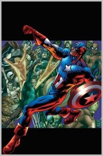 Barnes. I’ve never been much of a Captain America booster, but I have always been a sucker for legacy characters, and the notes Brubaker has hit in having Bucky step into the uniform and try to step out of the shadow has been incredibly well handled, and made me a fan of Captain America for the first time. Whereas Brubaker has made me a fan of Bucky Barnes, it’s another writers who has just recently made me if not a fan, at least better appreciate Steve Rogers. Mark Waid (whom my wife – an avid Cap fan of many, many years – tells me had an amazing run on Cap in the late 90’s through the turn of the millennium) returns to the character with his five-issue mini-series “Man Out Of Time” which tells the kind of story Waid excels at: a reinterpretation of a classic story in an iconic character’s history (see also, for example Superman: Birthright or the Life Story of the Flash). In this case it’s an updating of Steve Rogers return to civilization after being stuck in suspended animation for over 60 years. Waid captures, over five issues, not only Steve’s struggles to come to terms with the culture shock as a civilian, soldier, citizen and a superhero, and in doing so examines America itself, mostly in its fall from grace and loss of ideals, but this last issue Waid celebrates its progress. It’s a potent series, one of Waid’s best works, but made even better with art by Jorge Molina and Karl Kesel. Molina’s clean lines and eye for detail are impressive in the superhero moments, but shine even brighter in the civilian moments, and Molina handles the multiple eras with a remarkably natural ease. Kesel’s embellishments and Frank D’Armata’s lush colors compliment Molina’s environments, Kesel’s shadows doing a lot of heavy lifting in establishing mood and tone in the different eras and action sequences, D’Armata’s colors popping or muting where needed (this issues’ 1945 segments are a wonderful example of an art team working in perfect unison).
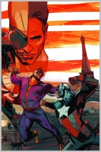 While “Man Out Of Time” highlights the sentimental side of the character, and the “point one” showcases the purpose, Captain America and Batroc the Leaper is about the fun. I don’t think “fun” is usually the first adjective people arrive at when they think of Cap (or perhaps that’s just me) but fun does happen, and nobody brings out the joie de vivre in Cap like Batroc The Leaper. Batroc is hard to take seriously with his twirled mustache, his godawful ugly purple pajamas, his penchant for tumbling, and of course his outrrrrrageous French accent, he’s almost offensive if he weren’t so ridiculously enjoyable. This one-shot has, as a back-up feature, a reprint of Tales Of Suspense #85, within which Stan Lee and Jack Kirby (inks by Frank Giacola) present an early confrontation between the two characters. The set-up is patented hokey (and frankly a little misogynist) Stan The Man, the thinnest pretense for action, as Cap searches for an unnamed female Agent of SHIELD kidnapped by agents of Hydra with Batroc in the way. It’s all meant as a showcase for what Kirby can do, and it’s dazzling. Lee shuts up for almost a full page to let a Kirby 9-panel grid shine, and it’s just a shame the whole story isn’t so restrained (because when the dialogue isn’t offensive, it’s camp, and when it’s not camp it’s just ridiculous). It’s a nice treat, and a great compliment to the main story.
Keiron Gillen’s story takes this goofball rather seriously, but in doing so, we realize that Batroc is very self aware of his image and he’s more than okay with it. Gillen’s take on the character is one of pride, with Batroc quite proud of his frequent homme-contre-homme encounters with Cap and fighting the famed super-soldier to a standstill. We get a peek into Batroc’s process, how it is he comes to oppose Cap, and how he trains and anticipates such a confrontation, all leading to, of course, a meeting of Batroc and Bucky-Cap (whom he’s quite aware is not his usual foe, but also not ignorant as to underestimate him). As is common with Gillen’s work, it’s laced with humor without being a comedy, and in taking the character serious he gives the reader more than a few good reasons to like and respect him outside of sheer irony. Renato Arlem handles art chores in a serviceable manner, but doesn’t quite pop when compared to Kirby, Molina, or Breitweiser. Arlem captures the dynamics of the fights and rooftop-bounding well enough, but it’s not as dynamic as it could be, or should be to really accentuate the primary traits of the character. Nick Filardi’s muted colors don’t exactly compliment the tone of the story either, with the bulk of the action happening with a dull red backdrop sucking much of the charge out of the characters momentum. Thankfully, Gillen’s characterization of Batroc more than makes up for any shortfalls in the art department, and any fan of Caps eccentric rogues will be enamored.
Captain America #615.1 – Rating: 


Out of a Possible 5 Stars
Captain America: Man Out Of Time #5 – Rating:


Out of a Possible 5 Stars
Captain America and Batroc The Leaper – Rating:


Out of a Possible 5 Stars
FF #1 ($3.99, Marvel Comics)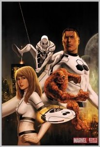
By Devon Sanders
Following the much-hyped and surprisingly well done death of The Human Torch, one may ask how writer Jonathan Hickman and artist Steve Epting could possibly top themselves. None need look further than this week’s FF #1, as the surviving members of the former Fantastic Four mourn the loss of a loved one, move on and welcome not one but TWO new members into their First Family.
A.I.M. is on the move with a plan to position themselves higher up the terrorist organization food chain. Meanwhile, a familiar, friendly figure in red and blue walks The Baxter Building halls, ready to face the future. The First Family is nearly set that is until one more invitation goes out and with a cold gaze, it is accepted and a new opportunity, born. Writer Jonathan Hickman does what many writers in his situation, quite frankly, just can’t. He makes progress. The advancement of this story from Fantastic Four to FF is seamless and feels exactly like where this story should be headed. One of Hickman’s greatest strengths is the trust he places in his FF artist, Steve Epting, using storytelling beats and open dramatic pauses that allow his art to unfold and quite effectively, tell the story. FF #1 is the thoughtful, natural evolution of a Marvel comic and exactly what I want from a Fantastic Four comic nowadays. Hickman and Epting have created a comic that stands on the shoulders of giants and yet, it never comes across as burdensome.
Rating: 


Out of a Possible 5 Stars
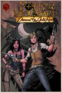 Foster Broussard: Demons of the Gold Rush #1 of 5 (Red 5 Comics, $3.50)
By Jeb D.
NOTE: This is an advance review of a May 2011 release.
Whatever the uncertainty of the future of the monthly printed-on-paper comic book, the present is an interesting time, with small publishers finding subject matter refreshingly far afield from the standard Big 2 spandex. Of course, we still wind up with comics that adhere to genre conventions, like mystery or horror, but every now and again you run across something with bigger ambitions, and in cases like that, you just hope that the execution is up to the ambition; that the reach doesn’t exceed the grasp.
Thus, Foster Broussard: Demons of the Gold Rush. Despite its setting, at the time of the California Gold Rush, it’s not a “Western” in the traditional sense: rather, it’s a story of the uses of power, conflicting social agendas, the transformational nature of the Industrial Revolution, racism, sexism, natural and unnatural forces, and their intersection at the focal point of our roguish protagonist.
And, honestly, I wish the book were as interesting as I just made it sound. Foster Broussard is a brash young British con man, who in 1850, manages to slip a date with the noose by means that rather stretch the imagination: he lifts a suggestive eyebrow at the well-endowed Young Victoria who happens to be on hand for his hanging, and tells her he can go to America and bring her back “enough gold to fill the Tower of London;” evidently, knowledge of the Gold Rush wasn’t common at court, since this impresses her enough to set him free. Accompanied by his Javert-like jailer/minder, he sails off to California, and becomes involved in the schemes and power struggles of wealthy mine-owners, exploited American Indians, colorfully eccentric black gangsters, and more well-endowed (but properly independent and liberated) women.
The biggest problem is that Foster himself isn’t quite the endearing scoundrel that writer Trevor Pryce (yes, the former NFL Pro Bowler) wants us to think he is: he’s always got a dodge or scheme, but they’re not necessarily all that clever (and often involve simply not sharing key information with the reader), and given their self-serving nature, they don’t do much to put us in his corner. Doubtless there is redemption ahead, as he learns to put the interests of others (like exploited Indians and big-breasted women) ahead of his own, but that transformation would mean more if it began at a place of higher interest.
Pryce has a good feel for the dynamics of moving his divergent groups around on the board, even if the characterization tends to be stock (the evil white power structure versus the completely-sympathetic people of color). The period detail is nice, and he’s clearly done his homework, though some of the attitudes feel a little too 21st century. His decision to leave the question of the supernatural open, at this point, is a good one, so long as he can stick the landing on the eventual reveal.
I’ll say this about the art by Dan Glasi (evidently a two-time winner of an Eisner scholarship competition): it’s consistent, and in small-press comics that’s not to be taken for granted. Technically, his work tends to the flat and scratchy, with action not conveyed all that convincingly, but the ability to keep characters and settings looking recognizably the same from panel to panel, and maintaining realistic proportions and perspective, isn’t always something that artists have under their belt before putting out a book this ambitious; even if I don’t find the look all that appealing from an aesthetic point of view, I get the sense of an artist with a strong set of fundamentals, and plenty of room to grow and develop (he’s already got the big-breasted women down, so he’s on the right track if there’s an opening over at Grimm Fairy Tales ).
I wish I could be more generous with my grade on this one: I’d give it a solid four stars for its ambition, and willingness to look outside the obvious genres for subject matter, and for what it is–unheralded creators on a small-press book–it’s impressive. But in its story construction and aesthetics, it’s definitely a notch or two below what most readers will regard as “professional” standard.
Rating: 


Out of a Possible 5 Stars