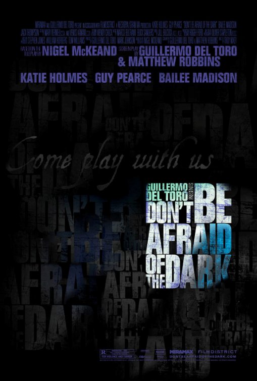
I don’t know. I’ve seen a lot of the artwork concepts for this movie [which I worked on, which you know by now] and there have been some amazing ones that folks will never see. I wasn’t aware of this one, though it’s nice to see the title treatment that they used at the party after the premiere (photo of marquee) we had last month. Bloody Disgusting is not a fan, though they did like the movie. I can understand that. Folks can pretty much project whatever they want to on a poster that’s just text. To some it could be refreshing in an era dominated by Photoshopped heads but to others it could seem like a rush job or ill-advised. It’s not my favorite of the posters we’ve used nor do I think it’s the last ones folks will see. But I love that title treatment.
How do you feel about it?
Source: Bloody Disgusting.