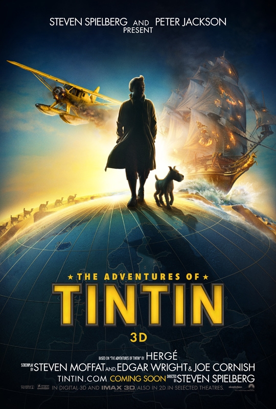
It’s time to start seeing TinTin marketing pick up some steam, and it all begins with a release of the official one-sheet from Empire Online.

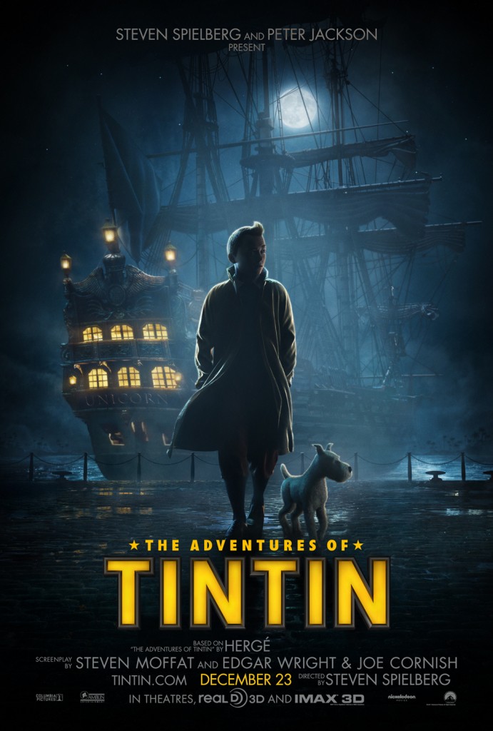
and now the US Poster from AintItCool!

Nick and I had a conversation about the posters, and found ourselves disagreeing a bit. Nick think it misses the mark by continuing to keep the main character’s face in shadow (at least in the US poster, where he has less history), but I think the class of the whole thing along with the hints of sweeping adventure are enough for a teaser poster. There’s no doubt who this is truly geared towards though, as the poster actually acknowledges that more than just North America is printed on the globe! There’s Europe –with its great hanging, top-mounted ballsack– sitting right up front.
As for the US poster specifically… I hope it’s not an indication that all of the marketing in the states is going to go for the darker, shadowy angle. We can appreciate adventure in the sunshine too!
Regardless, this is just the beginning as Empire is promising a first look at the trailer (though not the trailer itself it seems) tomorrow morning. Also: I shaved a few pixels off the posters up there, since it’s worth a click to the original sources to see them a bit bigger.
Whether or not this has a foothold in the US, it’s certainly going to be a staggeringly huge property across the rest of the world, and while motion-capture films have had a rough go of it this year, SPIELBERG and JACKSON go a lot farther than ZEMECKIS these days. There is enough studio marketing might behind this that the question is not “huge?” but “how huge?”
At the end of the day, I’m just happy to see Edgar Wright and Joe Cornish’s names so prominently featured!
DISCUSS THIS on the CHUD Message Board
&
Like / Share it on Facebook (above or below) if you think it’s great!
As is so often the case, thanks to Brian Henne.