 Earlier today, Fright Night unveiled a not-too-terrible trailer . It’s not the original, but at least it seems to get the point, unlike the other trailer we got today. (Something Dogs..?)
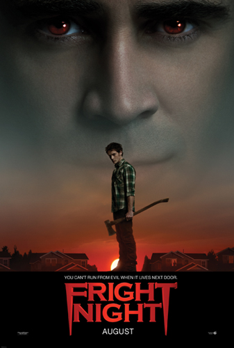
Tonight, we got the official Fright Night one sheet and you know what? It’s not bad either! The big black title bar is ugly, but otherwise it’s clean, simple, and emphasizes what is clearly the best part of the film: Colin Farrell.
The original Fright Night poster was one of those glorious, illustrated, just-a-bit-campy things that existed only in the 1980s. No stars. No characters. Just a design. I wish we could have that again, but at least this one isn’t a Photoshop of Horror, and it still emphasizes the quiet neighborhood that Jerry is about to drain dry.
