 Happy All Hallow’s Eve, Chudlingers and Chudlingerers.
This is our third and final week of Thor’s Creature Comics Feature, a series which looks at the annals of Thor’s reviewing history to remind you of some of the best, the worst, and those inbetween comics which ever so conveniently fit the genres we’ve picked out. It’s our "Clip Show" and we’ll cry if we want to. This week, we’ve actually got a lot more in store as we’ve been holding back some current comics reviews just for this moment. Feast, feast heartily and enjoy.
In continued celebration of our beloved Creature Comics Feature, Thor’s Comic Column and Oddgod Press present a wicked radical contest with loads of fabulous prizes WHICH NOT ENOUGH OF YOU ARE ENTERING, so we’re extending the deadline for one week. CLICK HERE for more details and the rules of entry but keep in mind you have one more week (until November 6th) to enter. It’s quick and fun, and the prizes are
And without further ado and getting bitten in half, we present Thor’s Creature Comic Feature – Monster Comics!
No Recall If “Mnemovore” Finished Well
By Russell Paulette
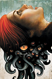 True story: in the midst of the run of Vertigo’s six-issue horror comic Mnemovore —co-written by Hans Rodionoff and Ray Fawkes, and sumptuously rendered by Mike “The Coffin and Deep Sleeper flipped Russell’s shit” Huddleston—they “accidentally” republished issue # 4 with a different color on the logo and shipped it right around when # 5 was supposed to hit the stands. I think. At least, I remember that happening. What was strange was, despite the gorgeous Huddleston covers, I didn’t remember the cover to # 4, and just assumed it was the latest issue. (We here at Viking Central must read piles of comics more plentiful than the dead men’s nails lining the hulls of Naglfar, just to bring you these insightful reviews.) Anyway, I happily took the book home, and read through half of the issue before realizing that I had bought a duplicate copy, as well as had read it a month prior.
The plus of my boner is that Rodionoff and Fawkes, in telling their story of young Olympic-hopeful, Kaley Markowic, and her battle with a succubus memory monster, had somehow recreated that preeminent experience of déjà vu with this reader in particular. The boo-boo of it all is that, well, I just had little-to-no recall of the prior month’s issue and, as such, some of the elements of the mini-series didn’t stick to my ribs.
Which, again, isn’t to call the work bad. Back in my review of last April’s issue # 1 RIGHT HERE, I described the writing as efficient, as the writers “lay a lot of groundwork in a very controlled, concise amount of time.” They introduced the problem of Kaley’s amnesia and brain injuries quickly and went about introducing the main cast swiftly and methodically, before they finished the recipe with “the promised monster…a dash or two of atmosphere, mix and serve with a nice garnish.” Now, despite my tortured metaphor, this is a fairly good description of the writing on an aggregate—Rodionoff and Fawkes keep your attention, as well as sustaining the mood and the atmosphere particularly well. They did develop an affectation—perhaps it was a letterers decision, I don’t know—of fading out key lines of dialogue in the word balloons. There was, again, a simultaneous loved-it-hated-it feeling this elicited with me, as it felt like you were missing something important in what the characters were saying, but it brought you closer to Kaley’s state of mind. At the same time, though, I never felt lost enough that the information seemed desperately important.
The art, by Huddleston “and the color choices added to the linework by Jeromy Cox—can only be described as flat-out amazing” still holds true to the first impressions given by that first issue. Huddleston maintained an even tone throughout the entire piece, and in particular that coloring by Cox proved to be one of the more effective artistic choices on the book. Cox chose a soft, even palate for much of the action, keeping the colors bold-yet-flat, mostly greys and blues, but then when the monster would come into the light, it would be this almost overly-rendered, leathery-looking flesh that was both out of place and frightening with the rest of the world provided.
Overall, it’s an entertaining piece—particularly in how it sustained the mood and atmosphere throughout the run. I can’t say I was totally bowled over by it, particularly since looking back over the issues, I’m not struck with too many scenes or moments that stand out in my memory. But, perhaps, that’s the way it should have been, all things considered.
THREE AND A HALF OUT OF FIVE VIKINGS

Steve Niles takes on a "Giant Monster"
By Graig
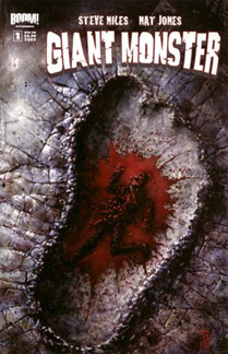 I think Steve Niles has made it his mission in life to write at least one comic for every type of horror creature cliche out there. He’s done vampires and bigfoots, zombies and frankensteins, ghouls and even a take Jekyll and Hyde. Now paired with Nat Jones at Boom! Studios,
After a year of preparation, Don Maggert became the first man to pilot a solo flight to the orbiting space station. It was a pretty incredible feat, but his dedication to his career cost him his wife and his happiness, and his return home was to be bittersweet. Was. But things didn’t go quite as planned as, on his return launch, a random space parasite managed breached his hull, and rapidly spread throughout the shuttle consuming anything organic, including Maggert. Every part of Maggert’s flight was recorded and broadcast live, so his horrible "death" was witnessed by millions, as was his shocking rebirth, just before the shuttle exploded. NASA and the military tracked all debris from the wreckage that entered the Earth, including the ever-growing creature that tore apart a shark and has started to make its way towards land. Magget’s consciousness is still in there, but the symbiote’s desire for carnage seems to take precedence, and mass bloody chaos ensues.
Niles doesn’t really delve too deeply into this one, basically letting it ride for what it is – a blood and gore monster story (if anything though, Niles plays things a little too straight. Giant monsters are supposed to be campy). The characters are hokey and paper thin, and the monster itself isn’t very inspired, but as these things go, it’s really the violence that matters. And, I mean, the monster rips a shark in two, smashes some ships and explodes a helicopter or two… that’s pretty cool, right? But this is the first of two books, and Niles is just warming up on the menace front. Surely some big, big guns have to get involved, and if a teaser image in the back of the book is dropping hints, a giant Nazi robot too.
Nat Jones handles the artistic duties, and his storytelling is quite good, with great pacing and clear visual details, but I’m just not sold on his linework. Jones has a scratchy, unpolished style that makes all his imagery look rough and unfinished, like it wasn’t quite ready to go to print. There aren’t a lot of solid lines here, but as I said it doesn’t really affect how the story is told. Jay Fotos colors really help establish a murky ambiance of doom, and he handles the underwater sequences especially well.
Perhaps not the greatest huge rampaging creature story ever told, Giant Monster is still a good bit of fun, and the cover image, which has been on display in ads for months now, is an instant classic.
TWO AND A HALF OUT OF FIVE VIKINGS

“Full Moon Fever” Leaves A Feeling of Dyspepsia
By Russell Paulette
 It almost writes itself, doesn’t it? One of those one-sentence, logline pitches that just springs, fully formed, right from the center of your forehead—a premise so simple, yet exquisite, that you become jealous you didn’t think of it first. Werewolves on the moon.
With that simple notion, writers Joe Casey and Caleb Gerard bring artist Damian Couceiro onboard for a quick by-the-book thriller about a sanitation crew hired to clean up a space station, only to find trouble afoot in the great unknown. That the trouble inevitably leads to someone suffering from a bad case of distemper and, oh, say, lycanthropy is merely the generic convention, right?
Longtime Valhalla Visitors are well aware of my unabashed man-crush on Joe Casey. Despite his bedroom eyes, his stories are typically well written; his dialogue is spot-on and nuanced; his plots are well conceived and interestingly paced; his characterization is solid-beyond-belief. With Full Moon Fever, however, I can’t help but be curious if the addition of co-writer Gerard somehow adds a differentiating feeling to the mix, or if it is just undercooked all around.
With Kirby, their protagonist, Casey and Gerard give us hints at the blue-collar-joe with the gruff exterior and the haunted past, but never seem to realize it in any meaningful way. And the plot, which runs through the standard Alien template, also seems to just hit the stock moments without breaking through with anything particularly memorable. (Scratch that: the one scene that did stand out was the tidal wave of shit from a busted sewer pipe that saved Kirby from certain danger. Should that have had a spoiler warning?)
While this isn’t to say it’s bad—they’re certainly well crafted, expertly constructed stock moments—they still feel largely stock. Added on top of this is the character arc for Kirby seeming to hinge on the revelation of the premise—something that the book promised from the beginning—as being a kind of last-page-big-reveal kind of moment, just left me wondering what exactly they were trying to achieve. I mean, I don’t know if I was spoiling anything by revealing that our heroes battle a werewolf on a spacestation, but I recall that’s how the book was sold to me—so why reveal it to our heroes on the last page and expect us to empathize with their shock and dismay?
On the art front, Couceiro does a fine job, particularly in differentiating the characters and sustaining the dark, dank mood of the piece. His work recalls AiT/PlanetLar mainstay artist, Charlie Adlard, particularly from some of the publisher’s other books. Frankly, the storytelling seems a little muddy in places, and his background detailing could use some work (I know they’re in a space station, but some of the choices the artist offers us are between blank-wall-number one, or blank-wall-with-door-number two). For the most part, the art is serviceable without being distracting, and in a few places quite effective.
All that said, the book did have its good moments, and those shouldn’t be turned down simply because the overall effect was a little unsatisfying. Ultimately, this is one book that had such a good hook, that I’m not sure any version of the story could have been more perfect than the one you thought of just with the pitch landed in your brain.
THREE OUT OF FIVE VIKINGS

"Nick Fury’s Howling Commandos" will leave you howling… in pain
By Graig Kent
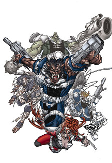 The "year of the Giffen" continues as yet another Keith Giffen project makes the light of day, and, if you’ve been paying attention, you will know this should make me very happy. Why, in the past two weeks alone there have been no less than six books with Giffen’s name attached to them, all of them more than worth just a look.
Except this one. No, this one is a big, big disappointment.
Nick Fury’s Howling Commandos is a great concept, in theory, much like Van Helsing was: toss a bunch of different classic monsters into one project and it’s got to be great. But the execution… oh, the pain. I just finished watching season four of Buffy: The Vampire Slayer on DVD (yeah, I know I’m so ten years ago), and the concept for the Howling Commandos bears a similarity to "the Initiative’, that government-run project which was honing in on the slayer’s turf and capturing demons and vampires and other supernatural types and experimenting on them for military application. In the case of Marvel Universe’s S.H.I.E.L.D., however, the supernatural creatures are the military application. Like Suicide Squad or The Dirty Dozen before it, the Howling Commandos are an expendable special ops team of bad people (things?) sent out on missions that would be otherwise too dangerous for the average strike force. It’s a mish-mash of funky ideas, which, in blurb form, seems like a wonderful idea, and by all means with someone like Giffen at the helm it should work out nicely. But it doesn’t. So what went wrong?
Well, it’s always easiest to blame the art for the failure of a book, and in this case it’s because the art is horrendous. Penciler Eduardo Francisco is a retro artist, a throwback to the more innocent 1990’s where over-rendering was the soup of the day. This book is all kinds of ugly and Francisco’s character work is so muddled by thick lines and scratches it gets hard to tell arses from arms and teeth from moustaches. What I’m sure he considers detail is just excess business which only serves to distract and detract from the storytelling. It took two inkers (Kris Justice and Terry Pallot) to pull the art together, and well, they didn’t do much to improve it, there’s a lot of in on the page but nothing really looks finished. Francisco’s character designs are nasty and not in a good way: the Frankenstein clone for instance inexplicably has two huge (bigger-than-his-head huge) Silvestri-esque screws-as-shoulder pads coming out of his shoulders. The technology looks even worse, Liefeld-esque one might say (i.e. absurd to the X-Treme!). To round it all out the colors by J. Tai are just plain gaudy, which is like slapping skanky sugar-free icing on top of a stale cake.
Yeah, Francisco’s design sense sucks, but it’s really his storytelling capabilities which fail the book. It’s so bad that it makes me wonder if I should call Giffen’s writing into question as well. I generally can’t make sense of the action, who’s saying what dialogue, nor understand the overall tone of the book because the pictures and the words seem out of synch. Giffen has a great sense of humor in his writing, but here I can’t tell if things are supposed to be funny because Francisco has no comedic timing or any grasp at all of facial expressions. There are a lot of gritted teeth, screaming mouths, and bulbous, pouty lips, but nothing that reads as a genuine reaction. Frequently in the past Giffen has done layouts for the books he writes, but I’m pretty certain he had no hand in the muddy, unintelligible layout of this book.
What more do I need to say? The art rots to the point that it detrimentally affects how the book is read. If they manage to change artists for the second issue I’ll continue to pick the series but as it stands it’s just too raw to enjoy.
ONE OUT OF FIVE VIKINGS

History Gives Ottaviani All the Toys From His Toybox in “Bonesharps, Cowboys and Thunderlizards”
By Russell Paulette
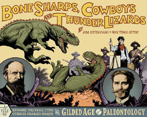 Not that anyone had a paleontologist action figure when they were growing up—though, if you did, I suggest you shut down your computer, turn off all your lights, and sit in the corner, freak. For the rest of us humans, a look at Jim Ottaviani’s latest graphic novel, Bonesharps, Cowboys and Thunderlizards is in order, particularly because it brings two really rad things together—cowboys and dinosaurs. Coolest part, though? It’s based on fact.
For those of you who didn’t know, GT-Labs is Ottaviani’s publishing company that specializes in graphic novels about defining moments in science history, and the scientists who made them happen. Wait, wait, wait—don’t stop reading now. Cowboys. Dinosaurs. Okay, while I still have your attention—what Ottaviani manages to do is inject his narratives with historical accuracy and well-crafted writing that makes these moments come alive. Like Oppenhimer and the creation of the atom bomb over in Fallout; or Einstein’s various meeting-of-the-minds in Two-Fisted Science; or the various intersections of government grants, scientific breakthrough, art history, manifest destiny, and tyrannosaurs in Bonesharps.
Taking his cue from history, Ottaviani translates the rivalry that developed between Edward Drinker Cope and Othniel Charles Marsh, who were paleontologists who weren’t fighting over the coolest, most ostentatious names, but rather the right to dig up old fossils and try to figure out how the bones fit together. Working with artist Charles R. Knight, these three men captured the public’s imagination with those Jurassic jerks who still refuse to tell us where they all went when those asteroids hit the terra firma. Roped into these historical events are figures such as Buffalo Bill (who pops up in every wild west tale), Ulysses S. Grant, PT Barnum (complete with huckster-typography), along with a few other surprises.
The major plus of Ottaviani’s tale is that—contrary to everything else this event has reviewed—it isn’t melodramatic or culminates in blood, gore or mayhem…wait, wait, wait—Cowboys. Dinosaurs. That’s right—since it’s historical fiction, Ottaviani’s book walks that fine line of integrating these cool figures of Americana with a tale that boils down to a pair of men who are jealous of each other and driven to achieve based on pure tenacity and spirit. It’s here where Ottaviani’s writing really excels, dramatizing the wants and needs of these men without ever being superficial or redundant, laying out in basic, human terms what it means to be the man to either get there first, or just plain find out the truth.
Bonesharps was drawn by an art collective known as Big Time Attic, who are enumerated to be Zander “…you may remember me from such Alan Moore comics as Top Ten and Smax” Cannon, Kevin “Russell’s not sure if he’s related, but has even money on it” Cannon, and Shad “It’s late and I’ve no clever nickname for him, either” Petosky. Drawn in a loose, cartoony style, the work compliments the writing by choosing to sustain a naturalistic feel without being literal. The book is also formatted on a landscape plain, which gives the pacing of the pages an unusual, elongated feeling, and implies an expanding horizon with an untapped limit to the imagination.
It’s hard to think of more praise to heap on this book and, though not spooktacular, does feature monsters—probably the coolest monsters around. Dinosaurs. Oh, and cowboys. Did I mention the cowboys?
FIVE OUT OF FIVE VIKINGS

Marvel celebrates the season with a quartet of retro-inspired "Marvel Monsters" books
By Graig Kent
 Gotta give credit to Marvel on this one, having top notch talent tackle some of their more unusual and monstrous characters and tying them all together under one banner during Hallowe’en season is a brilliant idea. Four weeks, four bucks, four classically inspired, fun books, each with a classic Kirby Marvel Monster backup story, and a smashing cover by the Goon’s Eric Powell.
The first out the gate, Eric Powell (with co-writer Tom Sniegoski) has some fun pitting the big green machine versus the big red t-rex in Devil Dinosaur. In this story, two youngsters from an alien civilization are watching a primitive planet develop. One tribe has created fire and has a fierce warrior instinct, while the other tribe has, well, a giant angry lizard. The scales are too askew, so the aliens decide to balance the equation by summoning forth an equally powerful monster, the Incredible Hulk. You know what that means: smashy smashy. The poor aliens got a little in over their heads on this one, and their corrective measures only prove to be more catastrophic. It’s madcap all-ages hilarity, with Powell’s art the highlight. While Kirby inspired, Powell (with colors by JD Mettler) still retains his own unique sense of style, with clean, crisp linework, full of exaggerated gestures and facial expressions – his Hulk particularly looking like a snarling Cro-Magnon. The classic back up feature starring the original "living" Hulk is, well, odd, especially considering the design of the creature (a giant orange robo-sasquatch with ape arms and squat legs). Not all of Kirby’s designs are classic.
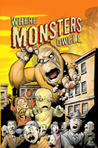 Where Monsters Dwell presents a trio of all-new terroriffic tales, and one classic story about Titano the giant crab which is, um, baffling, to say the least. The opening story is written and drawn by Keith Giffen and inked by Mike Allred, with classic four-color stylings by Lovern Kindzierski. Giffen’s art has never looked better as he presents the much anticipated follow-up to the classic Journey Into Mystery #60. Bombu the world conqueror reports back to his overlords explaining why his mission to Earth failed, and is coaxed into giving it another go. Things don’t end well for him, in hilarious fashion. Peter David with artist Arnold Pander and colorist Val Staples follow this up with a bizarre tale of "the return of Monstrollo, the Terror of Hollywood". It’s a pretty cliche story, but ends with a truly boffo kicker which makes the cheesy set-up worth it. The third tale, "the Shadow of Manoo" plays out like a classic episode of the Outer Limits, by way of Ed Wood. The art by Russell Braun and Jimmy Palmiotti has a very EC Comics feel to it, and Jeff Parker turns hokey into hysterical with the last page.
The Fantastic Four have squared off against many giant monster creatures in their day (check out the current Big In Japan mini-series for yet another rollicking example), but what happens to them after the Thing has knocked the living daylights out of them? Well, historically they’ve been scuttled off to "Monster Isle" for safe keeping, but these are sentient creatures, in most cases, should they not be allowed to rehabilitate, to pay their dues to society? This is what writer Scott Gray and artist Roger Langridge (with J. Brown’s totally retro colors) ask in Fin Fang Four. Elektro, Gorgilla, Fin Fang Foom and Googam are all selected as capable of entering society proper by Mr. Fantastic, and he shrinks them down to human proportions, giving them jobs at the Four Freedoms tower, and letting them attempt to be civilized. But Googam is picked on by that jerk Jonny Storm, and a practical joke turns practically deadly as Googam releases other-dimensional giant monsters loose on New York. With all the heroes out of town it’s up to the Fin Fang Four to save the day. Langridge’s cartoony style is perfect for this story, and Gray pulls out all the comedy stops, from slapstick to satire. The back-up feature presents the first appearance of Fin Fang Foom (witness as he flicks the Great Wall of China like a bull whip. Awesomeness).
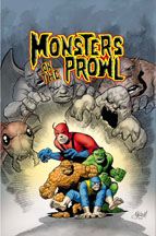 While his Giant Monster book (also reviewed this week) played things a little too straight, Steve Niles gets the camp and comedy just right in Monsters on the Prowl. Canada’s greatest threat, the Collector squares off against the Mole Man, unleashing a swarm of giant monsters into the Mole Man’s tunnels under New York. When they make it to the surface, it’s going to take monsters to fight monsters. Duncan Fegredo provides the art (with Moose Baumann on colors) and this is just another fine example of why Fegredo is one of my all time favorite artists. He has a style all his own which is equal parts rough and highly polished, classic and modern. He doesn’t get distracted by too many lines, but he always adds fine details, and he has a way with goofy expressions like nobody else this side of Kevin Maguire. The Beast, the Hulk, Giant Man and the Thing playing Smackdown with giant monsters. What’s not to love? Niles even drops in some big fun witty repartee, which is hardly his specialty (the Thing and Bruce Banner sitting down to lunch is worth the price of admission alone). In the back-up… the ninth wonder of the world. No, not former wrestler-turned-Playmate Chyna, but instead a giant snapping turtle. Oi.
Marvel gave their creators a little more freedom than usual to tell their stories, giving them a natural flow and pace, padding out the remainder of the book’s 48 pages with reprints and ads (lots and lots of ads). This means each book runs between 34 and 42 pages of actual reading material with no effect on price, so you’re either getting scammed or getting a bonus… I’m not sure which. In any case, each book is a tremendous amount of fun, some of the best comics to come from the house of ideas in some time. They’re perfect for readers of all ages, accessible to fans old and new, a look back at what comics used to be, and what they can be again.
Devil Dinosaur
Where Monsters Dwell

Fin Fang Four

Monsters on the Prowl

 The Black Forest
The “monster mash” isn’t an entirely new story concept, but while Van Helsing is demonstrated the definitive wrong way to do it, an Image book called The Black Forest establishes that the combination of classic monsters can prove mightily entertaining when properly executed.
Set during the action of WWI, this black-and-white tale from writers Todd Livingston and Robert Tinnell (more movie guys migrating to comics) and artist Neil Vokes is a pulp horror adventure with an old-school serial feel. Hotshot pilot Jack Shannon is recruited to escort famed magician/occult expert Archibald Caldwell (who bears a deliberate similarity to horror legend Vincent Price) behind enemy lines in order to investigate “Project Prometheus”, a secret weapon ze Germans are using to defeat the Allied forces in the trenches. Plunging their biplane deep in the heart of the mysterious Black Forest, Shannon and Caldwell encounter a sexy gypsy spy, a huge creepy castle, turncoats, German werewolves, the successful results of Victor Frankenstein’s experiments, and a familiar master vampire.
The Black Forest is a rousing take on the famed creatures, with sturdy variations on character archetypes, snappy yet suitable dialogue, and a simplistic, exaggerated art style that is also appropriately dark and moody. A shame that Stephen Sommers didn’t get hold of this as a more respectable (and fun) template for his monster mash, as we may have been spared such an expensive abomination. – Dave
RATING: 
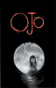 Ojo tpb
(Originally reviewed February 14, 2005)
"Annie finds a peculiar looking creature under the trailer, a giant hairy eyeball with tentacles, lost and wounded. She names it Ojo, and vows to make sure this one lives. Later, Annie finds the creature’s mother, a giant carnivorous version of little Ojo, and she struggles between her own desire to prove herself and actually doing what’s best for the creature, all the while protecting it from Melissa threatening hands.
"It’s a quirky book with a great sense of innocent whimsy and worry. Male or female, it will take you back to childhood at least somewhat, reminding you the difference between actually being an responsible adult and feeling like one as a child. The black and white art by Kieth and Alex Pardee is great, using, alternately, cartoonishness and heavy blacks and crosshatching to the desired levity and moody effect. Ojo is not just a great introduction for those who’ve never read (Sam) Kieth’s work before, but an accessible series for younger readers and those looking for an alternative to superheroes." – Graig
RATING: 
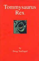 Tommysaurus Rex OGN
(Originally reviewed October 11, 2004)
"The story follows young Ely, whose dog Tommy is struck and killed by a driver. Sent to his grandfather’s farm for the summer to occupy his mind and hands, Ely finds it difficult to make new acquaintances as he’s harassed by the local bully, the mayor’s despicable son Randy. When hiding in a cave one day, he discovers a tyrannosaurus rex and befriends the destructive beast, a situation accepted by the town on the provision that the creature can be trained, which the malicious Randy spoils in a surprisingly pat ending evoking the original King Kong.
"As usual, TenNapel’s charming art is a pure delight to look at, with amazingly expressive characters. While there are a few tender and amusing moments in the story, it just never veers far enough into the realm of either the realistic or the surreal and instead treads water somewhere in the middle, resulting in a cute story that strives for Iron Giant territory but only hints at being a classic. Then again, Universal optioned the movie rights for a million bucks, so what the hell do I know?" – Dave
RATING: 
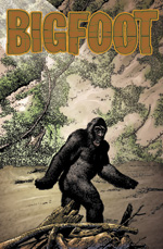 Bigfoot mini-series
(Originally reviewed February 28, 2005)
"In its attempts to turn Bigfoot into a serious and horrific threat, I felt the first issue better captured the Seventies’ cheese factor than any sort of sense of threat or terror. But two issues later, I’m completely wrapped up in the series, which has moved forward a decade from the first issue and witnesses the traumatized little boy all grown up into a traumatized, heavy-ammo toting man.
"The creative trio (Rob Zombie, Steve Niles, Richard Corben) have amped up the menace of Bigfoot with every issue, as the creature gets more and more primal and adventurous in his attacks. In the third issue the backstory of the Ranger that’s been covering up the creature’s trail is revealed, and it ends with the promise of a good ol’ grenades and shotguns hunting party. The series has more than delivered on the first issue’s set up. Oh, it’s still trashy but it’s also immense fun." – Graig
RATING: 
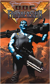 Doc Frankenstein #1
(Originally reviewed December 20, 2004)
"Set in some alternate now, the Wachowski Siblings’ take on Mary Shelley’s legendary character opens with the blue-skinned product of reanimation having just dispatched a massive kaiju-style beast in front of the White House. From there we learn pieces of the patchwork man’s past through flashbacks, covering his creation at the hands of his “father”, his rescue of an Eskimo girl from a rampaging Yeti, and his time in the Old West as a brutal bounty hunter. In the present (as it were), Frankenstein returns to his home in the middle of the desert, a massive utopian metropolis which immediately comes under attack by an air fleet of heavily-armed religious types.
"…Unsurprising is Steve Skroce’s exceptional artwork, dynamic without being overstylized, and the cover (painted by cover artist extraordinaire Kaare Andrews) is fantastic as well. I really like Skroce’s depiction of the Old West – this all-too-brief segment of the story is my favorite, and I hope the creative team revisits the period in future issues. So far I’m not entirely fascinated by Doc Frankenstein, but definitely intrigued." – Dave
RATING: 
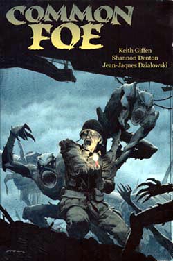 Common Foe #1
(Originally reviewed May 30, 2005)
"…we’re thrust into the smoke and carnage of the battlefield. Allied soldiers are standing back to back with Nazi troops, guns blazing, firing towards an enemy that’s all shadow and teeth. Hopping over rubble, dropping grenades, leaping from rooftop to rooftop, there’s no escaping them. They’re fast and vicious. An American helps a German to his feet, and proceeds to carry him until the endorphins kick in. How did they get here, what happened that forced two enemies into collusion against a greater threat?
"This is the story of Commo