Spellgame: This is one swindler who deserves to take your money
By Graig
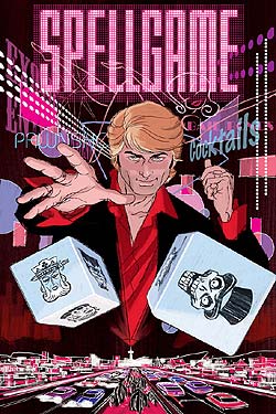 There’s something to be said about the power of the cover image. I’ve been seeing the Darwin Cooke cover illustration for Spellgame #1 in the backs of Speakeasy’s comics for about three months now and every time I see it I get a little shiver. That image alone immediately sold me on the book, and the more the weeks went by and the more times I saw that picture, the more I became excited about the book. And I didn’t even know what it was about.
The Speakeasy titles have done remarkably well with retuning the art to the cover image. Take a look at the Norman Rockwell inspired cover to Hero@Large #1 or Norm Breyfogle’s stunning tombstone angel on Of Bitter Souls #1 or Frank Espinosa’s whiz-bang cover to Rocketo #1. They’re all stunning. But as we all know from the dark era of comics in the 90’s where covers were chromium, gold foil, die cut or shot through with a bullet, the cover doesn’t necessarily make the contents any better.
So I’m happy to say that Spellgame delivers the goods its cover promises. The book is written by Blue Devil creator Dan Mishkin and, if you’re a child of the 80’s like I am, this book will recall as sense of nostalgia from that era without feeling dated.
This first issue is all set-up, introducing former big-time stage magician John Dodge, now a down on his luck, 3-card monte con-man. With his pal Harry as accomplice on the streets of Vegas, Dodge is armed with a devilish grin and a charming demeanour that earns him enough to survive and not enough to be too bothered by the law. But Dodge isn’t your average slight-of-hand artist, he’s a true magician, knowingly tapping into the dark arts, but unsure exactly how he’s doing it. Harry pressures Dodge to learn more about his abilities but the man with the gold bracelet and butterfly collar seems content enough with the hustle. It seems, however, that Dodge may not have a choice. The forces of magic are rising up once again, and the ages old good vs. evil war is coming, with Dodge stuck in the middle of the recruitment drive.
Mishkin’s script has that Vegas attitude working for it, where every character is either the con man or the mark, or sometimes both. John Dodge makes a suitable, roguish protagonist, completely egocentric but fully capable of having that ego deflated when things get a little beyond his control. Although the character is hesitant to explore the new world of magic, you can tell he’s going to have some fun with it.
Ramon Perez handles the artistic chores, giving a neon tinge to the back alley and porn valley
I’ve seen the next three covers for Spellgame, and they’re as equally fantastic as the first, and as long as the stories retain that same spirit, which I’m certain they will, this is going to be a fun, hopefully long ride.
FOUR OUT OF FIVE VIKINGS

Wells and Fisher Battle Big Kaiju in “Fantastic Four/Iron Man: Big in
By Russell Paulette
 Never been a big Godzilla fan, myself.
I know, I know. I should turn in my Geek Membership card right now, set my browser to permanently block CHUD.com, and go hide my head in shame, right? Not a big Godzilla fan, and what’s next? You read books that don’t get made into movies?
All kidding aside, I do acknowledge that giant lizard monsters attacking densely populated areas does hold a certain appeal—the Beastie Boys video comes to mind—it just doesn’t always do it for me. I do, however, like the way that Seth Fisher draws, so when you combine the two ideas, all of a sudden giant lizard monsters are sounding much more appealing than they did before.
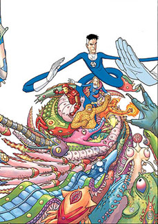
With the first issue of this four-issue mini-series, writer Zeb Wells and artist-extraordinare, Seth Fisher, have a great high-concept premise they’re beholden to deliver on: the Fantastic Four and Iron Man stuck in a Kaiju movie. That’s it—that’s pretty much the extent of the plot. Wells does a good enough job of contriving it all to happen—the FF are being honored with the ceremonial cutting-of-the-ribbon job on Tokyo’s new Giant Monster Museum and Expo. There, they learn that
Cue the big battles, et cetera. Tony Stark is thrown in for good measure—Stark Enterprises is a contributing sponsor blah blah blah—but who cares?!? It’s monsters smashing stuff, man! Get with it!
I think now I’m starting to see the appeal.
The plus of Wells’s script is that it mostly stays out of the way, and ably provides the rationale to get the players into place and let Seth Fisher do his crazy art thing. Ultimately, it’s the kind of script that’s forgettable-though-not-bad, and serviceable-without-being-terrible. There’s actually a lot of skill on display with that—I’m of the opinion that it takes as much savvy awareness to stay out of the way as it does to steer the ship—and for that, Wells should be applauded. It’s a fun story, and one that serves the concept without being too much of a burden on the reader.
Because, if the review thus far hasn’t made it clear, Seth Fisher’s artwork is the real draw, here. Rendering as a bastard child of Geoff Darrow and Jim Woodring, Fisher’s artwork is light, frothy and fun, maintaining a pop sensibility that’s one-part weird, and one-part fascinating. Additionally, it’s the little touches—drawing the FF as malformed babies for one page, or warping physical properties of things, all just ‘cause—that make his artwork fun, inviting, and intoxicating.
The appeal of this book, in the final analysis, mainly rests with the artwork, though Wells does an able-bodied turn with the script. Fisher, though, is the clear winner here, with the pop-infectious, brightly colored monsters that are more fun than scary, and are just wildly imaginative. You can’t ask for more fun for your three bucks.
FOUR OUT OF FIVE VIKINGS

Dysart’s “Swamp Thing” Has A Fever Dream, Richard Corben Gets it All on Paper
By Russell Paulette
 Ever since Joshua Dysart took over the writing duties on Vertigo’s Swamp Thing, he has very quietly turned it into one of the best books of the entire line. Feeling very much like a unique homage, what Dysart has managed to do is walk that thin line between paying tribute to the tone of the classic Alan Moore stories, while also infusing it with a spirit that is unmistakably unique and his and not just aping Moore.
Storywise, he very quickly kept the titular plant elemental permanently separated from Alec Holland’s consciousness, and has been exploring how effective a swamp monster can be when he a) is immeasurably powerful, and b) has no human mind to keep it anchored. Dysart has kept his stories trippy and metaphysical, giving us such unmistakable (and unshakable) moments as two bloated corpse-monsters shagging, a cartoon-character-avatar for a human mind, and a radiation blossom at the bottom of the sea. Since I read a high volume of comics each month, it takes quite a bit to stick out in my memory, and Dysart has quietly managed to do the trick, conjuring up such horrors that I can recall with a short snap of my eyelids.
Issue #20 finds Swamp Thing regressing in size from a multi-celled, human-sized organism down through the levels of reality as far as quarks, nuons and electrons, eventually to the very limits of reality itself, where he receives a very stern smack on the wrist and sent packing. While it doesn’t sound like much, Dysart keeps the script snappy and the metaphysical musings amusing and readable.
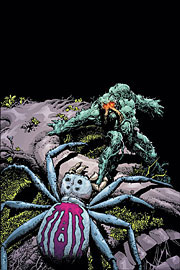
The true joy, then, is seeing regular fill-in artist, Richard Corben, draw a menacing spider; the spores of a patch of moss; attacking bacterium cells; the thermonuclear reaction of an atom; and the otherworldly presence of a not-quite-John-Constantine at a bar at the end of time. Corben has a gift for making the familiar grotesque and weird, and a knack for making the unfamiliar not only palatable, but also suitable and just-right. His forms are always solid and fully realized, feeling full of the weight and girth one would expect, and his linework is delicate and busy, full of unexpected details and surprises. Amazing, too, is his storytelling, which clips along simple when appropriate, and daring and unusual when called for.
Most of all, this issue was a delight as it was an interstitial story between larger arcs, but one loaded with auspicious promises for future arcs. Largely, though, it stands alone as a wonderfully evocative single-issue that holds most of what has made Dysart’s work to date on the title such a delight.
FOUR AND A HALF OUT OF FIVE VIKINGS

Dark Horse’s Æon Flux movie prequel serves as a fine introduction
By Graig
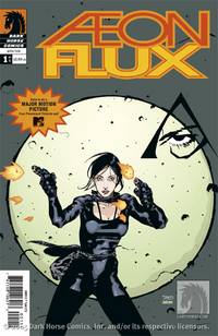 I saw very few instalments of the MTV animated series Æon Flux, and what I did see I hardly remember. I recall it being very dynamic and innovative in its animation, with a heavy inspiration from both European and Asian animation styles, but I recall nothing about the central character herself, save for her lanky, agile frame and fetish wardrobe. From what I’ve read, there were two series of the cartoon, the first in which every episode was dialogue-free and the heroine dies at the end, and a second that had a longer story arch to it.
CHUD readers are well aware by now about the Æon Flux movie starring Charlize Theron (what with the set visit coverage and all), and fans of the show have already proclaimed a disdain for the movie, citing that it bears little resemblance to the animated version (and recalling the visual aesthetic of the cartoon, it would be almost impossible to recreate for real). The new four-issue Dark Horse mini-series Æon Flux is not going to delight the cartoon’s fans much, as it serves as prequel to the film and again has little relation to the animated show. But “purity” aside, it’s quite a good read.
Launching the reader a few hundred years in the future, we are introduced to the sanctuary city of
There are some incredibly innovative sci-fi elements in this comic book. The book cracks the façade of its “utopia” with glee, and I particularly like the jungle threat, as, although unsaid, it would imply that there was genetic tampering for reforestation purposes in the past that’s gone wrong, forcing society into the walled city. I don’t know how much is originated from writer Mike Kennedy and how much is dictated by the film script, but it’s a fascinating story so far. Kennedy has done a fine job scripting the book, introducing the politics, the characters and the concepts. His dialogue is expository without reading like rote exposition, and he crafts a mean action sequence.
The art by Timothy Green II is sublime, favoring a more European style rather than the hybrid Euro/Asian appearance of the cartoon, fitting somewhere in between Moebius and Chris Bachalo. Green wisely doesn’t attempt to draw Charlize Theron in character, instead building his own beautiful and deadly (and less bondage-queen) Æon Flux. He keeps the action and settings more grounded than the cartoon, but that doesn’t make it any less appealing. His distinctive lack of shadows allows Dan Jackson’s colors to shine, and the book is clean and vibrant.
My apathy towards the movie, especially after seeing the trailer, has actually now shifted to anticipation. This comic is that good.
FOUR AND A HALF OUT OF FIVE VIKINGS

Bendis and Oeming Keep “Powers” in Neutral
By Russell Paulette
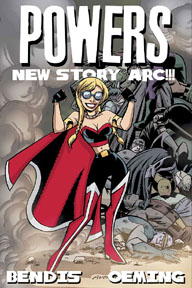 It’s kind of funny writing about Brian Michael Bendis and Mike Avon Oeming’s book, Powers, at this point. On the thirteenth issue of their second volume—their fifty-first issue between two publishers; or the first part of their ninth-or-so trade paperback—the book has had a healthy shelf-life. As a name-making little-engine-that-could book for both Bendis and Oeming, their creator-owned juggernaut has had its ups and downs, but is quickly becoming overlooked with the latest New Marvel launch from either creator. With this latest issue, marking the beginning of a new arc, it seemed like a good time to check in and see what was going on.
All the same elements that attract Bendis’s fans and annoy his detractors are on display here, and moreso than in his more mainstream efforts. He still has that penchant for elliptical, stuttered, staccato dialogue, and prefers to maintain a largely cinematic approach to his storytelling. He paces everything around the dialogue and the interaction—which works well for the book, as a detective procedural—and saves the clever lines for the characters he obviously likes. In spite of all of these tics which, thanks to his output, are more genuinely noticeable than if he were just writing this title, I’m still enamored with the book. Frankly, he’s gotten a lot of mileage out of a concept which, surely, shouldn’t have survived this long. Its longevity is reason enough to take notice, particularly with how major-with-a-capital-m some of the storylines have been to his fictional world.
All said, what’s the new storyline and what makes it so keen, you ask? Well, it concerns someone who is killed in front of his house while walking his dog—simply because a power happens to fall through him. When Walker and Deena come to investigate, they discover some secret in the victim’s closet which makes the case further their territory. Punctuating all the violence is an intertcut scene of a Bill Hicks-esque comedian delivering a monologue on celebrity facetiousness—leading us to believe the comedian is also, likely, the victim. Well enough premise, I suppose.
On the art front, Oeming has been working more loosely in the last few years, and on the one hand it works well for him, but I can’t help but feel that in some respects it looks a little too-loose and almost sketchy. There’s a fluidity to his artwork that’s always been a redeeming quality, and his storytelling is great-if-not-superb. He commands expression as well as anybody in the field, and keeps a real nice balance between lights-and-darks on the page. So, seeing his artwork get looser and sketchier, there’s a slight sadness since, while not diminishing the inherent quality, it does diminish the focus a bit. There was something to be said for the hard-edge sharpness of his work a few years back and currently, though different, loses that special something that he had then.
Overall, it’s still a good package, still worth checking out. In a sense, it is largely the same book Bendis and Oeming were doing a few years back, but you can’t really blame the blokes for doing what works, and doing it rather well.
THREE AND A HALF OUT OF FIVE VIKINGS

![]()

Alex Robinson Proves the Audience Aren’t the Only People Who Get “Tricked”
By Russell Paulette
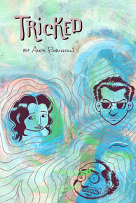 “Read Box Office Poison,” my friend said, “It’s really worth every penny.” All I could think was “it’s so long.” Writer/artist Alex Robinson’s sophomore effort, Tricked (Buy it HERE!), is also long, but clocks in a good buck, buck-and-a-half shorter than his first book. But you know what? At three-hundred-and-fifty pages, it’s also long, but you know what else?
It’s really worth every penny.
Telling about five stories at once, Robinson introduces us to a handful of characters—the washed-up rock star; the conniving husband; the better-than-this waitress; the naïve rural girl; the better-than-everyone loser—and charts them all on an inexorable course towards one final, fatal night in a little diner. Each character—or set of characters—have their own little dramas that play out over the course of the book, and each drama contributes, not merely to a sense of who these people are and, more importantly, why they are, but to this grander vision of all these people coming into each other’s lives for one unforgettable night. True, to a certain extent, there’s a level of contrivance in bringing so many disparate threads together, but Robinson does it in such a smooth, assured way, that you don’t fault him for choosing the type of story, nor the method of telling it.
Perahps more significant than the structure of the writing is the tone and texture of it. On the surface, the writing contains a richness of characterization. Rest assured, Robinson doesn’t go for that same sense of verisimilitude as a Peckar or Los Bros Hernandez, but rather he sets the characters firmly and definitively as who they are, and allows them to act in ways that are conditionally truthful. In short, this is a world—Robinson’s world—and he allows the characters to live, breathe and take over this world as they see fit and, in doing so, we get to see our favorite characters make mistakes, and our least favorite characters a glimmer of kindness and virtue. With deft, assured strokes, Robinson breathes life into this world, and I defy anyone who isn’t caught, line and sinker.
Artwise, Robinson’s no slouch, either. Admittedly, his character work is a bit stiff, with some moments looking more posed than naturalistic. Where his visuals excel, however, is in the characterization, for one, and the details of gesture, for another. Each moment a character’s face reddens from embarrassment, it’s hard not to feel for those characters, even though Robinson simply adds a few extra lines to their cheeks. On top of his virtues in the acting department, Robinson’s artwork also excels with the storytelling—as he chops up the page and the panel borders to fit the emotional or intellectual resonance of each scene.
This is a book that, top-to-bottom, breathes with the life of its characters and, subsequently, it’s creator. Perhaps, though, most importantly, is it’s a thick read, and a good one to boot. This is twenty bucks for an experience immersing the reader in the intersecting lives of a handful of strangers who all find answers in an unexpected place and at an unexpected time.
FIVE OUT OF FIVE VIKINGS

![]()

 Rann-Thanagar War #6 (DC) – Okay, so they killed off Hawkwoman in the previous issue (sorry, ummm Spoiler Warning?), which kind of pissed me off considering the juxtaposition of how lame of a death it was compared to there relative coolness of her character. This final issue launches directly into Infinite Crisis, and looking back, it appears the majority of the story is superfluous to what’s really happening in the DC Universe. Writer Dave Gibbons handles Hawkman all wrong, while Adam Strange seems a little too much like the second coming, and his wife, Alanna, is too much of a warrior and his daughter, Aleea, is far too cute (and oddly drawn like she’s an adult dwarf rather than a little kid) and his father-in-law, Sardath, acts way too much like Dr. Venture (from the Cartoon Network’s Venture Bros.) He did however handle Captain Comet and Tigorr quite well. The full mini-series seemed too cramped with “superheroes” that triumphed while disposable Red Shirts died beside them (superheroes aren’t really trained soldiers). There was a lot of action going on throughout which ultimate came together in the final battle but seemed to have little to do with the impending Crisis until the final pages of this issue. The story of the series overall was muddled (needed less action and more politics for balance), and the final few issues lose consistency as artists Ivan Reis and Mark Campos (providing really good Neil Adams-esque artwork) couldn’t hold to the deadlines. – Graig
RAID RATING:
 Gotham Central # 36 (DC): – This issue marks the end of the current story arc, as well as the departure of the series co-writer/co-creator, Ed Brubaker. The storyline focused on bodies turning up dead in Robin costumes, and ran the gamut from interviewing Batman and the Teen Titans, to tracking down a seedy casting agent who specialized in teenage boys, and touching on headlines-inspired issues like the reporter’s right to confidential sources. In a Bat-Book. Ending on a slightly bittersweet, happy note, the story wraps itself up neatly while also giving Brubaker a nice send-off. The other writer, Greg Rucka, turns in his usual superlative effort, while series artists
RAID RATING:

 DC Special: The Return of Donna Troy #4 (DC) – Akin to my comments on Rann-Thanagar War, again there’s a lot of superheroes fighting a war against the Titans of Myth alongside a legion of warriors, and apparently only the superheroes survived the battle. After three issues of highly confusing, WTF storytelling, the justification for this series’ existence finally comes to pass. Was it worth it? Well, yes and no. The secret of the planet Minosyss is revealed, tying it directly to both Crisis on Infinite Earths and the Infinite Crisis (and by proxy Zero Hour as well). Donna Troy and her convoluted past is also clarified (again, finally) with her importance in the DC Universe, and her role in the upcoming Crisis making perfect sense now. I actually really liked the resolution to this, however the first three chapters were a hard, confusing slog to get to this point. I’ve realized with his Otherworld series that writer Phil Jimenez relies too heavily on narrative for exposition, and it often making his books more complex than they needs to be. Artist Jose Luis Garcia-Lopez, as I’ve said in the past, is the perfect superhero artist, and with inks by George Perez, this book is prime example of why I say that. A satisfying finale to an unsatisfying mini-series. – Graig
RAID RATING:

 Fell # 2 (Image): – Following hot on the heels of last month’s first issue, (which, admittedly, is rare for an Ellis book these days), Warren Ellis and Ben Templesmith return to the cesspool of Snowtown with their titular hero, Detective Fell. In true Ellis form, he packs the issue neck-high with real-life horrors visited on the worst part of the worst town in human history, and he filters it all through the tortured eyes of a detective on the fast-track towards bitterness. Templesmith’s artwork conveys the atmosphere of the book expertly—and he shows a more refined sense of storytelling than I saw on his 30 Days work. That, plus it’s a one-and-done for two bits, so it’s well worth the price of admission. – Russell
RAID RATING:
 Wonder Woman # 221 (DC): – This issue is still dealing with the fallout from this summer’s Sacrifice crossover, and the events leading into this week’s Infinite Crisis. So, in one sense, it’s treading water while the big stuff happens elsewhere, but writer Greg Rucka does a respectable job keeping the tension and interest taut over the course of the issue. Largely, the superficial plot deals with Wonder Woman smacking around a couple of OMACs, while the bulk of the subplot material remains devoted to ongoing subplots that have been drastically effected by the crossover stuff. All of this clips along rather well, culminating in the same event we’ve seen in other DCU books, but having particular relevance to this title. “Regular” series artist, Rags Morales, chips in quite a few nicely rendered pages worth of OMAC smackdown, while fill-in artist Cliff Richards pales in comparison, while doing a yeoman’s job on the subplot stuff. It’s mostly a filling-in-the-gaps kind of story, but Rucka has enough chops to make those stories still feel meaty. – Russell
RAID RATING:
So ends this accounting of valiant warriors and high adventure! Return next week to honor still more comics. Praise Odin.
HAVE A COMIC YOU WANT TO SUBMIT FOR REVIEW? Contact Sean at scfahey@yahoo.com.
To discuss this column and all things Nordic, you may contact Sean at scfahey@yahoo.com , Devon at thedevonsanders@yahoo.com , Dave at dave@chud.com , Russell at inadvertent@mail.com , Rob at poprob@gmail.com and Graig at graig@geekent.com.