 BUY IT AT AMAZON: CLICK HERE!
STUDIO: Fox
MSRP: $19.98
RATED: R
RUNNING TIME: 95 Minutes
SPECIAL FEATURES:
• Two Documentaries
• Commentary by David Cronenberg
• Deleted and Extended Scenes
• Original Script and Cronenberg Rewrite
• Promo materials, Trailer, Original Featurettes and Articles
• Makeup and Effects Test Footage
• Alternate Ending
Try to show me a better monster movie than The Fly. If you’re not holding up a copy of Carpenter’s The Thing I won’t even allow a discussion, and even Carpenter is given a run for his money by Cronenberg’s grisly insect. The early ’80s were a great time for flicks like this, but the latex boom started to peter off in the summer of ’86 after the twin shotgun blast of The Fly and Aliens. What a way to go, though. And as badly as Aliens has aged, Cronenberg’s melodramatic sci-fi revival is as vital as ever.
And that’s exactly what The Fly is. Strip away the prosthetics and you’ve got a simple but layered medical drama. No surprise, given the director, but the elegance and feeling he brings to the material keeps it fresh almost twenty years later.
After years of looking resentfully at Fox’s miserable double-feature DVD, this special edition finally gives the film the attention it deserves. This presentation is among the best any genre director has enjoyed; that it’s from a mainstream studio is remarkable.
The Flick
What Stephen Sommers will never understand is that the most important element of a great monster flick is simplicity. The Fly could almost be a stage play; it’s got only three primary characters (plus, as Cronenberg mentions in his commentary, the baboon) and a couple of locations.
.jpg)
It was embarassing enough having to go back to school, but Stathis thought his days of comforting drunk chicks in bathrooms was long over. He was wrong.
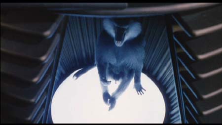
Inventor Seth Brundle (Jeff Goldblum) meets Veronica (Goldblum’s then squeeze Geena Davis) at a party. She’s a reporter, sent to cover the most intriguing ideas in town. Brundle promises her something big and he delivers. The lifelong motion sickness sufferer has created a working teleportation system. Items put into one ‘telepod’ are beamed to another in an instant. Seth demonstrates with one of Roni’s stockings; the act is simultaneously scientific and flirtatious. Smitten, Roni begins chronicling Brundle’s work and the two become lovers. Even the disastrous teleportation of the aforementioned baboon can’t break up the partnership.
Roni is plagued by an old boyfriend, however, who also happens to be her current editor. Stathis Borans, played by John ‘Blood Simple‘ Getz, is the perfect degenerate to face off against Brundle’s principled but disintegrating scientist. In a fit of drunken jealousy, Brundle decides his first human test subject should be himself. But carelessness introduces a wild card. A single fly joins Brundle in the first pod, and what emerges at the other end is something new, an unforeseen twist of evolution.
Counter to most monster flicks, the setup only eats up the first half hour. Brundle doesn’t walk out of the pod wearing a big fly head, however. Instead, he undergoes a long and painful transition courtesy of inspired effects guru Chris Walas. That process is what makes the movie different. It’s driven as much by intuitive acting as makeup.
Under layers of prosthetics, Goldblum’s emotions run through confused and horrified to settle on scientific fascination and finally grim determination. There’s no other film that investigates a monstrous loss of humanity with as much sympathy and detail as The Fly provides.
Goldblum and Davis are perfectly paired, and her revulsion and horror at Brundlefly’s ever more grotesque appearance never seems false. It’s easy to sympathize, though, since Cronenberg doesn’t flinch from the transformation. We’re talking about some shit-hot effects: Brundle’s body cracks and falls apart, arms are broken and legs dissolved by corrosive vomit. The only time the effects falter is when Cronenberg points the camera at Goldblum in an awkward full-body suit. But by then I was too immersed in the character to care.
.jpg)
Every time he watched Fight Club, Jeff tried to re-enact his favorite scene. It wasn’t the same.
Because while Getz and Davis become the film’s bedrock rhythm section, Goldblum solos like a strung-out muthafucker. His shuddering verbal tics and weird line readings make perfect sense for Brundlefly. When hanging from a wall he points at a weird abdominal growth: "What’s that? I don’t’ know…" It’s the sort of totally human throwaway lines the film is full of, and which stick around even after you forget the vomiting.
It’s in those moments that you can focus through all the gory latex to see the graceful, deeply felt drama within. Don’t laugh. Is there a better way to explore humanity than to take it away? Cronenberg strips Brundle layer by layer, matching every horrific sight with a hopeful or inquisitive thought that most monster movies never even consider.
9 out of 10
The Look
Even with a great transfer, there’s an almost faded look to The Fly. Even the blood is a dullish red. But that adds a sort of realism to a film filled with latex, and even when Goldblum is running about in a full body suit he’s believable, thanks in part to the subdued visual tone. No garish mid-’80s Argento effects here, thanks very much.
.jpg)
After leaving the Hong Kong Kavaliers, New Jersey tried his hand at prog under the name Elektrik Hawking.
This director-approved transfer is easily the best the film has ever looked on video, laser or DVD. The old double-feature DVD isn’t even close to the clarity and balance of this presentation. Cronenberg has said in the past that the film often didn’t eeven look right when projected, and that his name would only be on a DVD if Fox took the time to get the image right. His name is here, and that’s all the confirmation I need.
**Edit: Actually, that’s all bullshit. My evidence on the look of the old double feature DVD was based on screens sent to me by a source once thought competent, who must secretly be an agent of Fox. An email mentioned that this transfer and the double-feature one were actually the same and after a look at this comparison, that seems to be correct. There’s a slight brightness difference and the bitrate on this disc seems to be higher but in the final analysis there’s apparently very little, if any difference between the visuals here and last time.
9 out of 10
The Noise
Hey, it’s an ’80s picture. That doesn’t mean a terrible Manhunter soundtrack (thank god) but it is quiet an sort of…thin sounding, especially compared to Cronenberg’s newer films. Though the audio here is perfectly suitable, it’s the least impressive aspect of the disc. That said, there are no problems, either.
7.5 out of 10
The Goodies
Note to the crew responsible for the Warners Dead Ringers release: this is how you do a special edition DVD! It’s packed. Just packed, I’m telling you. The only releases in the Cronenberg catalog that can rival this release are the Criterion editions, and those will set you back a hell of a lot more than fifteen bucks. In addition, Cronenberg’s streak as the commentary-ing-est director in film continues.
The extras include alternate openings; lighting tests; some makeup tests that give a great look at Chris Walas’ great Brundlefly makeup; exploding bug tests and David Cronenberg dressed in a bargain basement fly suit. The original short story and screenplay are presented alongside Cronenberg’s rewrite, which gives a great perspective on the film’s origin. There are also the standard promo materials and the Cinefex and American Cinematographer articles on the film, which will now save me from having to dig out my back issues in the future.
Cronenberg hasn’t presented deleted scenes in the past, but here we get a small handful. Included is the long-legendary monkey-cat sequence and a truly horrible ending that shows how just a couple extra minutes of footage could have utterly ruined the end of the film. A couple of scenes are also presented in extended form (the steak sequence and Roni’s return after Brundle’s first teleportation) to show how a little tight editing can really move things along.

Look Closer.
And then there are the documentaries. Fear of the Flesh is a massive effort, nearly three hours long with all the extra "interactive" clips added in, and detailed almost to the point of absurdity. (Do we really need the condensed version of the original film?) It can be dry at times, making it something that only die-hards will really get into. But for anyone who wanted to know anything about where this film came from, who made it,, what steps were taken before production and where some of the ideas came from, there’s nothing to compete. Even if you’ve read the few good Cronenberg books that are available there’s a lot of new info here. As dry as Fear of the Flesh can be, it should be a template for the future. Only the extended Lord of the Rings discs can stack up against it.
If there’s a fault with the doc, it’s that it relies too heavily on scenes from the film, which are often inserted in their entirety. I’d like to see more of the interview material layered over the final footage, which would have cut the running time to a more palatable two hours.
There is one thing missing from the doc, as well – David Cronenberg. He only appears in on-set footage. But since he presents a solid commentary and every other key figure in the film’s creation appears here, I don’t feel like we’re missing anything.
The shorter documentary is The Brundle Museum of Natural History, in which Chris Walas takes us on a tour of the famous basement of Bob Burns, in which many of the surviving props and models reside. We don’t just see those cool items, though, as test footage and alternate effects attempts are cut in as well. You’ll know more about Stathis’ melting hand than you ever wanted.
9.5 out of 10
The Artwork
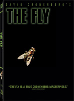
So close to perfect. Take away the extra text on the cover and it would be ideal; why mar the film’s title and image with extra words? Anyway — I’m a sucker for minimalist icons, and the fly’s leg protruding from a telepod (on the original poster) was always a little too on the nose for my taste. This is much, much better — just the title and a fly on a white background. (My copy is white, anyway. I haven’t seen this in stores yet, but since the image provided by the studio is black, maybe there are multiple editions.)
9 out of 10
Overall: 9.5 out of 10