You know what I’m getting burned-out on?
MINIMALIST MOVIE POSTERS.
Sure, sure – some great work is being done in the realm, but it’s getting to the point where it’s the road you take when you’re too lazy to do floating heads.
The beloved Drew Struzan stepped into retirement a short time ago, and with that – it seems as though the final tie to artistic endeavor in film marketing has breathed its last. And I get that the reason the minimalist thing is loved is because it is an attempt at artistically marketing a product – which makes us feel like the people behind that product might actually care a little – but what also seemed so full of wit and heart has become increasingly formulaic as internet fannerds with a semester of graphic arts hop on the train. All you need to do is make some shapes that are evocative of some image from the film, render the thing in almost primary colors, and do the title treatment like you think Saul Bass would have, and you’re done. See – it’s cynical already.
What happened to the artwork that made you feel your favorite moment from a film – sometimes before you knew it was a favorite moment? Who’s out there giving this work the heart and humanity it deserves?
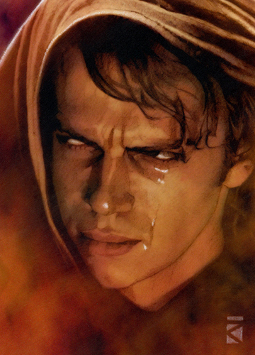
I don’t know why I’m asking – I already know the answer. His name is Russell Walks.
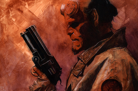
Walks has worked for the Big Two, as well as Dark Horse, Image, Topps, and Lucasfilm, and when you see his Star Wars work, you get the sense that he’s more passionate about the films than Lucas ever was.
Don’t be afraid – it’s not just Star Wars stuff:
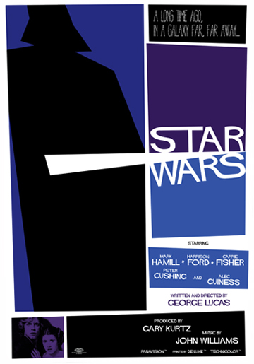
And yes – he can nail the minimalist style if you want him to:
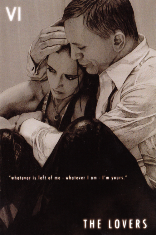
These couple of pieces don’t begin to scratch the surface. Walks is available for commissions, and he sells extremely affordable prints of his work. Visit www.russellwalks.com to inquire. I bought this one:


