If there’s a consistent theme that runs through every film you see at SXSW, it’s about making the most of your limited resources. Director Matt D’Elia and cinematographer Julian King do just that with American Animal, an intense, tightly-focused, performance-driven tale of two friends at a turning point in their lives: James (Brendan Fletcher) wants to put on a tie while Jimmy (director Matt D’Elia) wants to Put on the Ritz.
Here’s the trailer:
For a film that’s mostly made up of two people talking, there’s a great energy to it, which is also exciting because it’s all bottled up in one place, first within Jimmy then Jimmy’s bottled up in his loft. I realized about ten minutes into the film that we were never going to leave the apartment. How do you make that interesting?
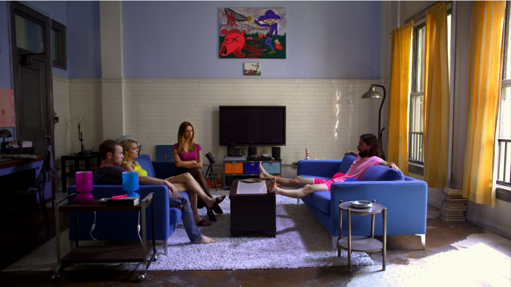
Matt D’Elia: When we decided that Julian was going to shoot it – because he was always going to produce it, but I’ve always known he was a great cinematographer – the very first thing we talked about is that we’re going to do this in once space. What are the themes we want to be aware of? We didn’t want to come up with some artificial reasons to change the lighting or make it interesting. We wanted it to be organic. We talked about setting up our shots a little bit wider in the beginning and then getting closer as the film goes on, developing more movement, and not showing each space in the same way.
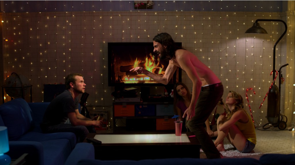
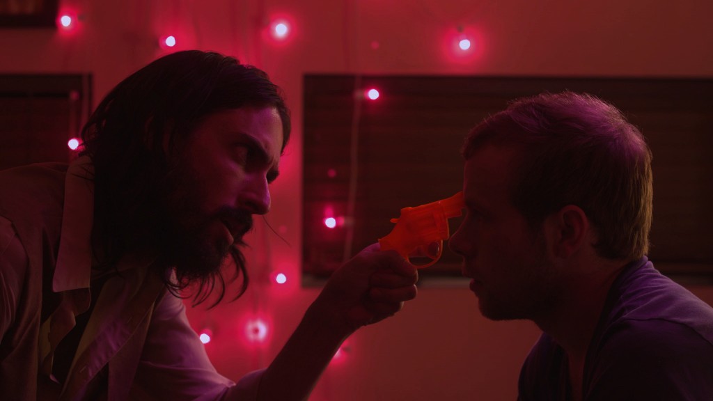
Julian King: The lighting also follows the arc of the character. The movie starts with daylight and moves towards nighttime lighting, which was Christmas-themed because Jimmy decides it’s Christmas – even though it’s August – which is part of his delusion. The lights in his room are pink and purple, and those colors move down into the main space as Jimmy gets more and more intense.
MD: Pink represents Jimmy and to put that everywhere makes it feel like he’s taking over and kind of exploding onto the others and infecting them. There’s a huge monologue scene in the living room where everything really goes pink. We tried to represent what was going on inside Jimmy.
It feels very theatrical, but in a live theater kind of way, with the small cast, the one location and the focus on one character. Did the live theater inform any of your cinematic decisions?
MD: That was always a thought of ours, that the script reads like a play, but it’s a movie. We had to address both of those. Mike Nichols did it with Who’s Afraid of Virginia Woolf? He has a way of making those texts seem like movies. We just decided to use the theatricality and in terms of the performances and even the lighting but take the framing and be very cinematic with it.
JK: The nature of the movie lends itself to approaching reality as an idea, and the things that are happening to the characters affect the reality. One thing I did was gradually soften the image with a Black Pro Mist filter as we moved into the night, from and I had an 1/8th Low Con filter on the entire time to just kind of soften the image overall. We shot with the Red One. The first version of the camera, Build 20.
I was also using a lot of bounced light and because the whole place was rigged with Christmas lights, it created this really soft ambiant light that kind of allowed me to let things be, and then I just brought in my hard accents and key lights.
What’s your director/cinematographer relationship like, as far as discussions about camera and lighting are concerned?
JK: We talked extensively and Matt had certain movies that he really felt were significant for this film and just totally on target. We were very much in the same headspace. I also produced the movie so by the time we actually started shooting there was less communication necessary. In terms of being on set, I learned so much from Matt. He frames everything very exactly. He’ll come in and set the frame in a very exact way as we’re lighting.
You mentioned there are other movies you wanted to reference visually. What are some of those films?
MD: All That Jazz is another big one. We talked about One From the Heart and films with directors that just lock the camera off. There’s some Clockwork Orange-influenced stuff in there, particularly with the cutting to classical music.
JK: One Flew Over the Cuckoo’s Nest came up a lot. We were very clear that we wanted a very classic feel for the movie because there’s so much happening in one place that if the camera was too frenetic it might’ve been too claustrophobic. If you lock off the camera it’s easier to sink into a scene and forget that it’s there. You’re just watching the actor and the action.
Just another note about limitations: this is a low-budget film, and when Matt sent me the script, I remember being excited about it because it was a movie that you could make for not a lot of money and really focus in on the environment and have a large amount of control over what you were doing.
What you’re saying is that if you’d tried to expand the focus of the story beyond the apartment-
MD: Control would’ve been lost. The big bonus was being able to control everything. The production design, the lighting, and the framing. A lot of independent films don’t have that luxury because you’re running and gunning, going from location to location and shooting handheld, but for us every shot was exactly what we wanted. It’s not a luxury many indie films have.


