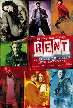
 There have been a couple of movie poster trends lately, and the big screen version of the musical Rent is taking part in both of them!
We’ve seen a number of posters where instead of the horrible floating head, the one sheet is broken up into a number of boxes, each with different images. That’s what the final one sheet for Rent looks like.
Then of course there’s the phenomenon of the character poster. Nick addressed this a couple of months back in a Steady Leak, and I have to chime in here – the character poster is neat when it means something. But here… well, no matter how much I am looking forward to Rent (and I really am, despite the three major misgivings I have: 1) they have brought back the original Broadway cast, all of whom are now way too old to play their own roles; 2) Chris Columbus is directing; 3) the central AIDS storyline will feel passé in this day and age, sadly), posters for each of these characters, mostly played by nobodies, are overkill. They’re just simply meaningless! Plus they’re ugly.
Oh well. I hope that the movie is good, and in the meantime, here are the character posters, presented in alphabetical order. Look for the one non-original actor, the astonishingly fuckable Rosario Dawson, looking astonishingly fuckable.
