 REVIEWED THIS WEEK:
– The Winter Men #1
– Hero Squared #1
– Ultimates Annual #1
– Hiroshima Atomic Holocaust #1
– At the Seams TPB
– Captain America #8
– When Zombies Attack #1
– Hero at Large #1
For the Love of Mother Russia, Read “The Winter Men”
By Sean Fahey
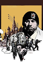 In many ways, Wildstorm’s new mini-series The Winter Men defies description. It’s a complex story about divided loyalties set in modern day
The bleakness of the setting compliments the thematic direction of the story incredibly well. The Empire has crumbled, completely taken over by the Russian mafia and American business interests. The bulk of the once proud military and police force are now working as bodyguards and hired muscle, and the Soviet’s superhero program (“The Winter”) is spoken of only in hush tones – almost as if it never existed. It’s a defeated world (which colorist Dave Stewart’s muted palette helps convey) that is literally begging for any sign of hope or new beginning. Against this backdrop Kris Kalenov, a washed-up
The Winter Men # 1 begins what has the clear makings of an intriguing and textured thriller, and Brett Lewis turns in a smart script that doesn’t insult the reader with info-dumping exposition. Instead, the story flows from the character interactions, as Kalenov makes his way (reluctantly at first) through
FOUR OUT OF FIVE VIKINGS

“Hero Squared” Brings More of the Same out of Giffen/DeMatteis …Yes, That’s a Good Thing
By Graig
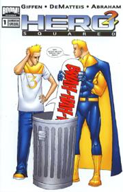 In a previous chapter of “Thor’s Comic Column” (RIGHT HERE), our illustrious Rob Glenn said of Hero Squared X-Tra Sized Special #1: “Hero Squared has the makings of something really good.“ And you know, he’s right. The first issue of the new Hero Squared three-issue mini-series is good. Really good. Then again, if you’ve been paying attention at all to this column, you’ll know I’ve got a bit of a bias for Keith Giffen (especially working with JM DeMatteis).
I mean, look: Defenders, 5/5 Vikings; Common Foe, 5/5 Vikings; Justice League Classified #6, 4.5/5 Vikings, and who can forget his CHUD exclusive cover (and interior contributions) to the first Zombie Tales anthology (which our glorious captain, Sean Fahey, gave 4/5 Vikings to). So, yes, I love Keith Giffen, and perhaps I will marry him.
Tossing all bias aside, however, I respect Rob as a colleague, and his 2.5/5 Viking rating on the inaugural Hero Squared book had me a little wary, especially since I couldn’t find a copy to read. So when the new mini-series hit the stand I eagerly snapped up the first issue but read it with a tentativeness that melted away as I progressed through it. Not only was I surprised by how free-flowing and giggle-to-one’s-self funny it was (which, considering my history with the Giffen/DeMatteis team, I shouldn’t have been), but also how contained the book was. Though I’m sure the X-Tra Sized Special provides a heftier grasp on the back-story, it isn’t an essential read to enjoy this mini-series. What we get with Hero Squared # 1 is a jump-on-board sitcom where a slacker must share his apartment with his other-dimensional self, who happens to be a superhero. It also turns out that the slacker’s girlfriend’s other-dimensional self is the superhero’s chief nemesis, and capable of obliterating this universe (as she did with the other one).
Like any sitcom, this book is centered on dialogue and character interaction. Punchy and comedic repartee abounds between the hero and his other-self, the slacker and his girlfriend, the villain and her henchmen, but each has their own mannerisms and distinctive personalities that the humor accentuates. And for the easily distracted, there’s also some action to help progress the storyline along (no, amidst all the jibber jabber, they didn’t forget to include a story).
One of the criticisms of the previous issue was with Joe Abraham’s artwork, which Rob dubbed “hesitant, sketchy line work gives the book an amateurish look… like something you’d see in a notebook from your local high school’s Napoleon Dynamite.” Since the Special, Abraham has eliminated much of the scratchiness from his work, tightening up his lines with a finer ink stroke. His characters seem much more natural and fluid in their environments, although there are still moments where the scene calls for tight details that get a little muddy. Overall it looks good, a loose style that fans of Invincible’s Cory Walker would appreciate.
On the one hand, Hero Squared doesn’t have the advantage of poking fun at institutionalized superheroes as Giffen and DeMatteis have done with the Justice League or are doing with the Defenders, on the other hand, they aren’t relying on continuity or character familiarity to carry the story along. They’ve created a smart, enjoyable cast of characters and a story that is simultaneously engaging and amusing. Big surprise, I liked it.
FOUR OUT OF FIVE VIKINGS

Millar and Dillon Reserve “Ultimates Annual # 1” for Bench Warmers and Snipers
By Russell Paulette
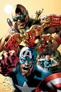 Is it the irony that makes Mark Millar’s writing on the Ultimates both dark and moody as it is fun and light, or is it something else altogether? It’s a weird tone he puts on the book, to be sure, but it’s one that this review finds imminently irresistible and readable. With Ultimates Annual # 1, Millar brings that same tone, and it’s matched by the artwork of Steve Dillon, which has always had that same weird irresistibility for me.
On the writing end, Millar takes the wise tack of making a stand-alone, fairly accessible done-in-one story that also provides insight and definition to the world of the monthly book. Not an easy task, I’m sure, but Millar pulls it off with a certain flair and panache. The story focuses mainly on Nick Fury and his rationale for the super-hero franchise he’s building for the US Government. On the one hand, he’s stepping on a lot of international toes—and he knows it—and is adding fuel to the fire of a super-powered cold war. On the other, Fury is actively developing the Reserves—who serve as the main focus of the action—developing the technologies that made the main-team heroes unique and mass marketing them for other team members to use. This leads to squads of Giant Men, Iron Men, et cetera. This plotline dovetails nicely into a focus on the Captain America backup—seems he’s the one stand-out super-power they’ve had trouble replicating—and this gives Millar the main emotional core of the story. As a c-plot to the Fury stuff is an assassin who’s been hired to dispatch Fury, and his plotline is not only interesting, but reaches a conclusion that’s both annoying and entertaining.
Which is the main problem with Millar’s writing—and it’s only a problem if it gets to you, otherwise it’s just how it is—and that’s his tendency to treat one or two of his main characters with such a precocious preciousness that there’s no adversity to extreme. He’s a big fan of the “I had this planned all along” kind of moment for these characters and, though it usually works and feels organic, is pretty much the annoying part I’m talking about. There’s a sense of characters being clever, and then being too clever, and it’s this line that Millar often toes if not just completely ignores. That said, the rest of the script is fine, full of those pithy, sharp lines of dialogue with people talking the way we all wish we could under those circumstances. His scene work and presentation are as exciting and entertaining as you would expect from the man.
Steve Dillon, he of the “I’ve never met a face I didn’t enjoy drawing on three different characters” fame, pulls off his usual job here. There’s solid storytelling, a mastery of anatomy and form, and a wicked sense of humor. If you’ve seen anything else he’s done, there’s not all that much different here, apart from the super-costumes, which he pulls off with nary a—ahem—hitch, and that same weird ironic tone described above. It’s Dillon doing what Dillon does, and there’re no complaints in that department.
Overall, there’s a lot to enjoy with this issue. If you’ve never gotten around to checking out the Ultimates, this Annual is a nice barometer of the tone of both series, and because of that it fits neatly and cleanly with everything else around it. If you’ve never gotten a taste for the book to begin with, Dillon’s art won’t do much to change your opinion. Mostly, if you’re in the mood for a conspiracy-laden, post-ironic romp through a world where super-heroes worry about Q-ratings, then by all means.
FOUR OUT OF FIVE VIKINGS

"Hiroshima: The Atomic Holocaust #1" Is A Rough Read and an Opportunity to See from the Other Side
By Rob Glenn
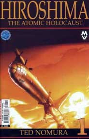 August 6th, 2005 was the 60th anniversary of the first atomic bomb used in warfare. A four-ton payload was dropped from a B-29 on Hiroshima, Japan, causing destruction and loss of life on a level inconceivable until then. The impact of this event was massive both physically as well as metaphorically. Nothing would ever be the same. These are the things on which everyone can agree. The details, however, are much more elusive. Antarctic Press has released the first in a two issue miniseries addressing these details.
Creator Ted Nomura has some very strong viewpoints about the events leading up to the violent birth of atomic warfare. Hiroshima: The Atomic Holocaust addresses what Nomura must assume are misunderstandings that many Americans hold to be true. Nomura doesn’t fault President Truman for authorizing the use of the bomb. Instead he concedes that had Truman refused to use this weapon at this time, a more powerful bomb would have been used at a later date on some other country or city causing multiple times the damage. At any rate, both Germany and Japan were also at different phases of producing the same bomb. It was bound to be dropped one way or another.
Where Hiroshima becomes flinch-inducing is the use of the word "holocaust". Although it has been said that use of the atomic bomb was unnecessary as the Japanese were losing the war by this time, Nomura disagrees. He sites what he calls a number of American holocausts. From the treatment of the Native Americans to the overly common lynchings of African Americans, Nomura states that Japan saw the U.S. as a terribly racist country. Anyone who has seen political cartoons from the 40s knows where he’s coming from. Horrible racist propaganda depicted the Japanese as monkey-like creatures wearing thick glasses, exaggerated slanted eyes and buck teeth could be found anywhere from your local paper to Bugs Bunny and Donald Duck cartoons. Nomura asserts that this is in part what kept the Japanese in the war. Their fear of post-war treatment left them with no other option than to fight to the last man.
Hiroshima is written very much in the Manga style. Whole pages are taken over by text, pushing the art to the sides in an effort to get as much information in as possible. This book is wholly unlike what most Americans think of in regard to comics. This isn’t musclebound heroes alternating between soap opera schmaltz and fisticuffs. This is a documentary in graphic form. It represents an opportunity for bringing in new readers to the medium. Your history buff uncle would eat this up. On a more interesting level, this book is an opportunity to see a world-changing event from the other perspective. Issue one ends with the dropping of the first bomb and its immediate aftermath. The images shown here are hard to take, no matter your feelings on Nomura’s viewpoints. Issue two promises to be much more disturbing.
FIVE OUT OF FIVE VIKINGS

Whether An Industry Hotshot or Writing “At the Seams,” Ed Brubaker Has Talent
By Russell Paulette
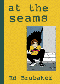 With the recent announcement coming out of Chicago that Ed Brubaker and Michael Lark are officially (and finally) Marvel’s choice for the new creative team on Daredevil, I thought a look back at some of Brubaker’s previous work would be in order. Last spring, Alternative Comics re-issued At the Seams, a one-shot single issue collecting three short stories written and drawn by Brubaker, all held together by the theme of relationship drama and the conceit of the sun dying and turning black.
To reiterate for those who may not know, all three of these stories were written and drawn by Ed Brubaker. In his early days of breaking into the industry, Brubaker drew his own work and was, in fact, quite the draftsman. The bulk of his early work was collected by Top Shelf and published under the title A Complete Lowlife. If you’re familiar with that work, At the Seams is on par with his Lowlife work, both in terms of the writing and the art. If you’re unfamiliar with either, then by all means read on and seek them both out.
At the Seams opens with a story entitled “Under a Big Black Sun,” which neatly establishes the themes and tropes used in the other two stories and is, perhaps, the strongest of the three. A simple relationship drama, the story focuses on the nerdy, bespeckled video store clerk dating a girl named June, who summarily dumps him and begins staying at his best friend, Paul’s. Soon enough, June and Paul start dating, and the story details the various relationship traps that ensue. Each page escalates the drama with a paranoid frequency, and it all finally culminates with one of those haunting, lonely moments that one doesn’t see too often outside of, say, a Raymond Carver story.
The other stories carry many of these elements of infidelity and the emotional complications. In addition, the other element that gives the pieces unity is in the melancholy tone of the narration. All three of these stories carry the same disaffected exhaustion in them, but they also read as three distinct voices, all wrestling under the same burdens and emotional weight. You almost feel, at the end of it all, that if you could get the three of them in the same room together, you might have the beginning of a support group.
It’s the strength of Brubaker’s writing that carries most of this through, and these three stories show off much of that strength. He not only manages to craft tight, short scenes, but he also manages to imbue them with a high sense of drama. Though they can run a little heavy on the narration, Brubaker also shows an instinctive knowledge of when and how to turn that off and let the images and dialogue carry the burden when they need to.
Because he also drew it, he can rely on his considerable draftsmanship to move the eye along the page. There’s nothing overwhelming or spectacular about his line work, but it’s capable and distinctive. He does carry a Jason “Berlin” Lutes quality to his storytelling and his rendering—which makes sense, since they’re friends and have worked together in the past—but Brubaker’s artwork has a greater sense of his simplifying the line work to its core basics.
If you’ve been enjoying his mainstream work, perhaps an appointment with the younger, hungrier Brubaker is in order.
FOUR OUT OF FIVE VIKINGS

Ed Brubaker’s Ballsy Writing Has Made “Captain America” One of Marvel’s “It” Titles
By Sean Fahey
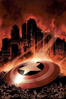 When writer Ed Brubaker came over to Marvel from DC to helm a relaunched Captain America, he came with a plan. Ahead of him by just a few inches were his balls, covered in brass, being pushed in a wheel-barrel. In the span of just eight issues, the Red Skull was assassinated, a WMD went off in Philadelphia, powering the Cosmic Cube (now in the possession of a rogue Soviet General), and Nomad was gunned down in cold blood. Oh, and it looks like Cap’s old (and long thought dead) side-kick Bucky Barnes is responsible for the whole thing. Brass ones folks. In the span of just eight issues, Brubaker has managed to turn Steve Roger’s world complete upside down, making Captain America one of Marvel’s “it” titles in the process.
I have nothing but respect for what Brubaker has done with this title. Not only has he given it a Sleeper-esque edge (spy / superhero fusion) by keeping the stories topical and weaving SHIELD more heavily into the narrative, but he’s also managed to create some real dramatic tension by having Cap face his worst nightmare. Some critics have denounced Bucky’s “return” as a gimmick, and perhaps it would be were it no so well written. But similar (only better) to what Judd Winnick has done on Batman with Jason Todd, Brubaker is putting Cap through the wringer emotionally and psychologically, and that makes for some good comics. I don’t feel there’s any threat to having Cap (or Batman for that matter) at the end of a gun barrel. But this. There’s real anxiety and stress here.
It may sound like a lot has been going on in this title (and it has), but Captain America # 8 is a pretty accessible jumping on point if you’re looking to see what all the buzz is about. Though it marks the beginning of a new story-arc, in many ways Captain America # 8 is also a recap of everything that’s lead up to this point, as the issue deals mostly with the fallout of the attack on Philadelphia and an examination of SHIELD’s intelligence on Bucky. The issue is also bookended by a World War II flashback sequence that seems to bolster what we suspect to be the identity of the Winter Soldier. Then again, you have to stay on your toes with Brubaker.
Thanks to Brubaker, Captain America has gone from a title I never really cared about to one of the Marvel books I most eagerly anticipate. To steal a line from Marvel’s EIC, it’s one of those comics that’s “made Wednesdays fun again.”
FOUR AND A HALF OUT OF FIVE VIKINGS

“Cops” Meets “Hellboy” Meets George Romero in “When Zombies Attack!”
By Sean Fahey
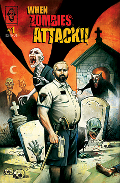 In case you hadn’t already noticed, we’re on a quest to review every single zombie title published here at ye olde comic column. Good or bad, if it bleeds it leads (well, maybe it doesn’t always “lead,” and often the undead don’t actually “bleed,” but you get the point). To that end, this week we have the first issue of When Zombies Attack!, a clever and quite humorous marriage of influences that includes Cops, Hellboy and the films of director George Romero. And as you’ve probably guessed, it’s a friggin’ hoot.
Published this past July as an adaptation / expansion of the short film of the same name (originally released in 2001), When Zombies Attack! details the day-to-day misadventures of Frank and Chet, two officers in Burke County’s PMAC (or Post Mortem Animation Control), as they keep their community safe from zombies, werewolves, vampires and more zombies. Following Frank and Chet around on their assignments is a documentary film crew that lends a witty “Cops” vibe to the book. But When Zombies Attack! is more than just a mere parody or a spoof. Writers Chad Waters and Matt Rose have created endearing characters in Frank and Chet who have much more substance than the boring “random cop A” and “random cop B” you get on the FOX program. Instead, both have their own pathos, personality and mysterious background.
That said, what truly sets this comic apart is its dark sense of humor. The slapstick situational comedy in this book works. The dialogue is funny, and the comedic pacing is spot on. Artist Jim Mahfood’s eclectic and exaggerated style really heightens the effectiveness of the physical comedy, giving everything a zany and over-the-top appearance. You just don’t feel so grossed out when those heads start exploding and people start tripping over corpses! (Plus, there’s a reference in here to a cereal named “Jesus Flakes.” How can you not love that?)
At times, When Zombies Attack! borrows a little too heavily from Hellboy. Frank is for all intents and purposes the human version of Hellboy, the PMAC is for all intents and purposes the human version of the BPRD, and the humor is very much in the same vein, albeit more slapstick. But hell(boy), if you’re going to borrow, borrow from the best. At the end of the day this is a fun book – and a smart looking one at that.
(If you want to learn more about this comic or the short film upon which it is based go to www.whenzombiesattack.com. If your having trouble finding this comic, you can order it HERE )
THREE AND A HALF OUT OF FIVE VIKINGS

Speakeasy’s “Hero@Large” is a Loser, and Unfortunately it’s Not Just the Main Character
By Graig Kent
 The bigger they are, the harder they fall. What goes up must come down. And other such clichés about getting very successful only to find fortune and fame fleeting.
This is the premise for the new Speakeasy Comics series Hero@Large by Erick Hogan and Jeremy Treece. Alpha Major, Megalopolis’ biggest superhero, walks into his agent’s office one day to find that he’s become passé, and that his toy line isn’t selling, his film options have expired and that he’s being dropped from the agency. To cap it off, the super team he leads, the Justice Five, has voted him off the island, so to speak. It doesn’t take long for the reality to hit him, depression to sink in, and the alcohol to take over. If he hadn’t found slum housing, he’d be on the street. But “how the mighty have fallen” isn’t the only trite offering of the book, as Alpha Major befriends a young boy in his building and saves his mom from an abusive boyfriend. He’s a hero again.
From rise to fall to redemption, it all happens in these 22 pages, what’s left to tell? This book confuses me, because it seems to have exhausted its direction and story possibilities with its first issue. None of the characters are particularly well developed beyond their stereotypes, and the self-contained story gives nothing to entice the reader to pursue a second issue.
Treece’s art is very urban graffiti inspired, with a Flash animation texture to it. It’s hyper-stylized but comes across extremely flat much of the time. Treece (who did the pencils, inks, colors and letters) is a skilled storyteller and has a playful feel to his layout and perspectives, but doesn’t have much new or interesting to work with in terms of story. Hogan’s script hits upon notes of commercialized superheroics that have been better explored in other series, recently Less Than Heroes and X-Statix.
Speakeasy is making a name for itself by keeping its books out of conventional territories (with different levels of success) which DC and Marvel have pretty much secured, so it’s disappointing to see such a plain book enter their roster. The cover is pretty sweet, though.
TWO AND A HALF OUT OF FIVE VIKINGS

So ends this accounting of valiant warriors and high adventure! Return next week to honor (maybe) a bunch of trades. Praise Odin.
To discuss this column and all things Nordic, you may contact Sean at scfahey@yahoo.com , Devon at thedevonsanders@yahoo.com , Dave at dave@chud.com , Russell at inadvertent@mail.com , Rob at poprob@gmail.com and Graig at graig@geekent.com.
HAVE A COMIC YOU WANT TO SUBMIT FOR REVIEW? Contact Sean at scfahey@yahoo.com.