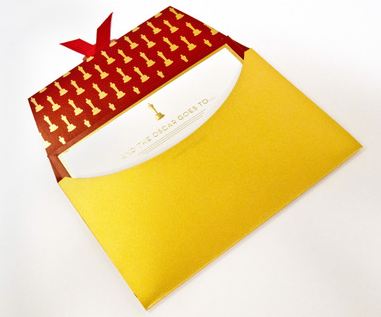
 If you speak to most movie fans they will tell you flat out that one thing the Oscars sorely need is more ostentatious displays, and that recent years have shown us a drop in opulence at the world’s largest movie ceremony. Well the Academy has heard your complaints and has taken proper steps. They announce plans to revamp the paperwork on stage, and just in time for the 70th anniversary of the use of a sealed envelope to herald category honorees.
In a bold stroke the Academy has decided that they will be leaving behind the drab and conventional envelopes used to deliver the winner of each category. They have commissioned an exciting reworking of the honor-delivery vehicle. In years past the firm of Price-Waterhouse-Cooper has basically used a FedEx-Kinkos level of paper stock with an affixed adhesive seal. Well where’s the pageantry in that?! Now the Academy takes on the persona of a young lover, one with a nascent swelling of affections for their beloved, who starts eschewing the $0.99 discount valentines at Wal-Mart and invests in complexly crafted greeting cards incorporating numerous media.
The envelopes are such an integral part of the Academy Awards, yet there has never been a dramatic, specially designed envelope and card to announce the Oscar recipients,” said telecast producers Bruce Cohen and Don Mischer in a statement Wednesday.

This bold stroke involved commissioning a Los Angeles company, Marc Friedland Couture Communications, to design and construct new presentation envelopes and announcement cards. According to owner Friedland this job has become a dream come true for him.(Not to be one to squash anyone’s dreams, but I have to wonder if this is not a slightly hyperbolic statement. I would love to find out, for instance, if his high school yearbook has a caption below his picture reading, “Dreams of designing the Oscar envelope one day!”)
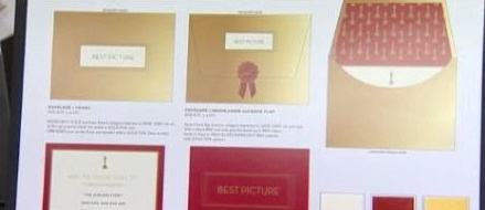
The new design looks like a major challenge for your scrapbooking family member to emulate. Friedland began with a high-gloss iridescent gold paper, then he gave it a red lacquered lining with a printed a pattern of the statue with gold leaf. The outer flap has an ecru inset panel. The card therein is also in ecru with the red lacquered backing which has the category printed on the back. The front comes with gold leaf accents and the statue displayed at the top, embossed with gold foil. The winner’s name is printed below is gloss charcoal ink.
These do seem at least one step above the Gnomeo & Juliet invitation cards I just picked up at Party City. To get the complete feel here is some stationary porn showing what they have in store.