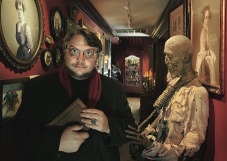
The New Yorker has a truly epic 13-page piece about genre demigod Guillermo del Toro up on their website. It is an excellent showcase of the filmmaker, covering his entire career from his humble beginnings mastering English so he could fully enjoy Forrest J. Ackerman’s goofy writings in Famous Monsters of Filmland, up through his current projects and plans for the future. There is plenty of talk of his time spent on The Hobbit, including this delightful blurb:
“Del Toro later said that he inevitably imposed his sensibility on source material: “It’s like marrying a widow. You try to be respectful of the memory of the dead husband, but come Saturday night . . . bam.”“
More importantly, though, there is also a lot of talk of At the Mountains of Madness. From the objective:
“The movie would not be an easy sell, though. Del Toro envisaged “Madness” as a “hard R” epic, shot in 3-D, with a blockbuster budget. Creating dozens of morphing creatures would be expensive, and much of the film needed to be shot somewhere that approximated Antarctica; one of the most disquieting aspects of Lovecraft’s novella is that the explorers are being pursued by monsters in a vast frozen void, and del Toro wanted to make the first horror movie on the scale of a David Lean production. But a “tent-pole horror film,” as del Toro put it, hadn’t been made in years. High-budget productions such as “Alien” and “The Shining” had been followed by decades of cheaper thrills. “The natural flaw of horror as a genre is that, ninety-nine per cent of the time, it’s a clandestine genre,” he said. “It lives and breathes—‘Texas Chainsaw Massacre,’ the first ‘Saw,’ ‘The Blair Witch Project’—in dark little corners that come out and haunt you. Rarely is there a beautiful orchid that blooms.” He mentioned Hitchcock’s “The Birds”: “It was a major filmmaker using cutting-edge optical technology and special effects. It was a big-budget movie. It had Edith Head designing costumes, it had all the luxuries. And it was appealing because it had all the polished aspects of a studio film.”“