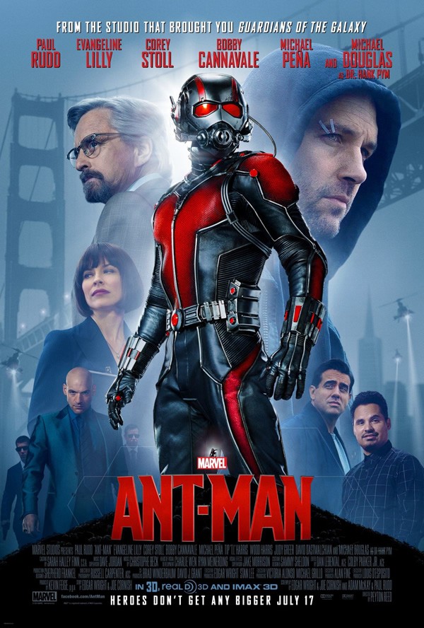
I love Marvel Studios to death, but could this new official one-sheet by our most beloved billion dollar company look any lazier?
- composition and choice of images is highly questionable
- it manages to say absolutely nothing about Ant-Man’s specific powers
- I get why they don’t want to advertise with disgusting insects, but no display of growing or shrinking?
- what does Michael Peña even wear?
- why don’t they show Yellowjacket in his amazing outfit?
- why is there another tiny Ant-Man below Rudd’s crotch?
- do those awfully generic helicopters look familiar to you? Well, it seems they just re-used the same clipart from the Iron Man Three one-sheet (new color, same shape)
Come on, they’re obviously not even trying. Why do have I a feeling they won’t even bother releasing character one-sheets for Lang, Hank, Wasp and Yellowjacket? And we got one-sheets for Glenn Close and John C. Reilly. We’ll all see this opening week anyway, no matter how lazy the promotional campaign may get, but they could really put a little more effort in it.
For more news, you can follow me on Twitter @keatonreturns.