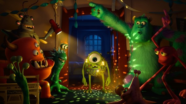
 Though most might have chalked it up to the advances in animation Pixar typically manages with each release, I’d bet a lot of people noticed a subtle difference in the look of Monsters University compared to the films before it. I noticed it in a scene in which Sully leans against a post and watches other monsters dance- the light bounces around with extraordinary sophistication. It wasn’t the lights that caught my eye though, it was the shadows. Deeper, richer- pouring into the nooks and crannies more realistically. Still, it was hard to put a finger on exactly what made this gorgeously animated film different from all of those other gorgeously animated films.
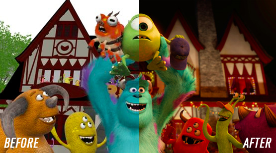
Well, turns out the change is that Pixar completely tossed out their old way of lighting and retooled their entire approach to illuminating their scenes.
 Pixar films have never lacked for stunning cinematography- I remember my jaw dropping at images in Wall•E, a film that had none other than Roger Deakins lending guidance to its look. And though digital animation has long been a process of creating scenes and then placing virtual lights and cameras as if they’re actual happening, that’s also entailed a great deal of painting in light and shadows like Murnau did in the German expressionist days. Apparently at the start of Monsters University, DP Jean-Claude Kalache decided to challenge the way Pixar does things and suggest that the company switch to a ray-tracing lighting approach. For a company known for throwing out movies deep into production to start over with ideas that work better, it wasn’t such a crazy idea…
 If you’ve not heard the term before, “ray-tracing” is the idea of tracking every single photon of virtual light as it passes against, through, and around surfaces in a scene, tracking how that light changes. It’s partly the reason CGI has become so much more photorealistic in recent years, and why the processing horsepower required to generate it has increased exponentially.
The change has to do with ray-tracing — the technique of mapping out every ray of light in a given scene, as it bounces off walls and characters, casting shadows and producing reflections. It’s closer to the way light works in the actual world, where a single light source will bounce light into every corner of a room. It’s already common in partial-CGI environments like the Transformers and Iron Man movies, where Industrial Light & Magic used the technique to create metallic reflections. But for Pixar’s full CGI environments, mapping out the millions of beams of light was seen as too arduous to be practical. Instead, Pixar relied on manually placed shadows and a network of direct light sources, a setup that was becoming increasingly intricate as the models and setups became more advanced.
Be you a fan of hardcore tech BTS stuff or just stories about how artists challenge themselves to rewrite the rules, I’d suggest giving this piece in The Verge a look and watching the video it contains. I’m eager to see how this lighting change plays out in Pixar’s future films. Seeing the way, say, Finding Dory compares to Finding Nemo will be a great chance to see how far the company has come visually, even as they endeavor to tell the same solid stories.
