 First of all, BUY THIS MOVIE FROM THE CHUD LINK.
Secondly, there is something to be said for dumbing down a somewhat niche product in order to succeed. That’s the ultimate goal of filmmaking. Art is a very distant second when it comes to the bottom line. Additionally, once a movie hits home video the sheen is off the subtlety. Painted art typically segues to floating heads.
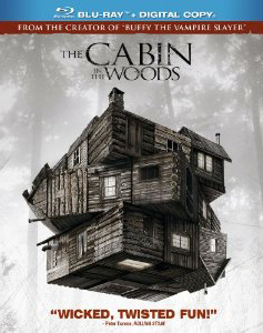
Logic aside, Anchor Bay shit the bed with the lenticular packaging for The Cabin the Woods.
If you have not seen the film and don’t know the intricacies of the plot buy the film and don’t look at the cover (some retailers don’t have the slipcase over the product so you’re safe). Enjoy it fresh. Then enjoy the cover, because for fans of the movie it’s awesome.
It just happens to spoil a major aspect of the film.
If you haven’t seen the movie, stop reading unless you don’t mind a little hint as to the plot of the movie. I’ll try to be vague.
What the hell is Anchor Bay thinking (and Joss Whedon and gang approving) by showcasing the hidden aspect of the cabin right on the cover? It’s bad enough that the text on the back of the case blandly discusses the secret of the film without even allowing the magic of the movie to reveal it properly. There is absolutely no reason to give it away at this stage.
Home video is where discerning moviegoers die on the vine. This is where the worst of every genre has a moment to shine as automatons click buttons without impunity on Redboxes the world over. The Cabin in the Woods is a horror movie with enough pedigree to warrant a rental or purchase almost without hesitation. This is a world where people make lowest common denominator films successes, a legitimate game-changer like Drew Goddard’s classic WILL find a sizable audience. It’s not even a prognostication. It’s a sure thing.
So why the lame-brained reveal on the cover and in the synopsis? Because someone apparently wanted their cake and eat it to, logic and creativity be damned.
Let’s pretend that if they hadn’t marketed the film around the amazing Rubik cover design they went with, it wouldn’t have been any less successful than if it was plastered with young pretty people looking scared. It surely would have made more money if it were marketed dumb. They took the road less traveled and a film that had been shelved for many moons did pretty good. It wasn’t a hit, but it was well received. It was challenging and it did a good job of weeding out the less cerebral patrons. Home video was always where this film was going to rock and roll.
The hard work was done. It had already baked its cake, lit candles, blew it out with gusto, and triumphantly devoured it.
It’s just plain wrong and damning to cop out at this stage.
Luckily, so few people read the box and pay attention to detail only a small percentage will be spoiled. But the movie’s THAT GOOD and the marketing was THAT SMART that I felt it needed to be said. Buy this film sight unseen. LITERALLY.