Does he suck? Does his comic? The Daywalker is Back in Blade #1
By Jeb D.
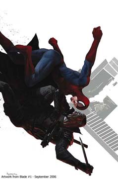 Blade got his start as a member of one of the best ensemble casts of the 70’s: the intrepid vampire-hunters of Tomb of Dracula. When Hollywood came calling, though, it became necessary to simplify things by ignoring and/or rewriting Blade’s past. And while I always thought that TOD would have made a great ongoing TV series, Blade’s success as a movie loner dictated the direction for his future comics page appearances. A few abortive attempts at his own comic have been made since Blade was revived by the movies, but no one’s made it stick so far (a recent attempt at an ongoing series was abruptly turned into a miniseries and then pulled almost before it had begun).
The latest team to try and raise the not-totally-undead Blade are TV writer Marc Guggenheim (Wolverine) and legendary artist Howard Chaykin (New Avengers).
(heh… I kid… Presumably I don’t REALLY have to introduce anyone to Mr. Chaykin).
The book is bifurcated—Blade in action “today” alternates with stories taking place “then”, giving us glimpses from Blade’s childhood (and even earlier). As Guggenheim relates in his introductory text piece, the commercial necessity of bringing in new readers means that Blade’s backstory is being rewritten on the fly. That’s fine, except that the series does appear to be living on an odd periphery of the Marvel Universe: the story begins with Blade dispatching both Dracula AND a vampire version of Spider-Man, then facing off against a small army of vampire S.H.I.E.L.D. agents. The explanation for the Spider-Man encounter (well, apart from the sales boost from putting the two on the cover) suggests that this is not some alternate universe, but the same Spidey we’ve always known. And while I don’t mind the idea of an ongoing series eventually explaining where all these vampire spies come from, Guggenheim seems to indicate that he’s structuring the series in self-contained issues, leading me to wonder if they’ve just edited out some key information. And considering next issue’s storyline, things are about to get even muddier…. Or possibly the guest baddie’s got an explanation up his sleeve.
Howard Chaykin’s a great choice for Blade—his overripe, decadent style has always had a slightly “undead” quality to it in the first place, and if his action scenes are no longer as ground-breaking as they were back in the days of American Flagg or The Shadow, he still gives Blade some nicely propulsive throwdowns. The “historical” sequences might be even better, though it can be hard to reconcile the specific period look with the modern version of Blade.
Will this series be Blade’s shot at mainstream success? Eh… maybe. Chaykin’s clearly having a ball, and watching him put our favorite daywalker through his paces is always going to have its appeal. Whether Guggenheim can bring the story together into something less fragmented than what we have here is the question. For fans of the character (particularly the Wesley Snipes version), definitely worth your time. For fans of Howard Chaykin, definitely worth your money. For anyone else… call it a maybe.
RATING: 
The World Storm begins with Wetworks #1
By Graig Kent
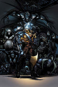 When Lee, Silvestri, McFarlane, Liefeld, and the rest left Marvel to form Image, it was at the height of the Wizard era of style over substance comics, where the artist called the shots and story stood wallflower while pretty pictures got to dance at the ball (obviously, “pretty” is a matter of opinion). Image expanded like wildfire, with each of its founding creators establishing their own little cottage universe, many establishing imprints, and all pimping some horrendously thin concepts to a collectable-crazy market.
Thankfully, those days are (pretty much) over, but the products, brands and characters that came out of that time still kick around, and, in the case of Jim Lee’s Wildstorm imprint (now a division of DC Comics), are being relauched with the hopes that tacking some notable scribes’ names onto sluggish titles under a token heading (the meaningless “World Storm”) can revitalize the line. Grant Morrison’s on WildC.A.T.S and The Authority, Garth Ennis is on Midnighter, Gail Simone takes Gen13, Azzarello on Deathblow and, here on Wetworks (with series creator Wilce Portacio) launching it all (by default, since WildC.A.T.S. is late) is Lucifer’s Mike Carey.
The “World Storm” is a concept-less blanket under which all the titles are being relaunched, without any sort of editorial mandate or guide, and without any real vision as to what’s going on in the “Wildstorm Universe”. I think the hope is that with a sense of freedom the end result will be gold, like when Warren Ellis took over Stormwatch or Ed Brubaker’s post-WildC.A.T.S. series Sleeper. But here, on Wetworks, there’s nothing signifying a new direction, even for someone like myself that’s never read the title, ever. Carey doesn’t use his storytelling freedom to much advantage, as he seems to be attempting a continuance of the same characters, thrusting them into the same special-ops-battling-monsters scenario. The first issue is thoroughly uninspired, the characters have no weight, and the drama Carey tries to install is either lost on – or meaningless to – a new reader.
Portacio is inked by Trevor Scott and colored by Wendy Broome, and the book is dark in both color and line, to the point where many scene’s actions or intentions are indiscernible. Muddy best describes the result throughout, and it doesn’t look any better than a random late-90’s Top Cow book, which may please some, but is pretty sub-par by my likings.
I can’t say I hate Wetworks #1 since I’m just so utterly blasé about the whole thing. The story is forgettable and the art is generic, and I’m as inspired by it as I was by the majority of Image titles back in their heyday, which is to say not at all. Pass.
RATING: 
Another Vampire Hunter? Not Any More. Union Jack #1
By Jeb D.
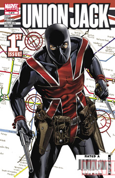 Well, it’s not exactly Queen and Country, but Union Jack appears to be another of those Marvel miniseries attempting to provide more variety in their superhero-centric line: in this case, a counterterrorism story that’s a sort of spandexed “24.”
Union Jack, introduced in Roy Thomas’ old “Invaders” series, has recently appeared in Ed Brubaker’s Captain America series, and he’s now being launched into a new 4-issue miniseries.
I don’t know how much of the story’s direction comes from writer Christos Gage, and how much is editorially-driven, but this first issue has a lot of heavy lifting to do. It begins by clearing the decks of the vampires that would be Union Jack’s usual prey—in a couple of quick pages, he’s rid London of them altogether. And while you’d imagine this development would be the setup for a story all its own, here, it’s just a way to put Jack at loose ends so that MI:5 can recruit him for a conveniently closed-ended mission: major terrorist acts are about to devastate London, and there’s only four hours left till their deadline. We get the usual rigmarole about Jack’s reluctance, and how there’s no other super-teams available, and are then introduced to the other members of Jack’s team: our old S.H.I.E.L.D. pal Val, the Israeli heroine known as Sabra, and the Saudi Arabian Knight (drawn here to look like Lost’s Sayid). Naturally, these latter two can’t get along, and it will be up to Jack to get them to put their mission first.
Once we get to the actual plot, it’s actually pretty decent, with a nice twist at the end. Whether the story’s resolution will go beyond your basic superhero slamfest remains to be seen, but at least there’s potential for something different. Artist Mike Perkins (who handled the flashback sequences so nicely in Captain America) brings us comfortably into today’s London, while offering both some backstory and some butt-kickin’.
Bringing second-banana characters to the forefront of a series isn’t always a tremendously successful approach, particularly when the company demands long-term sales. There’s potential here for the occasional miniseries, though, and if handled properly, Union Jack might become an enjoyable semi-regular dose of super-spy—or should I say “superhero-spy”—action.
RATING: 


Jinx : The Definitive Collection
(Image)
By Elgin Carver
 Art and its making produce questions almost as intriguing as the artwork. From where does creativity spring? Why are some artists and/or artwork more appealing than others? How is a piece of artwork made? Every true artist and his work grows and ripens as experience is accumulated and judgement matures, and an overview of one artist’s works can give insights to these questions. An interesting example is Brian Michael Bendis.
Best known for his writing in Daredevil and Marvel’s Ultimate titles, especially Ultimate Spiderman, this is not where he began. One of his earliest works is Jinx, the story of a female bounty hunter crossing the path of a streetwise grifter. This volume collects the entire story, with an interesting supplement covering the development of the story and artwork, sketches and a script for an animated project based on the characters, and a portfolio of drawings of these characters by other artists.
Here we see the "wordiness" Bendis is recognized for. Many word balloons offsetting each other, partial sentences, non-sequiturs, and other idiosyncrasies are already present in this work. What is not yet present is the natural flow of language. This dialogue might seem natural to some but is far more reminiscent of off-Broadway theater. A young artist trying to make ART can, and here did, forget that reality contains the lessons that apply, and dressing that up in frills adds nothing. In this case it detracts.
In this book Bendis also took a hand to the art. Heavily photo referenced, often with actual photos reduced to the highest possible visual contrast, and with some very creative compositions and panel layouts, the artwork sometimes outshines the writing. The creativity seen in this part of the book cannot but make one wonder where he might have taken this portion of his talent had he not concentrated on writing to the exclusion of the visuals.
Jinx is a difficult character to like. Self centered and hard natured, she deals with people that are even less likeable than she is. Her looks seem to be the only attractive part of her persona, and this should not be enough for the apparent display of interest other artists demonstrated in the gallery. Surely something beyond pity for one’s self and artsy dialogue is required to make comic book characters appealing. Still, the story has interesting aspects, the artwork has some inventive points, and the look into the beginnings of what has become a very good writer is instructive.
RATING: 


 Civil War #4 (Marvel). In a recent podcast, Mark Millar indicated that, while he’s delighted that Civil War readers are enjoying the political and social implications of the book, he mostly wanted to tell a story with a bunch of Marvel superheroes beating the crap out of each other. Issue #4?— Marvel superheroes beating the crap out of each other? — check. Thor showed up at the end of issue #3, surprisingly on the side of the pro-registration forces. This issue, he goes to work, and artist Steve McNiven gives us mayhem that makes things like the old Secret Wars look like a playground tussle. Marvel’s evident interest in making 2006 the year their female characters come into their own is reinforced by Sue Richards’ actions this issue (and the unfortunate delays in releasing this issue mean that the cover of #6 is already being promoted in this month’s other books, and it suggests that Sue’s going to play an even more pivotal role in the series’ outcome). There’s some real tragedy in this issue, too—and since it doesn’t involve one of Marvel’s key licensing properties, it cuts even deeper, knowing that it’s not someone who will be quickly put to rights after the series ends. Those reading across the entire Marvel line are probably frustrated by the fact that this book’s delay has thrown so many other book’s schedules out of whack, making the whole story choppier, but as a self-contained series, Civil War remains a gripping superhero read. – Jeb D.
RATING: 
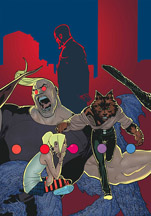 X-Factor #11 (Marvel) – My copies of X-Factor are making the rounds amongst friends, and everyone who reads it pretty much agrees on its quality. The book is damn good. Issue 11 gets the team back to the central story following the Decimation and Civil War bru-ha-has which found their way into the books pages (the great thing about it is that writer Peter David takes those impositions and uses them to the series’ advantage). After the shocking final page of issue 10, we find out that a member of the team has been Manchurian Candidated, and is a sleeper agent for the X-Factor Detective Agency’s rival, a company called Singularity, run by a man named Damian Tryp. This issue, as with the last, features flashback sequences, filling us in on some of the mystery of Tryp, but as per the mystery angle David infuses the book with, every answer seems to only ask more questions. In this case, it’s Tryp’s connection to Jamie Madrox’s past. Artist Renato Arlem does the bulk of the art chores, with last-issue’s fill-in artist, Roy Allan Martinez handling the flashback page. Arlem is competent, but Martinez does damn pretty work. –Graig–
RATING: 
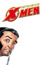 Astonishing X-Men #17 (Marvel). This book is for those who’ve ever wondered just what Wolverine and Popeye had in common. On the odd chance that you don’t fall into that category, fear not—Joss Whedon’s stuffed this issue with such delights as Kitty’s alluring and alarming mental landscape, the triumph of Cassandra Nova, the delightful revelation of S.W.O.R.D.’s mole in Xavier’s mansion, the arrival of Ord and Danger… and a moment of X-Men badassery that’s as unprecedented as it is satisfying. And Wolverine? While his “young Jamie” persona has been a real kick for the past few issues (and graces a cover that might be my favorite of the year), the way that Whedon brings him back to his old self is the stuff of near-genius, abetted by artist John Cassaday’s perfect paneling layout. Cassaday continues to make the X-Men look both classic and newly-minted; and if there’s a creepier image in mainstream comics this year than Kitty’s encounter with Colossus, I’d rather not see it, thanks.- Jeb D.
RATING: 
 52 Week 20 (DC) – After last week’s issue, which has so far been the highlight of the series, I have a renewed enthusiasm and faith in this book. Even still, I was expecting a bit of a come-down this week but Waid/Morrison/Johns/Rucka delivered again, focusing the majority of the book on the lost-in-space-faring heroes Starfire, Animal Man and Adam Strange, who are being jerked around by a religiously reformed/cult leading Lobo. This obviously means trouble, especially since he holds in his possession the Emerald Eye, whose original owner is coming to get it back. Other little asides reveals a glitch in Luthor’s “superpowers-for-all” program, and for reasons of foreshadowing, Supernova visits the Batcave. An entertaining issue that has some action and mercifully progresses the plot. Also features a very nice inking job of Ruy Jose on Chris Batista’s pencils. –Graig–
RATING: 
So ends this accounting of valiant warriors and high adventure! Return next week to honor still more comics. Praise Odin.
To discuss this column and all things Nordic, or if you have a comic you want to submit for review, contact Sean at scfahey@yahoo.com.
 It’s no secret that I am less than psyched about Alien vs Predator 2, even with CHUD friend Shane Salerno writing the script. Besides all the general misgivings about the project, recent casting news – a bunch of TV actors I’ve never seen – hasn’t lit me on fire.

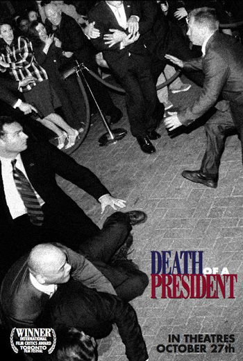 Death of a President
 There’s something about Baltimore that really brings out the baldie in Bruce Willis. He filmed
  Germany
 I had three opening sentences for this review, and I couldn’t decide between them, so please just use your favorite one:
 Aint It Cool News* is reporting that Robert Downey Jr has been hired to play Tony Stark, aka the guy inside the Iron Man costume, in Jon Favreau’s movie version of the Marvel comic book. If true (see the previous asterisk), this is a major indicator of where Favreau is going with the film (well, duh) and it’s also very, very good news. UPDATE: This is confirmed!


 Blade got his start as a member of one of the best ensemble casts of the 70’s: the intrepid vampire-hunters of Tomb of Dracula. When
 When Lee, Silvestri, McFarlane, Liefeld, and the rest left Marvel to form Image, it was at the height of the Wizard era of style over substance comics, where the artist called the shots and story stood wallflower while pretty pictures got to dance at the ball (obviously, “pretty” is a matter of opinion).
 Well, it’s not exactly Queen and Country, but Union Jack appears to be another of those Marvel miniseries attempting to provide more variety in their superhero-centric line: in this case, a counterterrorism story that’s a sort of spandexed “24.”
 Art and its making produce questions almost as intriguing as the artwork. From where does creativity spring? Why are some artists and/or artwork more appealing than others? How is a piece of artwork made? Every true artist and his work grows and ripens as experience is accumulated and judgement matures, and an overview of one artist’s works can give insights to these questions. An interesting example is Brian Michael Bendis.
 Civil War #4 (Marvel). In a recent podcast, Mark Millar indicated that, while he’s delighted that Civil War readers are enjoying the political and social implications of the book, he mostly wanted to tell a story with a bunch of Marvel superheroes beating the crap out of each other. Issue #4?— Marvel superheroes beating the crap out of each other? — check. Thor showed up at the end of issue #3, surprisingly on the side of the pro-registration forces. This issue, he goes to work, and artist Steve McNiven gives us mayhem that makes things like the old Secret Wars look like a playground tussle. Marvel’s evident interest in making 2006 the year their female characters come into their own is reinforced by Sue Richards’ actions this issue (and the unfortunate delays in releasing this issue mean that the cover of #6 is already being promoted in this month’s other books, and it suggests that Sue’s going to play an even more pivotal role in the series’ outcome). There’s some real tragedy in this issue, too—and since it doesn’t involve one of Marvel’s key licensing properties, it cuts even deeper, knowing that it’s not someone who will be quickly put to rights after the series ends. Those reading across the entire Marvel line are probably frustrated by the fact that this book’s delay has thrown so many other book’s schedules out of whack, making the whole story choppier, but as a self-contained series, Civil War remains a gripping superhero read. – Jeb D.
 X-Factor #11 (Marvel) –
 Astonishing X-Men #17 (Marvel). This book is for those who’ve ever wondered just what Wolverine and Popeye had in common. On the odd chance that you don’t fall into that category, fear not—Joss Whedon’s stuffed this issue with such delights as Kitty’s alluring and alarming mental landscape, the triumph of Cassandra Nova, the delightful revelation of S.W.O.R.D.’s mole in Xavier’s mansion, the arrival of Ord and Danger… and a moment of X-Men badassery that’s as unprecedented as it is satisfying. And Wolverine? While his “young Jamie” persona has been a real kick for the past few issues (and graces a cover that might be my favorite of the year), the way that Whedon brings him back to his old self is the stuff of near-genius, abetted by artist John Cassaday’s perfect paneling layout. Cassaday continues to make the X-Men look both classic and newly-minted; and if there’s a creepier image in mainstream comics this year than Kitty’s encounter with Colossus, I’d rather not see it, thanks.- Jeb D.
 52 Week 20 (DC) – After last week’s issue, which has so far been the highlight of the series, I have a renewed enthusiasm and faith in this book.