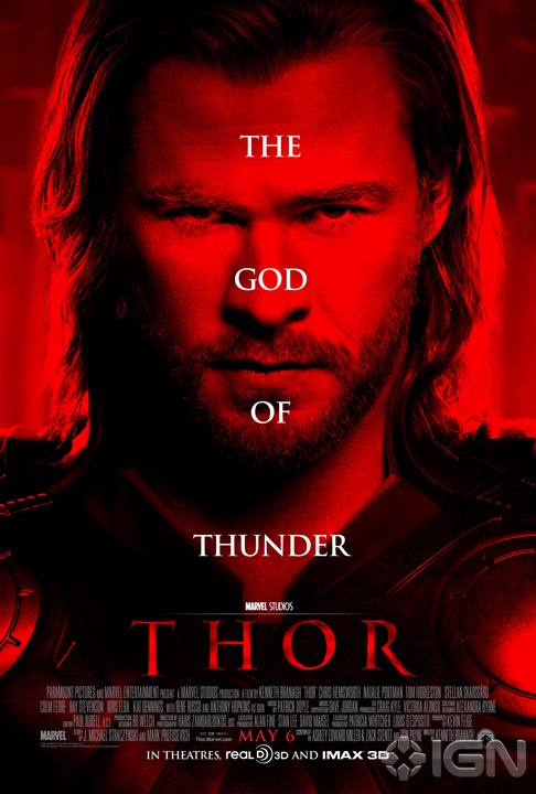
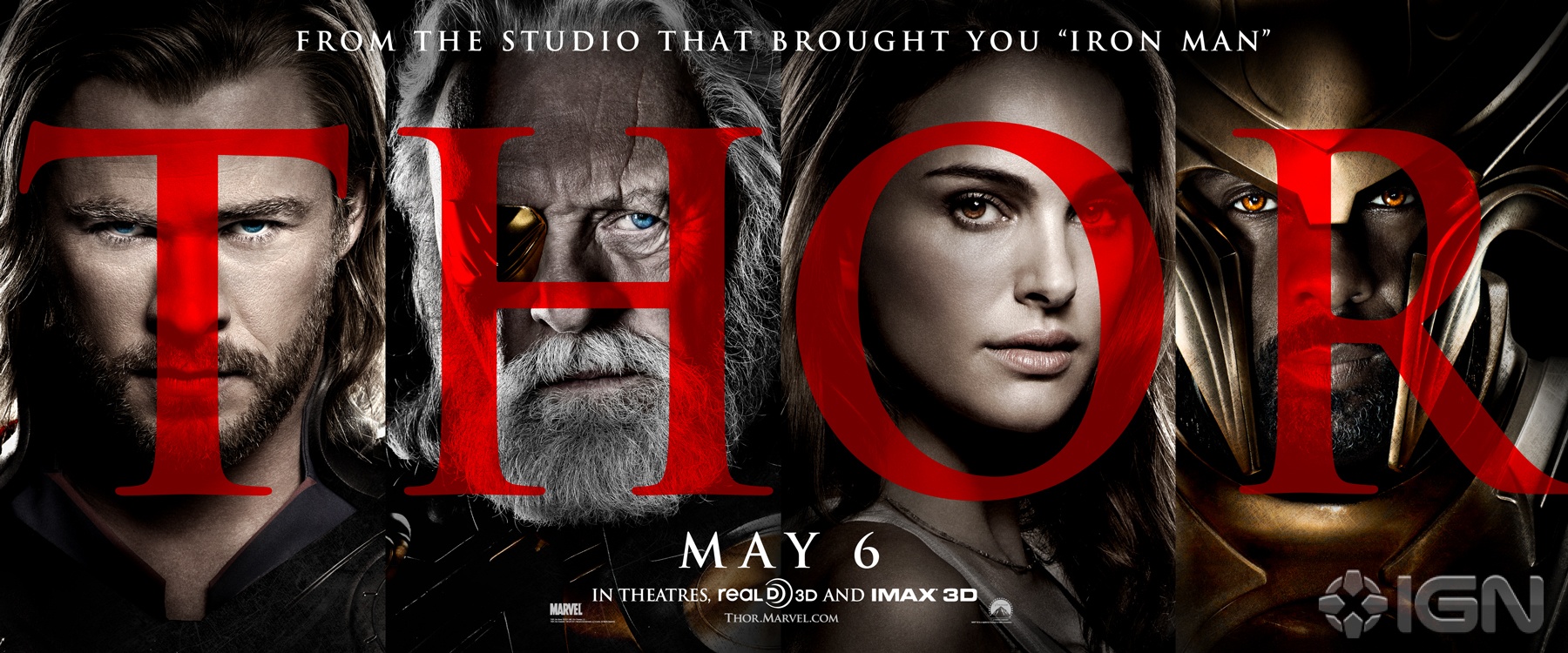
Marvel must have noticed how strong the reaction to Red Skull’s debut was yesterday and tossed a red filter on their newest Thor poster with the fury. A new banner also sports some big red letters atop the standard high-contrast, super-grainy one-sheet portraiture. I get that there are billing issues and everything, but shouldn’t Hopkins be under the “O” for Odin?
I suppose the big red Thor poster is an attempt to downplay the cartoony/comic-booky nature of the film and sell it as a grittier, meaner film to whoever that might appeal. If this is the only image anyone ever sees for the film, sure, that might work. Otherwise… whatever happened to marketing consistency?
Also, while Natalie Portman sure is purty, is it just me or has there been some kind of terrible fucking resizing incident that has left her bobble-headed? She’s a thin girl, and there’s some shadow illusion going on, but that shoulder looks far too small to me.
Either way, enjoy these Friday afternoon borings on your way out of the door. (via IGN)
Thanks to Brian Henne


DISCUSS THIS on the CHUD Message Board
&
Like / Share it on Facebook (above or below) if you think it’s great!