Ultimate Comics Spider-Man “Must Have” #1 (Marvel, $4.99)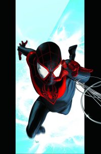
by Graig Kent
You’ve heard it a hundred times before, that one of the major factors contributing to Spider-Man’s broad appeal is it could be anyone under that mask (well, any man, or potentially a not-so-curvy/-endowed woman). So few characters, never mind top-tier popular ones, wear a full mask disguising their identity entirely, such that in the male-power-fantasy that is superheroes, Spider-Man crosses the color barrier like few other heroes can. And yet, in the actual comics, if he’s not Peter Parker, people just don’t seem to care. Hell, even Peter’s clone could barely make an honest go of it.
It’s true, in theory you could plug anyone into that suit and people could conceivably think, at least for a moment, “that’s Spidey”, but if you don’t have the character, the charisma, the personality to back it up, if the people don’t care about who the dude inside the suit is, then they’re not going to keep reading. It’s the main reason why I have never been an avid Spider-fan: Peter has never truly interested me as a character or as a hero. I’ve enjoyed the odd adventure starring him, and I have a lot of affection for the 60’s cartoon, but that’s about the extent of it. With word that there would be a new Spider-Man following Peter’s death in the pages of some Ultimate Comics book or another, I thought of it as my ticket in, and yet, after years of apathy towards the character, despite resoundingly positive reviews (including Jeb’s here) I just couldn’t muster up the enthusiasm (or the $4) to opt in.
At the same time as Ultimate Comics Spider-Man (“USM”) launched, so too did a whole new line of Ultimate Comics: The Ultimates, Ultimate Comics X-Men and Ultimate Comics Hawkeye (Marvel’s answer to DC’s reboot, just 1/13th the size), each of which I’ve been thoroughly enjoying, and through extracurricular reading it was mentioned frequently how closely woven the Ultimate Comics line would become. I began to feel like I should be reading the Ultimate Spidey book, but taking a 4-dollar-a-month risk just was hard to justify. Marvel, crafty buggers, have found a way to lure me in.
This week they’ve released their first “Must Have” books for USM, Ultimates and Ultimate X-Men, each containing the first three issues of each series bundled under one cover for one dollar more than it would cost for a single issue. It’s a brilliant way to pull the curious-yet-resistant, yet, I must admit, exceptionally frustrating for the budget-conscious who have already laid down $12 for the first three issues of any of these titles.
Of the three series, I think the USM story benefits the most from the format, as a cursory flip through the “Must Have” collection and one will notice there’s not a single panel featuring the new Ultimate Spidey in costume. In fact, one would probably note that there’s a decided lack of heroes, villains, punching and the usual action-heroics stuff. That’s because what writer Brian Michael Bendis has done with his first three issues is built a character to actually care about, including a supporting cast with complex relationships, and New York settings (home, school, friends and family) that resonate equal parts true to life (the struggle of the lower-middle class family to give their children a better life than they had) and fantastical (as Iceman and the Human Torch streak on by).
Bendis may get called on occasionally for decompressed storytelling, and were I reading this month-to-month, issue-by-issue, I could see having the same twinge of anxiousness, of “get him in the costume already” anticipation, but lumped together as it is here, it’s presented like the first act of a film, the introduction and the origin. We meet Miles Morales as his mother thrusts him into an educational lottery — a ticket to a better life — which he is fortunate enough to draw the right number, yet feels so much guilt for the others who are not. It’s a simply crafted moment to exemplify the compassion ingrained in the character.
Bendis takes pains to shape a loving family around him, showing off his exceptional skill at writing banter forming some marvelous dialogue between Miles and his father, highlighting Miles’ sensitivity, his intelligence and his humour in an organic manner. We also meet Miles’ Uncle Aaron, whom Miles has been spending time with despite estrangement between his uncle and father. In a candid, wonderfully executed conversation between Miles and his dad, it’s revealed that his dad was once incarcerated along with his uncle, as the two were thieves, something Miles’ dad rehabilitated out of but Aaron continues to pursue… cue the sequence wherein Aaron breaks into a laboratory (in a guise that I assume is supposed to make him the Ultimates Universe version of the Prowler), lifts some goods and picks up an unexpected genetically altered arachnid hitchhiker along the way.
There’s a great depth to these two masculine figures in Miles’ life, both in their relationships with Miles and with each other. There’s a lot untold that Bendis will no doubt unfold over time, and a lot of potential for conflict in the future. Despite only scratching the surface on Miles’ abilities, and his new scholastic setting, in these three issues Bendis has poured a firm foundation that the book can build stories and stories upon. At this point I’m not as much eager to see Miles Morales in costume as I am to find out why he gets in costume, and how. It was a gamble for Bendis to launch the book in this manner, but making a character rather than just putting a different guy in a costume seems like the surest bet to a lasting, meaningful creation.
If all this talk of the human drama rather than action makes the series sound dull, well, you have to see it to understand how not-dull it is. I’ve never seen Sara Pichelli’s work before but the woman is a genius. She doesn’t just draw, she creates. Miles, his father, Uncle Aaron, his best friend Ganke, these are just illustrations on the page, these are people, living in New York City, inhabiting homes that aren’t just spaces but lived in. A spider bite allows miles to jump, it’s Pichelli who makes him leap off the page. Joining her is colorist Justin Ponsor who fills in Pichelli’s crisp lines with the lushest of color details. Ponsor is a light sourcing master, his colors creating incredible texture and definition, complimenting Pichelli’s details astonishingly.
I’m more than impressed. With all the “Death of Spider-Man” hype, and the resulting ballyhoo around “the black Spider-Man”, it’s refreshing to see that this book isn’t just a gimmick. Bendis and company are pouring soul into this, making for impressive reading, and no doubt a fantastic journey. The “Must Have” has done its job. I will continue to read (though probably in trade), and for the first time in about 30 years of reading comics, I may actually call myself a fan of Spider-Man.
Rating: 


Out of a Possible 5 Stars
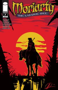 Moriarty #7 (Image Comics, $2.99)
By Bart Bishop
I’m not an avid Sherlock Holmes fan, but I have read A Study in Scarlet, the first published novel. Although it was a good read, it didn’t lead to any firm devotion to the character. Outside of the proto-Harry Potter Young Sherlock Holmes (1985) and the more recent Robert Downey Jr. vehicle Sherlock Holmes (2009), I don’t have much further experience with the character. The few liberties both movies take, therefore, do not bother me the in the least, and the same could be said for Image’s Moriarty, which is now in its second story arc. The premise of the series is that in a reversal of fortunes, Sherlock Holmes died at Reichenbach Falls in “The Final Problem”, not Professor James Moriarty. Twenty years later, on the cusp of World War I, Moriarty’s life has grown stale without the challenges of his archnemesis. Through a series of events in the first story arc, “The Dark Chamber”, involving MI5 and Holmes’ brother Mycroft, Moriarty has seen a vision of his own death, and now travels to Burma to try and change his fate.
Although Moriarty is a criminal mastermind, and is described by Holmes as the “Napoleon of Crime”, he actually only appeared in two of Sir Arthur Conan Doyle’s works. Moriarty was introduced in “The Final Problem” (1893) primarily as a narrative device to enable Conan Doyle to kill off Sherlock Holmes, as the author felt the consulting detective was distracting him from more serious literary efforts and that offing Holmes was the only way to get his career back on track. However, public pressure forced Conan Doyle to retcon the character back to life in 1903’s “The Adventure of the Empty House”. Although Moriarty was only featured in one other story, “The Valley of Fear” (1915), he has risen over the years to great prominence and is now treated as Holmes’ primary antagonist, as he will be in the upcoming Sherlock Holmes: A Game of Shadows.
So what is known about Moriarty? According to Holmes, by way of Doyle’s pen, he is “a man of good birth and excellent education, endowed by nature with a phenomenal mathematical faculty.” Showing an old fashioned, Victorian belief system, Holmes goes on to blame heredity for Moriarty’s evil, explaining that, “[a] criminal strain ran in his blood, which, instead of being modified, was increased and rendered infinitely more dangerous by his extraordinary mental powers.” Under Daniel Corey’s pen, however, Moriarty is more of an anti-hero. Although he says in issue #5 that he still seeks “world domination,” he is painted with such noble faculties as to imply that he at least thinks he would run the place well. He is a man of action, quick witted and adept at physical combat especially when his trick cane is involved. Issue #7 is, in fact, a very strong jumping on point for new readers as it pauses the immediate narrative drive and flashes back to 1880, providing some back story on Moriarty himself and the key secondary players.
The second story arc, “The Lazarus Tree”, concerns Moriarty’s trip to Burma to find an old friend and colleague, Eustace Morely. Moriarty has been having horrific dreams in which he is Holmes in a classic caper, but it always ends with him being attacked by a tree with a baby blossoming out of it. Trippy, right? If one enters the tree they can be reborn, but the catch is they have to die first. Moriarty’s friend is missing, and meanwhile he’s been finding dead bodies that have no navels and seeing visions of the baby from his dreams. The first issue of this arc had a nice trick of staging the dream like faded paper, all browns and yellows, and whenever Moriarty hallucinates in reality the spectres are like faded paper. This issue, which provides background on Moriarty’s relationship with Morely and business holdings in Jamaica, serves two purposes: to expand on the characterization of the secondary characters, and to inject humanity into Moriarty by not only showing his motivations have changed, but that he always had an empathetic heart for those robbed of their free will.
I hadn’t read anything of Daniel Corey’s before Moriarty. According to his bio, he is “a director, screenwriter, playwright, and novelist. He has authored screenplays, teleplays, stage plays, two comic series, and a novel.” Very impressive, and his extensive background shows. His characters all have distinctive voices and dialects, from Moriarty’s clipped intellectual to Officer Blair’s skeptical policeman. I’m not familiar with terms for different British accents, but Blair’s colloquialisms are especially charming, and all the characters “sound” very authentic. An especially enjoyable aspect of Corey’s writing is not just the intriguing murder and missing persons mystery but the period details. Historical accuracy is not the right word, as there’s a combination of late 90th, early 20th century milieu and fictional in-jokes. Issue #5, for instance, had a very appropriate reference to George Orwell’s “Shooting an Elephant”, and this issue not only references Moriarty’s book The Dynamics of an Asteroid (a book briefly mentioned by Holmes in “The Valley of Fear”, the contents of which have been debated about by fans ever since) but features Colonel Sebastian Moran, the villain of “The Adventure of the Empty House”. Corey obviously did his research and has a love for the source material.
Ever since 2009 Corey has been collaborating with Anthony Diecidue, producing product for Corey’s DangerKatt Creative Studio. Although I’m unfamiliar with his work, his bio describes him as “an alum of the prestigious Joe Kubert School of Cartoon and Graphic Art. His digital technique has a traditional flare inspired by everything from comic books and animation to concept art.” The Kubert influence is felt, as Diecidue’s thick, dark lines create a sketchy impression of a shadowy, abstruse world. His Moriarty is a weathered, world beaten man, covered in scars and not particularly handsome. His piercing eyes, however, hint at a man that has seen unspeakable things. The majority of this issue, however, is drawn by Mike Vosburg. Although I’m also unfamiliar with his work prior to this issue, he has a background mostly in film, having storyboarded several music videos and the Chronicles of Narnia movies. This cinematic experience shows, as he knows how to pace and stage an engrossing action scene, with Colonel Moran on a rooftop with a sniper rifle being a standout. The cover, however, is by Diecidue and is very striking, reminiscent of Pablo Piccasso’s 1955 sketch of Don Quixote, as Moriarty wanders off into the sunset on his horse. This is an ironic image, draped only in red, yellow and black, as the hero traditionally rides off into the sunset but Moriarty is not the average hero.
What’s fascinating about the character is his ambiguous actions. This story arc has made it apparent that Moriarty resents corrupt figures of authority, and even frees slaves in Kingston, Jamaica. Of course he frees the slaves to create a distraction, but the comic makes it a point to pause twice and show Moriarty’s reaction: first disgust at their being locked up, and then a smile as they burn the slave quarters to the ground. Without having any knowledge of Moriarty’s background prior to his becoming a professor, I think Corey is implying he has a blue collar, working class upbringing, having made his way in the world through intellect and hard work, and resents Old Money and Landed gentry. Although a cold man, it’s obvious that he enjoys the company of Colonel Moran, Officer Blair, and Eustace Morely and isn’t above friendships. In that way he’s different from Holmes in that he doesn’t revel in people’s inferiority. Corey also adds the wrinkle that Moriarty envied Holmes and wanted to be him, which makes him flawed yet relatable. My only complaint is that most of this must be inferred, as the protagonist is kept at a distance in order to maintain a mystique.
I did not expect to enjoy this as much as I did. For those fans of Conan Doyle’s classic tales, or anyone looking for a rollicking adventure, Moriarty is worth a look.
Rating: 


Out of a Possible 5 Stars
The Defenders #1 (Marvel Comics, $3.99)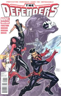
By Devon Sanders
One could easily dismiss The Defenders as nothing more another instance of comics-driven nostalgia porn. Having read this issue one could certainly be justified in doing so but here’s the thing; if you like it and it’s actually good while actually addressing the past while acknowledging the present and future of the individual characters, I say, what’s the harm?
Marvel’s assigned one of comics’ hottest writers, Matt Fraction and one of comics’ best artists, Terry Dodson to have some of their more interesting characters do fight interesting things and really, what’s more superhero comics than that? That said, the mechanism for The Defenders reforming is a simple one, by Fraction standards. The Hulk screwed something up royally and calls upon pretty much the only friends he has: The Silver Surfer, Doctor Strange and Namor, The Sub-Mariner. The current events within the pages of The Hulk comic won’t allow for him to stay past the premise’s set-up so The Red She-Hulk, Betty Ross, is called upon to help them, get this, fight an even angrier Hulk… but how to get to this new Hulk? Enter billionaire martial artist and Strange’s fellow Avenger, Iron Fist, who just so happens to be testing an experimental aircraft and with that… BOOM!
Defenders #1.
Fraction does a great job of pushing the spirit of the unique outsider appeal of The Defenders forward while acknowledging that, yes, the members have totally gone mainstream over the years. Strange and Iron Fist are both Avengers, Namor is an X-Man, The Hulk has become a franchise while The Silver Surfer is just going to always be the Silver Surfer. What’s great about Fraction’s Surfer is his having him adopt an almost bemused attitude towards, once again, venturing to Earth to do what only they can do, together. It’s a welcome change from the mopey alien we’ve come to know and accept and under Fraction, I’m actually looking forward to seeing where he can take the character.
Terry Dodson, as usual, brings the pretty and pushes along Fraction’s ideas with imaginative and sensible layouts. Dodson has certainly evolved from an artist once seen as coming from the Adam Hughes “school”and come one of superhero comics’ better storytellers.
All in all, The Defenders #1 is what any fan of The Defenders and most importantly, superhero comics wants. It’s well-written and well-drawn, providing a platform for characters to simply do the spectacular. Where better than The Defenders?
Rating: 


Out of a Possible 5 Stars
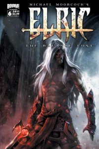 Elric: The Balance Lost #1-6 (Boom!, $2.99)
By Adam Prosser
Fantasy is supposedly the genre of unlimited imagination. You can literally do anything with it, create any kind of character or world you can imagine, completely unrestricted by history or even the laws of physics. Any supposed “rules” of the genre are really more like traditions that derive from the fact that this is the oldest genre of storytelling.
Yet, for all that, fantasy has been one of the most ghettoized genres in the modern era; even science fiction has been taken more seriously than fantasy. And to an extent, that’s understandable, since much of what the genre’s produced in the last 50 years or so has been rote product, cranked out to a formula derived from Tolkien and Edgar Rice Burroughs (with a dash of Star Wars), much of it needlessly bloated and in thrall to the bland clichés laid down by Joseph Campbell, which have rendered so much genre entertainment so faceless and generic in the past few decades. (But that’s another rant.)
But it wasn’t always thus. The first half of the 20th century saw a flowering of high-quality fantasy, from which most of the ground rules for the modern version of the genre were derived. In addition to Tolkien and Burroughs, there was Robert E. Howard and C. S. Lewis, plus lesser lights like Lord Dunsany and the sadly-forgotten James Branch Cabell. Then there was Fritz Lieber, whose tales of Fafhrd and the Grey Mouser have provided a major inspiration to much of the fantasy canon, even when modern readers aren’t familiar with the original template for the “barbarian and thief” partnership. And in a similar vein, there’s Michael Moorcock.
Moorcock was a late addition to what I’d call the old-school fantasy canon I’ve listed above, but no less influential. Bursting on the scene in the 60s, while the genre pulps were on their last legs and about to be replaced by fanzines and other products of “geekdom”, Moorcock injected a dose of the psychedelic weirdness that was sweeping the culture into the fantasy genre. With his earliest works, he took Robert E. Howard’s basic pulp swashbuckler formula as a template, but even then he was building something much stranger in the person of Elric, last ruler of the Melnibonean empire. Elric is an albino of an ancient “superior” race, one versed in magic and culture building but, traditionally, lacking in humanity, though Elric has started to develop the human “flaws” of compassion and self-reflection since he helped destroy his own empire to revenge himself on his usurping cousin. In the stories, he roams the “young kingdoms” (the usual antediluvian fantasy timeline) with his black sword, Stormbringer, a demonic and sentient weapon that literally drinks people’s souls, searching for some measure of peace. Elric didn’t just bring fantasy, traditionally a staid and backwards-looking genre, into the 60s—he looked forward, to the future, to the point where Elric seems strikingly modern, even now. Writers like Neil Gaiman and George R. R. Martin obviously owe a significant debt to Moorcock, and the whole image of the brooding, tormented, Byronic hero born of evil but fighting to maintain his humanity has obviously become a staple in genre fiction. But echoes of Elric can be seen everywhere from video games to rock and roll (it certainly seems like rock subgenres like glam and goth must have gotten at least a whiff of Elric…)
So now, with fantasy experiencing a bit of a renaissance in pop culture and comics in particular, it’s not surprising that Elric has once again got his own comic (he showed up in the medium several times back in the other heyday of fantasy comics, the 1970s.) What writer Chris Roberson (<i>Superman, iZombie</i>) has done here is far more than a mere continuation of the Elric stories, though; it’s actually a love letter to all of Moorcock’s work, including alternate-history warriors Dorian Hawkmoon and Corum, with appearances by various other Moorcock protagonists like Jerry Cornelius and Lord Seaton, as the balance between the forces of law and chaos is disrupted, threatening the entire multiverse (the latter, by the way, being another concept that Moorcock played a large role in popularizing.)
As you can probably tell just from that paragraph, this all risks bewildering new readers, but I have to give Robinson credit: unlike a lot of modern comics, the story here, for all the density, the decades of backstory, and the rapid cross-cutting between multiple planes of reality, is surprisingly clear. While comics have come under criticism of late for being incomprehensible to people who aren’t already longtime fans (to the point where the “new 52” seems to have dumbed down and oversimplified many of its books specifically to avoid this), I’ve long felt that complex stories that rely on world-building and which open in media res aren’t the problem, and are, in fact, one of the more fascinating and intriguing things about comics. The problem superhero comics are facing is more about failing to deliver stories that a new reader could possibly care about, taking it for granted that we’ll know and love the characters and be swept up in the continuity without being given a reason to. Roberson avoids this rather effectively, never holding our hands condescendingly but introducing Elric and the other characters in the midst of their adventures, making a decent case for why we should be interested without relying on prior knowledge. I didn’t think it was completely perfect—sometimes the narrative gets too busy, at the expense of characterization—but as someone who’s not completely familiar with all of Moorcock’s characters, I was never lost, which is quite an accomplishment. A stronger criticism could be made of the fact that, despite his obvious love of Moorcock’s stories and characters, Roberson doesn’t really capture the electric, eldritch style of Moorcock’s writing, a kind which can be seen in comics form in the 80s work of Alan Moore (a good friend of Moorcock’s, and another in the long line of geek writers who was inspired by him). Sure, there’s weirdness here, but it’s the kind of thing you’d tend to see in your average D&D campaign, with only a few moments achieving the demented poetry and surrealism that Elric and company should inspire. This is compounded by Francesco Biagini’s rather flat and literal artwork, which is technically fine but doesn’t have much character, except for his admitted gift for drawing chaotic mutant creatures. Elric himself often looks more like a snooty English butler in cosplay than an eldritch, inhuman warrior.
So this comic is, in a way, another example of the tendency among modern genre adaptations in all media to be technically faithful to the details while missing the spirit of the original work. Nevertheless, it’s ambitious and well-executed, and deserves a read if you’re a fantasy fan. And then, if you haven’t already done so, you can start the real work of going back and delving into some of Moorcock’s stories…and I envy you the discovery.
Rating: 


Out of a Possible 5 Stars
The Rinse #4 (Boom! Studios, $3.99) 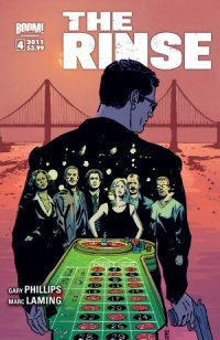
By Jeb D.
Crime stories, like romances or Westerns, operate within familiar structures, and one way or another, it’s pretty hard to avoid retelling a story that’s been done before. Much of the time, what sells it are the details, and as we wrap up the first story arc of The Rinse, writer (and crime novelist) Gary Phillips and artist Marc Laming have done a pretty fine job in the detail department.
The Rinse takes us inside the world of a big-time but low-key money launderer, Jeff Sinclair, and his entanglement with a score that gets bigger and more dangerous with each issue, as he has to negotiate his way through the mob, the Feds, Chinese triads, brutal hoods and dangerous dames. Phillips’ presentation of Jeff’s world has the necessary feel of verisimilitude, of drawing back the curtain on the hidden secrets of a crime that, in light of the world financial crisis, is probably more directly relevant to most readers than your typical tale of elaborate heists or deadly hitmen. Laming matches him with his depiction of San Francisco and its surroundings: the climax, set in mid-Peninsula San Mateo, is just as nicely detailed as the familiar tourist locations of The City; he also does a fine Vegas.
So, while The Rinse has mostly fulfilled its initial promise, of getting the details right when telling a familiar tale… well, it’s a bit flat on a basic storytelling level. No one in The Rinse speaks like a human being: they all talk in movie clichés. While there’s a touch of self-awareness here and there, if the hackneyed speech patterns have a purpose beyond trying to emulate the crime novels Phillips has read and movies he’s seen, it escaped me. And for what aims at being a fairly hard-boiled sort of story, it’s been pretty talky and exposition-heavy, which just reinforces the problem: not only is the dialog too heavy-handed, there’s way too much of it for this kind of thing. I also get the sense that this is one story that might have been better in the more-or-less standard 6-issue format: there’s a few shortcuts taken with character development, and Jeff pulls out a doozy of a deus ex machina to save his bacon in the climactic action scene, one that might have been set up better with more time.
And that climax is where I have to dock Laming’s art a notch or two: in my review of issue #1, I’d wondered how he’d take to the demands of more action-oriented illustration as the story heated up, and now that it’s happened, my take is that his work in that regard is just about adequate, but rarely more. His basics are good, anatomy consistent, background detail excellent, but the paneling isn’t terribly imaginative, and the action beats feel detached, rather than enveloping. Too, Phillips uses a lot of jump-cuts in his storytelling, but Laming doesn’t really take advantage of the shifts in mood or tone that approach can provide (more than once I had to go back a page to see just how and where the scene shift had taken place). His work beguiles the eye without demanding its attention.
It’s clear that The Rinse, as a series, is intended to be a longer, deeper story: not to be too spoilery here, but plenty is left open-ended so Jeff and IRS agent Della Dash can continue their opposite-sides-of-the-law-attract flirtation. I’d be interested to see if Phillips can get a bit more “show, not tell” with his plotting in the future, and I’d enjoy seeing what a different artist might bring to the party.
Rating: 


Out of a Possible 5 Stars
 G.I. Joe #8 (IDW, $3.99)
by Graig Kent
Those who lived through the speculator boom and bust of the 1990s saw comics diverge from being entertainment to collectibles, from something that was worth reading to something that needed to be, at best, superficially looked at, at worst, filed away in hopes of a big cash in years down the line. As dozens upon dozens of new publishers entered the market, looking for their slice of the salivating speculator pie, it was getting harder and harder to draw attention to a single title amongst the hundreds of others each month. Thus was born the gimmick cover. Chromium, glow-in-the-dark, gatefold, multiple variants, hologram, lenticular, embossed, foil, die-cut, fluorescent inks, “nude”… there was even one book that was shot through with a bullet. I can’t possibly name all the various gimmicks that have been used, but after years and years of these “extra special collectors items” — especially as they continued to proliferate even after the speculator bust — comic lovers (“purists” maybe?) got jaded when it comes to any sort of trickery up front.
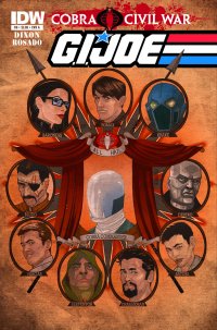
Personally, I try to avoid the gimmicks if I can to I even hate having to decide between variant covers when pulling books from the stand. It all seems like extra, unnecessary effort that in no way enhances the book, except perhaps for the price tag on the cover. And yet, even I was drawn in by G.I. Joe #8, the final chapter in the “Cobra Civil War” story that’s been running through IDW’s Joe books this past year. Cobra Commander got shot in the head dead, y’see, and various Cobra agents have been jockeying to become the new Cobra Commander by impressing some shadow cabinet that is, essentially, the board of directors for the criminal agency. This book reveals who wins the job. But if you’re too impatient to read the book, there’s a “scratch off” section on the cover that gives the answer (quite frankly I think it’d take less time to read the book).
Seriously, a scratch-off cover.
That’s a new one.
It’s silly.
Yet it got me to buy it.
I’ve read the book through (reading IDW’s main Joe title for the first time since early in the first series’ run), and Chuck Dixon delivers yet another workhorse effort, which, as expected, has its good parts and its not-so-good parts. I’ve actually only been reading the Cobra series IDW puts out, but it feels like Dixon’s fallen a bit more in line with the tone of that series, looking at things with a more of a stern eye, actually attributing some weight to the characters and the actions that occur rather than writing it as a glib, quasi-militaristic action romp. Even the artist, Wil Rosado, seems more in-style with Cobra‘s Antonio Fuso, harsher angles and less cartoony than artist in the previous volume. It’s still not up to the same quality as the Cobra series, but it seems the Joe line’s trying for some consistency at least.
So, now that I know who Cobra Commander is, the question is should I scratch off the cover or not?
If I don’t, then I’m basically saying I’ve mainly bought it as a collectible, and that I care about such things.
If I do, then there’s no way I can sell this thing off in 20 years to pay for my kids’ college tuition.
There’s a bit of a charge to something like this. It’s an interactive cover, but it’s also one-time-use only. I imagine scratching it off will feel pretty good. I also imagine that it will only feel pretty good for maybe 20 seconds, after which the cover will stare you in the face and say “you’re never going to sell me now, sucker. Might as well put me curbside…”
I have a theory that beneath that silvery gunk is, quite simply, Cobra Commander’s helmet (as seen on the variant cover here), and not the actual face of the character who won the contest. If it is, that’s one sick joke on the reader, IDW. This whole thing is devilish. I like it and I hate it at the same time.
Rating: 


Out of a Possible 5 Stars
Valen the Outcast #1 (Boom! Studios, $1.00)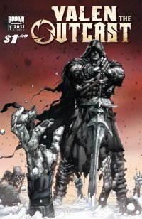
By Bart Bishop
The fantasy genre is not always my cup of tea. I grew up reading Conan and The Lord of the Rings, the two series of books that perfected the formula in the first half of the 20th century. Everything since has been derivative of those works. There are no original stories, however, so the key is in the execution. A Game of Thrones, for instance, continues to grow in popularity. I have not read the book, although my roommate’s sister’s husband let me borrow it and I plan to read it over Christmas break, or seen the tv show but I’ve heard good things. The soliciations for Valen the Outcast #1, in fact, claim that this new ongoing series will be “[p]erfect for fans of A Game of Thrones and Conan.” I beg to differ.
The premise is pretty basic, according to solicitations: ‘King Valen Brand is a fair, just king as well as a great and mighty warrior. Killed by a Necromancer in battle and resurrected as one of the walking dead. Now he’s considered an abomination in his own realm,an outcast with only one purpose: to restore his lost soul! From the mind of fan-favorite creator Michael Alan Nelson (28 DAYS LATER, HEXED, DINGO, ROBERT E. HOWARD’S HAWKS OF OUTREMER) comes OUTCAST, a visceral new ongoing series that blends “epic fantasy” with “sword-and-sorcery.”’ What’s funny about that solicitation is that the title was going to just be Outcast until a few weeks ago, when Valiant Comics threatened to sue Boom! over trademark infringement. Turns out Valiant, known for Harbinger and X-O Manowar in the 1990s, released a one-shot sixteen years ago called Outcast and they retain the rights to the title. As well, Nelson released a video online yesterday of himself and Boom! staffers burning 500 copies of the Joe Juski cover, stating that only 25 copies with the cover remained. Sensationalism at its best.
Why tell you this? Because that’s all much more provocative than the comic itself. This is a generic fantasy tale, set in the fictional lands of Oakhaven and Wraithendal. The comic is full of silly, Star Wars-esque names like that without the winking at the audience. All the characters, also with silly names, are constantly yelling or making threats, with little time for characterization beyond broad archetypes and beefcake. With the infinite possibilities of a fictional realm, why does Nelson, a writer I have not read prior to this, limit himself to medieval cliches? This reeks of Saturday morning cartoons amped up with violence and sex to appeal to the lowest common denominator.
The characters are all ciphers. Former King Valen Brand (branded with the Necromancer’s mark, get it?) is introduced fighting off hordes of “children of Korrus Null”, undead warriors (obviously meant to capitalize on the never-ending zombie craze in genre fiction) who all look like General Kael from the movie Willow. He apparently dies in battle, but then there’s an abrupt, confusing transition to some time later when Valen is getting a tattoo from scantily clad Zjanna. Valen isn’t much more than tough talk and over-the-top noble speak, and Zjanna is a bad grrl stereotype. At least she can defend herself, but ridiculous cleavage and tribal tattoos do not a personality make. Of course, she gets naked at some point. There’s some sort of past between these characters, but none of it has any weight. The third member of their trio, Alexio Cordovan, is a basic rogue character but at least he’s fun. He gets the best lines and clearest motivation. That’s something that the villain, Korrus Null, clearly lacks. He likes to conquer and is an over all evil guy, but why did he steal Valen’s soul? Boring. A fascinating opportunity is presented, as well, to consider what constitutes a soul if Valen is walking around without one but still maintains his self and drive, but there’s no attempt at contemplation.
The art by Matteo Scalera is somewhere in-between Stuart Immonen and Chris Bachalo, but without the inventiveness. He knows how to capture speed and strength, but the proportions of the characters and the scale of the surroundings change from scene to scene. All the men, aside from differing degrees of body hair and size, look exactly the same. It took me a second at the beginning, because King Brand had not been called Valen yet, to figure out that the undead giant being tattooed by Zjanna was the same man in the opening pages. The passing of time is jarring, and it felt like there was something missing to imply that the opening was Valen’s memories. As for the aforementioned cover, it’s evocative of Frank Frazetta in his prime although it says very little about what will take place within the pages of this comic outside of hacking and slashing.
I guess it’s worth a dollar.
Rating: 


Out of a Possible 5 Stars
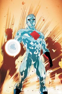 DC Comics Presents: Captain Atom 100-Page Spectacular One-Shot (DC, $7.99)
by Graig Kent
It’s always painful to read a comic where the artist pours him or herself into the work, but the writer doesn’t live up to their end with a story that’s actually deserving of their work. It’s equally painful to read a work from a writer (or two) who have produced some of modern comics more notable stories, yet dish out work that can at best be described as dreadful.
This latest in DC’s “DC Comics Presents” line of extra-sized reprints (not a big enough draw for a trade paperback) comes from a pre-reboot back-up feature in Action Comics, across 11 issues during 2009-2010 (if you’ve forgotten already, that was the time when two Kryptonians – Nightwing and Flamebird – were starring in Action Comics, and Mon-El, not Superman, was starring in Superman… no wonder there was a reboot). The story was concocted in-part by Greg Rucka, and written in full by James Robinson, both heavy hitters within DC at different times in their career.
This represents about the lowest either of their work has ever sunk. It’s evident that Rucka bailed on the story mid-way through (as he would shortly thereafter bail on DC altogether) leaving Robinson in charge, at which point it went from decidedly “meh” to, well, embarrassingly bad.
The book is a unsure, jumbled mess, starting off with a premise which finds Captain Atom with amnesia, waging battle in a land of magic, where others, the military from his own realm, seem to be interfering for their own gain. There’s a parable to U.S. military policy hiding in there somewhere but it gets lost, so terribly lost, as Robinson tries so desperately over 11 brief chapters to get some handle on Captain Atom as a character, and fails.
Robinson runs with the whole “amnesia” angle to terrible effect, offering single-panel flashbacks to momentous occasions in Nathaniel Adam’s super-hero career, triumphs and failures alike which are winks to readers in the know, and meaningless distractions to readers that don’t. Either way, they get in the way of fluid storytelling. It seems the point of it all being that Captain Atom, since his post-Crisis reboot in 1985, has been utilized many different ways, and in an inconsistent manner, and Robinson’s futile effort here is to resolve all of that and try to spit and polish the shiny nuclear man. Unfortunately there’s too much spit and not enough polish.
In one sequence, Captain Atom is brought aboard the JLA satellite by Mon-El, having just rescued him from certain doom by a military ensemble (whom we never hear from again). There he comes face to face with the rest of the JLA who promptly attack him unprovoked, then, after four pages of senseless confrontation, stop and say,in effect, “ah, sorry dude, you’re not a bad guy afterall”… again, with no provocation. It’s a stupid, pointless sequence that’s trying to convey something about Captain Atom’s tumultuous past with the heroic community but goes about it all wrong.
Much of the book finds Robinson just skittering Captain Atom around the DCU as if thrusting in as many disparate elements from the DC inventory will make it a better read. Things like that can be fun when there is both context and purpose, but here they just feel like an idea of fun without the party to go along with it.
Ultimately Captain Atom winds up back in the magic realm he started in, though supporting players from the opening chapters have disappeared, other characters have morphed into different roles altogether and the ending of that adventure is a doozy of a WTF moment of circular logic. The book culminates in a ridiculously contrived moment of character rehabilitation, a rehabilitation that wasn’t really necessary to begin with.
All this malarkey is made all the more unfortunate with the beautiful art by CAFU and Bit. The duo would later go on to work on T.H.U.N.D.E.R. Agents and “the New 52” Grifter series, and I’ve realized I’ve become quite a fan. The opening pages of this book in the land of magic finds Captain Atom a man definitely out of place, squaring off against a legion of soldiers, some saddled, some atop a hillside castles many walls and turrets, sending a swarm of arrows his direction. The detailing CAFU provides in the costuming, architecture and weaponry is phenomenal, and the coloring from Santiago Arcas is stunning, creating a tangible disparity between the ancient feel of the magic real and the super-science interloper. CAFU provides some awe-inspiring two page spreads and splashes throughout the book and generally invested himself in a work far beneath him terms of quality.
I like Captain Atom, but he’s rarely used well. With this 100-page spectacular (clocking in at 90 pages of story… I think we lucked out that there weren’t ten more) fluttering through his background, it’s clear that he was broken and this attempt to fix him didn’t help any. The New 52 reboot came at the right time to give him a fresh start (unfortunately, it’s not faring any better).
Rating: 


Out of a Possible 5 Stars