Before we get to this week’s reviews, we’ve got another fascinating essay from Bart:
Wolverine’s Goatee and Hawkeye’s Shades: Synchronized Branding in Marvel Comics
By Bart Bishop
Comic books are product. Don’t kid yourself, it’s true. Marvel Comics is a business out to make money, even before Disney bought them out, and Marvel characters are corporate mascots. That doesn’t mean that comic books, as a medium, cannot produce Art; that’s up to the individual writers and artists. It’s just not Marvel’s initiative to be a producer of Art, but a producer of product that results in profit. The first step in creating product is quantifying a marketable brand. A product of the Mighty Marvel Machine is Wolverine aka Logan aka James Howlett, made popular by years of comics, animated series, and now movies. In 2000 the X-Men movie elevated the Wolverine brand through the stratosphere; now the character was getting mainstream attention, and the comics reacted by attempting to propagate that attention through brand synchronization.
That is, Wolverine and the X-Men were given black leather costumes to align with the movie depictions. Although these costumes were evocative of the attitude and intention, an added dose of realism and a bid at “kids’ stuff” being taken seriously, of the movies, they were not identical to their movie counterparts and maintained a degree of autonomy. There was a feeling that the comic creators resented playing second fiddle to the movies, and were struggling to maintain creative freedom. Eventually this brand synchronization relented, and by 2004 Wolverine was back in the blue & yellow spandex. Brand synchronization would continue to rear its ugly head over the years, however, and has never been more evident than the recent redesign of Hawkeye’s costume to synch up with the upcoming Avengers movie of summer 2012. Unfortunately, this brand synchronization is awkwardly shoe-horned into comic book narratives, and as a result contrived in-universe explanations have to be concocted by writers to explain out-of-universe catalysts. This has yet to be proven as good business sense, and certainly hurts the storytelling.
Prior to super heroic restoration of 2004, however, the paradigm shift of 2003 took place. I’ve dubbed this the “New Look” Wolverine, after the redesign of Batman in 1964. That had a few subtle shifts in Batman’s look, most notably the introduction of the moon symbol around the bat which stayed predominant for more than thirty years. Although this look was adopted by the campy 1966 Batman TV show, in terms of the comics it signified a movement away from the silly sci-fi of the ’50s and back towards the Dark Knight Detective of old. In a case of reverse-engineering, New Look Wolverine was inspired by other media first (the movie and X-Men Evolution TV series), and was a gradual transformation that displayed a public drafting process. What did this new look mean for the character in terms of personality and depiction? Not much. In fact, this indecisive handling of Wolverine largely went unnoticed. Eventual (unwarranted) backlash against movie’s influence led to a whitewash of sorts, but a precedent had already been set that would influence Marvel business behavior for years to come. To understand New Look Wolverine, and the effect he would have on Marvel Comics, one must trace him back to his millennial origins…
In 2000, Marvel Comics unveiled Ultimate Marvel as an imprint featuring reimagined and updated versions of the company’s superhero characters. The first book launched was Ultimate Spider-Man, followed by Ultimate X-Men in February of 2001. The intention was for the characters to have new origins, freeing them from the convoluted back-histories of the classic versions. The Ultimate imprint was intended to attract and serve new readers beyond the existing Marvel fan base. Ultimate X-Men was created for an audience familiar with the film version, with self-contained story arcs that could be collected into trade paperbacks to be sold at Barnes & Noble. Amongst this band of merry mutants was a Wolverine with a sleeker, darker outfit (sans mask) than the yellow & blue spandex he’d been wearing in the classic Marvel U for years, and reflexively a more brash, sinister attitude. Also, the mutton chops had been replaced with a goatee. This was an odd choice, as the Ultimate line at the time claimed to be aiming at accessibility for new readers by modernizing its sensibilities, and one way it did this was by matching the aesthetic of the movie. The black leather outfits, for instance, and Magneto’s helmet blocking out telepathy. This younger Wolverine, however, did not bear much of a resemblance to Hugh Jackman outside of the exaggerated haircut.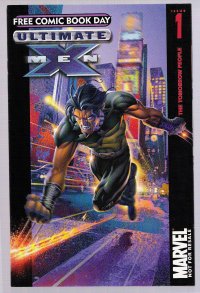
In July of 2001, Grant Morrison re-drafted the classic X-Men as the New X-Men, and although Wolverine was now wearing black leather it was not the same uniform as in Ultimate. Basically Wolverine wore leather pants and jacket, and dog tags. Although certain influences were felt from the movies (the dog tags, the claws coming out from between his fingers rather than behind his knuckles), artist Frank Quietly played down the mutton chops and spiked hair a bit, and the rest of the artists at the time followed his lead, providing a unique spin. Although the character didn’t appear any younger (perpetually 35-40), as opposed to the Ultimate counterpart, there was an obvious attempt to amp up the sex appeal. He made out with Jean twice in so many months, and had a one night stand with 2nd-tier character Domino. The whole thing came across as misinformed, however, as this Wolverine reeked of sleaze rather than sex, as Quietly’s surreal 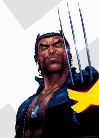 artwork hinted at a self-aware, ironic tone.
On both fronts, Marvel misunderstood what Hugh Jackman brought to the role. Yes, he was traditionally younger (31 at the time of the first movie) than the character had been depicted, and had sex appeal, but he also brought a combination of toughness and sensitivity to the role that distilled the essence of the character to the big screen. Further tinkering resulted. By the beginning of 2003 Classic Wolverine (during the “Riot at Xavier’s” story arc), Ultimate Wolverine (the “Hellfire and Brimstone” story arc) and the TV show X-Men Evolution (which ran from 2000-2003) were all wearing the same uniform, and both comic versions of the comic character sported a goatee (although the cartoon version was oddly clean shaven, neutering a character to render him suitable for Saturday morning cartoons). This uniform was blue with yellow stripes, somewhere between the classic uniform and the more modern Ultimate uniform, and it felt like a superhero costume. Two birds were killed with one stone, as Marvel was able to backpedal toward tradition and achieve brand synchronization. New Look Wolverine had been standardized and could now be easily identified across multiple mediums. A casual viewer of Evolution could pick up any comic and recognize the feral Canadian.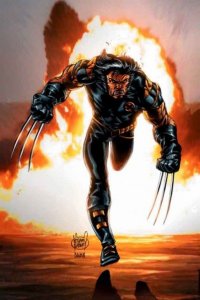
It was odd, however, that an entirely new design was concocted rather than simply mimic the cinematic Wolverine (and the rest of the X-Men by extension). In fact, this was only in practice with Wolverine, as the rest of the X-Men stayed uniquely their own (Ultimate Jean’s pixie hair cut, for instance). Although Wolverine’s most iconic aspects are his hair and claws, even more so than uniforms, drawing the character with Hugh Jackman’s likeness would’ve been a more ideal brand synchronization than the unifying goatee. The goatee not only distanced all other mediums’ versions from the movies, it was out of character and looked plain silly. Perhaps with the Ultimate version it was meant to evoke youthful bravado (as this was a Wolverine that bedded Jean, and later tried to kill Cyclops in order to keep her), but for the older Classic character it came across as awkward and ungainly. Goatees carry connotations, signifying a degree of vanity and upkeep. Wolverine’s usual mutton chop stubble was more about apathy towards appearances.
The question is: how effective was this brand synchronization from a business perspective and from a storytelling perspective? Bear in mind this is all anecdotal evidence as a long-time comic book reader. I haven’t been able to find any official word from Marvel on the decision to sync up Wolverine’s appearance across multiple versions, and even within the stories at the time there was little to no acknowledgment. It’s clear that storytelling had nothing to do with the decision, as the Classic character did not start acting younger or voice his need for change after having the same haircut and facial hair for over a hundred years (almost thirty years our time, as the character was created in 1974). From a business standpoint, as well, it was apparently ineffective as Wolverine’s appearance was in constant flux: he always had the same uniform, but the goatee appeared and reappeared in regular Marvel depending on the artist but stayed a mainstay in Ultimate Marvel until the character’s death during Ultimatum (2008-2009). By July of 2004, in Astonishing X-Men #1 and just in time for Wolverine to join the New Avengers, he was back to wearing a traditional superhero costume, albeit an updated version, and sporting the classic haircut and facial hair.
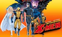 So was this a failed experiment? There have been a few obvious attempts by Marvel at brand synchronization since then, such as Ultimate Elektra’s costume’s similarities to the costume in 2003’s Daredevil, Bullseye having a bullseye scar on his forehead, and Spider-Man suddenly reverting back to his black costume in 2007 because of its prominence in Spider-Man 3. Much like with New Look Wolverine, however, Marvel played it safe and aped the movies without creating an entirely new design (even incorporating classic elements like Elektra’s headband, and the original black Spider-Man suit rather than the movie version with webs), and were all relatively short lived.
Hawkeye, however, is an entirely different story. New Look Hawkeye, unveiled in last week’s Avengers #19, is wearing exactly what Jeremy Renner will be wearing next summer, and that Hawkeye was designed off what the character wore in Ultimates v. 1 & 2. Classic Hawkeye used to wear a pretty silly outfit, a purple costume with two spikes for a mask and a giant H on his forehead, but it fit the character as he had once been a circus performance. Ultimate Hawkeye had actually even changed his look in Ultimates v. 3 (incorporating a mask and goggles) onward until the recent Ultimate Hawkeye mini-series, right around the time the first posters of Jeremy Renner in costume were unveiled.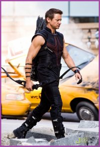
Whereas Wolverine was singled out due to his popularity, Hawkeye got the redesign treatment due to his relative obscurity. Not only is he a character that has achieved little name recognition outside of a vocal but small fan base, he’s the only character in the Avengers lineup to lack a pronounced appearance in a film so far. He appeared in Thor for about thirty seconds. Although Scarlett Johanssen as the Black Widow will also be battling lack of screen time, she at least had a supporting role and significant action set piece in Iron Man 2. Plus, she’s incredibly attractive. Hawkeye lacks super powers and an outmoded gimmick: a bow against Loki? I’ll leave it up to Joss Whedon to handle that. With Wolverine brand synchronization was off-base and wrongheaded, but from a business perspective New Look Hawkeye could help garner attention for the character. The problem is the implications of the look on storytelling.
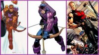 As previously mentioned, Classic Hawkeye’s civilian identity Clint Barton had been a circus performer and has an affinity for the theatrical. Ultimate Hawkeye, however, is an assassin with a shady past, and this is the depiction the movie version is adapting. This New Look costume, with its emphasis on Top Gun-style aviator sunglasses and sharp as a knife precision, is fitting for Ultimate and perhaps the movie, but not for Classic Marvel. There’s precedent for Clint Barton changing his costume and identity (he’s been Goliath and Ronin in the past, sans bow), but altering his appearance in this way has implications. Classic Hawkeye should not look like a killer (which is an argument I would make for 90% of mainstream superheroes); he should look like a swashbuckler.
So how to fix this? Marvel Comics, and the comic book industry as a whole, has to acknowledge and accommodate their long-term fans and possible readers. Brand synchronization is not the key, as it’s detrimental to the storytelling. Ultimate Marvel (or a new imprint), therefore, should be based entirely around continuing the movies’ stories and filling in the gaps between sequels. IDW, for example, started a new Star Trek series in September that picks up where the 2009 movie left off. This could not only attract readers that are only familiar with the movies, but give Ultimate Marvel a clearer objective than simply to be different than Classic Marvel. As a result, Classic Marvel could stop attempting to stay relevant to cinematic audiences and be free to tell stories in a classic vein.
Perhaps that’s pandering, but it makes good business and storytelling sense. The audience could be doubled as new readers would be welcomed while old fans would be ingratiated. There’s something to be said for a guy that can pull off draping himself in purple, prancing around in pirate boots, while shooting arrows into thugs. Don’t try to mold old fashioned heroes around cinematic sensibilities; what works in one medium doesn’t work in the other, and shouldn’t have to.
T.H.U.N.D.E.R. Agents volume 2 #1 (of 6)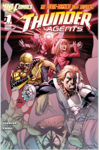
by Graig Kent
A quick scan through the ever-trustworthy Wikipedia reveals that there was a total of 27 issues to the T.H.U.N.D.E.R. Agents name (across three different publishers over a 20-ish year span from ’65-’86) prior to DC’s licensing of the characters in 2010. This means that the 10 issues of “volume 1” that came out just prior to the “New 52” DC reboot was the longest continuous publication of these characters since their 20-issue Tower Comics series in the sixties. It also means that once this 6-issue “volume 2” mini-series is complete, these sixteen issues will comprise about 1/3 of the total overall published history of these characters.
“Nice facts, bub,” you say, “but what does it all mean?”
The point is, my friends, that with such a minuscule amount of history behind the team and characters, Nick Spencer didn’t have to maintain any sort of consistency or continuity with the comics of the past. He could have easily forged his own distinct path with these characters and concepts and few but the dedicated T.H.U.N.D.E.R.-heads and Wally Wood-ites would see fit to complain. Yet he chose not to invalidate the past in the first volume by not dismissing it. He embraced it without relying upon it — thus ensuring previous comics were not mandatory reading for the new series — cleverly manipulating old threads into his stories of today. Yet even with his faithfulness to the past, he still tweaked and strengthened the core concept for a modern audience, giving it a charge that really differentiated it from other superhero team books everywhere.
Yes, The Higher United Nations Defense Enforcement Reserves aren’t the only “global guardians” in comics, but if there’s a team of super-hero soldiers/spies that volunteer to undertake these missions knowing that using the super powers they’ve been granted will kill them, well, I haven’t read it. The first volume of DC’s take on T.H.U.N.D.E.R. Agents was a critical smash, if not exactly a sales powerhouse. After the failure of the Archie Red Circle characters (like The Shield and The Web) and the fizzling integration of the Milestone characters into the DCU, it was truly a surprise. Excellent art from series artist CAFU and Bit, with flashback sequencing from a host of major talent like Ryan Sook, George Perez, and Mike Grell accompanied Spencer’s deliberately paced and uniquely structured tale, which introduce new characters and reintroduced the old over the 10 issue span.
When Spencer signed to an exclusive with Marvel, it was noted that his current creator-owned Image work (including the terrific Morning Glories) and this DC series were exempted from that exclusivity and that gave hope that the series wasn’t just a flash-in-the-pan. But the “New 52” loomed large and T.H.U.N.D.E.R. Agents wasn’t one of them, it seemed the writing was on the wall despite reassurances it would return, somehow I didn’t believe them.
But here it is. Unlike the integration DC tried to do with the Red Circle and Milestone characters, these characters weren’t forced to live within those confines, but at the same time, they were never explicitly exclusive of it either. Spencer kept them self-contained, but hasn’t made a point of mentioning it in-series one way or the other. Even with the reboot, there’s still no mention of a larger DC Universe in this first issue, but then there’s no real need to either. This issue seems a straight continuation of what Spencer was already doing, and really, it’s more of an issue 11 than it is an issue 1. It’s not a bad jumping-on point, but it’s not the best place to start either, especially given the major events in the lives of Toby Henston and Colleen Franklin, the two “civilians” who were the reader’s entry into the U.N. super-hero agency in the first series , and continue to be here.
I imagine Spencer probably had some, if not all, of these scripts locked and loaded before the reboot put it on hiatus, as unlike even those “New DCU” series that came out relatively unscathed like Green Lantern, Legion and Batman, there isn’t anything here to indicate things are at all different. It may just be a case of closure for the first series or a test of the waters to see if, in the new DC marketplace this critical darling will have better legs and, perhaps, worthy of a second mini or ongoing?
CAFU is out, launching the new Grifter series before switching to the Blackhawks. Wes Craig is in. It’s a jarring transition from CAFU’s uber-clean lines and crisp detailing to Craig’s softer lines, (slightly) more cartoonish figures and darker tone, but it’s not a difficult one to get used to. Craig’s style is like a gifted blending of Darwyn Cooke and Tim Sale, an animated feel but grounded and well defined. He negotiates Spencer’s story exceptionally well, dealing with two completely different settings (one is the costumed heroes in an underground kingdom helping to quell a riot, the other a civilian stting as Toby and Colleen go on a date) and also handling nicely the tricky super-science flashback/origin story of where the Agents powers (and more specifically the Menthor helmet) came from.
Once complete, as a near-continuous run of 16 issues, Spencer’s take on these notable if small-time heroes actually stands a pretty good shot of being the definitive take on the T.H.U.N.D.E.R. Agents. Blasphemy for the Wood-ites out there, sure, but it is a really good read.
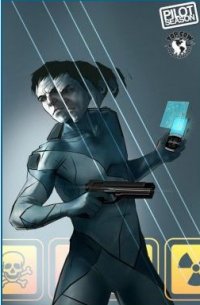 Theory of Everything #1 (Image/Top Cow, $3.99)
By D.S. Randlett
The first few pages of Theory of Everything should have been the coolest thing ever. It all starts with a bank heist in Switzerland, and the robbers are using some previously theoretical technology that lets them hop between dimensions, effectively letting them teleport where they want to be in the “main” Earth. There are a lot of fun ways that one could go with this idea, but for now we have to be satisfied with just seeing the teleportation in and out of the bank vault.
After the robbery, we start meeting out protagonists. Charles Witten is a physicist who has been doing work in the field related to the bank heist we just saw. He’s also a widower. After losing his job at a California community college, he gets picked up by an international (presumably) organization called S.T.R.I.N.G. (as in the theory) to help them with an investigation into the bank vault robbery. The odd thing about S.T.R.I.N.G. is that they’ve been established in order to look into things precisely like the robbery, but they say that Witten is the only scientist on Earth who’s been looking into creating this technology. The main mystery here is where the bank robbers got their gear if it never got past the design stage.
The way the story unfolds, it’s hard to get a handle on what exactly the reader is supposed to be latching onto. There’s simultaneously too much going on and not enough. Too much in that a lot of plot and exposition is being thrown out there, and not enough in that the rules of the story’s macguffin aren’t stated in a particularly clear or satisfying way. The reader gets all of this information, but no real vision of how this world is supposed to work.
But still, it’s not a bad comic. The core idea is, admittedly, very cool, and the series has an opportunity to go to some very fun places. It took me a bit of time to warm up to the artwork, but I did indeed warm up to it. Thomas Nachlik has a sketchy noir-esque style, and in general the tone reminded me more of classic thrillers than anything else. If Theory of Everything finds its feet in the next few issues, it could be something really special.
Rating: 


Out of a Possible 5 Stars
Flash Gordon: Zeitgeist (Dynamite Entertainment, $1.00)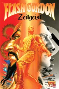
By Bart Bishop
I don’t have a lot of experience with Flash Gordon. The character certainly has name recognition, although I’d be hard pressed to find anyone that’s seen the old serials. I’ve only seen the 1980 movie once, for the first time this year. It is a fun, silly romp that is more self-aware than Star Wars, but what it’s most known for is that song: “Flash”, by Queen. You’ve heard it, from the movie Blades of Glory to Blackberry commercials, and it’s a classic. The problem is that the movie was a flop, although it built a cult following over the years. The closest the character has gotten to popular consciousness in the 21st century is from a failed SyFy channel series that lasted one season. When was the last time this character was relevant?
Dynamite Entertainment’s Flash Gordon: Zeitgeist is the answer to the question. Issue #1 jumps back in time to 1934, the very year the original Alex Raymond comic strip was first published. This new series, written by Eric Trautmann (Vampirella, Red Sonja), from a story and designs by Alex Ross (Kingdom Come, Marvels, Project: Superpowers) and illustrated by Daniel Lindro, sets to distance itself from any previous version. The last incarnation of Flash, published by Ardden Entertainment sporadically from 2008 until Dynamite gained the rights this year, was set in the present day and lost the wonder and can-do attitude of the original pulps. Restoring the original timeframe not only stays true to the roots, but creates ample opportunities for alternate history storytelling.
The story, so far, is almost identical to the movie (which says more about the movie being a faithful adaptation). The movie, however, had more of a kitsch tone in the vein of Rocky Horror Picture Show or Phantom of the Paradise. Although not a musical, it had the energy and operatic drama of one. This comic harkens back to its roots, played relatively straight and earnest. There is comic relief, but it comes more in the characterization and descriptions, which tend to have a subversive irony to them in contrast to the serious visuals. That’s actually quite brilliant on the part of Trautmann, who can potentially balance the traditional high adventure of fantasy/sci-fi with the faux-Wagnerian Camp of the movie.
What exactly is Camp? According to literary theorist Susan Sontag, in her landmark 1964 essay ‘Notes On “Camp”‘ in which she posits “the old Flash Gordon comics” as an example:
1. To start very generally: Camp is a certain mode of aestheticism. It is one way of seeing the world as an aesthetic phenomenon. That way, the way of Camp, is not in terms of beauty, but in terms of the degree of artifice, of stylization.
2. To emphasize style is to slight content, or to introduce an attitude which is neutral with respect to content. It goes without saying that the Camp sensibility is disengaged, depoliticized — or at least apolitical.
3. Not only is there a Camp vision, a Camp way of looking at things. Camp is as well a quality discoverable in objects and the behavior of persons. There are “campy” movies, clothes, furniture, popular songs, novels, people, buildings. . . . This distinction is important. True, the Camp eye has the power to transform experience. But not everything can be seen as Camp. It’s not all in the eye of the beholder.
So Camp, at least in its original sense, was unintentionally style over substance. The 1980 movie, in an odd bit of contradiction, uses Camp as its driving imperative. This comic, however, goes for a different tactic, embracing the kitchen sink method of anything goes. The fantastical universe of Flash Gordon suggests infinite possibilities within the context of the story. Alien empires ruled by Asian stereotypes, polo players as secret agents, mad scientists creating inter-dimensional travel before the invention of the IBM computer, and Hitler as the ruler of the Earth. That’s right; the narrative shift from any earlier Flash Gordon is that Ming the Merciless wants to appoint Hitler as his proxy on Earth. Trautmann trumps audience expectations, with the first 2/3 of the comic playing like a standard retelling of Flash’s origin only to add real world ramifications. Hitler, however, and Nazi Germany are overused tropes in genre fiction, having become literary shorthand for evil since Raiders of the Lost Ark.
So Trautmann is working against rejiggering an old story that has struggled for years now for viability with the tired threat of the Third Reich. Although the plotting is nothing special, where the author succeeds is in his economic pacing and quick-witted characters. The action never lets up, establishing the otherworldly Mongo, the Earth of the 1930s, and the opposing players in-between in short order and sets them on a path toward intersection. Ming is suitably slimy, but little stands him apart from any other dictator throughout fictional history. He might as well be wearing aviator sunglasses and riding in the back of a jeep. In fact, it’s rather disconcerting that Ming’s evil is epitomized by his sexual decadence, surrounding himself with scantily clad (white) slaves, whereas the heroes are All-American Caucasians with traditional, monogamous values. Flash and Dale Arden have a snappy banter right off the bat. The former is described as a “Yale graduate and champion polo player”, a classic hero of smarts and athleticism, while the latter is a “cartographer and researcher for U.S. Department of State.” It’s auspicious to have a capable female character, not overly sexualized in appearance or action, that can stand as Flash’s equal. Dr. Hans Zarkov, meanwhile, isn’t much more than a raving madman at this point, but his descriptions of “other-space” are fascinating and have the right balance of technobabble and super-science.
The cover is Alex Ross to the nines, all photorealism and big, bold style. This feels antiquated after all these years, with Flash posed the same as seemingly all of Ross’ heroes, depicted as part-statue, part pro-wrestler. That can work to this story’s advantage, as it harkens back to the old Doc Savage paperback covers by James Bama, but here it feels like Ross on autopilot. Still, there’s no denying the provocative contrast between Ming and Hitler, with Flash caught in the middle (I especially like one of Ming’s bizarre, colorful ships sneaking in amongst the German bombers). The low angle, as well, positions Flash and the villains as being above the reader, which is mimicked by Indro with the interior art. Ming’s and Flash & Dale’s introductions are all at low angles, preparing the reader for a tall tale and larger-than-life personalities. The interior art is atomic retro cool, especially a two-page spread of newsreels showing Ming’s natural disaster attacks around the world, although the thick inking and coloring creates an unintended murky quality.
Not a must read, but at $1.00 it’s a pleasant update on a fondly remembered character.
Rating: 


Out of a Possible 5 Stars
 Green Lantern: The Animated Series (DC, $2.99)
By D.S. Randlett
With the live action film, it could have been assumed that maybe Green Lantern just wasn’t meant for life beyond the comics page. Personally, I thought that this was a bit of a shame. Not only because the movie was, in and of itself, not very good, but because getting GL out of comics represented a chance to liberate some of the cooler ideas of the Geoff Johns run from the continuity porn that formed the foundation for it all in Rebirth. What’s more, Johns’ run has a lot of elements that made me wish that he were aiming a little younger in terms of content, as I would have loved to share bits of his ROYGBIV-tinted epic with my younger brothers. Alas, the dismemberment factor and the Star Sapphire outfits were a bit much. But then along came the recent Cartoon Network pilot for Bruce Timm’s Green Lantern cartoon to kill two birds with one stone. It was a bit light at first, but in the end it ended up being a nice little story about self sacrifice and doing the right thing. It managed to hit that sweet spot of being a show for kids while not talking down to them. Plus, it had Red Lanterns in it, which kind of blew my kid brothers’ minds.
And with a new animated series comes a new comic tied to it. If you’re like me, you fondly remember the Batman Adventures and Superman Adventures which featured some great work by guys like Mark Millar and Scott McCloud that could sometimes border on definitive versions of the characters and their worlds. The great opportunity of these books is that they give creative teams to really focus on what works about these characters without having to satisfy the continuity demands of the main fanbase. What does that mean for Green Lantern: The Animated Series: The Comic Book?
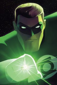
Time will tell, I guess. This inaugural issue is a fairly simple one and done affair. Hal and Kilowog are checking out some uncharted bit of space in Aya, a talking space jet thing that I’m sure is going to be a toy very soon. There they find a Green Lantern ring floating in space, which turns out to actually be a Red Lantern ring. How the Red Lanterns set this trap ends up being one of the book’s mysteries. Before Hal and Kilowog can figure it out, the Red Lanterns attack. Hal ends up getting away while Kilowog is captured. Of course, Hal has to save his pink hippo pal and get to the bottom of what the Red Lanterns are up to.
The execution is about what you’d expect, but the vibe and look of this book (and the show, too) is way more reminiscent of the Silver Age than other Timm/Dini-inspired series. While not being quite up to their level, there’s some intentional hearkening back to guys like Gil Kane or Alex Toth here. Everything is just so clean and economic. It’s a familiar look, but it’s much different from the Batman/Superman animated styles. The economy is something that the writing shares, along with its Silver Age influence. We don’t just get a rock ‘em sock ‘em adventure, but Hal has to get to the bottom of one of the book’s mysteries by learning a bit of science trivia and employing that new piece of knowledge to get out of a scrape. Sixties Barry Allen would be so proud!
For grownups, this is probably a three star book. It does what it needs to do and does it inoffensively. For it’s intended audience, it introduces an imaginative world in a fun and age appropriate way. If you’ve got kids at home and want to be able to bring something home from your pull list just for them, you could do much worse.
Rating: 


Out of a Possible 5 Stars
5 Ronin (Marvel, $19.99 HC, $16.99 TPB)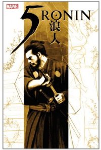
By Jeb D.
Used to be that DC and Marvel had a sort of systematic approach to Imaginary stories (yes, I know they’re all “imaginary”; thank you, Alan). DC had a nicely branded Elseworlds line, while Marvel’s What If? series has had a couple of ongoing runs. I have no idea how or if the “New 52” will handle this kind of tale (for all I know, the entire DC line is now an “Elseworlds” story), but things at Marvel seem a bit haphazard. The recent Marvel Noir line was an interesting experiment in alternate world-building, and much of its effectiveness came from creating its own little pocket universe. Peter Milligan’s 5 Ronin, though, seems to be hanging out there like an orphaned concept, with little chance for resonance beyond this one rather derivative tale.
While I wouldn’t quite put the lone samurai, cut adrift and smarting from betrayal, up there with zombies at the top of the “tired-pop-culture-trope” list, there’s no question that Western writers have been mining (and simplifying) this setup quite a bit, to the point that it’s pretty hard to work a new variation on it. For better or worse, Milligan doesn’t really try: he’s going for classicism, not reinvention.
The story is pretty straightforward: in feudal Japan, an evil warlord has trashed the honor of samurai, betrayed them, and slaughtered a bunch of them along the way. The hook is that the surviving, now masterless, samurai seeking revenge are based on Wolverine, the Hulk, the Punisher, Psylocke, and Deadpool.
The first installment features Wolverine, and for all the obviousness of the choice, in some ways it’s the most interesting segment, as this version of Logan appears in the form of multiple identical-looking samurai brethren, one of whom “cannot die.” It does make it hard to form a rooting interest, though, as we’re just waiting for all the interchangeable Wolverines to sort themselves out by killing each other off. Had this been the start of a new ongoing series, with some kind of mysterious cloning taking place in feudal Japan… well, it would have been stupid, obviously, but in an imaginative kind of way. Unfortunately, it’s just a curtain raiser for a mini-series that relies on such tired plotlines as the monk who renounces violence in order to tame the beast raging inside him (you’ll never guess), the silent, sanguinary assassin whose family was brutally slain (who could that be, you ask), the wisecracking fool who’s deadlier than he lets on (think hard, now), and the hot babe who just happens to be a 17th-century asskicker. If you have a favorite samurai film (Seven Samurai, Yojimbo, Ran, etc.), rest assured you’ll find elements of it here. The added grace notes of characterization are based as much on the expectations we bring to the characters ourselves as anything in the actual script.
For the most part, the art is good, although with a series like this, you sort of prefer to have the same artist for all five parts, particularly since the setting and story beats are similar for all five characters; each individual section works fairly well, but you feel as though you’re starting over again every time one ends.
For Wolverine, the work of Tomm Coker and Daniel Freedman has a rough-hewn quality that’s somewhat reminiscent of the alternate-universe Japan of Bart Sears’ The Path. Dalibor Talajic and Lee Loughridge sharpen and tighten things for the Hulk’s story (though they and Milligan avoid the full-on greenskin, clothes-busting transformation), and the feel is almost like a good Western comic: as much Magnificent Seven as Seven Samurai. Laurence Campbell is one of two artists here who is associated with The Punisher, and his tale of revenge is all noir camera angles, shadows, and black streaks of blood in the moonlight. The other Punisher regular, Goran Parlov, has the trickiest assignment: neither multiple Wolverines or monks who hulk-out stretch the boundaries of credibility any further than Psylocke’s tale of a 17th-century pleasure girl turned hand-to-hand brawler, and the lightness of color palette and tone underline the script’s glibness; one notes in passing that the only female character in the story gets cast as a prostitute. Finally, Leandro Fernandez and Loughridge turn in clean, colorful action work as Deadpool wraps up everyone’s story for them, and sorts it all out for us.
For anyone in a “What If?” mood, who’s got a samurai itch to scratch, it’s what the doctor ordered. Otherwise, though, Milligan and company have much better material on offer elsewhere.
Rating: 


Out of a Possible 5 Stars