I’ve always been a big fan of infographics, or really any kind of movie-related art that employs well considered graphic design. Right now the minimalist poster art trend is already huge and still growing. In fact, CHUD has partnered with FroDesigns to help bring one particularly excellent artist to your attention and in return get to spotlight some films that might not otherwise get that kind of treatment. Infographics are a different animal though, and you don’t quite as often see good examples of cleverly selected or interesting information married with a good design sensibility. A decent selection of worthwhile pieces have stacked up lately though, so I thought I’d bring you another round of Look At This Now. This is something I’ve done once before, last year around Oscar time.
1. BoxOfficeQuant – Statistics and Film
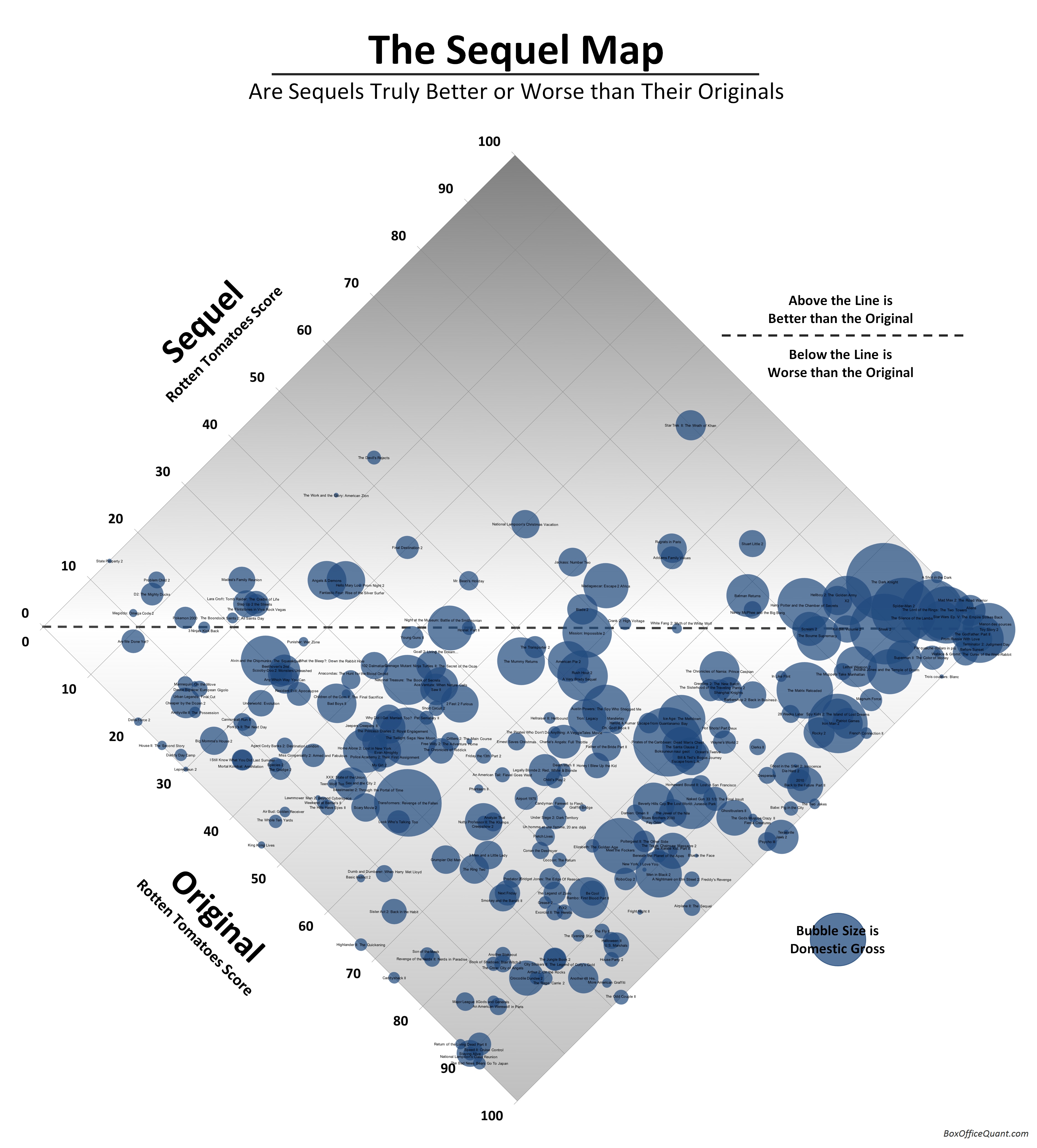
First up I wanted to bring your attention to an interesting new site called BoxOfficeQuant.com that is devoted to infographics concerning film statistics. This site isn’t pumping out your typical box office chart though, having started with an examination of Pixar’s consistently stellar return on investment for their films and in the short time since generated some other uniquely interesting graphics. Their most obviously awesome piece is a map of what sequels are better or worse than their originals. Using the aggregated figures from Rotten Tomatoes, you can see a pretty clear critical trend indicating that sequels rarely fare better than their successors. It’s a high-res piece, so you can really dig in there and explore the titles and pick out the anomalies.
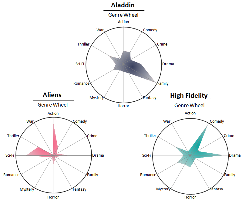
To show you how out-of-the-box Quant’s statistical examinations are going to be though, take a look at a portion of today’s piece, which mined the Internet Movie Script Database, parsed the scripts for the most frequently and uniquely used words of each genre, and reapplied them to specific titles to see how they charted on a genre wheel. They admit their sampling is (by no fault of their own) not pulling from enough information to make it definitive, but it’s fascinating all the same. Definitely worth taking a look at the rest of the information on their blog.
2. Star Wars Galactic Map
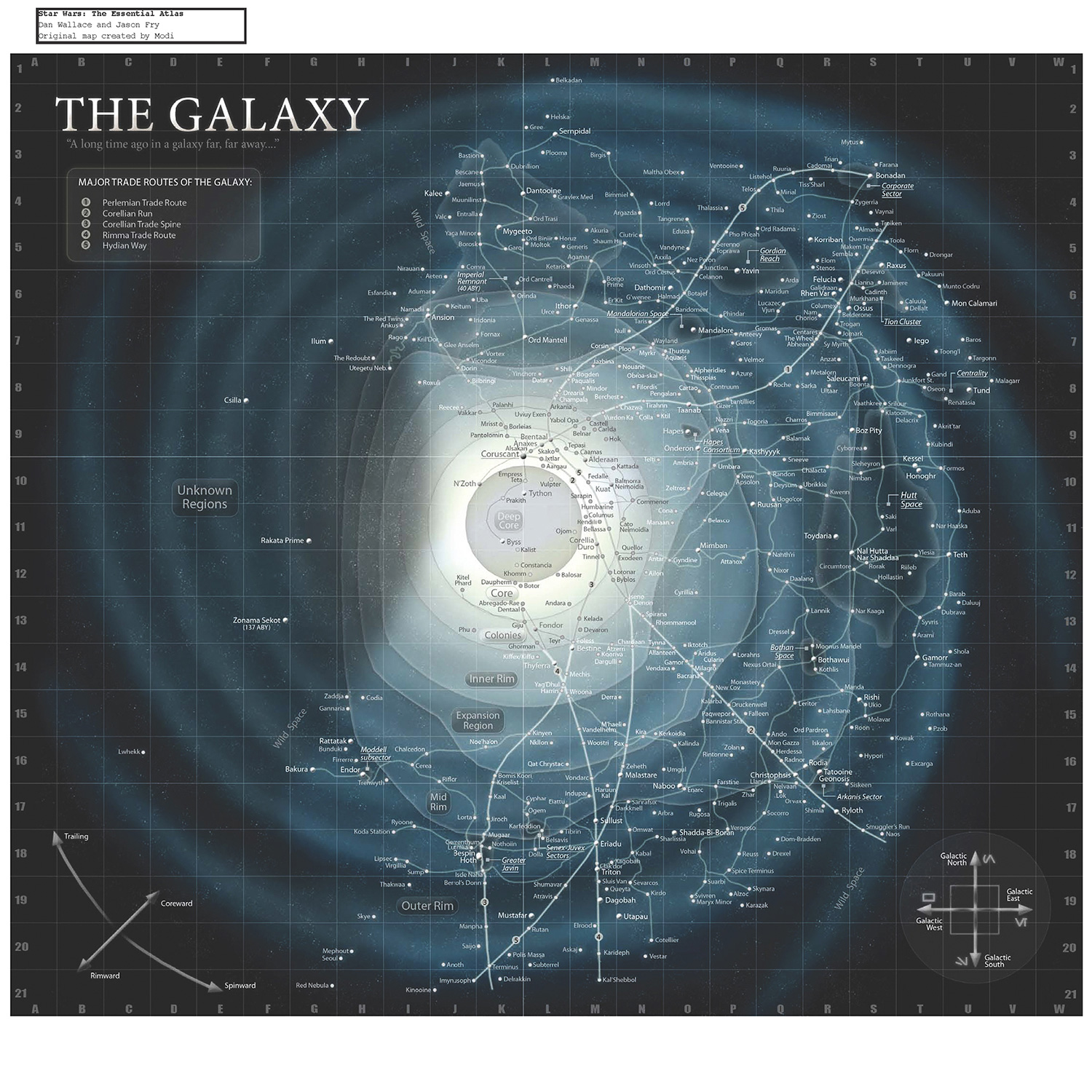
This is for the Star Wars nerds. EW put the spotlight on this piece, which maps out every planet and system ever mentioned in the Star Wars universe. Frankly, it took me a minute or two of searching to find even one that I’ve heard of, but I know there’s a large group of people that will have fun digging into this and trying to remember in what book or video game was one obscure planet or another mentioned.
3. YouTube Icons
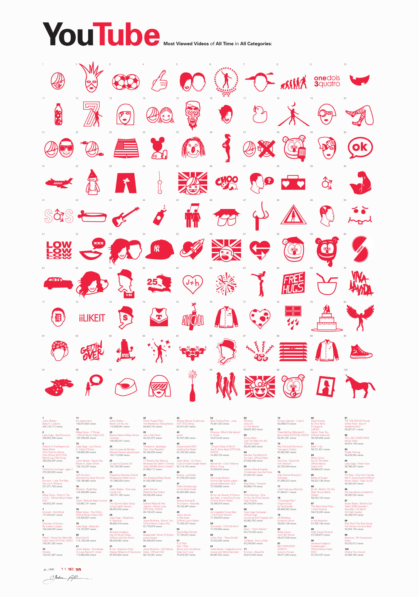
We’re branching into wider media than just film with this one, but well regarded artist Ibraheem Youssef has created an icon map that covers the top 100 YouTube videos of all time. Ibraheem is responsible for one particularly popular batch of minimalist movie posters (which I think are a touch overrated, but still very awesome), and this is his newest work.
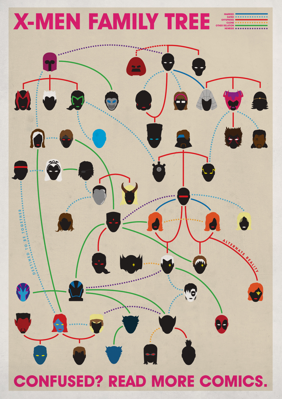
4. X-Men Genealogy
This is a chart aimed at pretty hardcore comic book geeks, but it’s been making its way around the webzones of late and is certainly well-designed enough to merit a mention. Charting just a small section of the bizarre familial links between the X-Men, graphic designer Joe Stone challenges you to recognize your favorite nearly-incestuous mutants in icon form.
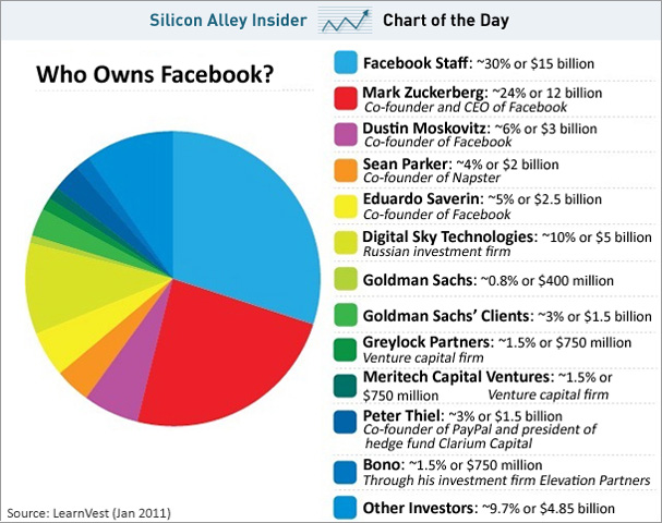
5. Facebook Ownership Chart
There isn’t anything here for graphic design fans, but I figured this recent ownership pie graph of Facebook from Business Insider would be interesting to include. The Social Network is an amazing drama (that still held up perfectly upon my third theatrical viewing, which occurred Sunday night while it was winning Golden Globes) and it’s still profoundly impressive that Sorkin and Fincher managed to make affidavits, stock divisions and algorithms such key parts of such an energetic and riveting film. This chart shows shows the division of ownership of Facebook stock –a key plot point in the film– and you can see how much it has changed in the few short years since the events the film covers. As you can see, Zuckerberg is still the majority single shareholder with Sean Parker and Eduardo Saverin still taking up significant chunks. What you may not have known is that Bono actually owns a percent or more of Facebook! I smell a Social Network sequel, or even better… a disastrous Broadway adaptation!
Hope you enjoyed one or more of these pieces- spread it around if so! Support good graphic design!
DISCUSS THIS on the CHUD Message Board
&
Like / Share it on Facebook (above or below) if you think it’s great!
