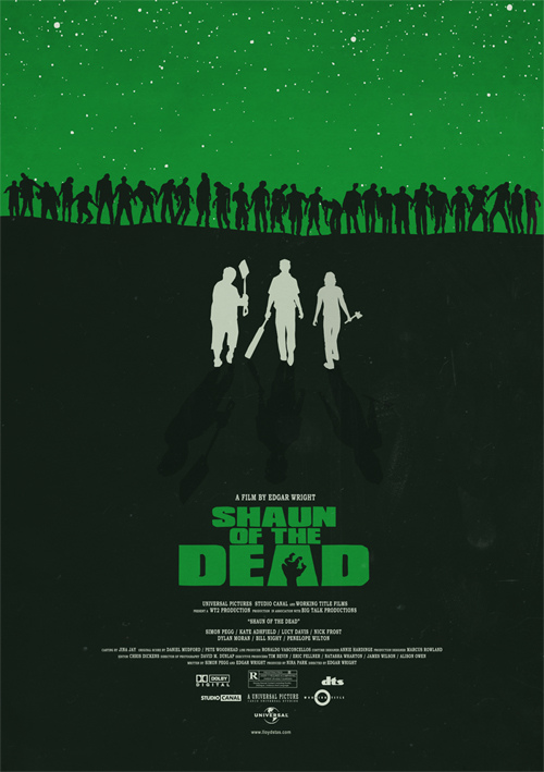
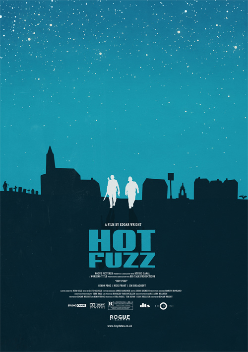
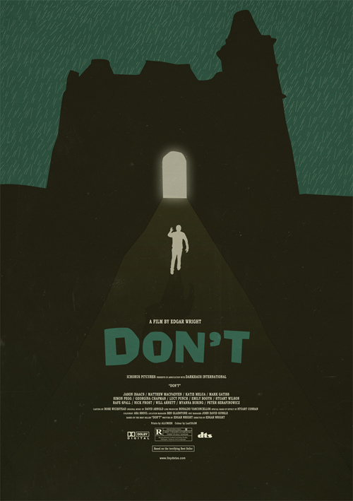
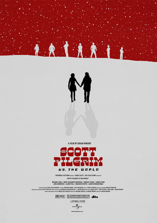
You don’t need me to tell you that vector minimalist and screenprinting style posters for movies have fucking exploded in the last few months, with a new round of clever images popping up on a daily basis. There’s certainly fatigue that is setting or will set in for certain elements of the style that many of these (often young) artists are flocking to, but overall it demonstrates a real excitement for creative reinterpretation of the idea of a movie poster. It says a lot for the films that are honored as well, as we discover just how simply some films can be recalled with single images or stripped-down ideas.
Edgar Wright is the latest filmmaker to get a round of posters honoring his work in this fashion, as a young artist named Lloyd Stas from the UK has generated a series of graphic posters covering all of the delights the director is known for. What’s great is that Spaced and Don’t, Edgar’s TV show and Grindhouse trailer respectively, are covered with equal care as his three feature films. What’s even better is that when looked at all together, those two even stand out from the movies by making a looming architectural structure the centerpiece- perhaps it just turned out that way, but it’s a nice touch. The overall palette is nice, and I love how Scott Pilgrim sort of stands out and punctuates the rest of the posters with its inverted brightness.
It’s a really great set of images, and perfectly timed with Wright’s upcoming New Beverly Wright Stuff film fest (tickets on sale tomorrow, I hear).
Prints for this sort of thing are always sketchy since studios want approval (and a cut of the action), and Mr. Stas may not even care for the headache that it would require, but they’re certainly wonderful to admire in a browser at least. Check them all out below, and then have a look at Stas’ other work on his Flickr account, and his twitter feed.
DISCUSS these Slices of Great on the NEW CHUD MESSAGE BOARD


