I don’t usually like commenting on posters because most posters these days are either bad or not worth expending energy on. Character sheets are often doubly useless, unless it happens to be our first look at the featured character. That’s obviously not the case with this triumvirate of posters for Batman v Su…You Know, but I just can’t get over how silly each of the faces in these posters are.
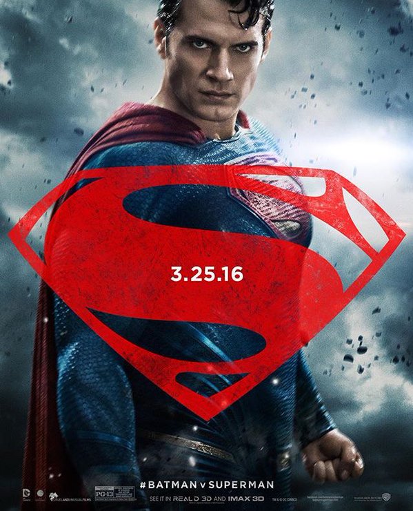
First off, we have a Henry Cavill who looks like he was the victim of a Photoshop makeup swirly:
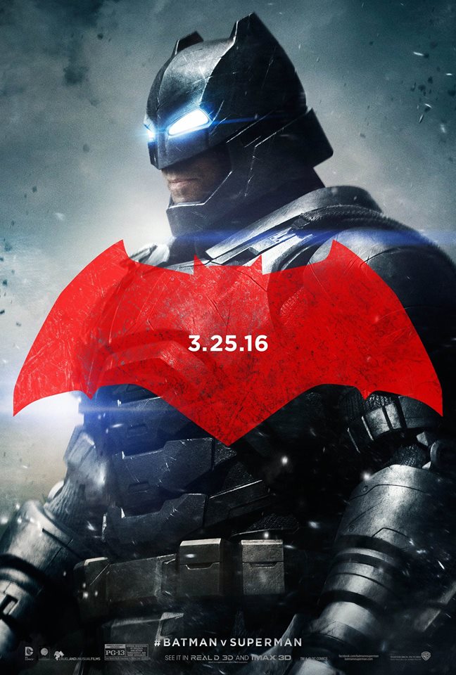
Then we have a Batman who I swear is not Ben Affleck. Maybe it’s a testament to Batfleck’s mouth-acting, but his lips just look… stretched? Or like he has some marshmallows he’s trying to keep from popping out of his Bat-mouth?
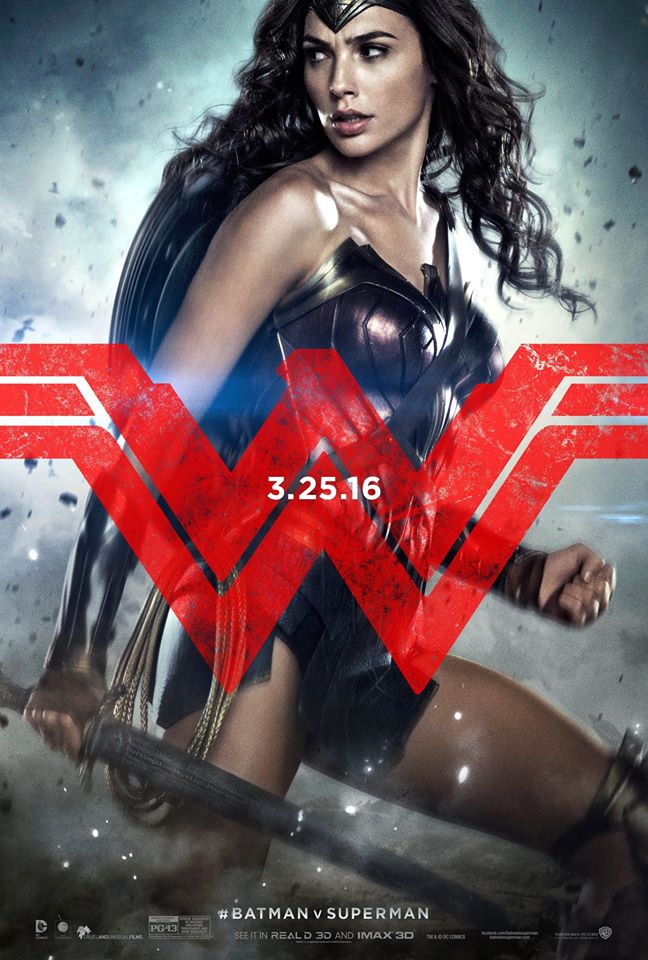
Gal Gadot has the best one (and her first official poster!), but was her mouth born in a barn? Close that thing! It’s hard to look badass with your jaw hanging open. And is it just me, or does that sword she’s wielding look incredibly plastic-y?
It’s pretty clear that this movie is a Superman sequel in name only. This is Justice League 0.5 and I expect the marketing to continue to reflect that. I do like all of the logos though. That’s a nice touch.
Batman v Supuzlflumbi starts on the date listed on these posters.
Thanks to board member Sprinky for the heads up on these!
If you like how stupid I am, you can follow me on Twitter or listen to my podcast.