Flash Gordon # 1 (Dynamite, $3.99)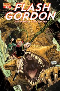
Nightcrawler #1 (Marvel, $3.99)
By D.S. Randlett
It’s the one sad fact of comics, and arguably all media: No matter how great some titles are, or how bad other titles are, the vast bulk of comics are… fine. Just fine. In comics, I think it’s safe to often lay that particular blame at the feet of many of the field’s often good or great writers. Great artists can elevate flat material, but only so much.
That’s the case with two titles this week. Jeff Parker, a great writer, turns in a rote script for Flash Gordon, while the legendary Chris Claremont is barely there for the next chapter in the rebirth of my beloved Nightcrawler. Both of these are first issues featuring familiar faces, and both make many of the same mistakes.
Parker’s script for Gordon is probably the stronger of the two in terms of plot, but he simply fails to find a hook into any of the characters. I’m sure that longtime fans of the character will be delighted to be plunged into a new adventure with their favorite characters, but as a newbie I had a hard finding anything to sink my teeth into. Conflicts are taken for granted, and to a one the characters are all wit and no passion. But still, there are… seductions. Gordon’s ship teleports between several different planets before landing on one that seems to be composed entirely of forest. No earth. No ocean. Just forest. And then there’s a giant bug and a civilization of blue-skinned warriors. I like that stuff, and you probably do too, but in terms of story there is nothing to really connect to.
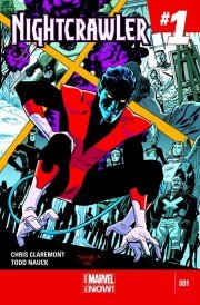 Claremont, probably more responsible for more people’s love and hatred of the X-Men than anyone else, turns in a script that has the opposite problem. It feels pretty obvious that Claremont is extremely glad to have Kurt Wagner back, and he quickly finds a voice for the character. The problem is that there’s no voice for anyone else, and the threat comes out of nowhere. In this comic, a lot happens, but very little of it feels of any great import. Kurt fights Logan in the Danger Room. Kurt visits old (and apparently current) flame Amanda Sefton, Kurt gets attacked by a heavily armored stranger. In each instance, you have either character beats that have no foundation (or at least a foundation that hasn’t been in play for about a decade), or a ham-handed attempt at mystery. Flash Gordon has no characters. Nightcrawler has a substandard plot. Both are dramatically uninteresting.
But the artists on each book save them from being completely worthless. Evan “Doc” Shaner is something of an unknown in terms of big mainstream comics, but he’s begun making waves. I first found his art while searching Tumblr for awesome Superman art (shut up), and was happy to see him draw an excellent three part story in the digital Adventures of Superman. Seriously, if I were to infiltrate the DC offices in a Dan Didio costume, I’d get him on a regular Superman title stat. He’d be the next Curt Swan in terms of grasp of character and quality of storytelling. Whatever character there is in Flash Gordon seems to be Shaner’s creation. In his hands, the rote “adrenaline junkie” archetype that Flash adheres to becomes joyful and believable. I may not care about what’s happening, but damn it if I don’t want to see it happen. Shaner also displays an incredible grasp of the page, choreographing several stunts in a way that recalls the great practical work in classic Bond films while giving the detached observation of motion an energy and kineticism all its own.
Todd Nauck’s Work on Nightcrawler performs a similar task, and also features some stunning action choreography. Naucks best character is, well, Nightcrawler himself. He’s put a lot of thought into how this character should carry himself and move, and it really shows in the action scenes. In theory, Nightcrawler should be easy to capture in terms of action: his powers make him ready-made for random action shots. The better artists to draw the character manage to capture a sense of continuities in the phases of his teleportation movements, and Nauck is one of those artists.
So, in some pretty significant ways, these books probably aren’t worth your time, but strong artists make them worth a look. Use caution.
Flash Gordon #1 Rating: 


Out of a Possible 5 Stars
Nightcrawler #1 Rating: 


Out of a Possible 5 Stars
Astro City #11 (DC/Vertigo, $3.99)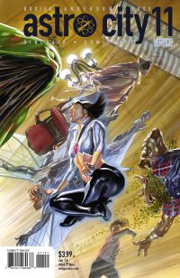
By Cat Taylor
If there was ever a case to be made for ignoring comic book issue numbers, Astro City is the best example. Although the entire Astro City universe is as connected as any other comic book universe, the comic book issues themselves are told in no particular order. Kurt Busiek may write a story from the present day in one issue, then a three-issue story that takes place in World War 2, then a six-issue story that takes place in the near future, and so on. I point this out because I know how anal comic book buyers can be about getting a continuous run of a series from issue #1. Many people won’t even start picking up a new series if they can’t get it from issue #1. This buying pattern is one of the reasons publishers constantly end popular series prematurely only to relaunch them with a new first issue as often as they can get away with it. With Astro City the issue numbers don’t matter unless Busiek just happens to be in the middle of a multi-issue storyline. Fortunately for potential new readers, he just finished one of those and issue number 11 is a stand-alone issue.
For anyone who assumes that Astro City is just another boring superhero universe, please allow me to explain. Kurt Busiek did create a superhero universe with very recognizable archetypes that you can find in Marvel, DC, and other places. However, where Marvel and DC tell stories of the adventures of their superheroes and their battles with supervillains, Astro City explores the effects of living in a world with super-powered beings, the seemingly insignificant ordinary people that happen to be around, and other aspects that you never realized would be interesting until you read about them. More interesting than the stories themselves is the fact that Busiek never seems to run out of new ideas that few, if any, writers have even touched on. In addition, Busiek’s writing is well matched by the art of Brent Eric Anderson and the colors of Alex Sinclair and Wendy Broome. This art team is among the best at depicting a superhero universe, but rather than just drawing a bunch of square-jawed heroes and big-boobed heroines, they know how to draw ordinary people that look like real and unique individuals.
With all that praise being said, the story in this issue, while interesting and worth reading, is one of Busiek’s less original ideas. The story in question focuses on the Administrative Assistant to the world’s “sorceress supreme.” Have you ever wondered how the most popular characters who have multiple solo books and are also members of one or more teams can possibly keep their schedules together? Someone has to handle the details while they are fighting the big fights, right? Well, this story answers those questions and lets you also see how resourceful an ordinary person can be when they have to make “executive decisions” during the boss’s absence. The closest thing to this that you are likely to see in a mainstream Marvel or DC comic would be an issue that focused exclusively on the daily duties of Jarvis or Alfred, but I guarantee that they wouldn’t be as interesting or well-written as this. To be fair, it’s not one of the stronger entries in the series but even a mediocre issue of Astro City is better than 95% of everything else in the comic book store. So, if you like this issue, you’ll love all the others. If you don’t like it, I’d encourage you to try one of the trades before giving up on the consistently best series on the market today.
Rating: 


Out of a Possible 5 Stars
SHUTTER #1 (Image Comics, $3.50)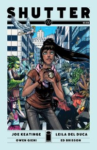
By Devon Sanders
“What happens when wonder is lost?”
That’s the basic question behind the excellent new series from writer Joe Keatinge (Glory) and artist Leila del Duca.
Deep into the 21st Century, for one young lady The Moon is that place your dad dragged you to. The sight of aliens on Earth is just another day and adventure, like her father, is long gone. You see, Kate Kristopher is the last living adventurer in a long line of explorers and since the death of her father, adventure is a thing simply remembered.
Keatinge delivers in Kate Kristopher a hero believing herself at the end of adventure and on the comics’ final page, offers a surprising and dramatic rebuke in the form of ninjas. Ninjas, yo!
Artist del Duca with every lush line draws the reader deep into Kate’s fantastic world. The true beauty of her art is that she creates these wonderful landscapes for Kate and despite being an ace photographer, just can’t quite seem to open her eyes to them anymore. There’s a bit of lovely symmetry in what writer Keatinge is doing to Kate and what del Duca is doing for her and that immediately made me a fan of this comic.
Shutter #1 with its strong characterization, gorgeous art and promise of adventure and legacy simply has me ready for more.
Rating: 


Out of a Possible 5 Stars
Iron Fist: The Living Weapon #1 (Marvel, $3.99) 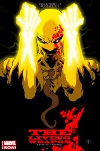
By Jeb D.
There’s not much question that 2006’s Immortal Iron Fist was the most successful character reboot that Marvel had produced in a decade or so; Ed Brubaker, Matt Fraction, and David Aja took one of Marvel’s cheesier 70’s leftovers, born of the pop-cultural martial-arts frenzy that followed in the wake of Enter the Dragon and Kung Fu, and introduced Danny Rand to legacy, history, atmosphere, and a varied and exotic assortment of locales and characters. At its best, the series was classic pulp adventure fiction, and if for nothing else would be remembered fondly for the introduction of Danny’s Iron Fist predecessor (and step-grandfather) Orson Randall, an old-school two-fisted pulp adventurer who’s right up there with The Winter Solider among Marvel’s best new characters of the century.
Eventually, Brubaker, Fraction, and Aja moved on, and when the book ended Danny was merged back into the regular Marvel U. Even if his subsequent adventuring with The Avengers hasn’t been marked with the same levels of detail or imagination for the character, the solid grounding that Immortal Iron Fist had provided allowed Danny Rand to carry more thematic weight than you’d expect from a guy in yellow dance shoes.
Given that, I tend to think that Kaare Andrews has probably taken on the most significant challenge in the latest series of Marvel NOW! rejiggerings: Robinson may be pulling the Fantastic Four to pieces, but that’s sort of the standard approach anytime someone needs to do shake up The World’s Greatest Comic Magazine; and while I like the idea of the new Ghost Rider being a Hispanic muscle-car enthusiast, passing of the mantle is par for the course for Ghost Rider. But to take a character who has stood for the sort of lameness that results from comic-book trend-hopping for most of his career, and reinvent him successfully even once was a challenge—doing it again, so soon, risks either undoing the good work of your predecessors, or simply failing to measure up to them.
Andrews opens on a very different Danny Rand than we’ve seen lately: he’s being interviewed by a young female journalist, though we don’t see her yet. Instead, we meet her through Danny’s bitter inner monolog, initially dismissing her as “…three steps out of a journalism degree, subsidized by Mommy and Daddy, and enabled by a pretty face”; it feels as though more than a bit of Randall’s tough-guy cynicism has rubbed off on his protégé. As the conversation goes on, though, Danny finds himself surprised, and disturbed, by the nature of her questions, setting off a reverie that brings new readers up to speed on the origins of Iron Fist. Andrews sets this flashback sequence in what resembles a faded, mid-20th century comic, and its transition back to the present day suggests that Andrews is planning to unload his full bag of storytelling tricks on this series. Of course, Danny and the reporter wind up in bed together, but even those moments of pleasure don’t dispel the existential angst that Andrews is piling onto the character, and Danny winds up with the perfect excuse to eschew a post-coital cuddle when ninjas come crashing in through the window, and Andrews lets loose.
Immortal Iron Fist was a series defined by plotting and characterization; as brilliant as it was, there’s room for an Iron Fist series to distinguish itself as an action comic, and the first issue of Living Weapon promises to be just that. The ninja battle takes place in a Die Hard style high-rise setting, and is all shattered glass and broken bones, flaming fists and flailing limbs, and furiously propulsive paneling. Andrews also brings classic noir-style gloom to the setup, with Danny and the reporter finally seen from high above their table in the restaurant, then slowly brought into focus, underlining the isolation that’s eating away at Danny; throughout, Andrews employs the full cinematic range of cuts, pushes, and deep focus, with an appropriately noir-ish color palette.
Like a lot of artist-writers, Andrews is stronger on the former than the latter, and his dialogue can be pretty on-the-nose, though in this kind of hard-boiled tale, that’s almost the point. But this is a great start to a new Iron Fist series, one that has the potential to stand beside Immortal Iron Fist, but very much on its own little bootied feet.
Rating: 


Out of a Possible 5 Stars
Bandthology II (King Bone Press, $5.00 (print copy), $0.99 (digital copy))
By Cat Taylor
If there’s anything I love more than comics, it’s music. So, a well-done comic book that effectively involves music can be a wonderful thing. Unfortunately, a lot of attempts to include rock bands and such in comic books are embarrassingly bad. With an anthology collection like Bandthology, that involves a lot of creators telling stories about bands, there are bound to be some really bad ones and hopefully some good ones. In this case the bad heavily outweighs the good, but there are a couple of stories in here that stand out for being interesting. The really bad stories in this collection have two things in common. First, they take advantage of what has apparently become an accepted underground comic art style, the sloppy and hurried sketched panels as finished art. In some cases, this “style” is an obvious excuse for lack of artistic ability, but in others it’s disappointing because the artist shows an understanding of dimension, form, and using comic panels for story structure, but just doesn’t seem to care enough to finish his or her work. In this collection, you can usually identify which stories have an artist who cares and which ones look like they were quickly sketched and published unfinished from the table of contents. If the artist is a different person from the writer, the art most likely looks like crap. I don’t know why that is but that’s the way this collection turned out. Second, most of the really bad stories in this issue involve a band in outer-space. I didn’t know that the intergalactic rock band had become such a dominant sub-genre of comics, but judging from the number of stories about them in this collection, it’s a thing nowadays.
It’s impossible to describe this book as a whole since there are so many stories from many different creators. So, here’s a very brief synopsis of each one from my point of view. Hopefully, this information will help you decide if this book is for you or not.
1. Farewell by Jon Westhoff and Bobgar Ornelas: What seems to be a boring story about a band’s farewell concert has a surprise ending that made this story my favorite in the book.
2. Cover Up by Wendi Freeman and Mat Nixon: Jack and the Jackhammers are on an intergalactic tour but the mysterious opening act that’s been assigned to them keeps playing their entire set list before they even hit the stage. I’m pretty sure this really happened once when George Jones opened for Buck Owens…the part about covering the headliner’s entire set, not the part about the intergalactic tour.
3. Left to Write by Dan Daugherty: A songwriter with writer’s block solves his problem by going for a walk. Seriously, that’s all there is to the story but, unlike most of the other stories in this collection, the artwork in this one looks like it was done by somebody who cares and is actually pretty good.
4. Matter of Life or Death by Andy V.: It’s the future where the world has decided that there are too many bands. In order to solve this problem, audiences now decide if a band lives or dies based on their performance. It’s like American Idol with wishful thinking. Unfortunately the actual story doesn’t extend beyond the concept.
5. Band of Brothers by Aaron Pittman: Another story where the artist appears to care about the visuals and produces something worth looking at, but the story itself is nothing more than a sappy emo love letter to his bandmates about growing up.
6. How Do Songs Work? By Matt Collander: I’m not sure what to think about this one. The writer/artist uses the comic format to explain what goes on in his head as he writes songs and the result is probably more confusing than any of the songs that he’s actually written. His artwork, though, while very cartoonish, incorporates some nicely unique and interesting visuals that go beyond a basic panel-to-panel narrative interpretation of the words on the page.
7. Blood! Blood! Kill! Kill! By Don Cardenas: Although the band in this comic is called Dethmeat, they may as well be Gwar because this is pretty much a Gwar comic story. Once again, we also have an artist who cares and in this case that means a comic that looks like the house-style of Image Comics in the 1990s.
8. Sound & Fury by Lauren Burke, Greg Sorkin, and Antonio Maldonado: This story is an exception to the above rule about the outer space stories in this collection being the worst ones and the rule that the stories with a different artist than writer have bad artwork. In fact, this story may contain the best art in the entire collection. It’s a really cartoony underground style that I could see being used in an Adult Swim cartoon. The premise of this story is very similar to the earlier “A Matter of Life or Death” in this volume, but the losers aren’t automatically killed. Instead they are thrown into a pit with Mexican wrestlers. Also, “Sound & Fury” is actually a fully constructed story with an amusing ending. It’s my second favorite segment of this entire collection.
That’s pretty much what you get in a nutshell. If you want really good rock band comics, I’d recommend the various Kiss comics, Hate!, Last Temptation of Alice Cooper, Novelty Song, or the Bloom County collection called Billy and the Boingers Bootleg before this collection. However, if the descriptions of the content in Bandthology II sound like your thing, it might also interest you to know that while this volume is new to the digital format at comixology.com, a print edition of Bandthology III has already been published. So, you have some catching up to do.
Rating: 


Out of a Possible 5 Stars