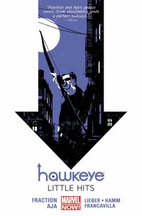
Hawkeye Volume 2: Little Hits (Marvel, $16.99)
by Graig Kent
What can I say other than Hawkeye is astounding, boundary-pushing comics with Matt Fraction and his artistic collaborators (primarily David Aja, but also Francesco Francavilla, Steve Lieber of Jesse Hamm, plus Matt Hollingsworth on colors). Each issue in this collection (numbers 6 throug 11 of the ongoing series) is a bold storytelling exercise.
The sixth issue is evenly split between Clint and Kate as they weather a storm (an uncredited Hurricane Sandy?) hitting the East Coast (providing Fraction ample room to pit Brooklyn against Jersey, playing up the common stereotypes of each in Kate and Clint’s verbal sparring, then undermining them in their actual respective stories). The seventh issue toys with non-linear storytelling set over a six day span. The eight brings back the femme fatale of volume one, once again wreaking havoc on Clint’s life. The story features interjections in the form of romance comic covers by Annie Wu that have a story relevance while sort of acting as chapter breaks or interludes.
The ninth issue separates itself into vignettes — forming a linear whole — that feature the women in Clint’s life: the work wife, the ex-wife, the protege, and the girl… friend(?), all spiraling out from the emergence of the femme fatale in issue 9. Issue ten is a European art film posing as an origin story for the Clown, the hit man hired to destroy Clint’s life. And the final chapter in this volume is the now-infamous “Pizza Dog” issue (covered here by Jeb a few weeks back) that tells its story from a dog’s perspective, interpreting language only sporadically and thinking/interpreting the world in a glyph-based reference.
Each of these issues on its own is a different level of genius which makes for entertaining, challenging and fascinating reading, but as a whole they combine to form a less than satisfying story, one that gets a lot of set up but then spins its wheels without going anywhere before revving up some more. There needed to be some payoff of at least one of the story threads introduced by this incredible team but they seem so overwhelmed with creative freedom (and perhaps too much self-satisfaction with their own cleverness … and it is very clever) that they forget to deliver a rewarding sense of momentum (or even movement) to the story in play. The crafty structures the team devises to engage the reader also serves to distance them from the story as a whole as narrative consistency is sacrificed from one issue to the next.
It is, however, kind of worth it, because there isn’t another book out there like this and it entertains in all sorts of ways, particularly in ways that wouldn’t suit any other medium.
Rating: 


Out of a Possible 5 Stars
 Brother Lono #2 (Vertigo, $2.99)
by D.S. Randlett (@dsrandlett)
Here’s my confession as a Brian Azzarello superfan: I haven’t gotten around to finishing 100 Bullets yet. I have read most of it, but not all, but what I have read is quite the achievement in terms of its authorial voice. It’s rare in comics to find a writer who manages to give each character their own identity, way of speaking, and dialect while at the same time writing a series that has its own authorial voice and identity. That balance alone is the sign of a very, very good writer. Last year, Azzarello, again partnering with Eduardo Risso, released the very good Spaceman, which seemed to throw many of Azzarello’s authorial tricks out the window while the pair experimented in a new genre. The sensibility was still there, and the quality.
I don’t know how Azzarello and Risso resolved Lono in 100 Bullets, so I can’t contextualize this series in those terms, but then I don’t know that Brother Lono is necessarily a sequel. In his first appearances, Lono appears as a nearly demonic force of nature. He not only can fight his way out of any situation, but he also nearly always knows the exact biting cynical comment for any situation. Here, as a man denying his baser urges and helping tend to a Catholic orphanage near a gang infested town in Mexico, he seems like a quite different character. However, there’s always the constant threat of the old Lono seething beneath the surface. As he tells himself, “You can deny yourself, but you can’t help yourself.”
Knowledge of 100 Bullets is entirely unnecessary to enjoy this series. In the first two issues, Azzarello and Risso use their considerable economic storytelling chops to set the table. If you’ve never read 100 Bullets, it’s still clear that Lono has a past, and that he’s dangerous. What matters here is the story at hand. Brother Lono is essentially riffing on Shane at this point, telling the story of a man running away from himself and the kind people who have taken him in. It’s a familiar setup, and already there’s a storm brewing that will cast Lono in the role of the protector. But what will that unleash? On the one hand, we know what to expect. But given the creative team involved, we can also expect to be surprised with some twists on genre convention and thematic meat. As of its second issue, the cards have not all fallen into place yet, but as ever with Azzarello and Risso’s slow beginnings, there’s a feeling of caustic elements coming together, waiting to explode.
I could talk about how the creative team have acquitted themselves here, but you know what I would say. So, I’ll just finish with this. Azzarello and Risso are seasoned creators, and they do what they do well in starting a series that’s one part Spaghetti Western and another part The Postman Always Rings Twice. Brother Lono doesn’t quite signal a coup for the pair, but another entry in the career of a creative pairing with this degree of command over the genres they choose to work in is always welcome.
Rating: 


Out of a Possible 5 Stars
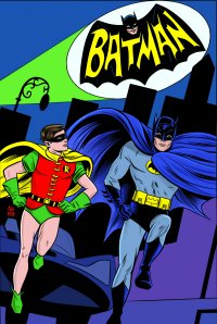
Batman ‘66 #1 (DC, $3.99)
By Adam Prosser
One of the things that bugs me about the endless attempts to reboot and reconfigure the various superhero universes—DC’s in particular—is that it’s a bit Orwellian. After 75 years, multiple generations, and a dozen drastic cultural shifts, there’s much about the shared history of the DCU that’s become dated or awkward or redundant, as well as—let’s face it—a lot that was pretty silly or disposable to begin with. Nevertheless, I’m not sure the healthiest response to this is to rewrite history to serve the needs of the present, particularly when the needs of the present consist of making everything XXXTREME and HARDCORE. Superhero universes have always been a motley assortment of styles and ideas that don’t necessarily fit together, and trying to make them fit in the literal sense can lead to some pretty reductive, unimaginative storytelling. The major casualties of this “let’s start over from scratch” mentality in recent years have been whimsy, charm, fun, and surrealism—the kinds of things that characterized superhero comics for so long.
Of course, when it comes to Batman, this particular tension has been around for a very long time. When the live-action TV series starring Adam West and Burt Ward hit the airwaves in 1966, there was already a gang of comics nerds howling that the show was making a mockery of their chosen medium. Which is actually kind of odd, since the “grim ‘n gritty” Batman as we know him hadn’t really come into being yet (yes, Batman had been fairly Film Noir for the first year or two of his existence, but the ratio of “dark and serious” Batman comics to “goofy kid-friendly” Batman comics was already something like 1:20 by the mid-60s). Nevertheless, the show did ladle on the camp with what might reasonably have seemed like a certain level of contempt for the source material.
Funny thing, camp. People tend to say they flatly love it or hate it, but it comes in so many varieties that this kind of blanket dismissal always rings a bit hollow. I mean, even as comics fans were bemoaning the Batman TV show, they were going nuts for the original Stan Lee/Jack Kirby run of Marvel comics, and just try and tell me those things weren’t campy. The difference, I think, is that something like Batman ’66 uses camp for a (cheap?) laugh, whereas with the Marvel run the camp is bound up with a spirit of inventiveness and originality. After all, if you don’t take yourself too seriously, you’re likely to try things that others might shy away from. In this context, camp becomes secondary to good storytelling—and this is something I appreciated about DC’s new Batman ’66 comic.
In this done-in-one story, the Riddler snatches a series of statues designed by a recently-deceased artist who loved puzzles almost as much as Mr. Nygma does, and who left a trail of clues to a fabled lost masterpiece of his. All the straightforward signifiers are there—the resemblances to Adam West, Burt Ward and Frank Gorshin, Batman’s moral homilies, the 60s fashion, Robin saying “Holy [whatever], Batman!”, and yes, a celebrity who cameos by popping out a window while the Dynamic Duo are clambering up a building.
But this isn’t just an exercise in nostalgia. I can’t claim to be a huge fan of the original show—I watched the movie that spun off from it and laughed my head off, sure, but I’ve never been able to take the show in large doses, because far too often the writers seemed to be using their camp mandate as an excuse to be, well, kind of stupid. Sometimes this led to moments of berserk brilliance like “Some days, you just can’t get rid of a bomb!”, but a lot of the time it felt a bit too much like those later Simpsons episodes where the story would resolve itself with the characters pointing out how stupid it all was and then abandoning the premise. There’s only so much, “Look at how silly this is, WINK WINK” I can take.
However, this comic is, surprisingly, its own thing in many ways. Jonathan Case’s artwork is zippy and pop-art influenced, but it doesn’t rigidly adhere to the look of the show. It’s the kind of thing where there are benday dots, but it’s not trying to look exactly like a classic comic book; the dots become part of the design, fading in and out to emphasize the shapes or boost the colours. Likewise, there’s no snickering attempt to replicate West and Ward’s unimpressive physicality—the opening pages feature a dynamic action sequence that the show could never have pulled off, and yet it feels right in line with what they would have tried to have done. On top of all that, Jeff Parker’s script, for all its nods and hat-tips, is based around a legitimately good Riddler plot—with some superficial tweaking, it would have made for a fine episode of the 90s animated series.
I started this review by talking about comics’ desire to distance itself from its cheesy past, but of course wallowing in nostalgia is a recipe for creative ossification, too. But whereas much of modern DC seems to be providing the worst of both worlds in this regard, Batman ‘66 hits the sweet spot of paying tribute to the past while using it as a springboard for something that feels fresh.
Rating: 


Out of a Possible 5 Stars
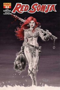
 Red Sonja #1 (Dynamite, $3.99)
By Jeb D.
I’ll admit that I didn’t read the solicitation for this book as carefully as I should have, and I had assumed that Gail Simone taking over the writing duties on the book included an all-female team of artists, as well. Turns out I was wrong, as Nicola Scott, Stephanie Buscema, Fiona Staples, Amanda Conner and the rest are, at this point, just providing alternate covers. The interiors are by veteran Sonja artist Walter Geovani with colorist Adriano Lucas, and while he brings a nice fluidity to the action scenes, the choice of a male artist for the book kind of undercuts some of the enthusiasm that Simone’s name brought to the project.
That’s not to belittle her efforts: Simone’s command of character, and ability to personify through dialog, remains as strong as ever, but up to this point, Dynamite’s slate of male writers for the character (including Mike Carey, Michael Avon Oeming, and Christos Gage) has already done a fair job of making the red-haired Conan knockoff into a decent sword and sorcery book: even if Simone proves the best of the lot, it won’t be that much better.
But it would have been nice to have a female artist take a long, hard look at the character’s iconic bikini outfit and rethink the possibilities. One of the keys to the success of Kelly Sue DeConnick’s Captain Marvel series has been the uniform redesign that got Carol Danvers out of the stripper costume, and back into the sort of conventional fetish outfit we accept from her male counterparts. Not that it takes a woman to do that—Carol’s redesign came courtesy of artist Dexter Soy—but, then, the fan-service costume was actually a fairly recent development for Ms Marvel compared to the more conventional superhero duds with which she debuted. By contrast, Sonja’s portrayal has always carried more than a whiff of sexploitation, and the half (no, more like three-quarters) naked swordswoman makes a ludicrously prurient picture in her barbaric setting, and I’d love to have seen what kind of “empowerment” might have come from a ground-up (or maybe I mean top-down) reevaluation.
Which is not to dismiss the book out of hand. The setup is a good one: a figure from Sonja’s past, to whom she owes her life, or at least her freedom, comes to her for help in an hour of dire need, and the redheaded swordmaiden will be forced to contend with insuperable odds to return the favor. Simone’s Sonja has the rough haughtiness of a proven warrior, balanced with the flame of indignation when she sees the weak exploited. She’s about as convincingly badass and capable as a character can be in her underwear, and Geovani has a nice feel for his setting. It’s an intelligent, well-crafted first issue of yet another in the interminable iterations of the Hyborian Age, for those not yet burned out on that. I guess I had sort of built my hopes up for something more revolutionary, which is certainly not Simone and Geovani’s problem.
Rating: 


Out of a Possible 5 Stars
Arsenic Lullaby: The Big Stall (AL Publishing, $11.99)
by Graig Kent
It is strange, yet all-too-real that the long-ish running, award-nominated humor series Arsenic Lullaby had trouble at the distributor level getting orders (or an acceptable level of orders) to make it a worthwhile venture for its creator. Given the cuts that distribution and retail take on the end product, it’s hard for indie creators, particularly the long-serving ones like Douglas Paszkiewicz, to see the reward in working within (or continuing to work in, once established) the confines of the traditional system. The remarkable thing about where we are with social media and interconnectedness today is a creator can take their project to the people and get the funding directly from them to make the venture worthwhile. Arsenic Lullaby went to Kickstarter and made over $16,000 in a month, not only supporting the creator directly, but also getting the book published and available to the public.
This one’s a beaut, in full color (for the first time) even. As with any Arsenic Lullaby book there’s the expected “bad taste” jokes (involving the holocaust and the blind and veterans and the like) which skate by handily as comedy in not making them the target of the jokes (of course the easily offended/overly sensitive/humourless should still stay away). Paszkiewicz has long ago mastered the shock comedy art and while they may be the more memorable aspects of his work it’s always his longer-form, character-driven work that I appreciate even more. Here he cycles through multiple stories each of Baron Von Donut, Cthulu, and the stage magician the Great Duranti. In the case of Baron Von Donut it’s all tangential, disconnected, while the Great Duranti stories connect in a nonlinear fashion revealing ever more curious tidbits about the character and his journey. Meanwhile the recurring Cthulu bits play out as one longer narrative, brilliantly building in compartmentalized chunks of comedy. The rest of the book is rounded out by a number of pop culture-tinged skits (including a trio of Wizard of Oz themed ones), which I don’t recall seeing so prevalently in AL in the past (but I could just be remembering the character-centric and shock sketches the most).
Paszkiewicz’s art is at its most confident here, just an unprecedented level of consistency and craft (some of which he conveys in a lesson on “leading the eye” in the backmatter…a fascinating read for illustrators and comic art fans, particularly of economical or comedic storytelling). Paszkiewicz’s art in the past felt a little rough around the edges, a little unsure, but he’s grown with each subsequent effort into a distinct storyteller with a very unique style that now feels fully polished. It’s not just the first appearance of color within the pages of Arsenic Lullaby either, every line feels assured. The color is as fantastic as it is surprising. A subtle and soft, almost chalk-like palette eases the entry of some of the comedic blows, like a sharpened knife versus the jagged blade of black and white.
Arsenic Lullaby has for years ranked with he best of the best humour comics and The Big Stall shows no sign of decline. To the Kickstarter supporters, thanks for making this latest gem from Paszkiewicz a reality.
Rating: 


Out of a Possible 5 Stars
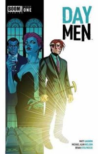
 Day Men #1 (BOOM!, $3.99)
By Jeb D.
Arbuably the only thing more played out in pop culture these days than vampires is the idea that the next bright idea for using them is a brand-new stroke of genius. Day Men blends world-building reminiscent of films like Daybreakers with the venerable tradition of ruling vamps using humans to handle the daytime tasks they can’t manage for themselves, a trope that goes back at least as far as Dracula’s use of Harker and Renfield. The storyline sets up elements borrowed more from crime movies than conventional horror flicks, though at this point its principal novelty is the use of vampires in place of wiseguys or yakuza. And while there’s a sense that writers Matt Gagnon and Michael Alan Nelson have a multi-layered epic in mind, there’s too much tell, and not enough show, in this comic-largely, I assume, to get important exposition out of the way in the first issue, so that they don’t lose readers as they build to the main story, but it drags when the things aren’t popping.
When they do pop, though, Day Men benefits greatly from Brian Stelfreeze’s first regular interior work in several years, and it’s up to his usual high standard. He’s definitely in action-movie mode here, and most of the moodiness or unease the reader might expect from a vampire titles comes courtesy of colorist Darrin Moore. Stelfreeze delivers great punchup, but since that’s already more or less inherent in the script, it would have been nice for him to toss in some of the creeps that a good vampire tale can provide, as well. But even relatively conventional Stelfreeze is more than welcome, and every page will reveal a new detail or visual fillip to catch the eye.
A must for Stelfreeze enthusiasts, a mild recommendation for anyone else.
Rating: 


Out of a Possible 5 Stars