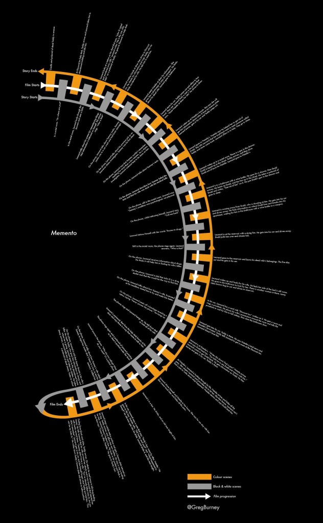
Smarter writers than I have labeled the screenplay of Memento the “best of the decade” in the 2000s, and the film has become an enduring cult classic. The thunderous studio (though small) debut of Christopher Nolan, it set the tone for his puzzlebox filmmaking with an absurdly simple, “Why didn’t I think of that!” premise of a film noir told backwards and forwards simultaneously. The inversely parallel storytelling is accentuated by a switch from black-and-white to color photography, as both ends of the story collide to a central moment.
It’s no surprise then that when a graphic designer makes a project out of breaking the film down and laying it out as an infographic, the results so starkly reveal the architectural simplicity of the film’s structure, and that it makes something aesthetically pleasing in and of itself. Take a look…
While it wouldn’t be till Inception that Nolan would produce another film demanding such a detailed breakdown to get a grip on it, it was this film that provided Nolan the tools to go forward and shake up the superhero film and become, perhaps, the most well-known filmmaker of the new millenium. The director has set his sights on a space epic now, so it’s important to remember the foundations of the man’s work, even as the scale increases.
Source | Film-Book
