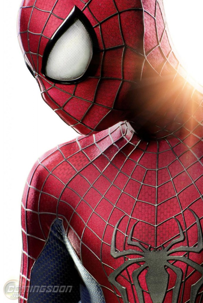
My cooler of haterade for Marc Webb’s The Amazing Spider-Man runs deep, but I’ll admit as quickly as anyone that this newly redesigned suit is a big step in a good direction. Ultimately the suit’s design tells us nothing about the film, but the sensibility that results in the selection of this design is admirable. With interesting villain casting out of the way, all that’s left is to have written a script that isn’t the stupidest blockbuster screenplay of the year. Maybe with that accomplishment already scratched off everyone’s bucket list they went a different route this time.
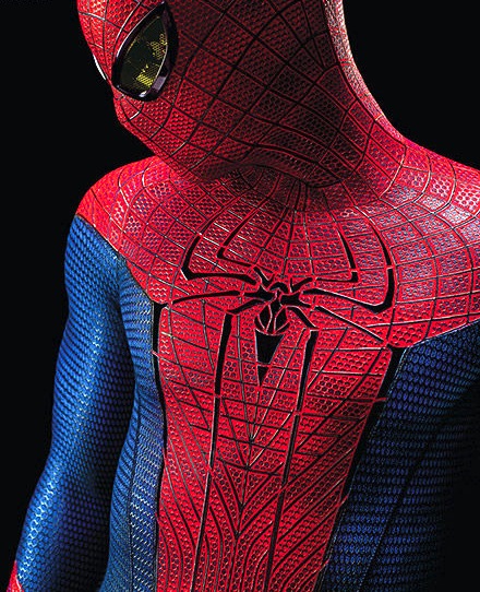
As for the suit, it’s got much bigger eyes, as promised. I like their look- they add some humanity to the suit without going full retard Macfarlane and overtaking the face. I like that the texture of the suit remains, but is printed rather than embossed and seems to fades out at some angles. I wonder if that’s photo-processing or an actual thing it does. Finally I like the basic, bold chest insignia. It all compares well to the old suit (not to be confused with the OLD old suit, which it is essentially a return to…), which already looks dated as hell y’all:
What do you guys think?
Source | ComingSoon (via Movies.com)

