Happy #1 & 2 (Image, $2.99)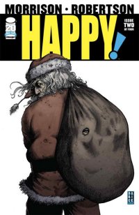
by Graig Kent
I approach every Grant Morrison project with a sense of anticipation, mostly because I have no preconceived notions of what the Scotsman is going to deliver. Morrison, is a thinker, which doesn’t necessarily mean his output always results in something cerebral, but he’s continuously putting a lot of consideration into the genre, character archetypes, subject matter and/or storytelling he’s playing with. There’s nothing workmanlike about what he does. Whether it’s always successful is a whole other matter and subject to one’s preferences, tastes, opinions and interpretations (thesaurus!). however in most Morrison endeavors, especially his creator-owned ones, I think the end result, including his choice of collaborator, is calculated and exact to result in the product he wants to put out there.
So it was with some disappointment that I came out of Happy #1, finding it to be a fairly off-the-shelf take on mob enforcers, with the requisite sex, cursing, blood spray, corruption and betrayal. In the set-up Nick Sax takes out a trio of hired guns, only to have the job go sour, taking a bullet himself. The question is, did Sax learn his victims passcode for their cash stash or not? He winds up in a mob hospital, moments away from a whole new world hurt as “specialists” are called in to extract exactly what Sax knows, when before him appears a tiny flying blue unicorn. I did say it was “fairly” off-the-shelf. It’s a bizarre twist at the tail end of a rote story that, upon first and even second reading still didn’t sit well. Of course, I should expect that the purpose of Morrison’s stock dark and trashy set-up is to juxtapose against the arrival of a vibrant, cartoonish, puerile little blue horse with wings.
Partner-in-crime Darick Robertson, having worked heavily in the worlds of Garth Ennis and Warren Ellis the past dozen years, is well-versed in the darkness that Morrison wants, and nails it by adhering to a real-world physicality, and richly detailed, heavily shadowed, lined and crosshatched environments. Most of all, Robertson has a gift with fabric, given appropriate weight and movement to clothing, which goes tremendously far in building a comic book environment that strives to approximate reality. When the tiny blue unicorn arrives, it pops out like something back from Robertson’s Space Beaver days, expressive and floppy in a cartoon manner. Robertson provides a bit of shading to the character, so it’s not quite a Roger Rabbit/Bob Hoskins contrast but it’s in the physicality that it’s most differentiated.
The starkness in contrast between Sax and this manically animated character continues into the second issue of Happy, making it a difficult buy-in to start. As the hitman escapes his hospital danger and finds a safehouse, though not solitude. The horse is adamant on getting Sax to help him save “Hailey”, whom, by the end we’re still not clear on whether Sax knows her or not. The horse is Haley’s imaginary friend, and apparently Sax is the only person who can see him. He’s otherwise intangible, but able to see things that Sax cannot, like what’s happening around a corner, such as to make it clear he’s not a product of Sax’s mind.
The corner Morrison turns with book comes with the horse proving his existence by helping Sax cheat in a poker game in exchange for Sax’s help in rescuing Hailey. It’s a fitting cliche, as scene Morrison uses to maximum comedic and character effect, especially given everything Sax does in the aftermath. It seems the horse has chosen a champion that refuses to accept his role and has no honor to speak of. He’s a true bastard of a character, one that hopefully won’t be toned down in Morrison and RZA’s recently announced adaptation to screen.
The final page reveals a dank and dirty Santa Claus deep in his lair, assembling vulgar Christmas cards before a room full of whimpering children bound with wrapping paper and ribbon. What’s worse than a heartless, murdering liar… a child abuser, naturally, someone to make the killer look saintly in comparison. Of course, if you look at the timing, this is a four issue mini-series that’s going to conclude around Christmas, so Morrison is taking a bit of a piss here, providing a sick crime genre version of a festive story (for the same people who consider Die Hard a Christmas movie). Is the title, “Happy”, the horse, or short for “Happy Holidays”? Would “Merry” have been too on-the-nose as an alternative?
I’m honestly not sure what to think about Happy at this stage. It has indeed become more interesting and I anticipate more deviation and playing with the genre in the two issues that remain. I can’t say I necessarily like it, but as with so much of Morrison’s work seeing it as a whole makes all the difference in appreciating and/or enjoying it.
Rating: 


Out of a Possible 5 Stars
 Avenging Spider-Man Annual #1 (Marvel, $4.99)
By Jeb D.
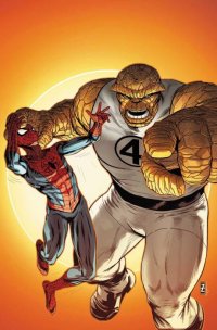
Back in the pre-Marvel movie-verse days… back before Heroes Reborn-or-Rejiggered-or-whatever… back before Wein/Cockrum/Claremont/Byrne… if you grew up Marvel, you had two favorites: Spider-Man and The Thing, two wisecracking tough guys, whose fists and banter were deployed to keep an underlying vulnerability at bay. And while the Fantastic Four ‘s adventures were defined by Jack Kirby’s extravagantly high-flying visuals, there was always a special satisfaction in Ben’s street-level encounters with home-grown nemesis the Yancy Street Gang (if there is one thing I would want forever retconned out of existence, it would be Mark Waid’s “revelation” that their pranks on Ben were actually Johnny Storm’s doing). And, of course, the streets of New York were just right for a webslinger’s playground. In a time of awkward team-ups and face-offs, this fun, one-off adventure of two characters that defined the Marvel Age is a welcome breath of fresh air.
I hold no particular brief regarding Marvel’s decision to shoehorn Spidey into both the Avengers (the basis of this book’s title, which I swear I only just realized) and the FF, and Ben into the Avengers, but it’s kind of amusing to have editor Tom Brennan address that logistical absurdity in the introduction. From there, we meet a couple of Brooklyn jamokes, Frankie and Spages, a pair of brothers, each of whom believes he’s got to be looking out for the other. In Central Park, they unearth some alien tech, and once it begins to affect the people around them, Frankie sees an opportunity for a big score by hooking up with some unsavory characters.
Naturally, they run afoul of our heroes: Spidey trying to get across town while his webshooters are cruising on fumes, Ben on an outing with Val and Franklin Richards. Writer Rob Williams has crafted the setup so that the inevitable “superheroes meet and fight” trope gets an entertaining workout, Val and Franklin have some cute moments, Spidey’s jokes are a great foil for Ben’s short tempered outbursts, and the entire story plays out very much at street level (not a supervillain in sight). The resolution has the “feel-good” quality we associate with the days when Annuals were a lighthearted break from the “troubles” that typically beset the Marvel hero.
Artist Brad Walker’s work (with inks from John Livesay) is polished, his action scenes kinetic, and he contrasts his principals nicely: his Spidey has a Romita Sr-style roundness, while Ben’s blockiness is sharp and angular, his face wonderfully expressive.
Not a book to change your life, and not a story that really justifies the 27-page count on any basis save squeezing out an extra buck. But for anyone who’s got a soft spot for the heroes involved, you could absolutely do worse.
Rating: 


Out of a Possible 5 Stars
Masters of the Universe: The Origin Of Skeletor (DC Entertainment, $2.99)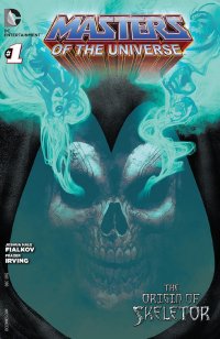
by Graig Kent
I don’t know how other occasional fans and die-hard fanatics of Masters of the Universe (“MOTU”) feel about it, but this is one story I know I certainly didn’t need. I was an original MOTU fan, an early adopter of the toys, a devotee to the comics (both from DC and Marvel’s Star imprint) in the 80s, and of course a daily viewer of the cartoon … lesser so the movie, but it has grown on me. Never once, however, did I wonder what Skeletor’s back-story was. It wasn’t terribly relevant to playing with the toys, or enjoying the rather frivolous adventure stories (/forced morality plays) that were be created back then.
I had a cathartic break from He-Man in my teenage years (literally destroying much of my childhood with a hammer), and have only randomly dabbled in MOTU since then, including the troubled current DC Comics mini-series, from which this origin story seems to be spinning off of. I can’t tell you when Skeletor became Prince Adam’s uncle, whether this was developed in a previous comic or animated series, or if it was a development devised by James Robinson before he departed the mini-series, or something the comic book and/or toy executives came up with, but it seemed a jarring, peculiar addition to the MOTU universe to me, one I was not at all certain was a good fit.
Let’s face it, the current mini-series is not very good. We’re three issues deep and there’s very little about it that feels at all like the MOTU that I grew up with. That’s all fine, as I’m one who is fully capable of embracing change, but it seems that they’ve thrown so much of what made He-Man and his vast menagerie of accomplices and opponents entertaining out the window and haven’t replaced it with anything of equal value. What I loved most about MOTU was the seemingly endless parade of creatures and beings manipulating a hybrid of technology and magic in an endless battle for the fate of Eternia. It didn’t matter so much who these characters were, it was more about the display, the showiness. In the cartoons, often lessons would apply to the matter at hand, but largely it was a classic battle good versus evil (and, more relevant to adult life, triumph over incompetence).
The trend of late is obviously to grow-up our childhood play-things. Christopher Nolan’s Batman got it right. Toy Story 3 got it right. IDW’s Cobra series gets it really right. Even Michael Bay’s Transformers series falls more on the “right” side than wrong. But I’ve yet to see Masters of the Universe get it right, and I wasn’t certain it should really even mature. Until now.
For all the reasons above, I turned my nose up at this book the moment I read about this book whilst perusing the October solicitations for DC a few months back. I continued to just plain ignore it until I caught wind of the talent involved. Joshua Hale Fialkov on script. Frazer Irving on art. I was more than sold. I was excited. I was so excited I rounded the bend and went straight to expecting disappointment.
But this did not disappoint. Fialkov has been killing it for 14 months on the surprisingly amazing I, Vampire, so much so that he’s situating himself to break out in a big way (which, as is typical, likely won’t happen until he moves to Marvel). Irving, meanwhile, has long been one of my favourite artists, from the still to be completed Gutsville to his many collaborations with Grant Morrison to, well, everything he does. He’s an absolutely unique talent with both a visual and storytelling style all his own. Together they have produced an origin story for Skeletor which, actually, is pretty great. In a 20-page self-contained book, Fialkov has managed to produce a sweeping mini-epic tale of family love and betrayal, of identity and belonging, and of humanizing Skeletor in a way that I never thought possible. That they won’t just cancel the current mini-series and hand the title over to Fialkov to work his techno-magic on the entire property is quite a shame. If this is any indication it would be a grandiose hybrid of Game of Thrones-like intrigue with a vibrant toy cartoon action.
Frazer Irving… what can I say. Open that front cover to the first page, witness the skin melting off Prince Keldor, the Half-Breed’s face and tell me this isn’t the best MOTU has looked, matching, perhaps surpassing even those glorious painted covers from Earl Norem on the 80’s He-Man Magazine. The way Irving transitions the story into duochromatic flashbacks is poetry, while the emoting of the characters in this book surpass anything seen in cartoon or live action. Visually Irving has both grounded MOTU in a fantastic-but-tangible reality, and lofted it visually in a manner I’m not certain the franchise even deserves. That Irving is also able to hold onto the aesthetic of the toys and 80’s cartoon to a very high degree, and make it work in the reality he’s visualized, means the art still tweaks the nostalgia buttons in all the right ways.
As excited as I am by this, it’s all a great big tease for no true payoff. Fialkov and Irving are not working on any ongoing series. Whether current mini-series writer Keith Giffen carries forward the threads Irving establishes with any dramatic interest, I’m doubtful. At the very least we have Fialkov, with Ben Oliver, providing the Origin of He-Man in January to look forward to and then be depressed about afterwards.
Rating: 


Out of a Possible 5 Stars
 A + X #1 (Marvel, $3.99)
By Jeb D.
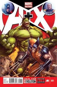
The recent Avengers vs X-Men: VS miniseries was a loopy sort of concept: each issue depicted more detail of a pair of fights that were taking place during the Avengers vs X-Men crossover. But for all its essential silliness, it worked, at least to a degree, because each encounter was allowed to exist without beginning or end; all the stories were, essentially, “middles,” with the heavy expositional lifting taking place in the main series, leaving more room for breathing (and fighting). The difference between the VS series, and this + one, is more than just a matter of mathematical symbols: instead of pitting Avenger against X-Man, each issue will feature a pair of half-issue stories where one member of each group teams up with one from the other (yes, I do realize that various mutants are or have been members of both teams; I didn’t create the damn comic). And because each of these short pieces exists without the context of a crossover event happening around it, exposition has to be crammed in someplace. Typically, this is done in vintage Stan Lee/Roy Thomas fashion, with everyone in the story spouting out details, exchanging ideas, and calling each other by name, as they slug it out with the bad guys.
Thus, the first story, with Dan Slott and Ron Garney (plus THREE inkers for ten pages) giving us a WWII-era meeting of Captain America, Bucky, and a time-hopping Cable taking on Nazi robots, feels as though it’s over before it’s begun, since no one can stop talking long enough for the reader’s eye to settle in and follow the action; Slott also tosses in some cutesy time-travel Easter eggs that are handled so cheesily (Bucky sees the mechanical arm of one robot, and exclaims “Imagine what I could do with one of those babies!”) that I’d have sworn the thing was written by Jeph Loeb.
Who actually does write the second story here, with art from Dale Keown (and Danny Miki, solo this time, on inks): yet another time-travel job, with Hulk and Wolverine versus future/old Hulk and Wolverine (sort of a mashup of Days of Future Past with Old Man Logan). They meet, they fight, the “good guys” win (assuming we’re cheering for the contemporary versions of the characters) by using the oldest trick in the super-powered playbook. Oddly, given the writers involved (and the fact that this part is actually only nine pages long), Loeb’s story works slightly better than Slott’s, but that’s largely because it’s not hemmed in by being self-contained; it’s evidently the opening chapter to a story that will continue Loeb’s obsession with Hulks of all hue and variety.
I have nothing against team-up books per se, and comics that are allowed to stand apart from the rigors of monthly continuity have their special charms. But they rarely manage much in the way of depth or resonance in so few pages, and a comic that I’ve pretty much forgotten the minute it’s over isn’t one I’ll be forking out for in future.
Rating: 


Out of a Possible 5 Stars
Debris #4 (of 4)(Image. $3.50)
by Graig Kent
Previous in Thor’s Comic Column, our own D.S. Randlett offered an excellent and insightful view into the world of post-feminist, post-Buffy heroines, holding up the first issue of Debris as example. He notes the flaw of the book, and the “kick-ass female hero” sub-genre as a whole (see also Underworld, Resident Evil, Salt etc.) is that the characters come off as flat (though not as often flat-chested) and could be exchanged with a male counterpart without issue (Salt, for example, was actually first written with a male lead).
Over the four issues of Debris, our hero, Maya, never does take on much in the ways of defining characteristics, beyond a samurai-like nobility and commitment to her quest. That’s all well and good, as that is a sort of requirement of her role, but again, it doesn’t necessitate her being a woman. However, where it does turn the page — and I would like to think D.S. agrees with me — is in this final issue which, subtly mind you, justifies why Maya, as Protector of Maiden, “the last civilization on Earth” is female, and why the protectors have always been female.
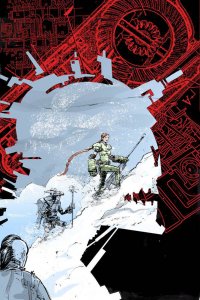
The set-up for the first issue, the destruction of Maiden’s water supply, led into the journey in second and third issue, traversing the wasteland in search of Athabasca, the lost civilization with an abundance of water. Along the way she encounters and befriends the outcast Kessel, who accompanies her on her dangerous journey, out of sheer loneliness more than anything else. Kessel’s character, his motivations, are much richer than Maya’s, so he does add some color to the proceedings. He even manages to draw a bit more life out of Maya in repartee. There’s a brilliantly executed sequence in issue three where she reacts to discovering snow, grass and soil with a childlike wonder and innocence that briefly highlights her youth otherwise hidden under the layers of responsibility. They encounter in their journey a few of the impressive techno-garbage creatures gorgeously rendered by Riley Rossmo, and find the end of the wasteland, which ultimately leads them to their destination.
We learn in this final issue that the settlers of Maiden were originally women cast out of Athabasca hundreds of years prior by a patriarchy that refused to see equality as an option. It’s a complete extrapolation, but given that small tidbit of information it does make perfect sense why the Protectors of Maiden are female (because they always were), why they have the demeanor they do (one that befits the responsibility they have, given the mentor-protege system) and how their gender plays a role in the grander scheme of the story as written by Kurtis J. Wiebe. It’s not until this issue that we understand the scope of the world Wiebe has constructed, and how far-off the civilization introduced in the first issue is from our own.
I found myself becoming futher and further invested in the mythology of Debris as the issues carried on, from the history between Kessel and Maya’s mentor, to the truth behind the Colossals, to the traditions of the Protectors. It built slowly in as sense, but came together quickly in the final act to form a rich tapestry of ideas. In the final issue the reservations that I shared with D.S. (mostly because he planted them in my brain with his wonderfully insightful review) melted away and this series did become that something more that I had wanted. So it was a downright shame that it ended like it did.
There’s poignancy in its finale, and it wraps up the story and the entire world of Debris with a definitiveness that, in this era of sequels and prequels, franchises and idol-building, actually seems fresh. But it’s just so… final, in some respects so abrupt. I could have used one more issue. It’s like a tremendous movie that’s so involving that it seems too short, too complete for… well, not it’s own good, but for your own satisfaction. With such a movie you anticipate the deleted scenes on DVD, with comics, unless they add a few more pages in the collected edition, what you got is all there is.
I credit Weibe with developing a scenario, a setting and a mythos, if not fully the central character, that’s worth investing in, and as much credit goes to Rossmo (and colorist Owen Gieni) for his distinctive art. Rossmo’s soft edges along with Gieni’s equally soft palette give the book a very unique feel, like something torn from the pages of Heavy Metal, but scaled back to appeal to an all-ages audience. Perhaps it’s just that my 3-year-old daughter has been binging on Samurai Jack for the past two weeks, but Weibe’s structure captures much of that cinematic-samurai storytelling feel, and in Rossmo’s artistic execution, much of the kinentic energy that that legendary cartoon had, not to forget Rossmo’s wonderfully crafted wardrobes, environments and, of course, those Colossals.
I’m in want of more, but I’m also wonderfully pleased with what I got.
Rating: 


Out of a Possible 5 Stars
 MIND MGMT #6 (Dark Horse, $3.99)
by Graig Kent
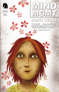
Creator Matt Kindt has made MIND MGMT for the comics aficionado. He’s stated time and again that the effort he puts into the series all stems from his desire to put a monthly comic on the stands that takes full advantage of the format, something that can’t be replicated in trade paperback format. That full effort involves writing, illustrating, coloring, lettering, designing the fake ads on the back page, and pretty much everything but answering the letters column (but even then, given the nature of the book at hand, can we be sure that “Brendan AKA The Editor” is also not Kindt?).
The title, for the past six months, has been a cover-to-cover affair. Quite literally no space is wasted in MIND MGMT. The front cover serves a purpose, the first six issues sharing a close-up head-shot uniformity, bringing you up-close and personal with the major players of the book, as well as providing subliminal hints of the danger and nefariousness contained within the central story. The inside front and back covers combine for a single mini story that enriches the history and influence of the agency. The ongoing main feature takes up the first 22 (of 24) pages, with its blue page gutters still on display and “secret” MIND MGMT Field Guide text on (virtually) every page. The final two pages house yet another short story, or rather, more like case files, introducing new characters and providing brief excerpts of their lives or extrapolations upon their capabilities. The inside back cover is split with the continuation of the front cover story and a letter column (every comic should have a letter column… message boards just can’t replicate the fan engagement the same way). Finally there’s the aforementioned mock ad on the back cover. These are precisely designed by Kindt to look generic enough to pass for real ads, but just off enough to draw your attention to read them, where it serves more as a recruitment ad for the MIND MGMT agency than an ad for bubble gum or sports drink.
But as subliminal as that back ad seems, the sixth issue encourages you to put together all six back covers to reveal a four digit code to enter at Kindt’s website and retrieve bonus features. This is a man who just likes to give and give and give to his reading audience. The sheer level of effort and commitment is astounding. That, however, is just the packaging, which would be all for naught if the material itself was dodgy. Mercifully, not only is MIND MGMT addictive reading, but it’s an absolute trip, a completely unique experience.
It’s an odd comparison, but I see MIND MGMT as a metaphysical espionage version of the immortal, beloved comedy Arrested Development. Like Arrested Development, the comic is one that reveals its intricacies upon repeated reading. Elements which you may have missed the first time around highlight themselves, and items that may have seemed insignificant at first suddenly take on a whole new importance.
Genius may be too bold a word, but rewarding definitely isn’t. This isn’t a series that wants you to bag it up and tuck it away. It wants you to keep coming back, keep rereading those first issues and beyond.
One of the bonus features from Kindt’s website is a lengthy Issue One Page-by-Page Commentary. Throughout this, Kindt notes some of those things that are relevant which you most likely missed the first time around, but also he teases the importance of other things that haven’t even become relevant yet by issue six. The first six issues do form a complete story, one that circles in on itself, but hearing Kindt talk about it, it doesn’t quite circle, but spiral outwards. Maybe the better way is to consider it a spider web, where it both spirals and explodes from the center. Everything connects, but the connections aren’t always apparent until you look at it just right. It’s storytelling craftsmanship at its finest. I’m not certain how big the web will get, but Kindt has an endgame, and a map. Through the “special features” on the website, one gets a full sense of how the wizard creates his magic, and it’s reassuring to take a peek behind that curtain. Kindt is taskmaster enough to have the story densely conceived already (he wrote the first six issue arc before illustrating issue one) but also leaving enough room for the characters to breathe and dictate their own evolution within the framework.
It’s an interesting project to be sure, but as I start back in on a second read through, I’m just starting to grasp how enthralling and exciting it is.
Rating: 


Out of a Possible 5 Stars
The Shaolin Cowboy Adventure Magazine #1 (Dark Horse, 1599 cents)
by Graig Kent
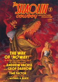
It’s been a long time since we last saw the Shaolin Cowboy. I just went down to the archives to dug my Burlyman issues out of storage. Looking inside the front cover of issue #7 I found it had a publication date of May 2007 (issue 6 before that came June 2006). It’s fully possible I may have missed something in the intervening years, but I truly hadn’t realized how long it had been since I last saw Geoff Darrow’s bizarro tribute to post-apocalyptic, western, kung-fu and samurai films.
Having only published seven issues over a four year span in the mid-aughts, I hadn’t missed Shaolin Cowboy. The character — the stoic, silent, wandering figure that he is, with his (apologies for the comparison in advance) Shrek-like verbose talking donkey sidekick/transportation — didn’t resonate so much with me as a reader, certainly not as much as Darrow’s exquisitely detailed illustrations and phenomenal use of page and panel structures. That said, looking over these just-dusted-off back-issues, my eyes bulge with interest and my pupils dilate with excitement. There was never much going on in the story department, but artistically Shaolin Cowboy was rich, unsullied gold.
In that regard, it’s seems odd to return the character back to the masses by way of prose-on-pulp. Since the book primarily worked as a showcase for Darrow’s art and action choreography, it’s not exactly the best fit to produce an adventure novelette around him. True, Darrow supplies plenty of eye-popping, detail-rich black-and-white illustrations throughout, but leaving the bulk of the heavy lifting up to the reader’s imaginations is almost a crime when it could be substituted with Darrow’s artwork instead.
Darrow has recruited crime novelist Andrew Vachss to provide the purple prose, and it’s… well, it’s not terrible, but it’s far from great either. Vachss does adopt a suitably pulpy, ham-fisted style of writing for the story, and he strives to capture the humour and bizarreness of the mutant-filled desert wasteland that the Cowboy inhabits, with mixed results throughout. I caught myself chucking on occasion, but I literally rolled my eyes even more.
The adventure finds the Cowboy on his way to “T.A. Town”, a mob-owned shit hole run by a 700 pound named T.A. (for “Totally Awesome” or “Toxic Amoeba”, depending on who you ask). T.A., aware that the Cowboy was hired by a small-time gang with big aspirations to kill him and his posse, has himself hired the Cowboy in order to lure him into a trap, and has assembled himself a massive menagerie of killers to back him up.
The set-up is ripe for a gloriously gruesome bloodbath, but the payoff is continually teased out as the Cowboy and the Mule make their way through the desert, getting sidetracked by an encounter with a biker gang, and then waaay-sidetracked with escorting an abused pre-teen girl they discover to a sanctuary. Some interesting stuff happens along the way, including an encounter with a mammoth snake that puts that one that ate Jon Voight to shame, but the fact that the sanctuary side-track eats up nearly half the story it seems like it should have been told as a completely separate tale altogether. In a pulp adventure magazine, multiple stories would seem apt (there is a Cowboy-free back-up feature, written by Michael A. Black, with illustrations by Gary Gianni).
That whole side-track also slides in, by name, the Protect agency, a non-profit child protection and rights organization which Darrow is heavily invested in. I think it’s a great cause and certainly worthy of promotion (such as it is in the back pages of the book), but to sandwich it into a story set in a hyperviolent, distopian future starring a disgraced Shaolin monk and a horny mule seems at best ill-fitting, at worst diminishing, pandering, disrespectful and a little cheesy.
Darrow both wrote and drew the Burlyman series, so naturally his work is the authoritative voice with the characters. Vachss captures the spirit of the Cowboy but not the verbal diarrhea of the mule, which is the most noticeable aspect of the transition to prose even after all these years.
In addition two the two short stories, Darrow also provides a series of “The Shaolin Cowboy’s Helpful Tips”, a series of “how-to” illustrations advising on general use of household implements, all with the punchline of using them to kill mutants. There are also randomly placed ads (all for Shaolin Cowboy Comics) and even a “Shaolin Cowboy Funnies” comic strip provided by Darrow’s daughter, Alice.
This all leads to the back cover, promising new Shaolin Cowboy comics from Dark Horse… “Coming Soon”. This “Adventure Magazine” is but an appetite whetter.
Rating: 


Out of a Possible 5 Stars