Victories #1 ($3.99, Dark Horse)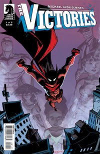
by D.S. Randlett (@dsrandlett)
I feel like I end up confessing to not having read a lot of comic books from the past decade that are considered “great” in this column. Time to add another one to the pile: Powers. So, I am something of a Michael Avon Oeming virgin, and I do not do I know what influence collaborators like Bendis have on his style. Still, Oeming’s reputation precedes him, and I was excited to have my first exposure to an artist who had heretofore been a blind spot for me.
Victories follows the story of a pretty loose Batman analog called Faustus, but it looks like as the story progresses we’ll start to see other characters who belong to the titular superhero team. Whether or not the title will diverge from Faustus’ perspective remains to be seen, but given the hero’s prominence in the basic iconography and aesthetic of the title, that is probably unlikely. It’s easy to see Victories as a Watchmen knockoff, and the first page, which shows a rat in a bloody gutter accompanied by some rather ominous narration, definitely calls Watchmen to mind. But that’s about where the similarities end.
For one, this is definitely an artist’s book. There was something very measured and writerly about Watchmen, and it took great pains to distance the reader from the iconography of superheroes. No one in that book ever really looks cool, which contributes to its distancing effect and goal of deconstruction. Oeming takes a very different tact with Victories. He revels in Faustus’ iconography, and his considerable grasp of the immediate, grisly, and visceral style that he adopts invites the reader into it. As such, it would seem that Oeming is not seeking to deconstruct the Batman-slash-street vigilante archetype, but rather to use it in plena voce to explore his themes and style. He eschews realism for something rather heightened and dreamlike.
Part of the genius of this comic book is that the themes are hard to articulate because they are so deeply rooted in Oeming’s visual style that they hardly register on the rational level so as to be nearly unspeakable. Oeming is getting across the pain of mental illness and depression here, and he registers that through a style that cuts pretty deep, speaking to the unconscious rather than the rational. This may disappoint some readers, as the plot itself is nothing too inventive on offer as of yet, but he manages to treat his themes where they live in an aesthetically compelling way.
Victories is also a pure thrill. The action is bloody and tense, and at once murky and extremely clear. Oeming’s pages evoke intense motion in the action scenes, thrilling not only in the story but also in the inventiveness at play. As mentioned earlier, the plot is nothing unique. It’s the first issue of a dark superhero book, and it establishes a lot of the old saws that this particular subgenre relies upon. There is the introduction of a street drug called Float that is not unique in and of itself, but it provides a rather interesting point of conflict between Faustus and his archnemesis.
There is certainly much here that is derivative, but Oeming goes after Victories with such gusto that even the most derivative elements feel fresh.
Rating: 


Out of a Possible 5 Stars
 Underwater Welder OGN [Top Shelf, $19.95]
by Graig Kent
This just didn’t do it for me, fully, and I feel bad about that.
Damon Lindelof’s introduction to Underwater Welder leans heavily on how Twilight Zone-esque the book is, which I think did it a disservice from the onset, and probably would have serviced the story better as an afterward. The whole idea of an introduction to a comic or a book baffles me, it’s setting up the reader’s expectations for the book they’re just about to read, but setting up those expectations based on how the person writing the introduction interpreted the story. It’s like a review, but from a totally biased perspective, trying to convince you that you’re going to love what’s coming up. But I’m diverging and will save this rant for another day. The whole Twilight Zone thing threw me as a reader for a loop. Perhaps because I know of the Twilight Zone more than I actually know the Twilight Zone, and my perceptions of what a Twilight Zone story is [twist endings primarily] and what this book is just didn’t gel.
For those that know Jeff Lemire — from his brilliant Essex County trilogy to his great Sweet Tooth and fabulous Animal Man, amongst other notable projects — this is another very Lemire project. Perhaps too Lemire: small town, tightly focused cast, family drama… check, check, check. It all works mind you, and Lemire has put together a genuinely sweet story about how one man can’t let go of his issues from the past in order to move on with his life. Jack Joseph, the titular underwater welder, uses his job as both an escape and therapy, as he continues to hold out hope that as we works on an off-shore oil rig, he will discover some clue about his father’s decades-old disappearance. His desire to escape into both the recesses of the ocean and his mind seems to grow more and more the closer his unborn child’s due date looms.
Lemire does handle his story with aplomb. His characters are very natural in demeanor and dialogue, and he manages to work in a supernatural element that seems equally natural to the story. I’ve followed Lemire on most of his work, and for good reason, he’s a very talented and distinct voice, and while I do like this book, it’s just not resonating with me like I think it should. Perhaps I’m just a little overexposed to the “exploring daddy issues” subgenre right now.
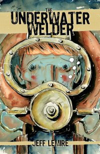
On the artistic front, the cover is one of my favorite Lemire pieces to date, but the interiors are some of the most difficult to penetrate, at least for the first third of the book. As the man himself states in his “Thank You”, he was working multiple duties before given some time to focus on it more, and the art is most reflective of that. The splash pages leading into the third chapter signify a shift in Lemire’s illustrations in this book, as they do become less sketchy, more refined, confident, dramatic and attractive. An overhead view of Tigg’s Bay, Nova Scotia is a stunning example of Lemire’s freehand draftsmanship, and a distinct departure from the often muddy and rushed-feeling opening 80 pages.
The end of the book captures a very tangible emotional moment, the one many new fathers have when they realize the severity of the tectonic shift that’s occurring beneath the feet of their lives. Their entire foundation is shaking and the structure of your life has to be rebuilt to support that quaking or else it will all crumble beneath you. Through his art it’s a defining moment that Lemire shares with (hopefully) millions of other fathers out there, myself included. It’s handled beautifully, I just wish the journey that got Jack Joseph there resonated as strongly.
Rating: 


Out of a Possible 5 Stars
The Adventures Of A Comic-Con Girl #1 of 3 (AP Entertainment, $3.99)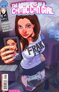
By Jeb D.
While it’s not uncommon to see someone refer to an unsuccessful enterprise (whether comic book, movie franchise, or business undertaking) as having “shit the bed,” this is probably the first time I’ve ever seen I’ve seen it played out literally in a comic. While it’s possible that it’s intended as a sly bit of pre-emptive meta-commentary, it certainly does an excellent job of tossing us directly into the very real, uncomfortable, surroundings of a tale of geek culture that straddles the often difficult line between self-love and self-loathing.
Co-writer (along with Matt Spradlin) Dana Braziel-Solovy shares her name (and, one presumes, a certain amount of biographical detail) with our protagonist, a pop culture-obsessed young woman who awakens in her hotel room on the final morning of Comic-Con to find that she has no memory of how the place comes to be decorated with the traces of a previous evening’s debauchery: strewn with the detritus of cosplay, peopled with young men and women that she really ought to remember but can’t quite, and the aforementioned excrement, which Dana takes in embarrassed stride as she realizes it was her own contribution (a running joke throughout the book will be the fact that everyone but her knows that the home-made alcohol she overindulged in gives you the uncontrollable shits).
From there, our titular protagonist sets off on a quest: to recover her prized signed copy of “Werewolves vs Ninjas vs Zombies” that disappeared from her room sometime during her blacked-out evening. Striding out onto the convention floor (to the tune of “The Imperial March” running furiously through her brain), she traces her artifact’s progression from hand to hand, as it’s traded for a succession of similar nerd-culture touchstones, with each exchange introducing us to another familiar ‘Con character type. Along the way, we get a “surprise guest star” and the expected barrage of pop culture references; I would have called them “in-jokes,” but for the most part, they’re not particularly funny, just there to test the reader’s geek cred. Dana’s climactic assault on the costume contest, in a last-ditch effort to recover her comic, though, is played for honest laughs, and most of the humor in the book comes from interpersonal interaction, not ridiculed stereotypes (though she certainly manages a few of those).
If the story had to stand or fall on simply lampooning Comic-Con and its attendees… well, not only would that be a waste of time in the first place, but Adventures Of A Comic-Con Girl would come up short on that basis, as it’s too far inside that environment to offer much perspective, and only someone who’d never attended any sort of gathering of comic/movie/TV/etc. fans at all would find any of it revelatory. Fortunately, Braziel-Solovy offers up something a little unexpected: a “version” of herself that’s far from the expected Mary Sue of this kind of comic. In-story, Dana is presented as being self-centered, manipulative, and dismissive of anyone not on her specific geek wavelength; and her “quest” to recover her comic results in some self-examination that, while it’s a bit “After-School Special” in its tidiness, is an effective character arc: the lesson she learns about empathy and tolerance may be an easy and obvious one, but valid nonetheless.
Artist David Beauchene’s slightly sketchy storytelling is brisk and effective, his designs fresh and often funny (he’s also got a strong handle on consistency in terms of anatomy and facial expression; something not to be taken for granted in the small-press world these days). There’s no credited letterer, so I’ll assume that Beauchene is also responsible for some of the creative approaches to balloons (like the layer-masks used for the songs running through Dana’s head). Colorist Robby Bevard does a creative job of painting the story’s shifting moods and time-frames.
I won’t pretend that Adventures Of A Comic-Con Girl is as polished a comic as you’ll find this week, and its slight story is a bit dragged out at 25 pages, but its personal touches, light humor, and fundamental honesty, help it ride over those objections. I don’t know that I can quite imagine this team coming up with another two issues’ worth of interesting story in this milieu, but I’m certainly going to have a peek and see.
Rating: 


Out of a Possible 5 Stars
 Before Watchmen: Rorschach ($3.99, DC)
by D.S. Randlett (@dsrandlett)
By now, we’ve all said what we’ve had to say about the mediocrity that is Before Watchmen, and why it’s pretty much useless. But to recap the essential creative handicap that these miniseries face: There’s nothing essential about these characters that we still need to know. Moore’s vision for these characters was fully explicated in the original series, and so there’s really nowhere left for them to go, forward or back. Of course, there are also the ethics of the project. As far as that element is concerned, I feel that if DC had been a little more upfront with Moore, then this would exist as a nice little tribute project for the anniversary or something, and not seem like the flagrant cash grab on DC’s part. But I must admit, when I saw the name’s Azzarello and Bermejo in connection to this project, I was pretty curious as to what they would come up with.
Rorschach faces the same foundational problems as every other Before Watchmen title: we really know all that we need to know about this character already. The other miniseries in this project have dealt with this by basically telling the same stories as the original series, but with more stuff. Brian Azzarello deals with it by essentially writing the next issue in a Rorschach ongoing that doesn’t exist. Azzarello is a talented guy, and he writes his story pretty effectively. His flaif for dialog and the dramatic is intact, and he manages to wring an appealing, hard boiled tale out of this project. Out of all of these series, this is probably the one that feels the most right for its title character. Lee Bermejo’s art is some career best stuff, and saying that about an artist of Bermejo’s caliber is saying something. He captures the grit of Rorschach’s world with aplomb, but he really comes through on the body language. He draws Rorschach very much as his enemies must see him, and the effect is scary and unsettling. As a whole, the book feels like a variation on Taxi Driver, and to some degree it works.
But Rorschach is nonetheless betrayed by its place in this project. For one, we are not as detached from the character as we were in the original Watchmen. One of the great things that Moore did was create a space of detachment from these characters, but not so much that we could not empathize with them. The effect is useful for the aims of that story, because it allows the reader to critically evaluate the characters without stepping into their shoes. Even though some try, especially in the case of Rorschach. While this is a competently done comic book, more than competent in some respects, it just doesn’t feel right for this character because we’re supposed to be looking at him in a certain way. In its removal of the reader’s distance from the character, the book asks us to form a relationship with Rorschach that is the direct opposite of what Moore and Gibbons engineered him for.
In a sense, that’s the problem of picking up characters who were built to exist in a closed loop: they are no longer the characters they once were, and that has been the Achilles heel in the Before Watchmen effort from the beginning, no matter how much talent has been brought to the table. Rorschach is worth it for the art alone, but I think that this would have worked better as a revival of The Question, or Mr. A, both characters with more flexible relationships to the outside world.
Rating: 


Out of a Possible 5 Stars
Fistful of Reviews
by Graig Kent
Working on this column on a (mostly) weekly basis for the past, oh, six years-is, my review writing has evolved quite dramatically, to the point where I’ve established a method, and, perhaps, a structure for crafting my reviews. This involves, more often than not, looking for a hook in the material I’ve chosen to read, and then exploring the hook before diving into the work itself. It is in equal parts a fun and frustrating endeavor, as sometimes there’s not a hook to be found, thus I struggle for something to say, or conversely the hook takes over the review and I lose focus of what I’m actually writing about.
I often get lost in this process, and as such I just as often forget about the fun of just telling friends and readers about the stuff I’ve been reading and what excites me or disappoints me about it in a clear and concise manner. So, this week, I present a fistful of reviews, a quick-hit look at some new and recent books that I have no hook for.. [Also, I was just listening to the Will Ferrell episode of the Nerdist podcast where they kind of rail against this self-indulgent, hook-driven type of reviewing, and I’m feeling a little sensitive about it.]
Wonder Woman #12 (DC, $2.99)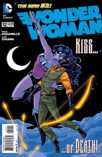
I’m not sure if I’ve covered this book yet, nor which Thor-ougher (we really haven’t come up with a good nick name for ourselves) last reviewed Wonder Woman, nor what issue it was they last covered (I’m just not doing the research right now) but frankly, this book is so good we should be covering it monthly, if only to continue to reiterate just how damn good it is. Because it is. Damn good. In 30 years of reading comics (that number scares me) I’ve never liked Wonder Woman as much as I do now. Of all the “New 52” character shake-ups, this is hands down the best of them. Diana was revealed mid-way through the year-long story arc — concluding this issue — to be one of Zeus’ many offspring (thus making her “molded from clay” origin a total lie that Hyppolita has basically been disowned for). As such she has a keen interest in protecting the human Zola from the many Olympic assassins and warriors that Hera has sent to kill her and the bastard child of Zeus she carries. The offspring may or may not be a kingslayer and one day take the throne of Olympus itself, which concerns many of the children of god who wish the throne for themselves in the wake of Zeus’ apparent death. This issue, which brings it all to a very climactic head, is 20 pages of dynamite. Writer Brian Azzarello’s re-creation of the Greek gods (with no doubt a bid of a tip o’ the hat to Neil Gaiman’s novel American Gods) modernizes them in a way that stays true to the spirit of their myths while also brings something fresh and relevant to them in a way Percey Jackson and other such stories fail to think of. Cliff Chiang returns to close out the first year, and what can I say? His work is clean, attractive and appeals to me on a molecular level. HIs Wonder Woman is beautiful, powerful and completely intimidating. His designs for the Olympians are equally incredible and inspired, while Matt Wilson’s colors are lush but not showy.
This issue has no less that four scenes that made me cheer out loud. One includes a reveal about Wonder Woman which is something I guarantee you’ve never seen in her character before. Another is the not-a-twist-but-kind-of ending which nobody will see coming (but perhaps should have). Still another is the final page, which takes only a littl bit of contemplation to get the connection and will have Kirby fans’ eyes bugging out. If you’ve never been much of a Wonder Woman fan, or are not quite yet sold on her role in the new DCU, I would actually recommend this issue as a starting point. But if you’re even mildly curious, do yourself a favour and start at the beginning, get the first trade, already available, and dive in. The New DCU has faltered in a great many places trying to breathe new life into old trademarks, this is one of them that’s doing exactly what its supposed to.
Rating: 


Out of a Possible 5 Stars
 Saga #6 [Image, $2.99]
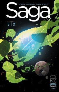
I wasn’t sure what to think of Saga at first. It’s a sci-fi space opera, of sorts, with a fantasy and supernatural bent that wholly earns the “recommended for mature readers” tag that appears nowhere on its front cover. The biggest barrier to entry is that Its characters largely all speak in a normal, American dialect, with not a lot of gobbledygook or faux-jargon muddying up the works that SF can be so often strapped with, nor any of the overbearing, pretentious, olde-English twaddle that fantasy can get mired in. It’s an odd adjustment, these alien creatures — beautifully rendered and humanized by Fiona Staples (perhaps the greatest secret in sequential art this woman) — speaking in such earthly tongue, but once you adjust, it’s just a rollicking good time. This series contains violence, nudity, coarse language, and some tripped out concepts that I’m sure Grant Morrison is kicking himself for not thinking of first. Every issue so far has shown me at least one thing I’ve never seen before (here we have Rocketship Trees, which is one of the zaniest and awesomest concepts to emerge in recent SF memory), and I’m grateful for it. Brian K. Vaughan has yet to let me down with any of his comics work, and his impeccable track record continues with Saga. I’m not sure that it’s going to exceed Y: The Last Man or Ex Machina as his best work, but I’m not sure that it won’t either. What’s incredibly evident is how much fun he’s having with this series, how much thought he’s put into it already, and just how much he loves and knows his main characters. He has a journey in mind that he wants to take his characters on, and as he exclaims in his letter column (remember those?) he’s exceptionally pleased that there’s a growing audience wanting to join him on that journey. A low-budget ($10) trade is on its way in October of the first six issues, which could be a bit of a pisser for those of us that paid our $3 bucks per, but I’m more than confident I’ve gotten my money’s worth so far. This is good, fun, adult comic book entertainment.
Rating: 


Out of a Possible 5 Stars
The Shade #11 [DC, $2.99]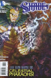
I believe I mentioned in previous reviews how this is the best work James Robinson has done since his early Starman days, and that’s held firm through the entire run of this maxi-series. The Shade is obviously very close to his heart and he writes him as if he’s an extension of himself. But I have to say this issue is all about Frasier Irving who delivers some (no pun intended) stellar and downright stunning work in the conclusion of this story arc. As the Celestial Pharoahs, giant centuries old beings who may be aliens or may be actual Egyptian deities, set about destroying London, the city’s greatest heroes have no effect in stopping them. Irving, a native Briton, seems to have an extra charge in setting the England’s capital aflame with cosmic blasts, and with the monstrous scale of these immortal beings, Irving toys ever so playfully with perspective. When the Shade launches his counter-attack, the book doesn’t go into wide-screen, it goes into IMAX format. Using elongated panels, and dual page splashes, Irving makes the book feel physically much larger than it actually is. Once the Shade employes his secret weapon, Irving gets a little trippy with his layouts, giving J.H. Williams a run for his money in creative paneling. There are some who do not like Irving’s digitally illustrated and painted art, for many the lack of hard ink lines put them off, but I honestly can’t get enough. Irving’s style is at it’s worst unique, and at its best, as it is here, jaw dropping. His storytelling prowess rivals the best the industry has to offer, and his creativity in layout, page construction and character design only seems to be growing. I could stare at these splash pages for ages.
Oh, and you have to check out the character Beaumont, whom Robinson first introduced in his run on Superman. He makes his second appearance here, in a seven-panel sequence and four lines of dialogue, that has, for some reason, made him one of my new favourite b-list characters.
Rating: 


Out of a Possible 5 Stars
 Thoughts on a Winter’s Morning (Monkeybrain, $0.99 – digital only)
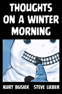
This is a tough one. I realized only after buying, then reading that this was a digital 8-page story for one dollar. Given that we pay $3 or more for a 20 page book it’s on par or better page-per-cent value, but somehow it still doesn’t seem like it’s a good deal. Yet, viewing through the comixology app’s guided view on my iPod, I had no sense of how long it was, and it didn’t really seem to matter. Kurt Busiek wrote the script for this slight yet meaningful nostalgia trip in 1998, and years later it was illustrated by Steve Lieber for a 2005 Negative Burn anthology, and now it’s available to the masses once more after a long absence. Busiek channels Harvey Pekar here, relating a personal anecdote about taking a walk on a winter’s day that triggers a childhood memory that’s as equally strong as it is vague. Some details are crystal, others are clay, and he touches on the fact that our perspective of the world is ever-shifting and yet our memories are locked into the perspective we experienced them. He writes about winter sledding down “the big rock” in his front yard, a later life visit to his childhood home reveals a rock not so be. I have a similar recollection of “the Big Hill” near my childhood home, which, I’ve seen in recent years, truly isn’t much more than a mound. Like the Underwater Welder, also covered this week, there’s also the impact of a child having just entered Busiek’s life at the time of writing, changing his perception of the world dramatically, as well as changing how he interacts with it. The two books both share, in very small yet poignant ways, the impact of achieving fatherhood. Steve Lieber’s monochromatic art is fantastic, bringing the memories of another to life must be a difficult task, but he illustrates with impeccable detail as if they were his own. Busiek provides an afterward that’s a nostalgia trip all its own, as he relates the history of the story, breaks down some details and provides an update on his family. In all, yes, slight but charming.
Rating: 


Out of a Possible 5 Stars
Oglaf (oglaf.com, webcomic)
The very first story on Oglaf introduces the Cumsprites — living ejaculate brought to life every time the evil sorceress’ virgin manservant spills his seed so it can run back to her and rat him out for his indiscretions — a (literally) running (sometimes literally) gag paying off continuously throughout the run, climaxing with the proclamation “Oh my god, blow jobs are adorable!” Yes, yes they are.
The creative team of Trudy Cooper and Doug Bayne (Aussies, both of them) are the parties responsible for Oglaf, a deliriously dirty, yet faithfully funny high-fantasy erotica webcomic that is most explicitly not-safe-for-work. They have produced, to date, around 150 stories, varying in length from the one-page, multi-panel gag, to a multi-part epic involving the slaying of the God of Fun. From start to finish it’s currently about 3 hours worth of immersive, titillating reading, available on-line, for free, and it’s so well made it’s almost too good to be free. But there it is. Cooper and Bayne have no boundaries with regards to where their story goes. Liberated from the censorship of any publisher or having to answer to any advertiser, they explore the Oglaf world with complete freedom, so there’s tons of masturbation, hetero, girl on girl, guy on guy, and all of it is treated as just a normal part of this world. But, I should affirm, it’s not pornography. Well, not *just* pornography. Pornography generally doesn’t have (much of) a story, it’s very rarely funny (porn takes itself waaay too seriously, even those proclaiming to be “parodies”), and characterization rarely extends beyond cup size or cock length. Oglaf is pornographic generally, but isn’t always. That it can go on extended strips without any nudity or even sexual innuendo and still be just as entertaining proves how strong the series is as a whole, not just as porn. It’s a wonderfully realized, richly populated world of ridiculous, frequently (but not always) sex-obsessed characters, magicians, faeries, demons, gods and weirdos, amongst others. The comic is riddled with visual and verbal gags (“humpa humpa humpa humpa” is my new favorite sound effect), not just end-of-page punchlines, but true absurd humour throughout, sold marvelously by Cooper and Bayne’s expressive cartoons and great cast. Their highly animated style is impeccably well refined from story one, with simple lines and great coloring. It’s richly detailed, and designed to be equally alluring, amusing, yet remaining true to the genre. The jokes are mostly hits, frequently laugh out loud, and there’s a plethora of running gags which crop up and constantly pay off. Naturally, this isn’t going to be everyone’s cuppa, but it’s about as great a fantasy-erotic-comedy as anyone could hope to get, especially for free.
Rating: 


Out of a Possible 5 Stars