Aesop’s Ark #1 (Monkeybrain, $0.99)
Bandette #1 (Monkeybrain, $0.99)
Edison Rex #1 (Monkeybrain, $0.99)
October Girl #1 (Monkeybrain, $0.99)
By Adam Prosser
One of the most powerful aspects of comics, historically speaking, is that they’re a populist medium. 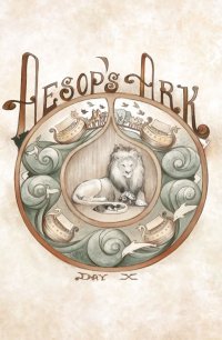 During their heyday, comics were everywhere, ground out at a breakneck pace and sold at every newsstand as a way for kids to while away their afternoons. This has naturally opened them to charges of being puerile, brainless junk (an attitude that has often been self-fulfilling), made them vulnerable to censorship, and often put them at the mercy of gatekeepers interested only in grabbing a quick buck. But it also meant that comics were able to saturate pop culture, an almost century-long investment that’s paid off major dividends in the last couple of decades, as superheroes and other comics have taken over the movies and TV. Comics are, for lack of a better word, prime cultural real estate, and a great way for the most imaginative to saturate our collective dream-space on a low budget.
Or at least, they used to be. With the arrival of the Chromium Age, comics became expensive collectables first and stories second. Pamphlet comics went through a massive, unsustainable inflation in price based on the idea that they would one day be worth even more than the suckers, excuse me, consumers were paying for them at the time. That bubble, as we all know, eventually burst, but unfortunately it’s the nature of capitalism that once a company’s able to charge a certain amount for something, that price is unlikely to go down across the board short of a flat-out economic disaster. And despite the bottom falling out of the comics market, the sales job perpetrated on the hardcore fans was such that they continued to believe that these marked-up prices were worth it, that they represented an investment rather than an expense. While pamphlet comics have stumbled along ever since, they have of course become the domain of the aging, obsessive collector rather than the kid with some pocket money to blow, and while the content of the books is usually blamed for this, I see that more as a symptom than a cause. The fact is, there was once a time when readers could afford a big stack of comics for a few bucks at most—enough to buy every Marvel or DC title for the sake of following continuity, for instance, or enough that you wouldn’t think anything of trying out a new comic just because the cover looked cool. Comics used to be a trivial expense, and that allowed readers to take chances with their money. Nowadays, when a 22-page pamphlet comic is four times the cost of a candy bar and a third the price of a paperback novel or a movie, consumers are more hesitant to spend their money on anything but familiar standards—which holds the industry back creatively, both at the major companies (who wallow in nostalgia) and the indies (who struggle to survive).
 The real promise of digital comics, it seems to me, isn’t the shiny new format in and of itself; it’s the possibility of returning comics to the days of impulse buys and kid-friendly pricing. It’s no coincidence that the new lineup of digital offerings from Monkeybrain are kid-oriented, or that they’re actually selling in a way that the Big Two’s halfhearted attempts to reach the younger market rarely do. Digital publishing allows the comics to be priced the way they used to be back in the days when kids could blow their allowance on a stack of comics and keep themselves busy for the afternoon.
How are the comics themselves? Pretty good, overall. Aside from being geared towards younger readers, there’s also a strong attempt to make some of the books female-friendly, the other thing that pamphlet comics have been lacking. Bandette (see also Jeb’s review, below), October Girl, and Amelia Cole and the Unknown World (the latter being the longest of these Monkeybrain comics, reviewed by my colleague D. S. Randlett below) all feature female protagonists. Bandette, by Paul Tobin and Colleen Coover, is the most charming of these, featuring a winning cat burglar-style protagonist who steals from rich criminals and has a team of kid helpers not unlike Sherlock Holmes’ Baker Street Irregulars. The book is clearly inspired by Euro comics–the idea of the criminal mastermind as protagonist has always been a popular one in Europe, and the heroine’s almost like a distaff, kid-friendly Diabolik. Tobin sketches out the premise quickly and elegantly, and Coover’s art is always a delight to see. (I’m not really clear on why this comic is tagged for an older audience than the others, though—is Coover planning on busting out some of her trademark sexiness in future issues?)
Aesop’s Ark is probably the quirkiest premise of these books—lushly illustrated in storybook style 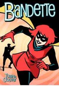 by Jennifer L. Meyer and written by J. Torres, it’s more of an anthology setup than anything, involving the animals on Noah’s Ark whiling away the time by telling instructive stories to each other. I could gripe that there’s only one actual story (and thus only one colour page) in this comic, but this isn’t the kind of book that’s about momentum; it’s about atmosphere, and hanging out with an interesting band of misfits, and it’s certainly the kind of thing that will appeal to young children.
Edison Rex was my personal favourite of these books—like many indie superheroes, it basically revolves around pseudonymous versions of the big two characters (and even more commonly, Superman) who are taken in crazy new directions that would never fly in the “real” book. But I believe the superhero concept is rich enough and loaded with enough ideas to support this kind of story dozens of times over, and writer Chris Roberson helps prove this with a great, hooky first issue that tries to conceive of how a Lex Luthor type of mad scientist might plausibly beat Superman (or does he?) and what happens afterwards. Aside from being an entertaining setup, this issue (with art by Dennis Culver and colours by Stephen Downer) shows once again how much more exciting superheroes can be when they’re allowed to focus purely on the underlying narrative ideas, rather than being bogged down in decades of continuity. Even with the obvious debt to pre-existing characters, Edison Rex still feels fresh.
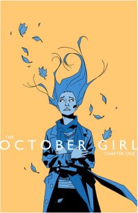 October Girl is probably the weakest of these Monkeybrain books, but it’s still pretty decent. The art, by Matthew Dow Smith (who is also the writer) is distinctive and moody, basically combining Mike Mignola’s distinctive angular lines and pools of shadow with the careful detail of an indie artist like Daniel Clowes. The main problem is that it takes too long for anything to happen to the protagonist, a teenage girl named Autumn who’s struggling to keep herself and her mother fed and housed by working a dreary day job. By the end of the issue, of course, something fantastical has happened to Autumn, but unfortunately this means that the rest of the comic up to that point is devoted to a litany of how awful her life is, which wasn’t the most fun thing to read. But this is clearly setup, and the story is undeniably headed somewhere, so it’s still a worthwhile read. In fact, it’s the perfect demonstration of what I said before: a cheap comic makes it harder to feel cheated, and makes you more likely to keep reading. Sometimes being ephemeral has its advantages.
BANDETTE: Rating: 


Out of a Possible 5 Stars
AESOP’S ARK: Rating: 


Out of a Possible 5 Stars
EDISON REX: Rating: 


Out of a Possible 5 Stars
OCTOBER GIRL: Rating: 


Out of a Possible 5 Stars
Enormous (Image, $9.99)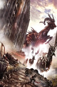
by Graig Kent
I went on a blind date this week. It’s not that I was looking for new love, but you know, sometimes it’s worth putting yourself out there, taking a chance and seeing what happens. It started as an on-line thing, you see, completely unexpected. I was looking at the shipping list for this week, as I do every week before I head out to my LCS, and I took a peek at all the new additions. This one, Enormous, really caught my eye. I mean, it was only a tiny thumbnail of a picture, so I wasn’t totally judging by that (but it did look fiiine), it was the description that kind of wooed me. it’s a book about humanity’s struggle for survival in a post-apocalyptic world dominated by giant monsters. It’s an idea I’ve been rolling around in my brain for over a decade now, and I’ve been continually surprised there haven’t been more post-apocalyptic-giant-monster books, movies, and the like out there. It’s like a fantasy girl you never think exists in real life, until suddenly she does.
When I went to my LCS to pick up this thing that had so grabbed my attention, I was a little nervous when, at first glance, I thought it hadn’t shown. I was looking all over the rack, typically organized in alphabetical order, and it was nowhere to be found. I felt stood up, somewhat rejected. Had I missed my window, had someone else already snapped it all up for themselves? But, I asked someone who knew, and they pointed it out… and there it was, as if a spotlight targeted it in the darkness, bigger, brighter, bolder and more beautiful than I had anticipated. Enormous is a stacked, glossy, tabloid-sized book (nothing pushes the nostalgia button for me quite like tabloid-sized comics) with rich, digitally painted artwork on the cover and throughout. I was quite ready to fall in love with this book.
Alas, like a promising blind date that goes sour the moment the other person opens their mouth, Enormous and I are not going to continue with this affair. I gave it a shot, I stuck through the entire date hoping to see some of those expectations I had built up in my head get fulfilled, but I honestly couldn’t wait for it to be over.
Let’s start by saying Enormous isn’t a terrible book, it’s just not the book for me. It looks good on the surface, but upon closer inspection it wears too much make-up, and its beauty truly is only on the surface. Illustrator Mehdi Cheggour’s style bears comparison to Tim Bradstreet’s photo-real illustrations, which is like comparing a girl to Rashida Jones… she’s not the first person you think of when you think “hot”, but you get it instantly. But say this girl you’re comparing to Rashida Jones has, like, faint sideburn hair, and a mole on the side of her nose that you mistook for a piercing, and some unsightly wrinkles when she smiles… and you notice, in the wrong light, that the angles are all off. That’s Cheggour to Bradstreet. He puts on a glossy finish, a good polish, to mask the weaknesses, but the weaknesses invariably shine through. The consistency of Cheggour’s characters are problematic to the point of confusing characters with one another as the story progresses. The wardrobes, beyond a cowboy hat, don’t provide much assistance either. It’s a real “dark jeans, dark shirt for everyone” kind of production. As well, Cheggour’s characters are stiff, looking more posed than in motion. It’s a problem many photo-referenced illustrators have. Cheggour does illustrate some awesome big beasts, but he doesn’t show them off enough, and it’s all too hard to see them in the light and shadows he provides. I couldn’t help but stare, but far too often I couldn’t really tell what I was looking at.
But Cheggour’s work was still attractive enough that a great story would have made up for it. If it had personality, then, well… even if I hadn’t fallen in love, I would’ve liked to have seen more of it. But it just wasn’t to be. Tim Daniel’s story is, foremost, confusing. The characters are so poorly drafted that there’s very little to invest in, and you’re not terribly sure where any of them are coming from, motivation-wise. The story is constantly announcing new locations and characters, and jumping through time willy-nilly that it’s very difficult to catch one’s bearings. I had to read pages five through seven over again two or three times in an attempt to grasp who was who, and what was going on, but just moved on when I realized that wasn’t happening. The pacing was off from start to abrupt finish, and any drama that occurs in between is never earned. The world building is done in a haphazard manner, with no relative impact on the core story behind each reveal. It’s just an flummoxed, awkward mess all around. There’s no satisfaction to spending time with it at all.
Not to kiss and tell, but, I did take it home. I opened it up and got a good look at what was underneath.. Ultimately, what I learned about Enormous is it sure looks like its got some big beasts, but when you undress it, it’s mostly just padding.
Rating: 


Out of a Possible 5 Stars
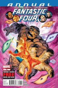 Fantastic Four Annual #33 (Marvel, $4.99)
By Jeb D.
There’s plenty of reasons to love Alan Davis, but I think what I find most interesting/amusing about the guy is his blithe singleness of purpose. A few years back, when Marvel was putting together their occasional series of “The End” books, Davis got the plum assignment of Fantastic Four: The End… and promptly ignored the dark poignance inherent in the concept, and instead crafted a delightful, gorgeously-illustrated tribute to the look and feel of 70’s Marvel superhero comics, tossing in Avenger upon Defender upon Inhuman, and using the almost incidental presence of Marvel’s flagship team as a springboard for a space-and-time-spanning adventure that seemed to belong to a comic-book universe of hope and promise that need never have been troubled by Watchmen or The Dark Knight Returns. Now, in the wake of the muted (at best) reaction to the recent revival of his beloved ClanDestine comic, he’s borrowing three high-profile Marvel annuals to spin a new epic tale of ClanDestine, with the Fantastic Four (and, still to come, Daredevil and Wolverine) more or less along for the ride.
Actually, this is a Ben-and-Johnny story, which is always a great dynamic for the FF: both characters are at their best when in over their heads, and here, with the Richards family on vacation, the hapless duo find themselves without Reed’s intelligence, and Sue’s fierce common sense, to guide them though the time-shifting, dimension-hopping story; the presence of Dr. Strange only seems to make things more confusing, and dangerous, for the pair.
Longtime ClanDestine fans will be delighted to meet the long-mooted Vincent Destine: for everyone else, suffice it to say that he’s a mysterious, bespectacled young boy, whose troubled relationship with his magically-powered family (most of whom we meet in this issue) is causing all manner of mystical time-and-space folderol, and he needs Ben Grimm’s down-to-earth solidity, Johnny Storm’s “fiery” personality, and Strange’s particular bag of tricks, to put things to right.
As usual, Davis’ dialog tends toward the functional, but that’s a minor nit to pick, really: his plotting is nicely intricate without slogging (something I wouldn’t always say about previous ClanDestine stories), with some of the wild insanity of an old Lee-Ditko issue of Strange Tales (there’s even a scene at Woodstock that reads just like what most 60’s comic artists thought “hippies” were all about).
And even that is almost a minor consideration next to the art: with his usual help from inker Mark Farmer, and colors by Javier Rodriguez, Davis may have outdone himself: FF Annual #33, with its imaginative monsters and settings, is every bit as gorgeous as FF: The End was, but his layouts and paneling feel even more dynamic and exciting, with ample doses of fantasy and visual humor (he’s got a great assortment of Ben Grimm reaction shots). Davis’ use of Dr. Strange also strongly evokes the Doc’s classic Englehart/Brunner era, and rivals it for sheer imagination.
Don’t worry if you’re either unfamiliar with ClanDestine, or have been put off by the convolutions of some of their previous appearances; all you need to know is that this is vintage, character-driven, old-school superheroing, with absolute knockout art. If that’s your thing, don’t hesitate.
Rating: 


Out of a Possible 5 Stars
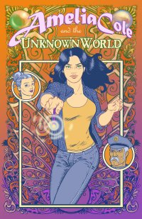
Amelia Cole and the Unknown World #1 ($1.99, Monkeybrain)
by D.S. Randlett (@dsrandlett)
In the words of the Great Gonzo, “This looks familiar.”
There’s something cozy about the new, creator-owned, all ages title Amelia Cole and the Unknown World. It takes a bit to sink in. I was prepared to give this book a bad review while reading the action beat which opens the book. It’s a fun enough scene, but it tells the reader literally nothing about why he or she should care about the titular character or her story. Once that’s done with, however, the book manages to find a very pleasant groove.
The art helps this feeling along. Nick Brokenshire’s style has a warm softness to it. He gives the book a friendly and welcoming appeal in the face of the menace and danger on hand in the plot. However, it doesn’t seem as if he’s really settled into this style yet. The art gets better with each page, but by the end of this first issue Brokenshire’s lines don’t really display the full confidence that he seems capable of.
The writing follows a similar pattern. There’s a lurking sense that this could be something special. The writers, D.J. Kirkbride and Adam P. Knave, want this book to feel special, but they haven’t yet found that spark to bring that ambition to pass. It doesn’t help that they commit what seems to be the cardinal sin of genre fiction these days: twists that mean nothing to the audience. There’s a “nothing is as it seems!” moment that comes late in the book, and it is completely and totally unearned. It turns the world upside down for Amelia Cole, but we’ve only just met her, so we have no idea of the enormity of the import of this particular revelation. First issue-itis strikes again!
Amelia Cole and the Unknown World also isn’t terribly original. The most obvious touchstone here is Neil Gaiman in his lighter moods. In other words, the Neil Gaiman that’s been coasting for the past few years. It’s that brand of Y.A. low fantasy that borrows heavily from superhero fiction (what with double live and all) and cultivates a sort of indie-rock feel. There’s nothing inherently wrong with this, but there’s something about this subgenre, and Amelia Cole, that tends to feel utterly lacking in creative passion. There’s usually a certain checklist style of thinking at play that assures that the art created within its confines is almost certainly always hip, but rarely ever true.
Still, for all of the flaws present, this is one damn likeable comic book. There’s a kernel of earnestness here, and I think that the book would be well served by erring more toward that impulse than to the urge to be hip or cool. There is a lot of skill and potential on display here, as well as a bit of heart. If the creative team can bring a bit more passion and confidence to future issues of this series, I’ll probably be able to quote another part of Gonzo’s song, “I’d like to go back there someday.”
Rating: 


Out of a Possible 5 Stars
 Morning Glories Volume Three: “P.E.” (Image, $14.99)
by Graig Kent
It’s got to be frustrating reading Morning Glories as a monthly comic. I’m reading it in trade only, getting it in concentrated doses, but even still it’s a frustrating read.
My wife likens it to the comic book equivalent of Lost, which is a fairly apt analogy.
I started watching Lost as season sets, soaking up first three seasons on DVD, each in less than a week’s time with a bit of a break in between. To me, it was the ideal way to watch it, as in such concentrated doses, all the finer details, all the more intricate links seeded throughout stayed fresher in the mind as the season progressed. It actually made it easier to enjoy, although the two-questions-asked-for-every-one-answered formula was a bit maddening.
With Morning Glories I’ve patiently waited for each trade to emerge, resisting the urge to dive in monthly (as I did with Season 4 of Lost when I started watching weekly). Writer Nick Spencer has really embraced the style and structure of Lost, where each issue has a focus character that carries forward the “current’ story, and a flashback sequence that expands the background of the character, and in both deepens the mythology of the Morning Glories Academy, and the subtly fantastical world it inhabits. The main difference is a weekly, 44-minute-long series like Lost can get a lot more detail in each episode than Spencer can in a 24-page comic, so each issue is fairly compact compared to the, generally, more sweeping movements of Lost. Spencer is a very methodical writer, something apparent in his other works such as T.H.U.N.D.E.R. Agents at DC and Ultimate Comics X-Men at Marvel. He’s not interested in rushing through his story or character points in order to get to an action sequence or shocking moment. Everything happens in its own time, but Spencer’s pacing is quite impeccable, and invariably each issue ends with something big. But I could see, on a month-by-month basis it feeling like nothing is moving forward very quickly, whereas in one solid dose like this trade paperback (spanning seven issues), the progress is very tangible while at the same time allowing you to savor the many moments Spencer allows to breathe.
The Lost comparisons don’t just stop at the structure, however, as there’s very much a “Lost island” feel to the Morning Glories Academy, a fenced off institution that is an island all its own. The teachers are like the Others, who themselves seem to serve a higher master, and there’s something … more … going on here than meets the eye, including a very rich supernatural component. As we keep getting more of this “more” revealed, it’s like the many mysteries on Lost, some are just background details that enrich the environment, and others are pertinent to the story-at-hand, and only Nick Spencer knows for sure what’s what.
This collection, “P.E.” owes some credit to the Battle Royale/Hunger Games model, as kids from the academy are selected, at random, to participate in the Woodrun, a competition of sorts that feels downright nefarious, in part due to the pas happenings at the school, and in part to our all to heightened awareness of Battle Royale and the Hunger Games. There’s also some Lost-ian time travel and parental-issue shenanigans, soap opera romantics and more murder than you can shake a stick at. To be honest, I have no idea what’s really going on, but I’m loving the voyage of discovery.
Spencer’s partner-in-crime is Joe Eisma, who’s quickly evolving into a master storyteller. He’s shaken off a lot of the weaknesses evident early in the series, and is displaying extreme confidence in his line work. His detailing is becoming richer, his characters more uniquely defined, and their movements far more natural. The growth in his facial expressions is worth its weight in gold on a series like this that lives and dies on the emoting of the characters. I wasn’t a fan early on, but now I’m impressed and wouldn’t want to see the series without him.
If I have any complaint about this series, it’s that I’m going to have to wait for another volume. Hashtag: First world problems.
Rating: 


Out of a Possible 5 Stars
Bandette #1 (Monkeybrain/Comixology, 99 cents, digital)
By Jeb D.
I’ve read a bit of debate over the question of whether or not the 13 digital “pages” of this story constitute “good value” for 99 cents; I will just say that the first installment of Bandette provides at least as effective an introduction to its main character, glimpse at the supporting cast, and hint of its unfolding plot, as any $3.99 first issue I’ve read lately, regardless of page count.
Bandette is a masked thief in a black-and-scarlet costume who zips around Paris on a motor scooter, and breaks into the expensive homes of sleazy rich baddies with a cheerful nonchalance that immediately lets us know that the stakes aren’t particularly high (the bright-yellow lining to her cape, combined with her constant chatter during a daylight caper, is sort of a giveaway that stealth isn’t a priority); she later doffs her costume and red wig to be “revealed” as a Hepburn/Tatou style gamine. She has a network of charming French folk upon which to rely when things get dicey, and is simultaneously serving as a mysterious “consultant” to a Paris police inspector. Meanwhile, the elegant 1-percenter known simply as “Monsieur” gets a phone call from yet another (judging from the glimpse we get of her shapely figure) mysterious woman, telling him of the Macguffin that will set the overall plot in motion.
Veteran “all-ages” writer Paul Tobin isn’t kidding himself, or us, about the light, frothy nature of the material, relying on his artist (and wife) Colleen Coover to charm us with her whimsically relaxed cartoonish style, simple but effective facial work, and evocative street scenes. The overall impression is something like a Tintin comic illustrated by Darwyn Cooke.
The Parisian setting, and the Herge evocation, are driven home by Tobin’s odd choice to have the dialog read with the archly formal voice of a comic translated to English from an original French source. It’s a bit distancing, but given that most everything in the book is taken from stock in the first place, it’s not as though some intimacy with characters or story is being sacrificed, and it’s certainly a distinctive approach. Thirteen pages in, Bandette is a charming trifle; I don’t know how well such lightness of touch will sustain over a full-length story, but that’s a question for next time.
Rating: 


Out of a Possible 5 Stars
He-Man and the Masters of the Universe #1 ($2.99, DC)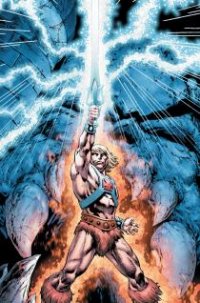
by D.S. Randlett (@dsrandlett)
Sure, I guess that it all started with the Transformers, but of all the 80s/early 90s cartoon characters to rear their heads again in the twenty first century, the only return that’s really worked has been that of the Ninja Turtles. The fuel for these revivals has been different on a case by case basis. I’m pretty sure that Transformers was made because Spielberg and Bay wanted to do a giant robot movie and that was a property that had some recognition behind it. G.I. Joe was made because Transformers made money. Neither of those properties really worked because they lacked what TMNT has: actual characters, thin though they may be. With properties like Transformers or G.I. Joe, the problem with adapting them to quality narratives is the toyline nature of the properties. Optimus Prime’s defining trait is that he turns into a truck. Snake Eye’s main personality trait is that he’s a ninja. These are icons, avatars of certain abilities that young boys can play with or simply shove firecrackers into. Ray Harryhausen once said that the mark of a good creature design was one that evoked what the creature looked like in repose. The Transformers and Joes have no repose: there really isn’t a way to think of them in terms of what they like, as there is with the Turtles.
He-Man and the Masters of the Universe faces the same problem as properties like Transformers or G.I. Joe one a basic story level. No one can really think of these characters in repose, they have no identity beyond “lead good guy” or “weapons expert.” Everyone’s either the guy who does task X, or wears the outfit that looks like Y. In many respects, this is enough for children, especially in the context of toys and play. A new limited run comic book with some good talent behind it is not toys and play, however. So once again, we’re faced with the resurrection of a bygone property almost solely on account of its name recognition.
I don’t remember the He-Man universe at all, really. I remember liking the show as a kid, and having some of the toys (my favorite was this over muscled leech-man who could suction on to stuff with his face), but it eventually fell away. The weird thing about this resurrection by James Robinson and Philip Tan is that it has the same overall look as the old show, but the tone is a fair bit darker, though it doesn’t quite dip its toe into grim ‘n gritty territory. Still, Robinson and Tan seem to get that a big part of the original appeal was the trippy look of this toyline. It was like a high tech version of Conan mashed up with Kirby’s Fourth World comics. Many of the characters in this toyline didn’t have nearly the amount of thought put into them as Kirby’s characters, however, so there was just this overarching sense of weirdness over the whole Masters of the Universe concept. It was like reading a sexually-toned-down-to-the-point-of-repression Heavy Metal while tripping on LSD. For kids.
Where He-Man and the Masters of the Universe falters is in its failure to really embrace this weirdness. It retains it in some of the look and the design sensibilities, but the story (so far) does not in the least. What story there is, anyway. Most of this first issue’s page count is taken up by an extended dust up between Adam (He-Man when he’s not He-Man) and Beast Man, which for this sort of book is probably for the best. Adam himself is probably the character who’s seen the most change from his previous iteration. Instead of being a distressingly swishy prince who needs to grab on to a big sword in order to unleash the man within, he’s a secret badass like Jason Bourne. It’s not explicitly revealed in this issue, but there’s basically a neon sign pointing out that the Adam identity is some sort of conditioned memory wipe thing, and that what we’re waiting for is for Adam to realize his true identity as He-Man, full time ass kicker.
All of this is competently done by Robinson and Tan, but all that that means is that the book isn’t offensively bad. It just feels typical, which is quite the feat considering the source material’s trippy feel and lack of character foundation.
Rating: 


Out of a Possible 5 Stars
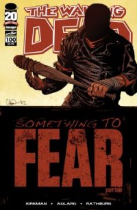 The Walking Dead #100 (Image, $3.99)
By Jeb D.
Remember when you started reading The Walking Dead? Rick’s battle to try and preserve what remained of humanity’s higher values in a world that seemed to have no more use for them, interspersed with horrifying visuals and grim predation, mingled with familiar soap-opera elements among the cast, and leaving the reader to ask whether what they were seeing was a brutal new world, or simply a bleak reflection of our own.
Remember when you stopped reading The Walking Dead? Rick’s battle to try and preserve what remained of humanity’s higher values in a world that seemed to have no more use for them, interspersed with horrifying visuals and grim predation, mingled with familiar soap-opera elements among the cast, and leaving the reader to ask whether what they were seeing was a brutal new world, or simply a bleak reflection of our own.
Remember when you started watching The Walking Dead TV series? Rick’s battle to try and preserve what remained of humanity’s higher values in a world that seemed to have no more use for them, interspersed with horrifying visuals and grim predation, mingled with familiar soap-opera elements among the cast, and leaving the reader to ask whether what they were seeing was a brutal new world, or simply a bleak reflection of our own.
Remember when you stopped watching The Walking Dead TV series? Rick’s battle to try and preserve what remained of humanity’s higher values in a world that seemed to have no more use for them, interspersed with horrifying visuals and grim predation, mingled with familiar soap-opera elements among the cast, and leaving the reader to ask whether what they were seeing was a brutal new world, or simply a bleak reflection of our own.
Remember when you read issue #100 of The Walking Dead…?
Rating: 


Out of a Possible 5 Stars